

react native floating button component graphic tutorial
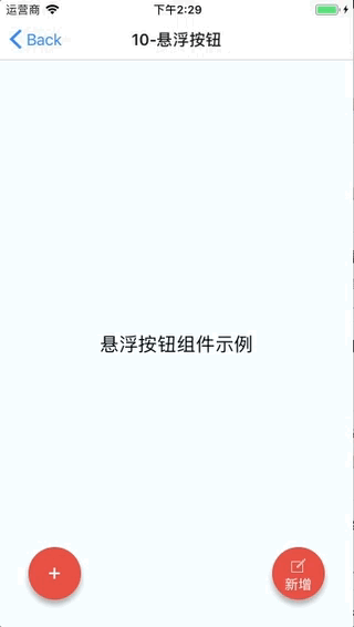
This time I will bring you the react native floating button group picture and text tutorial, what are the precautions when using the react native floating button component, the following is a practical case, let's go together take a look.
React Native floating button component: react-native-action-button, a pure JS component, supports Android and IOS dual platforms, supports setting sub-buttons, and supports custom positions, styles and icons.Rendering
Installation method
npm i react-native-action-button --save
react-native link react-native-vector-icons
Sample code
<View style={styles.container}>
<Text style={styles.welcome}>
悬浮按钮组件示例
</Text>
<ActionButton buttonColor="rgba(231,76,60,1)" position='left' verticalOrientation='up'>
<ActionButton.Item buttonColor='#9b59b6' title="New Task" onPress={() => console.log("notes tapped!")}>
<Icon name="ios-create-outline" style={styles.actionButtonIcon} />
</ActionButton.Item>
<ActionButton.Item buttonColor='#3498db' title="Notifications" onPress={() => {}}>
<Icon name="ios-notifications-off" style={styles.actionButtonIcon} />
</ActionButton.Item>
<ActionButton.Item buttonColor='#1abc9c' onPress={() => {}}>
<Icon name="ios-done-all-outline" style={styles.actionButtonIcon} />
</ActionButton.Item>
</ActionButton>
<ActionButton
buttonColor="rgba(231,76,60,1)"
onPress={() => { alert('你点了我!')}}
renderIcon={() => (<View style={styles.actionButtonView}><Icon name="ios-create-outline" style={styles.actionButtonIcon} />
<Text style={styles.actionButtonText}>新增</Text>
</View>)}
/>
</View>Main parameter description
ActionButton
- size: The size of the button, the default is 56
- active: Whether to display the button
- position: The position of the button, which can be left center right
- offsetX: The offset position on the X axis
- offsetY : Offset position on the Y axis
- onPress : Click
- onLongPress : Long press event
- buttonText: Button title
- verticalOrientation: The direction of the pop-up button, up or down
- renderIcon: Yes Customize the button display style. The default is a plus sign
ActionButton.Item
- size: the size of the button , the default is 56
- title: button title
- buttonColor: button color
- onPress: Click event
Full example
Full code: GitHub - forrest23/ReactNativeComponents: React Native component collectionThis sample code is in the Component10 folder.
Component address
GitHub - mastermoo/react-native-action-button: customizable multi-action-button component for react-native I believe you have mastered the method after reading the case in this article. For more exciting information, please pay attention to other related articles on the php Chinese website! Recommended reading:Detailed explanation of using webpack hot module replacement
Detailed explanation of the use of three types of $() in jQuery
Summary of JS sorting algorithm
The above is the detailed content of react native floating button component graphic tutorial. For more information, please follow other related articles on the PHP Chinese website!

Hot AI Tools

Undresser.AI Undress
AI-powered app for creating realistic nude photos

AI Clothes Remover
Online AI tool for removing clothes from photos.

Undress AI Tool
Undress images for free

Clothoff.io
AI clothes remover

Video Face Swap
Swap faces in any video effortlessly with our completely free AI face swap tool!

Hot Article
Hot Tools

Notepad++7.3.1
Easy-to-use and free code editor

SublimeText3 Chinese version
Chinese version, very easy to use

Zend Studio 13.0.1
Powerful PHP integrated development environment

Dreamweaver CS6
Visual web development tools

SublimeText3 Mac version
God-level code editing software (SublimeText3)
Hot Topics
 1653
1653
 14
1413
52
1306
25
1251
29
1224
24
14
1413
52
1306
25
1251
29
1224
24

 How to install the Windows 10 old version component DirectPlay
Dec 28, 2023 pm 03:43 PM
How to install the Windows 10 old version component DirectPlay
Dec 28, 2023 pm 03:43 PM
Many users always encounter some problems when playing some games on win10, such as screen freezes and blurred screens. At this time, we can solve the problem by turning on the directplay function, and the operation method of the function is also Very simple. How to install directplay, the old component of win10 1. Enter "Control Panel" in the search box and open it 2. Select large icons as the viewing method 3. Find "Programs and Features" 4. Click on the left to enable or turn off win functions 5. Select the old version here Just check the box
 PHP, Vue and React: How to choose the most suitable front-end framework?
Mar 15, 2024 pm 05:48 PM
PHP, Vue and React: How to choose the most suitable front-end framework?
Mar 15, 2024 pm 05:48 PM
PHP, Vue and React: How to choose the most suitable front-end framework? With the continuous development of Internet technology, front-end frameworks play a vital role in Web development. PHP, Vue and React are three representative front-end frameworks, each with its own unique characteristics and advantages. When choosing which front-end framework to use, developers need to make an informed decision based on project needs, team skills, and personal preferences. This article will compare the characteristics and uses of the three front-end frameworks PHP, Vue and React.
 Angular components and their display properties: understanding non-block default values
Mar 15, 2024 pm 04:51 PM
Angular components and their display properties: understanding non-block default values
Mar 15, 2024 pm 04:51 PM
The default display behavior for components in the Angular framework is not for block-level elements. This design choice promotes encapsulation of component styles and encourages developers to consciously define how each component is displayed. By explicitly setting the CSS property display, the display of Angular components can be fully controlled to achieve the desired layout and responsiveness.
 How to open the settings of the old version of win10 components
Dec 22, 2023 am 08:45 AM
How to open the settings of the old version of win10 components
Dec 22, 2023 am 08:45 AM
Win10 old version components need to be turned on by users themselves in the settings, because many components are usually closed by default. First we need to enter the settings. The operation is very simple. Just follow the steps below. Where are the win10 old version components? Open 1. Click Start, then click "Win System" 2. Click to enter the Control Panel 3. Then click the program below 4. Click "Enable or turn off Win functions" 5. Here you can choose what you want to open
 Integration of Java framework and front-end React framework
Jun 01, 2024 pm 03:16 PM
Integration of Java framework and front-end React framework
Jun 01, 2024 pm 03:16 PM
Integration of Java framework and React framework: Steps: Set up the back-end Java framework. Create project structure. Configure build tools. Create React applications. Write REST API endpoints. Configure the communication mechanism. Practical case (SpringBoot+React): Java code: Define RESTfulAPI controller. React code: Get and display the data returned by the API.
 Vue component development: implementation method of progress bar component
Nov 24, 2023 am 08:56 AM
Vue component development: implementation method of progress bar component
Nov 24, 2023 am 08:56 AM
Vue component development: Progress bar component implementation method Preface: In Web development, the progress bar is a common UI component, often used to display the progress of operations in scenarios such as data requests, file uploads, and form submissions. In Vue.js, we can easily implement a progress bar component by customizing components. This article will introduce an implementation method and provide specific code examples. I hope it will be helpful to Vue.js beginners. Component structure and style First, we need to define the basic structure and style of the progress bar component.
 Vue component practice: paging component development
Nov 24, 2023 am 08:56 AM
Vue component practice: paging component development
Nov 24, 2023 am 08:56 AM
Vue component practice: Introduction to paging component development In web applications, the paging function is an essential component. A good paging component should be simple and clear in presentation, rich in functions, and easy to integrate and use. In this article, we will introduce how to use the Vue.js framework to develop a highly customizable paging component. We will explain in detail how to develop using Vue components through code examples. Technology stack Vue.js2.xJavaScript (ES6) HTML5 and CSS3 development environment
 Vue.js vs. React: Project-Specific Considerations
Apr 09, 2025 am 12:01 AM
Vue.js vs. React: Project-Specific Considerations
Apr 09, 2025 am 12:01 AM
Vue.js is suitable for small and medium-sized projects and fast iterations, while React is suitable for large and complex applications. 1) Vue.js is easy to use and is suitable for situations where the team is insufficient or the project scale is small. 2) React has a richer ecosystem and is suitable for projects with high performance and complex functional needs.
