

CSS realizes background gradient image transition transition effect

This article mainly introduces to you the relevant information that explains the CSS background gradient image transition effect techniques in detail. The editor thinks it is quite good, so I will share it with you now and give it as a reference. Let’s follow the editor to take a look, I hope it can help everyone.
1. background-image does not support CSS3 transition
background-image does not support CSS3 transition, and CSS3 gradient exists as a background image Sometimes, the following CSS settings will not have a transition effect.
.gradient {
  background-image: linear-gradient(to right, olive, green);
  transition: background-image 0.5s linear;
}
.gradient:hover {
  background-image: linear-gradient(to right, green, purple);
}When you hover the mouse, you will find that the gradient changes are very abrupt and there is no transition effect at all.
The following question arises. If we want to achieve a transition effect when the gradient hovers, how to achieve it? Here are a few possible methods.
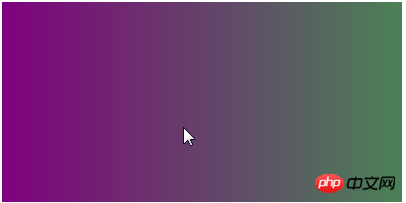
2. Use background-position to achieve gradient transition
Background-image does not support CSS3 transition, but background-position does. Therefore, by controlling the background position, we can achieve a gradient transition effect.
The effect is as follows (mouse hover):
The relevant code is as follows:
<p class="box"></p>
.box {
    max-width: 400px;
    height: 200px;
    background: linear-gradient(to right, olive, green, purple);
    background-size: 200%;
    transition: background-position .5s;
}
.box:hover {
    background-position: 100% 0;
}3. Use background-color to achieve gradient transition
background-image Although it does not support CSS3 transition, background-color supports it, so by controlling the background color , and a color rendering technique, we can also achieve a gradient transition effect.
Comparison of the effects of mouse hover before and after:

The relevant codes are as follows:
<p class="box"></p>
.box {
    max-width: 400px;
    height: 200px;
    background: olive linear-gradient(to right, rgba(0,255,0,0), rgba(0,255,0,.5));
    transition: background-color .5s;
}
.box:hover {
    background-color: purple;
}4. Use pseudo elements and opacity to achieve gradient transition
Use pseudo elements to create a transformed gradient effect, and achieve a gradient transition effect by changing the opacity of the covered gradient.
The picture below shows the effect after hover:

The relevant code is as follows:
##
<p class="box"></p>
.box {
    max-width: 400px; height: 200px;
    background: linear-gradient(to right, olive, green);
    position: relative;
    z-index: 0;
}
.box::before {
    content: '';
    position: absolute;
    left: 0; top: 0; right: 0; bottom: 0;
    background: linear-gradient(to right, green, purple);
    opacity: 0;
    transition: opacity .5s;
    z-index: -1;
}
.box:hover::before {
    opacity: 1;
}The above is the detailed content of CSS realizes background gradient image transition transition effect. For more information, please follow other related articles on the PHP Chinese website!

Hot AI Tools

Undresser.AI Undress
AI-powered app for creating realistic nude photos

AI Clothes Remover
Online AI tool for removing clothes from photos.

Undress AI Tool
Undress images for free

Clothoff.io
AI clothes remover

Video Face Swap
Swap faces in any video effortlessly with our completely free AI face swap tool!

Hot Article
Hot Tools

Notepad++7.3.1
Easy-to-use and free code editor

SublimeText3 Chinese version
Chinese version, very easy to use

Zend Studio 13.0.1
Powerful PHP integrated development environment

Dreamweaver CS6
Visual web development tools

SublimeText3 Mac version
God-level code editing software (SublimeText3)
Hot Topics
 1662
1662
 14
1419
52
1313
25
1262
29
1235
24
14
1419
52
1313
25
1262
29
1235
24

 How to use bootstrap in vue
Apr 07, 2025 pm 11:33 PM
How to use bootstrap in vue
Apr 07, 2025 pm 11:33 PM
Using Bootstrap in Vue.js is divided into five steps: Install Bootstrap. Import Bootstrap in main.js. Use the Bootstrap component directly in the template. Optional: Custom style. Optional: Use plug-ins.
 Understanding HTML, CSS, and JavaScript: A Beginner's Guide
Apr 12, 2025 am 12:02 AM
Understanding HTML, CSS, and JavaScript: A Beginner's Guide
Apr 12, 2025 am 12:02 AM
WebdevelopmentreliesonHTML,CSS,andJavaScript:1)HTMLstructurescontent,2)CSSstylesit,and3)JavaScriptaddsinteractivity,formingthebasisofmodernwebexperiences.
 The Roles of HTML, CSS, and JavaScript: Core Responsibilities
Apr 08, 2025 pm 07:05 PM
The Roles of HTML, CSS, and JavaScript: Core Responsibilities
Apr 08, 2025 pm 07:05 PM
HTML defines the web structure, CSS is responsible for style and layout, and JavaScript gives dynamic interaction. The three perform their duties in web development and jointly build a colorful website.
 How to insert pictures on bootstrap
Apr 07, 2025 pm 03:30 PM
How to insert pictures on bootstrap
Apr 07, 2025 pm 03:30 PM
There are several ways to insert images in Bootstrap: insert images directly, using the HTML img tag. With the Bootstrap image component, you can provide responsive images and more styles. Set the image size, use the img-fluid class to make the image adaptable. Set the border, using the img-bordered class. Set the rounded corners and use the img-rounded class. Set the shadow, use the shadow class. Resize and position the image, using CSS style. Using the background image, use the background-image CSS property.
 How to write split lines on bootstrap
Apr 07, 2025 pm 03:12 PM
How to write split lines on bootstrap
Apr 07, 2025 pm 03:12 PM
There are two ways to create a Bootstrap split line: using the tag, which creates a horizontal split line. Use the CSS border property to create custom style split lines.
 How to set up the framework for bootstrap
Apr 07, 2025 pm 03:27 PM
How to set up the framework for bootstrap
Apr 07, 2025 pm 03:27 PM
To set up the Bootstrap framework, you need to follow these steps: 1. Reference the Bootstrap file via CDN; 2. Download and host the file on your own server; 3. Include the Bootstrap file in HTML; 4. Compile Sass/Less as needed; 5. Import a custom file (optional). Once setup is complete, you can use Bootstrap's grid systems, components, and styles to create responsive websites and applications.
 How to resize bootstrap
Apr 07, 2025 pm 03:18 PM
How to resize bootstrap
Apr 07, 2025 pm 03:18 PM
To adjust the size of elements in Bootstrap, you can use the dimension class, which includes: adjusting width: .col-, .w-, .mw-adjust height: .h-, .min-h-, .max-h-
 How to use bootstrap button
Apr 07, 2025 pm 03:09 PM
How to use bootstrap button
Apr 07, 2025 pm 03:09 PM
How to use the Bootstrap button? Introduce Bootstrap CSS to create button elements and add Bootstrap button class to add button text
