

Examples of methods for creating various web icons using CSS

This article mainly introduces you to the relevant information on making various web icons (triangle, pause button, download arrow, plus sign, etc.) using pure CSS. The editor thinks it is quite good, so I will share it with you now and give it to everyone. Here is a reference for everyone, I hope it can help everyone.
Triangle

##
<p class="box"></p>
<style>
.box{
            width: 0;
            height: 0;
            border-top: 50px solid transparent;
            border-bottom: 50px solid transparent;
            border-left: 50px solid transparent;
            border-right: 50px solid red;
}
</style>Parallelogram icon

<p class="box"></p>
<style>
 .box{
            width: 50px;
            height: 50px;
            margin: 100px auto;
            background-color: red;
            transform: skew(-25deg);
        }
</style>Pause button
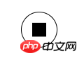
# #
<p class="box"></p>
    <style>
        .box{
            width: 50px;
            height: 50px;
            margin: 100px auto;
            color: #000;
            border: 1px solid;
            border-radius: 50%;
            outline: 10px solid;
            outline-offset: -26px;
        }
</style>The implementation principle of the pause button is to use border for the border and outline for the square inside. Because outline has an offset attribute that can be used to set the offset, and it is based on proportion.
In fact, if you set the value of outline-offset a little smaller, it will appear after one addition
Plus sign
<p class="box"></p>
<style>
    .box{
        width: 50px;
        height: 50px;
        margin: 100px auto;
        color: #000;
        border: 1px solid;
        border-radius: 50%;
        outline: 10px solid;
        outline-offset: -35px;
    }
</style>If you rotate it again, it becomes a close button
Close button
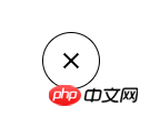 ##
##
<p class="box"></p>
<style>
    .box{
        width: 50px;
        height: 50px;
        margin: 100px auto;
        color: #000;
        border: 1px solid;
        border-radius: 50%;
        outline: 10px solid;
        outline-offset: -35px;
        transform: rotate(45deg);
}Burger Button
##
<p class="box"></p>
<style>
    .box{
        width: 50px;
        height: 0px;
        margin: 100px auto;
        box-shadow: 36px 10px 0 3px red,
        36px 0 0 3px red,
        36px 20px 0 3px red;
    }
</style> Burger Button 2:
 <p class="box"></p>
<style>
.box{
width: 30px;
height: 3px;
margin: 100px auto;
padding: 2px 0;
border-top: 3px solid red;
border-bottom: 3px solid red;
background-clip: content-box;
background-color: red;
}
</style>Radio Button
Because box-shadow will scale proportionally, just set the first value to white, and then set the second value to be larger than the first value
<p class="box"></p>
<style>
    .box{
        width: 30px;
        height: 30px;
        margin: 100px auto;
        background-color: #000;
        border-radius: 50%;
        box-shadow: 0 0 0 5px #fff,0 0 0 10px #000;
    }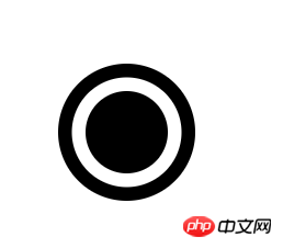
</style>Circle with a cross
##
<p class="box"></p>
<style>
    .box {
        width: 30px;
        height: 30px;
        margin: 100px auto;
        background-color: #000;
        border-radius: 50%;
        box-shadow: 0 0 0 5px #fff, 0 0 0 10px #000;
        outline: 36px solid #fff;
        outline-offset: -50px;
    }
</style>Field icon
<p class="box"></p>
<style>
    .box {
        width: 0;
        margin: 100px auto;
        border: 3px solid red;
        outline: 6px dotted red;
        outline-offset: 6px;
    }
</style>Download arrow
Made using border Triangle, use box-shadow to make a square, mainly using offset
<p class="box"></p>
<style>
    .box {
        width: 0;
        margin: 100px auto;
        color: red;
        border: 8px solid transparent;
        border-top: 8px solid red;
        box-shadow: 0 -12px 0 -4px;
    }
</style>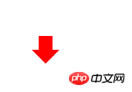 Bookmark
The principle of achieving this effect is to set the triangle as the background color, so that the hollow triangle appears
<p class="box"></p>
<style>
    .box {
        width: 0;
        height: 8px;
        background-color:orange;
        border: 8px solid transparent;
        border-bottom: 8px solid #fff;
    }
</style> Two semicircle icons
This is relatively simple, it is implemented through the gradient function, and then a rounded border
<p class="box"></p>
<style>
    .box {
       width: 50px;
        height: 50px;
        border-radius: 50%;
        background-image: linear-gradient(to right,#ccc 50%,#000 50%);
    }
</style>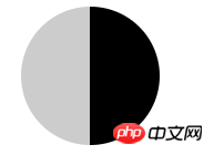 Disable the icon
Use a rounded border for the outer circle, use a gradient for the vertical line inside, and then use the rotation attribute
<p class="box"></p>
<style>
    .box {
       width: 50px;
        height: 50px;
        border-radius: 50%;
        border:2px solid #000;
        background: linear-gradient(to right,#fff  45%,#000 45%,#000 45%,#fff 55%);
        transform: rotate(40deg);
    }
</style>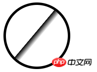 Left and right arrow icons
Since you can make one triangle, you can make two triangles.
<p class="box"></p>
<style>
    .box {
        width: 0;
        height: 0;
        margin: 100px auto;
        border: 10px solid transparent;
        border-left: 10px solid red;
        -webkit-box-reflect: left 5px;
        box-reflect:left 5px;
    }
</style> Needs to be opened in Chrome browser, because other browsers may not support Eagle beak icon
<p class="box"></p>
<style>
    .box {
       width: 32px;
        margin: 100px auto;
        border-top: 50px solid transparent;
        border-right: 22px solid #096;
        border-bottom-right-radius: 100%;;
    }
</style>
The above is the detailed content of Examples of methods for creating various web icons using CSS. For more information, please follow other related articles on the PHP Chinese website!

Hot AI Tools

Undresser.AI Undress
AI-powered app for creating realistic nude photos

AI Clothes Remover
Online AI tool for removing clothes from photos.

Undress AI Tool
Undress images for free

Clothoff.io
AI clothes remover

Video Face Swap
Swap faces in any video effortlessly with our completely free AI face swap tool!

Hot Article
Hot Tools

Notepad++7.3.1
Easy-to-use and free code editor

SublimeText3 Chinese version
Chinese version, very easy to use

Zend Studio 13.0.1
Powerful PHP integrated development environment

Dreamweaver CS6
Visual web development tools

SublimeText3 Mac version
God-level code editing software (SublimeText3)
Hot Topics


 How to use bootstrap in vue
Apr 07, 2025 pm 11:33 PM
How to use bootstrap in vue
Apr 07, 2025 pm 11:33 PM
Using Bootstrap in Vue.js is divided into five steps: Install Bootstrap. Import Bootstrap in main.js. Use the Bootstrap component directly in the template. Optional: Custom style. Optional: Use plug-ins.
 The Roles of HTML, CSS, and JavaScript: Core Responsibilities
Apr 08, 2025 pm 07:05 PM
The Roles of HTML, CSS, and JavaScript: Core Responsibilities
Apr 08, 2025 pm 07:05 PM
HTML defines the web structure, CSS is responsible for style and layout, and JavaScript gives dynamic interaction. The three perform their duties in web development and jointly build a colorful website.
 Understanding HTML, CSS, and JavaScript: A Beginner's Guide
Apr 12, 2025 am 12:02 AM
Understanding HTML, CSS, and JavaScript: A Beginner's Guide
Apr 12, 2025 am 12:02 AM
WebdevelopmentreliesonHTML,CSS,andJavaScript:1)HTMLstructurescontent,2)CSSstylesit,and3)JavaScriptaddsinteractivity,formingthebasisofmodernwebexperiences.
 How to write split lines on bootstrap
Apr 07, 2025 pm 03:12 PM
How to write split lines on bootstrap
Apr 07, 2025 pm 03:12 PM
There are two ways to create a Bootstrap split line: using the tag, which creates a horizontal split line. Use the CSS border property to create custom style split lines.
 How to set up the framework for bootstrap
Apr 07, 2025 pm 03:27 PM
How to set up the framework for bootstrap
Apr 07, 2025 pm 03:27 PM
To set up the Bootstrap framework, you need to follow these steps: 1. Reference the Bootstrap file via CDN; 2. Download and host the file on your own server; 3. Include the Bootstrap file in HTML; 4. Compile Sass/Less as needed; 5. Import a custom file (optional). Once setup is complete, you can use Bootstrap's grid systems, components, and styles to create responsive websites and applications.
 How to insert pictures on bootstrap
Apr 07, 2025 pm 03:30 PM
How to insert pictures on bootstrap
Apr 07, 2025 pm 03:30 PM
There are several ways to insert images in Bootstrap: insert images directly, using the HTML img tag. With the Bootstrap image component, you can provide responsive images and more styles. Set the image size, use the img-fluid class to make the image adaptable. Set the border, using the img-bordered class. Set the rounded corners and use the img-rounded class. Set the shadow, use the shadow class. Resize and position the image, using CSS style. Using the background image, use the background-image CSS property.
 How to use bootstrap button
Apr 07, 2025 pm 03:09 PM
How to use bootstrap button
Apr 07, 2025 pm 03:09 PM
How to use the Bootstrap button? Introduce Bootstrap CSS to create button elements and add Bootstrap button class to add button text
 How to resize bootstrap
Apr 07, 2025 pm 03:18 PM
How to resize bootstrap
Apr 07, 2025 pm 03:18 PM
To adjust the size of elements in Bootstrap, you can use the dimension class, which includes: adjusting width: .col-, .w-, .mw-adjust height: .h-, .min-h-, .max-h-
