

How to solve CSS layout problems

A very important part of the front-end layout is the construction of the page framework, which is also the most basic part. In the construction of the page framework, there are centered layout, multi-column layout and global layout. Today we will summarize the CSS layout in front-end useful information.
Centered layout
Horizontal centering
1)Use inline-block+ text-align
(1) Principle and usage
Principle: First change the sub-box from a block-level element to an inline block element, and then center the inline block element by setting it to achieve horizontal centering.
Usage: Set display:inline-block for the child box and text-align:center for the parent box.
(2) Code examples
<p class="parent">
    <p class="child>DEMO</p>
</p>.child{ display:inline-block;
}.parent{ text-align:center;
}(3) Advantages and disadvantages
Advantages: Good compatibility, even compatible ie6, ie7
Disadvantage: the text in the child will also be horizontally centered, you can add text-align:left; in .child to restore
2) Use table+margin
(1) Principle and usage
Principle: First set the sub-box to a block-level table for display (similar to < table>), and then set the sub-box to be centered to achieve horizontal centering.
Usage: Set display:table for the subframe, and then set margin:0 auto.
(2) Code example
<p class="parent">
    <p class="child>DEMO</p>
</p>.child { display:table; margin:0 auto;
}(3) Advantages and disadvantages:
Advantages: Only child is set, ie8 All the above are supported
Disadvantages: ie6 and ie7 are not supported, replace p with table
3) Use absolute+transform
(1) Principle and usage
Principle: Set the sub-frame to absolute positioning, move the sub-frame so that the left side of the sub-frame is the distance from the left border of the relative frame is half the width of the relative box, and then moves the subbox half the width to the left to achieve horizontal centering. Of course, before that, we need to set the parent box to relative positioning so that the parent box becomes the relative box of the child box.
Usage: Set position:relative for the parent box, position:absolute, left:50%, transform:translateX(-50%) for the child box.
(2) Code example
<p class="parent">
    <p class="child>DEMO</p>
</p>.parent { position:relative;
}.child { position:absolute; left:50%; transform:translateX(-50%);
}(3) Advantages and disadvantages
Advantages: The centered element will not interfere with other elements Impact
Disadvantages: transform belongs to css3 content, there are certain compatibility issues, higher version browsers need to add some prefixes
4) use flex+margin
(1) Principle and usage
Principle: Use the layout tool flex in CSS3 to convert the sub-box into a flex item, and then set the sub-box Center the box to achieve centering.
Usage: First set the parent box to display:flex, and then set the child box margin:0 auto.
(2) Code examples
<p class="parent">
    <p class="child>DEMO</p>
</p>.parent { display:flex;
}.child { margin:0 auto;
}(3) Advantages and disadvantages
Disadvantages: Low version browser (ie6 ie7 ie8) does not support
5) Use flex+justify-content
(1) Principle and usage
Principle: Horizontal centering is achieved through the justify-content attribute in flex, a layout tool in CSS3.
Usage: First set the parent box to display:flex, and then set justify-content:center.
(2) Code example
<p class="parent">
    <p class="child>DEMO</p>
</p>.parent { display:flex; justify-content:center;
}(3) Advantages and disadvantages
Advantages: Just set parent
缺点:低版本浏览器(ie6 ie7 ie8)不支持
垂直居中
1)使用 table-cell+vertical-align
(1)原理、用法
原理:通过将父框转化为一个表格单元格显示(类似
和 ),再通过设置属性,使表格单元格内容垂直居中以达到垂直居中。 用法:先将父框设置为display:table-cell,再设置vertical-align:middle。
(2)代码实例
<p class="parent">
    <p class="child>DEMO</p>
</p>
Copy after loginCopy after loginCopy after loginCopy after loginCopy after loginCopy after loginCopy after loginCopy after loginCopy after loginCopy after loginCopy after login.parent { display:table-cell; vertical-align:middle; }Copy after login(3)优缺点
优点:兼容性较好,ie8以上均支持
2)使用 absolute+transform
(1)原理、用法原理:类似于水平居中时的absolute+transform原理。将子框设置为绝对定位,移动子框,使子框上边距离相对框上边边框的距离为相对框高度的一半,再通过向上移动子框的一半高度以达到垂直居中。当然,在此之前,我们需要设置父框为相对定位,使父框成为子框的相对框。
用法:先将父框设置为position:relative,再设置子框position:absolute,top:50%,transform:translateY(-50%)。
(2)代码实例
<p class="parent">
    <p class="child>DEMO</p>
</p>
Copy after loginCopy after loginCopy after loginCopy after loginCopy after loginCopy after loginCopy after loginCopy after loginCopy after loginCopy after loginCopy after login.parent { position:relative; }.child { position:absolute; top:50%; transform:translateY(-50%); }Copy after login(3)优缺点
优点:居中元素不会对其他的产生影响
缺点:transform属于css3内容,兼容性存在一定问题,高版本浏览器需要添加一些前缀
3)使用 flex+align-items
(1)原理、用法原理:通过设置CSS3中的布局利器flex中的属性align-times,使子框垂直居中。
用法:先将父框设置为position:flex,再设置align-items:center。
(1)代码实例
<p class="parent">
    <p class="child>DEMO</p>
</p>
Copy after loginCopy after loginCopy after loginCopy after loginCopy after loginCopy after loginCopy after loginCopy after loginCopy after loginCopy after loginCopy after login.parent { position:flex; align-items:center; }Copy after login(3)优缺点
优点:只设置parent
缺点:兼容性存在一定问题
水平垂直居中
1)使用 absolute+transform
(1)原理、用法原理:将水平居中时的absolute+transform和垂直居中时的absolute+transform相结合。详见:水平居中的3)和垂直居中的2)。
见水平居中的3)和垂直居中的2)。
(2)代码实例
<p class="parent">
    <p class="child>DEMO</p>
</p>
Copy after loginCopy after loginCopy after loginCopy after loginCopy after loginCopy after loginCopy after loginCopy after loginCopy after loginCopy after loginCopy after login.parent { position:relative; }.child { position:absolute; left:50%; top:50%; transform:tranplate(-50%,-50%); }Copy after login(3)优缺点
优点:child元素不会对其他元素产生影响
缺点:兼容性存在一定问题
2)使用 inline-block+text-align+table-cell+vertical-align
(1)原理、用法原理:使用inline-block+text-align水平居中,再用table-cell+vertical-align垂直居中,将二者结合起来。详见:水平居中的1)和垂直居中的1)。
见水平居中的1)和垂直居中的1)。
(2)代码实例
<p class="parent">
    <p class="child>DEMO</p>
</p>
Copy after loginCopy after loginCopy after loginCopy after loginCopy after loginCopy after loginCopy after loginCopy after loginCopy after loginCopy after loginCopy after login.parent { text-align:center; display:table-cell; vertical-align:middle; }.child { display:inline-block; }Copy after login(3)优缺点
优点:兼容性较好
3)使用 flex+justify-content+align-items
(1)原理、用法原理:通过设置CSS3布局利器flex中的justify-content和align-items,从而达到水平垂直居中。详见:水平居中的4)和垂直居中的3)。
见水平居中的4)和垂直居中的3)。
(2)代码实例
<p class="parent">
    <p class="child>DEMO</p>
</p>
Copy after loginCopy after loginCopy after loginCopy after loginCopy after loginCopy after loginCopy after loginCopy after loginCopy after loginCopy after loginCopy after login.parent { display:flex; justify-content:center; align-items:center; }Copy after login(3)优缺点
优点:只设置了parent
缺点:兼容性存在一定问题
多列布局
定宽+自适应
1)使用 float+overflow
(1)原理、用法原理:通过将左边框脱离文本流,设置右边规定当内容溢出元素框时发生的事情以达到多列布局。
用法:先将左框设置为float:left、width、margin-left,再设置实际的右框overflow:hidden。
(2)代码实例
<p class="parent">
    <p class="left">
        <p>left</p>
    </p>
    <p class="right">
        <p>right</p>
        <p>right</p>
    </p></p>
Copy after loginCopy after loginCopy after loginCopy after loginCopy after loginCopy after loginCopy after loginCopy after loginCopy after loginCopy after login.left { float:left; width:100px; margin-right:20px; }.right { overflow:hidden; }Copy after login(3)优缺点
优点:简单
缺点:不支持ie6
2)使用 float+margin
(1)原理、用法原理:通过将左框脱离文本流,加上右框向右移动一定的距离,以达到视觉上的多列布局。
用法:先将左框设置为float:left、margin-left,再设置右框margin-left。
(2)代码实例
<p class="parent">
    <p class="left">
        <p>left</p>
    </p>
    <p class="right">
        <p>right</p>
        <p>right</p>
    </p></p>
Copy after loginCopy after loginCopy after loginCopy after loginCopy after loginCopy after loginCopy after loginCopy after loginCopy after loginCopy after login.left { float:left; width:100px; }.right { margin-left:120px; }Copy after login(3)优缺点
优点:简单,易理解
缺点:兼容性存在一定问题,ie6下有3px的bug。right下的p清除浮动将产生bug
3)使用 float+margin(改良版)
(1)原理、用法原理:在1)的基础之上,通过向右框添加一个父框,再加上设置左、右父框属性使之产生BFC以去除bug。
用法:先将左框设置为float:left、margin-left、position:relative,再设置右父框float:right、width:100%、margin-left,最后设置实际的右框margin-left。
(2)代码实例
<p class="parent">
    <p class="left">
        <p>left</p>
    </p>
    <p class="rigth-fix">
        <p class="right">
            <p>right</p>
            <p>right</p>
        </p>
    </p></p>
Copy after login.left { float:left; width:100px; position:relative; }.right-fix { float:right; width:100%; margin-left:-100px; }.right { margin-left:120px; }Copy after login(3)优缺点
优点:简单,易理解
4)使用 table
(1)原理、用法原理:通过将父框设置为表格,将左右边框转化为类似于同一行的td,从而达到多列布局。
用法:先将父框设置为display:table、width:100%、table-layout:fixed,再设置左右框display:table-cell,最后设置左框width、padding-right。
(2)代码实例
<p class="parent">
    <p class="left">
        <p>left</p>
    </p>
    <p class="right">
        <p>right</p>
        <p>right</p>
    </p></p>
Copy after loginCopy after loginCopy after loginCopy after loginCopy after loginCopy after loginCopy after loginCopy after loginCopy after loginCopy after login.parent { display:table; width:100%; table-layout:fixed; }.left { width:100px; padding-right:20px; }.right,.left { display:table-cell; }Copy after login5)使用 flex
(1)原理、用法原理:通过设置CSS3布局利器flex中的flex属性以达到多列布局。
用法:先将父框设置为display:flex,再设置左框flex:1,最后设置左框width、margin-right。
(2)代码实例
<p class="parent">
    <p class="left">
        <p>left</p>
    </p>
    <p class="right">
        <p>right</p>
        <p>right</p>
    </p></p>
Copy after loginCopy after loginCopy after loginCopy after loginCopy after loginCopy after loginCopy after loginCopy after loginCopy after loginCopy after login.parent { display:flex; }.left { width:100px; margin-right:20px; }.right { flex:1; }Copy after loginCopy after login(3)优缺点
优点:flex很强大
缺点:兼容性存在一定问题,性能存在一定问题
两列定宽+一列自适应
(1)原理、用法
原理:这种情况与两列定宽查不多。
用法:先将左、中框设置为float:left、width、margin-right,再设置右框overflow:hidden。
(2)代码实例
<p class="parent">
    <p class="left">
        <p>left</p>
    </p>
    <p class="center">
        <p>center</p>
    </p>
    <p class="right">
        <p>right</p>
        <p>right</p>
    </p></p>
Copy after loginCopy after login.left,.center { float:left; width:100px; margin-right:20px; }.right { overflow:hidden; }Copy after login不定宽+自适应
1)使用 float+overflow
(1)原理、用法原理:这种情况与两列定宽查不多。
用法:先将左框设置为float:left、margin-right,再设置右框overflow: hidden,最后设置左框中的内容width。
(2)代码实例
<p class="parent">
    <p class="left">
        <p>left</p>
    </p>
    <p class="right">
        <p>right</p>
        <p>right</p>
    </p></p>
Copy after loginCopy after loginCopy after loginCopy after loginCopy after loginCopy after loginCopy after loginCopy after loginCopy after loginCopy after login.left{ float: left; margin-right: 20px; }.right{ overflow: hidden; }.left p{ width: 200px; }Copy after login(3)优缺点
优点:简单
缺点:ie6下兼容性存在一定问题
2)使用 table
(1)原理、用法原理:通过将父框改变为表格,将左右框转换为类似于同一行的td以达到多列布局,设置父框宽度100%,给左框子元素一个固定宽度从而达到自适应。
用法:先将父框设置为display: table、width: 100%,再设置左、右框display: table-cell,最后设置左框width: 0.1%、padding-right以及左框中的内容width。
(2)代码实例
<p class="parent">
    <p class="left">
        <p>left</p>
    </p>
    <p class="right">
        <p>right</p>
        <p>right</p>
    </p></p>
Copy after loginCopy after loginCopy after loginCopy after loginCopy after loginCopy after loginCopy after loginCopy after loginCopy after loginCopy after login.parent{ display: table; width: 100%; }.left,.right{ display: table-cell; }.left{ width: 0.1%; padding-right: 20px; }.left p{ width:200px; }Copy after login(3)优缺点
缺点:ie6 ie7不支持
3)使用 flex
(1)原理、用法原理:通过设置CSS3布局利器flex中的flex属性以达到多列布局,加上给左框中的内容定宽、给右框设置flex达到不定款+自适应。
用法:先将父框设置为display:flex,再设置右框flex:1,最后设置左框margin-right:20px、左框中的内容width。
(2)代码实例
<p class="parent">
    <p class="left">
        <p>left</p>
    </p>
    <p class="right">
        <p>right</p>
        <p>right</p>
    </p></p>
Copy after loginCopy after loginCopy after loginCopy after loginCopy after loginCopy after loginCopy after loginCopy after loginCopy after loginCopy after login.parent { display:flex; }.left { margin-right:20px; }.right { flex:1; }.left p{ width: 200px; }Copy after login(3)优缺点
优点:flex很强大
缺点:兼容性存在一定问题,性能存在一定问题
两列不定宽+一列自适应
(1)原理、用法
原理:这个情况与一列不定宽+一列自适应查不多。
用法:先将左、中框设置为float:left、margin-right,再设置右框overflow:hidden,最后给左中框中的内容设置width。
(2)代码实例
<p class="parent">
    <p class="left">
        <p>left</p>
    </p>
    <p class="center">
        <p>center</p>
    </p>
    <p class="right">
        <p>right</p>
        <p>right</p>
    </p></p>
Copy after loginCopy after login.left,.center{ float: left; margin-right: 20px; }.right{ overflow: hidden; }.left p,.center p{ width: 100px; }Copy after login等分布局

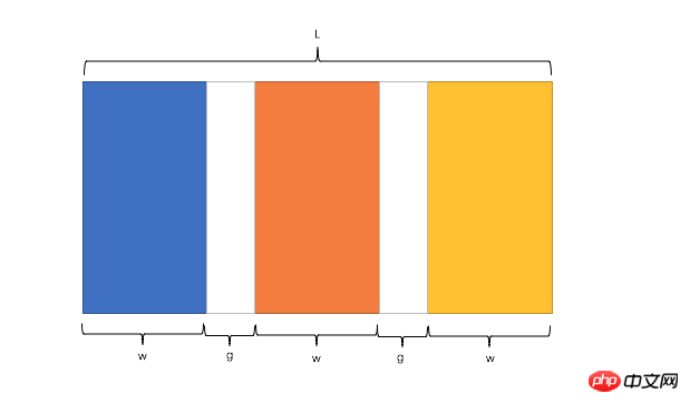
公式转化:l = w * n + g * (n-1) -> l = w * n + g * n - g -> l + g = (w + g) * n
Copy after login因此,我们需要解决两个问题:
如何让总宽度增加g(即:L+g)
如何让每个宽包含g(即:w+g)
1)使用 float
(1)原理、用法原理:增大父框的实际宽度后,使用CSS3属性box-sizing进行布局的辅助。
用法:先将父框设置为margin-left: -*px,再设置子框float: left、width: 25%、padding-left、box-sizing: border-box。
(2)代码实例
<p class="parent">    <p class="column"><p>1</p></p>
    <p class="column"><p>2</p></p>
    <p class="column"><p>3</p></p>
    <p class="column"><p>4</p></p></p>
Copy after loginCopy after login.parent{ margin-left: -20px;//l增加g } .column{ float: left; width: 25%; padding-left: 20px; box-sizing: border-box;//包含padding区域 w+g }Copy after login(3)优缺点
优点:兼容性较好
缺点:ie6 ie7百分比兼容存在一定问题
2)使用 table
(1)原理、用法原理:通过增加一个父框的修正框,增大其宽度,并将父框转换为table,将子框转换为tabel-cell进行布局。
用法:先将父框的修正框设置为margin-left: -*px,再设置父框display: table、width:100%、table-layout: fixed,设置子框display: table-cell、padding-left。
(2)代码实例
<p class="parent-fix">    <p class="parent">
        <p class="column"><p>1</p></p>
        <p class="column"><p>2</p></p>
        <p class="column"><p>3</p></p>
        <p class="column"><p>4</p></p>
    </p></p>
Copy after login.parent-fix{ margin-left: -20px;//l+g } .parent{ display: table; width:100%; table-layout: fixed; } .column{ display: table-cell; padding-left: 20px;//w+g }Copy after login(3)优缺点
优点:结构和块数无关联
缺点:增加了一层
3)使用 flex
(1)原理、用法原理:通过设置CSS3布局利器flex中的flex属性以达到等分布局。
用法:将父框设置为display: flex,再设置子框flex: 1,最后设置子框与子框的间距margin-left。
(2)代码实例
<p class="parent">    <p class="column"><p>1</p></p>
    <p class="column"><p>2</p></p>
    <p class="column"><p>3</p></p>
    <p class="column"><p>4</p></p></p>
Copy after loginCopy after login.parent{ display: flex; }.column{ flex: 1; }.column+.column{ margin-left:20px; }Copy after login(3)优缺点
优点:代码量少,与块数无关
缺点:兼容性存在一定问题
定宽+自适应+两块高度一样高
1)使用 float
(1)原理、用法原理:通过过分加大左右子框的高度,辅助超出隐藏,以达到视觉上的等高。
用法:将父框设置overflow: hidden,再设置左右子框padding-bottom: 9999px、margin-bottom: -9999px,最后设置左框float: left、width、margin-right,右框overflow: hidden。
(2)代码实例
<p class="parent">
    <p class="left">
        <p>left</p>
    </p>
    <p class="right">
        <p>right</p>
        <p>right</p>
    </p></p>
Copy after loginCopy after loginCopy after loginCopy after loginCopy after loginCopy after loginCopy after loginCopy after loginCopy after loginCopy after loginp{ background: none!important; }.left,.right{ background: #444; }.parent{ overflow: hidden; }.left,.right{ padding-bottom: 9999px; margin-bottom: -9999px; }.left{ float: left; width: 100px; margin-right: 20px; }.right{ overflow: hidden; }Copy after login(3)优缺点
优点:兼容性好
缺点:伪等高,不是真正意义上的等高
2)使用 table
(1)原理、用法原理:将父框转化为tabel,将子框转化为tabel-cell布局,以达到定宽+自适应+两块高度一样高。
用法:先将父框设置为display:table、width:100%、table-layout:fixed,再设置左右框为display:table-cell,最后设置左框width、padding-right。
(2)代码实例
<p class="parent">
    <p class="left">
        <p>left</p>
    </p>
    <p class="right">
        <p>right</p>
        <p>right</p>
    </p></p>
Copy after loginCopy after loginCopy after loginCopy after loginCopy after loginCopy after loginCopy after loginCopy after loginCopy after loginCopy after login.parent { display:table; width:100%; table-layout:fixed; }.left { width:100px; padding-right:20px; }.right,.left { display:table-cell; }Copy after login3)使用 flex
(1)原理、用法原理:通过设置CSS3布局利器flex中的flex属性以达到定宽+自适应+两块高度一样高。
用法:将父框设置为display: flex,再设置左框width、margin-right,最后设置右框flex:1。
(2)代码实例
<p class="parent">
    <p class="left">
        <p>left</p>
    </p>
    <p class="right">
        <p>right</p>
        <p>right</p>
    </p></p>
Copy after loginCopy after loginCopy after loginCopy after loginCopy after loginCopy after loginCopy after loginCopy after loginCopy after loginCopy after login.parent { display:flex; }.left { width:100px; margin-right:20px; }.right { flex:1; }Copy after loginCopy after login(3)优缺点
优点:代码少,flex很强大
缺点:兼容性存在一定问题
4)使用 display
(1)原理、用法原理:通过设置display中的CSS3的-webkit-box属性以达到定宽+自适应+两块高度一样高。
用法:将父框设置为display: -webkit-box、width: 100%,再设置左框width、margin-right,最后设置右框-webkit-box-flex: 1。
(2)代码实例
<p class="parent">
    <p class="left">left</p>
    <p class="right">right </p>
</p>
Copy after login.parent { width: 100%; display: -webkit-box; }.left { width:100px; margin-right: 20px; }.right { -webkit-box-flex: 1; }Copy after login(3)优缺点
缺点:兼容性存在较大的问题
全屏布局
全屏布局的特点
滚动条不是全局滚动条,而是出现在内容区域里,往往是主内容区域
浏览器变大时,撑满窗口
全屏布局的方法
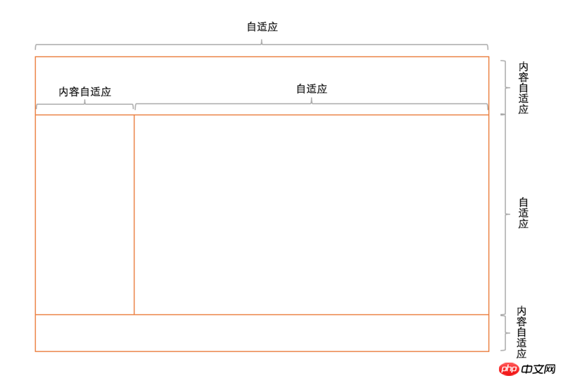
1)使用 position
(1)原理、用法原理:将上下部分固定,中间部分使用定宽+自适应+两块高度一样高。
用法:见实例。
(2)代码实例
<p class="parent">
    <p class="top">top</p>
    <p class="left">left</p>
    <p class="right">
        <p class="inner">right</p>
    </p>
    <p class="bottom">bottom</p>
</p>
Copy after loginhtml,body,.parent{ margin:0; height:100%; overflow:hidden; } body{ color:white; } .top{ position:absolute; top:0; left:0; right:0; height:100px; background:blue; } .left{ position:absolute; left:0; top:100px; bottom:50px; width:200px; background:red; } .right{ position:absolute; left:200px; top:100px; bottom:50px; right:0; background:pink; overflow: auto; } .right .inner{ min-height: 1000px; } .bottom{ position:absolute; left:0; right:0; bottom:0; height:50px; background: black; }Copy after login(3)优缺点
优点:兼容性好,ie6下不支持
2)使用 flex
(1)原理、用法原理:通过灵活使用CSS3布局利器flex中的flex属性和flex-direction属性以达到全屏布局。
用法:见实例。
(2)代码实例
<p class="parent">
    <p class="top">top</p>
    <p class="middle">
        <p class="left">left</p>
        <p class="right">
            <p class="inner">right</p>
        </p>
    </p>
    <p class="bottom">bottom</p>
</p>
Copy after loginCopy after loginhtml,body,.parent{ margin:0; height:100%; overflow:hidden; } body{ color: white; } .parent{ display: flex; flex-direction: column; } .top{ height:100px; background: blue; } .bottom{ height:50px; background: black; } .middle{ flex:1; display:flex; } .left{ width:200px; background: red; } .right{ flex: 1; overflow: auto; background:pink; } .right .inner{ min-height: 1000px; }Copy after login(3)优缺点
缺点:兼容性差,ie9及ie9以下不兼容
1)使用 flex
(1)原理、用法原理:通过灵活使用CSS3布局利器flex中的flex属性和flex-direction属性以达到全屏布局。
用法:见实例。
(2)代码实例
<p class="parent">
    <p class="top">top</p>
    <p class="middle">
        <p class="left">left</p>
        <p class="right">
            <p class="inner">right</p>
        </p>
    </p>
    <p class="bottom">bottom</p>
</p>
Copy after loginCopy after loginhtml,body,.parent{ margin:0; height:100%; overflow:hidden; } body{ color:white; } .parent{ display:flex; flex-direction:column; } .top{ background:blue; } .bottom{ background:black; } .middle{ flex:1; display:flex; } .left{ background: red; } .right{ flex:1; overflow:auto; background: pink; } .right .inner{ min-height:1000px; }Copy after login全屏布局相关方案的兼容性、性能和自适应一览表
方案 兼容性 性能 是否自适应 Position 好 好 部分自适应 Flex 较差 差 可自适应 Grid 差 较好 可自适应 The above is the detailed content of How to solve CSS layout problems. For more information, please follow other related articles on the PHP Chinese website!
Statement of this WebsiteThe content of this article is voluntarily contributed by netizens, and the copyright belongs to the original author. This site does not assume corresponding legal responsibility. If you find any content suspected of plagiarism or infringement, please contact admin@php.cn
Hot AI Tools
Undresser.AI Undress
AI-powered app for creating realistic nude photos
AI Clothes Remover
Online AI tool for removing clothes from photos.
Undress AI Tool
Undress images for free
Clothoff.io
AI clothes remover
Video Face Swap
Swap faces in any video effortlessly with our completely free AI face swap tool!

Hot Article
How to fix KB5055523 fails to install in Windows 11?4 weeks ago By DDDHow to fix KB5055518 fails to install in Windows 10?4 weeks ago By DDDRoblox: Grow A Garden - Complete Mutation Guide2 weeks ago By DDDRoblox: Bubble Gum Simulator Infinity - How To Get And Use Royal Keys3 weeks ago By 尊渡假赌尊渡假赌尊渡假赌How to fix KB5055612 fails to install in Windows 10?3 weeks ago By DDD
Hot Tools
Notepad++7.3.1
Easy-to-use and free code editor
SublimeText3 Chinese version
Chinese version, very easy to use
Zend Studio 13.0.1
Powerful PHP integrated development environment
Dreamweaver CS6
Visual web development tools
SublimeText3 Mac version
God-level code editing software (SublimeText3)
Hot Topics
Java Tutorial 1663
1663
 14
CakePHP Tutorial
1420
52
Laravel Tutorial
1313
25
PHP Tutorial
1266
29
C# Tutorial
1239
24
See all articles
How to use bootstrap in vue
Apr 07, 2025 pm 11:33 PM
14
CakePHP Tutorial
1420
52
Laravel Tutorial
1313
25
PHP Tutorial
1266
29
C# Tutorial
1239
24
See all articles
How to use bootstrap in vue
Apr 07, 2025 pm 11:33 PM
Using Bootstrap in Vue.js is divided into five steps: Install Bootstrap. Import Bootstrap in main.js. Use the Bootstrap component directly in the template. Optional: Custom style. Optional: Use plug-ins.
Understanding HTML, CSS, and JavaScript: A Beginner's Guide
Apr 12, 2025 am 12:02 AM
WebdevelopmentreliesonHTML,CSS,andJavaScript:1)HTMLstructurescontent,2)CSSstylesit,and3)JavaScriptaddsinteractivity,formingthebasisofmodernwebexperiences.
The Roles of HTML, CSS, and JavaScript: Core Responsibilities
Apr 08, 2025 pm 07:05 PM
HTML defines the web structure, CSS is responsible for style and layout, and JavaScript gives dynamic interaction. The three perform their duties in web development and jointly build a colorful website.
How to insert pictures on bootstrap
Apr 07, 2025 pm 03:30 PM
There are several ways to insert images in Bootstrap: insert images directly, using the HTML img tag. With the Bootstrap image component, you can provide responsive images and more styles. Set the image size, use the img-fluid class to make the image adaptable. Set the border, using the img-bordered class. Set the rounded corners and use the img-rounded class. Set the shadow, use the shadow class. Resize and position the image, using CSS style. Using the background image, use the background-image CSS property.
How to write split lines on bootstrap
Apr 07, 2025 pm 03:12 PM
There are two ways to create a Bootstrap split line: using the tag, which creates a horizontal split line. Use the CSS border property to create custom style split lines.
How to set up the framework for bootstrap
Apr 07, 2025 pm 03:27 PM
To set up the Bootstrap framework, you need to follow these steps: 1. Reference the Bootstrap file via CDN; 2. Download and host the file on your own server; 3. Include the Bootstrap file in HTML; 4. Compile Sass/Less as needed; 5. Import a custom file (optional). Once setup is complete, you can use Bootstrap's grid systems, components, and styles to create responsive websites and applications.
How to resize bootstrap
Apr 07, 2025 pm 03:18 PM
To adjust the size of elements in Bootstrap, you can use the dimension class, which includes: adjusting width: .col-, .w-, .mw-adjust height: .h-, .min-h-, .max-h-
How to use bootstrap button
Apr 07, 2025 pm 03:09 PM
How to use the Bootstrap button? Introduce Bootstrap CSS to create button elements and add Bootstrap button class to add button text