

css3 draws circular loading circle animation
This time I will bring you CSS3 to draw a circular loading and turning animation. What are the precautions for drawing a circular loading and turning animation in CSS3? . Here is a practical case. Let’s take a look.
How to draw a round loading circle
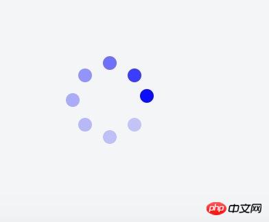
The applet needs a loading like the one below. There is no native one. It is too big to introduce other component libraries. All Decided to write one myself.
1. Basic principle
The dynamic implementation principle is to set the transparency of 8 small circles from large to small, and set a different animation start time for each circle. . The implementation principle of layout is to set the parent element to position: relative, and set the style of each circle to position: absolute; left: xx; top: xx; right: xx; bottom: xx. Distribute them evenly on a circle by setting different values for left/right/top/bottom. The html code is as follows:
<view class="q-loading-dot-warp">
                <view class="dot dot1"></view>
                <view class="dot dot2"></view>
                <view class="dot dot3"></view>
                <view class="dot dot4"></view>
                <view class="dot dot5"></view>
                <view class="dot dot6"></view>
                <view class="dot dot7"></view>
                <view class="dot dot8"></view>
</view>
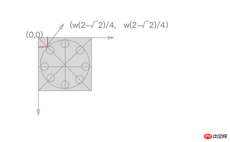
It sounds simple, but I have no experience in assigning values to them. For the first time, I used the thinking of a science student to simply divide the circle into three equal parts to calculate the coordinates. Often 8 circles form a circle. Diamond/Square. . . Just like the following

2. Position setting skills
Later I saw the article posted by a classmate with css3 to achieve 10 loading effects. According to the code of JRd3, it is indeed possible to achieve a good-looking effect, but when I want to change the size of the loading circle, the style collapses. After analysis, there is a certain mathematical relationship between their coordinates, as shown in the figure below. The coordinates on the vertical or horizontal lines can be positioned by 50%, and the coordinates on the diagonal line are as shown in the figure, where w is the width and height of the rectangle or the radius of the large circle surrounded by 8 small circles.
The formula is derived as follows:
The specific css code is as follows:
$width: 64px;
$height: 64px;
$dotWidth: 10px;
$dotHeight: 10px;
$radius: 5px;
$offset: 9.37px;
@function getLeft( $x ) {
  @return ($width/4)*$x;
}
@function getTop( $y ) {
  @return ($height/4)*$y;
}
@keyframes changeOpacity {
    from { opacity: 1; }
    to { opacity: .2; }
}
.q-loading {
    position: fixed;
    top: 0;
    left: 0;
    right: 0;
    bottom: 0;
    .q-loading-overlay {
        position: fixed;
        top: 0;
        left: 0;
        right: 0;
        bottom: 0;
        background-color: rgba(255, 255, 255, .5);
    }
    .q-loading-content {
        position: absolute;
        left: 50%;
        top: 50%;
        transform: translate(-50%, -50%);
        width: $width;
        height: $height;
        z-index: 2;
    }
    .dot {
        width: 10px;
        height: 10px;
        position: absolute;
        background-color: #0033cc;
        border-radius: 50% 50%;
        opacity: 1;
        animation: changeOpacity 1.04s ease infinite;
    }
    .dot1 {
        left: 0;
        top: 50%;
        margin-top: -$radius;
        animation-delay: 0.13s;
    }
    .dot2 {
        left: $offset;
        top: $offset;
        animation-delay: 0.26s;
    }
    .dot3 {
        left: 50%;
        top: 0;
        margin-left: -$radius;
        animation-delay: 0.39s;
    }
    .dot4 {
        top: $offset;
        right: $offset;
        animation-delay: 0.52s;
    }
    .dot5 {
        right: 0;
        top: 50%;
        margin-top: -$radius;
        animation-delay: 0.65s;
    }
    .dot6 {
        right: $offset;
        bottom: $offset;
        animation-delay: 0.78s;
    }
    .dot7 {
        bottom: 0;
        left: 50%;
        margin-left: -$radius;
        animation-delay: 0.91s;
    }
    .dot8 {
        bottom: $offset;
        left: $offset;
        animation-delay: 1.04s;
    }
}The code uses scss to define the radius of the large circle and the small circle, regardless of To change the size, you only need tochange the variables, and the following styles do not need to be changed.
The calculation calculated by this formula will look like a circle
3. Animation time setting
Assume that the animation duration is t, the number of circles is c, and the position of a certain small circle is i (for example, i is 1~8 above), then the time for small circles to start one after another is i * t/c
I believe you have mastered the method after reading the case in this article. For more exciting information, please pay attention to other related articles on the php Chinese website!
Recommended reading:
Detailed explanation of positioning properties of CSS
How to make a thin line smaller than one pixel in css3
The above is the detailed content of css3 draws circular loading circle animation. For more information, please follow other related articles on the PHP Chinese website!

Hot AI Tools

Undresser.AI Undress
AI-powered app for creating realistic nude photos

AI Clothes Remover
Online AI tool for removing clothes from photos.

Undress AI Tool
Undress images for free

Clothoff.io
AI clothes remover

Video Face Swap
Swap faces in any video effortlessly with our completely free AI face swap tool!

Hot Article
Hot Tools

Notepad++7.3.1
Easy-to-use and free code editor

SublimeText3 Chinese version
Chinese version, very easy to use

Zend Studio 13.0.1
Powerful PHP integrated development environment

Dreamweaver CS6
Visual web development tools

SublimeText3 Mac version
God-level code editing software (SublimeText3)
Hot Topics
 1654
1654
 14
1413
52
1306
25
1252
29
1225
24
14
1413
52
1306
25
1252
29
1225
24

 How to achieve wave effect with pure CSS3? (code example)
Jun 28, 2022 pm 01:39 PM
How to achieve wave effect with pure CSS3? (code example)
Jun 28, 2022 pm 01:39 PM
How to achieve wave effect with pure CSS3? This article will introduce to you how to use SVG and CSS animation to create wave effects. I hope it will be helpful to you!
 Use CSS skillfully to realize various strange-shaped buttons (with code)
Jul 19, 2022 am 11:28 AM
Use CSS skillfully to realize various strange-shaped buttons (with code)
Jul 19, 2022 am 11:28 AM
This article will show you how to use CSS to easily realize various weird-shaped buttons that appear frequently. I hope it will be helpful to you!
 How to hide elements in css without taking up space
Jun 01, 2022 pm 07:15 PM
How to hide elements in css without taking up space
Jun 01, 2022 pm 07:15 PM
Two methods: 1. Using the display attribute, just add the "display:none;" style to the element. 2. Use the position and top attributes to set the absolute positioning of the element to hide the element. Just add the "position:absolute;top:-9999px;" style to the element.
 How to implement lace borders in css3
Sep 16, 2022 pm 07:11 PM
How to implement lace borders in css3
Sep 16, 2022 pm 07:11 PM
In CSS, you can use the border-image attribute to achieve a lace border. The border-image attribute can use images to create borders, that is, add a background image to the border. You only need to specify the background image as a lace style; the syntax "border-image: url (image path) offsets the image border width inward. Whether outset is repeated;".
 How to enlarge the image by clicking the mouse in css3
Apr 25, 2022 pm 04:52 PM
How to enlarge the image by clicking the mouse in css3
Apr 25, 2022 pm 04:52 PM
Implementation method: 1. Use the ":active" selector to select the state of the mouse click on the picture; 2. Use the transform attribute and scale() function to achieve the picture magnification effect, the syntax "img:active {transform: scale(x-axis magnification, y Axis magnification);}".
 It turns out that text carousel and image carousel can also be realized using pure CSS!
Jun 10, 2022 pm 01:00 PM
It turns out that text carousel and image carousel can also be realized using pure CSS!
Jun 10, 2022 pm 01:00 PM
How to create text carousel and image carousel? The first thing everyone thinks of is whether to use js. In fact, text carousel and image carousel can also be realized using pure CSS. Let’s take a look at the implementation method. I hope it will be helpful to everyone!
 How to set animation rotation speed in css3
Apr 28, 2022 pm 04:32 PM
How to set animation rotation speed in css3
Apr 28, 2022 pm 04:32 PM
In CSS3, you can use the "animation-timing-function" attribute to set the animation rotation speed. This attribute is used to specify how the animation will complete a cycle and set the speed curve of the animation. The syntax is "element {animation-timing-function: speed attribute value;}".
 How to implement global loading effect in Vue
Jun 11, 2023 am 09:05 AM
How to implement global loading effect in Vue
Jun 11, 2023 am 09:05 AM
In front-end development, we often have a scenario where the user needs to wait for the data to be loaded during interaction with the web page. At this time, there is usually a loading effect displayed to remind the user to wait. In the Vue framework, it is not difficult to implement a global loading effect. Let’s introduce how to implement it. Step 1: Create a Vue plug-in We can create a Vue plug-in named loading, which can be referenced in all Vue instances. In the plug-in, we need to implement the following two methods: s
