

Introduction to mix-blend-mode/background-blend-mode of CSS3

This article mainly shares with you that there are two attributes related to mix mode in CSS3, mix-blend-mode and background-blend-mode. I hope it can help you.
1. About the blending mode
Everyone familiar with PS should know the blending mode:
SVG and Canvas also have blending modes, which are essentially the same.
The following are some common blending mode algorithms:
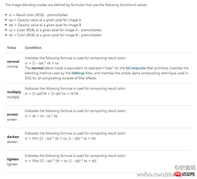
There are also instructions on the wiki. If you are interested, you can find out.
The content of this article briefly introduces the two properties related to the mixed mode in CSS3, mix-blend-mode and background-blend-mode.
2. CSS3 mix-blend-mode
First of all, you must know that "blend-mode" means mix mode. As for mix, well, I don’t know why it’s named mix. Maybe it’s because this attribute can be used not only on HTML, but also on SVG, so I might as well call it mix. This CSS property causes the content of an element to "blend" with its background and the elements below it.
Compatibility is as follows:
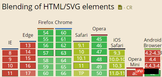
It can be seen that the recent Chrome and FireFox browsers have good support, and there is no need to use private prefixes.
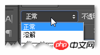
It supports many values. The Chinese and English comparisons are as follows:
mix-blend-mode: normal;          //正常
mix-blend-mode: multiply;        //正片叠底
mix-blend-mode: screen;          //滤色
mix-blend-mode: overlay;         //叠加
mix-blend-mode: darken;          //变暗
mix-blend-mode: lighten;         //变亮
mix-blend-mode: color-dodge;     //颜色减淡
mix-blend-mode: color-burn;      //颜色加深
mix-blend-mode: hard-light;      //强光
mix-blend-mode: soft-light;      //柔光
mix-blend-mode: difference;      //差值
mix-blend-mode: exclusion;       //排除
mix-blend-mode: hue;             //色相
mix-blend-mode: saturation;      //饱和度
mix-blend-mode: color;           //颜色
mix-blend-mode: luminosity;      //亮度
mix-blend-mode: initial;         //初始
mix-blend-mode: inherit;         //继承
mix-blend-mode: unset;           //复原
The last three soy sauce smells strong and have not appeared in PS, so you can ignore them.
If you want to experience the performance of each mixing mode, you can click here: CSS3 mix-blend-mode Mixed Mode Demo
For example, if you select Overlay, the text and the following The mixing effect of the content is like this:
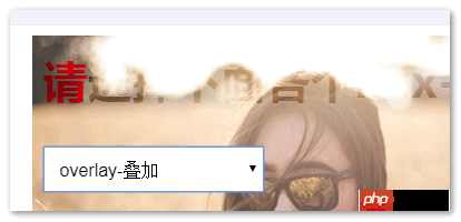
mix-blend-mode provides us with a broader idea for realizing some text effects.
3. CSS3 background-blend-mode
background-blend-mode This needs to be better understood, the background blending mode. It can be a mixture of the background image and the background color, or it can be a mixture of the background image and the background color.
Compatibility is as follows:

The supported attribute values are the same as above and will not be displayed repeatedly.
If you want to experience the performance of each blend mode, you can click here: CSS3 background-blend-mode Mixed Mode Demo
For example, choose a common multiply multiply , as a result, the two girls merged:

It should be noted that only the background image and color in the background attribute can be mixed, and it can only be in one background attribute.
CSS3 backgrounds Multiple backgrounds are supported by IE9+ browsers. Therefore, if you want to mix multiple pictures, you just need commas and write them one by one in the background attribute. For example, the two girls in this Demo:
.box {
    background: url(mm1.jpg) no-repeat center, url(mm2.jpg) no-repeat center;
}Related recommendations:
The above is the detailed content of Introduction to mix-blend-mode/background-blend-mode of CSS3. For more information, please follow other related articles on the PHP Chinese website!

Hot AI Tools

Undresser.AI Undress
AI-powered app for creating realistic nude photos

AI Clothes Remover
Online AI tool for removing clothes from photos.

Undress AI Tool
Undress images for free

Clothoff.io
AI clothes remover

Video Face Swap
Swap faces in any video effortlessly with our completely free AI face swap tool!

Hot Article
Hot Tools

Notepad++7.3.1
Easy-to-use and free code editor

SublimeText3 Chinese version
Chinese version, very easy to use

Zend Studio 13.0.1
Powerful PHP integrated development environment

Dreamweaver CS6
Visual web development tools

SublimeText3 Mac version
God-level code editing software (SublimeText3)
Hot Topics
 1666
1666
 14
1425
52
1328
25
1273
29
1253
24
14
1425
52
1328
25
1273
29
1253
24

 How to achieve wave effect with pure CSS3? (code example)
Jun 28, 2022 pm 01:39 PM
How to achieve wave effect with pure CSS3? (code example)
Jun 28, 2022 pm 01:39 PM
How to achieve wave effect with pure CSS3? This article will introduce to you how to use SVG and CSS animation to create wave effects. I hope it will be helpful to you!
 Use CSS skillfully to realize various strange-shaped buttons (with code)
Jul 19, 2022 am 11:28 AM
Use CSS skillfully to realize various strange-shaped buttons (with code)
Jul 19, 2022 am 11:28 AM
This article will show you how to use CSS to easily realize various weird-shaped buttons that appear frequently. I hope it will be helpful to you!
 How to hide elements in css without taking up space
Jun 01, 2022 pm 07:15 PM
How to hide elements in css without taking up space
Jun 01, 2022 pm 07:15 PM
Two methods: 1. Using the display attribute, just add the "display:none;" style to the element. 2. Use the position and top attributes to set the absolute positioning of the element to hide the element. Just add the "position:absolute;top:-9999px;" style to the element.
 How to implement lace borders in css3
Sep 16, 2022 pm 07:11 PM
How to implement lace borders in css3
Sep 16, 2022 pm 07:11 PM
In CSS, you can use the border-image attribute to achieve a lace border. The border-image attribute can use images to create borders, that is, add a background image to the border. You only need to specify the background image as a lace style; the syntax "border-image: url (image path) offsets the image border width inward. Whether outset is repeated;".
 It turns out that text carousel and image carousel can also be realized using pure CSS!
Jun 10, 2022 pm 01:00 PM
It turns out that text carousel and image carousel can also be realized using pure CSS!
Jun 10, 2022 pm 01:00 PM
How to create text carousel and image carousel? The first thing everyone thinks of is whether to use js. In fact, text carousel and image carousel can also be realized using pure CSS. Let’s take a look at the implementation method. I hope it will be helpful to everyone!
 How to enlarge the image by clicking the mouse in css3
Apr 25, 2022 pm 04:52 PM
How to enlarge the image by clicking the mouse in css3
Apr 25, 2022 pm 04:52 PM
Implementation method: 1. Use the ":active" selector to select the state of the mouse click on the picture; 2. Use the transform attribute and scale() function to achieve the picture magnification effect, the syntax "img:active {transform: scale(x-axis magnification, y Axis magnification);}".
 How to set animation rotation speed in css3
Apr 28, 2022 pm 04:32 PM
How to set animation rotation speed in css3
Apr 28, 2022 pm 04:32 PM
In CSS3, you can use the "animation-timing-function" attribute to set the animation rotation speed. This attribute is used to specify how the animation will complete a cycle and set the speed curve of the animation. The syntax is "element {animation-timing-function: speed attribute value;}".
 Can css3 linear gradient achieve triangles?
Apr 25, 2022 pm 02:47 PM
Can css3 linear gradient achieve triangles?
Apr 25, 2022 pm 02:47 PM
CSS3 linear gradient can realize triangles; just create a 45-degree linear gradient and set the gradient color to two fixed colors, one is the color of the triangle and the other is transparent color. The syntax "linear-gradient(45deg, color value , color value 50%, transparent color 50%, transparent color 100%)".
