
 Web Front-end
JS Tutorial
Example sharing of implementing parallax effect on APPLE TV posters using jQuery and CSS3
Web Front-end
JS Tutorial
Example sharing of implementing parallax effect on APPLE TV posters using jQuery and CSS3
Example sharing of implementing parallax effect on APPLE TV posters using jQuery and CSS3

This article mainly introduces the parallax effect of APPLE TV poster based on jQuery and CSS3. Friends who need it can refer to it. I hope it can help everyone use jQuery and CSS3 to create a parallax effect of APPLE TV poster.
Use CSS and jQuery to implement it, try to look the same as the original effect.
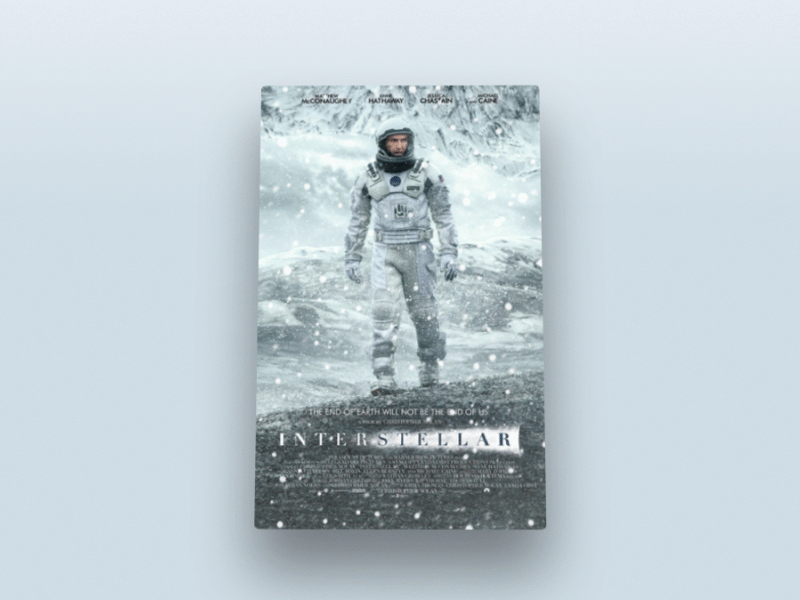
In this tutorial, I will use CSS, HTML and jQuery to create an approximate Apple TV parallax effect. If you are reading this, I assume you are familiar with the above three techniques. Have a basic understanding.
Without further ado, let’s start the first part.
HTML page
Our page structure is as follows:
<p class="poster">
 <p class="shine"></p>
 <p class="layer-1"></p>
 <p class="layer-2"></p>
 <p class="layer-3"></p>
 <p class="layer-4"></p>
 <p class="layer-5"></p>
</p>
First, we need a p with a style class of .poster, which contains 5 other styles. layer p. On top of these five layers p there's a shine p to add some sparkle.
CSS part
First, add the following code to ensure that the height of the body part of the web page is the entire page height:
body, html { height: 100%; min-height: 100%; }Then give the body part some background gradient color:
body { background: linear-gradient(to bottom, #f6f7fc 0%,#d5e1e8 40%); }In order for .poster to have a 3D rotation effect, the parent container needs to set perspective and transformation effects. As we can see, the parent container of p is the body itself, so add the following CSS code:
body {
  background: linear-gradient(to bottom, #f6f7fc 0%,#d5e1e8 40%);
  transform-style: preserve-3d;
  transform: perspective(800px);
}Now style and size the card, center it on the page, and add some rounded corners and shadow effects:
.poster {
  width: 320px;
  height: 500px;
  position: absolute;
  top: 50%; left: 50%;
  margin: -250px 0 0 -160px;
  border-radius: 5px;
  box-shadow: 0 45px 100px rgba(0, 0, 0, 0.4);
  overflow:hidden;
}In order to center the poster, you need to set the position value to absolute, top:50%, 'left:50%'. The upper margin value is a negative number that is half of the p height, and the left margin value is the p width. Half the negative number. Something to remember is that the center of the .poster is also the center of the entire page.
Shadow effect
We can use the following CSS selector to select all layers:
p[class *= 'layer-']
.poster has been designed, let’s take a look at the effect.
So, CSS selects all p containing "layer-" in the class name.
Now, set the position value of all layers to absolute, the background-repeat value to no-repeat, the background-position to top left, and the size of the layer background to 100% width and automatic height.
p[class*="layer-"] {
  position: absolute;
  top: -10px; left: -10px;
  right: -10px; bottom: -10px;
  background-size: 100% auto;
  background-repeat: no-repeat;
  background-position: 0 0;
  transition:0.1s;
}Notice that the values of top, left, right, and bottom are all -10px. The purpose is to make the size of the layer 20px larger than the poster, so that the layer will not be seen when inspecting the effects of each layer. The edge part is gone.
The following is to add a background to each layer:
.layer-1 {
  background-image: url('http://designmodo.com/demo/apple-tv-parallax/images/1.png');
}
.layer-2 {
  background-image: url('http://designmodo.com/demo/apple-tv-parallax/images/2.png');
}
.layer-3 {
  top: 0; bottom: 0;
  left: 0; right: 0;
  background-image: url('http://designmodo.com/demo/apple-tv-parallax/images/3.png');
}
.layer-4 {
  background-image: url('http://designmodo.com/demo/apple-tv-parallax/images/4.png');
}
.layer-5 {
  background-image: url('http://designmodo.com/demo/apple-tv-parallax/images/5.png');
}In the layer-3 part, the layer will not move, so the size does not need to be too large.
Complete the static effect
JavaScript part
Before you start, please make sure you have introduced the jQuery library, otherwise an error will be reported.
The logic of the parallax effect is like this. Whenever the mouse moves, the transforms: translateY, rotate, rotateY properties of .poster will change according to the position of the cursor. The farther the cursor is from the upper left corner of the page, the more obvious the animation effect will be.
The formula is similar to this: offsetX=0.5-the position/width of the cursor from the top of the page.
In order to have a different value for each element, multiply the value returned by each cursor formula by a custom value, return the HTML code and add data-offset to each layer element that will have animation. =Properties of numbers.
<p data-offset="15" class="poster">
  <p class="shine"></p>
  <p data-offset="-2" class="layer-1"></p>
  <p class="layer-2"></p>
  <p data-offset="1" class="layer-3"></p>
  <p data-offset="3" class="layer-4"></p>
  <p data-offset="10" class="layer-5"></p>
</p>
The rules for each .layers are the same, but we apply them to the translateY and translateX properties.
The larger the value of the data-offset attribute, the more obvious the animation effect will be. You can change these values to experience it.
For the sake of code readability, we assign .poster to the $poster variable in JavaScript, .shine to the $shine variable, the $layer variable represents all layers, and w and h represent the width and height of the page.
var $poster = $('.poster'),
$shine = $('.shine'),
$layer = $('p[class*="layer-"]');Now, we need to consider the problem of obtaining the cursor position when the cursor moves. We can use the mousemove event of $(window) to achieve this. This event will return a JavaScript object containing the position information we need and some other variables that we do not need yet.
$(window).on('mousemove', function(e) {
  var w=e.currentTarget.innerWidth,h=e.currentTarget.innerHeight;
  var offsetX = 0.5 - e.pageX / w, /* where e.pageX is our cursor X coordinate */
  offsetY = 0.5 - e.pageY / h,
  offsetPoster = $poster.data('offset'), /* custom value for animation depth */
  transformPoster = 'translateY(' + -offsetX * offsetPoster + 'px) rotateX(' + (-offsetY * offsetPoster) + 'deg) rotateY(' + (offsetX * (offsetPoster * 2)) + 'deg)';
  /* apply transform to $poster */
  $poster.css('transform', transformPoster);
  /* parallax foreach layer */
  /* loop thought each layer */
  /* get custom parallax value */
  /* apply transform */
  $layer.each(function() {
    var $this = $(this);
    var offsetLayer = $this.data('offset') || 0; /* get custom parallax value, if element docent have data-offset, then its 0 */
    var transformLayer = 'translateX(' + offsetX * offsetLayer + 'px) translateY(' + offsetY * offsetLayer + 'px)';
    $this.css('transform', transformLayer);
  });
});The next step is to use the formulas explained above to calculate the values of offsetY and offsetX, and then apply the parallax effect to .posert and each poster layer.
Very cool, now we have a widget with parallax effect.

Basically completed
But it’s not finished yet, the glossy part on the poster has not been set yet
Now go back to the CSS part and give .shine p Absolute positioning, add a gradient color effect, set the z-index attribute value to 100, so that it is on top of all layers.
.shine {
  position: absolute;
  top: 0; left: 0; right: 0; bottom: 0;
  background: linear-gradient(90deg, rgba(255,255,255,.5) 0%,rgba(255,255,255,0) 60%);
  z-index: 100;
}There is already a nice glitter layer on the poster, but to achieve a more realistic effect, the lighting should change as the cursor moves.

More realistic
How do we do it? Maybe you still remember the boring math class in the third grade of junior high school. When you think that you are learning some formulas that you will never use, we are using them now.
So, the angle of tilt should be equal to the opposite of the angle between the cursor and the center of the poster forming a triangle. (Remember, the center of the poster is the center of the entire page, which is half the width and height of the page)
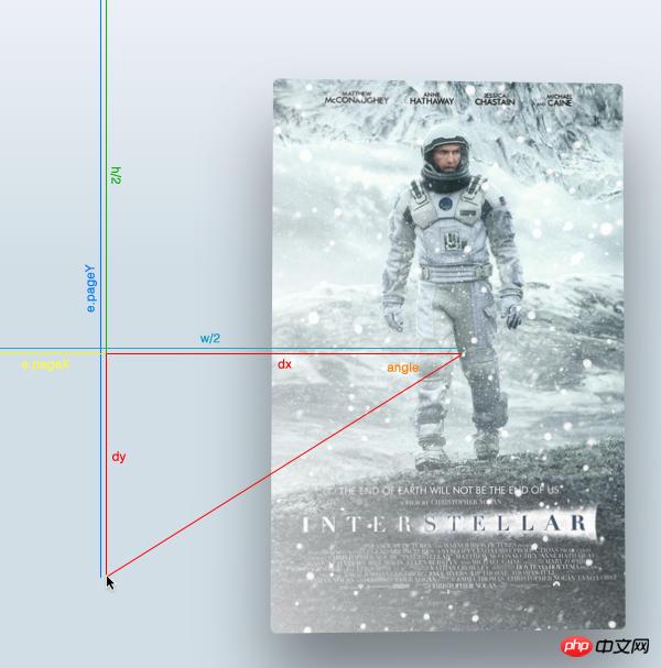
角度示意图
首先,找到光标与页面中心形成的三角形的直角边,光标与中心连线后作出一个直角三角形。
然后用 Math.atan2() 函数得到中心点的角度值。注意这个函数的返回值使用弧度值来表示的,所以我们得在CSS中转换成角的度数,用以下公式:
弧度值*180/pi = 角度值
var $poster = $('.poster');
  var $shine = $('.shine');
  var $layer = $('p[class *= "layer-"]');
  $poster.data("offset",15);
  $(window).on('mousemove', function(e) {
    var w=e.currentTarget.innerWidth,h=e.currentTarget.innerHeight;
    var offsetX = 0.5 - e.pageX / w, /* where e.pageX is our cursor X coordinate */
    offsetY = 0.5 - e.pageY / h,
    offsetPoster = $poster.data('offset'), /* custom value for animation depth */
    transformPoster = 'translateY(' + -offsetX * offsetPoster + 'px) rotateX(' + (-offsetY * offsetPoster) + 'deg) rotateY(' + (offsetX * (offsetPoster * 2)) + 'deg)';
    dy = e.pageY - h / 2,
    dx = e.pageX - w / 2,
    theta = Math.atan2(dy,dx), /* get angle in radians */
    angle = theta * 180 / Math.PI; /* convert rad in degrees */
    /* apply transform to $poster */
    $poster.css('transform', transformPoster);
    /* parallax foreach layer */
    /* loop thought each layer */
    /* get custom parallax value */
    /* apply transform */
    $layer.each(function() {
      var $this = $(this);
      var offsetLayer = $this.data('offset') || 0; /* get custom parallax value, if element docent have data-offset, then its 0 */
      var transformLayer = 'translateX(' + offsetX * offsetLayer + 'px) translateY(' + offsetY * offsetLayer + 'px)';
      $this.css('transform', transformLayer);
    });
});你会发现角度值的范围是从-180到180度,以下代码修复这个问题让角度值从0-360度:
if (angle < 0) {
  angle = angle + 360;
}现在角度有了,就可以随着光标的移动来动态改变渐变颜色的角度值:
$shine.css('background', 'linear-gradient(' + (angle - 90) + 'deg, rgba(255,255,255,' + e.pageY / h + ') 0%,rgba(255,255,255,0) 80%)');大家学会了吗?赶紧动手尝试一下吧。
相关推荐:
The above is the detailed content of Example sharing of implementing parallax effect on APPLE TV posters using jQuery and CSS3. For more information, please follow other related articles on the PHP Chinese website!

Hot AI Tools

Undresser.AI Undress
AI-powered app for creating realistic nude photos

AI Clothes Remover
Online AI tool for removing clothes from photos.

Undress AI Tool
Undress images for free

Clothoff.io
AI clothes remover

Video Face Swap
Swap faces in any video effortlessly with our completely free AI face swap tool!

Hot Article
Hot Tools

Notepad++7.3.1
Easy-to-use and free code editor

SublimeText3 Chinese version
Chinese version, very easy to use

Zend Studio 13.0.1
Powerful PHP integrated development environment

Dreamweaver CS6
Visual web development tools

SublimeText3 Mac version
God-level code editing software (SublimeText3)
Hot Topics
 1653
1653
 14
1413
52
1306
25
1251
29
1224
24
14
1413
52
1306
25
1251
29
1224
24

 Update | Hacker explains how to install Epic Games Store and Fortnite on iPad outside the EU
Aug 18, 2024 am 06:34 AM
Update | Hacker explains how to install Epic Games Store and Fortnite on iPad outside the EU
Aug 18, 2024 am 06:34 AM
Update: Saunders Tech has uploaded a tutorial to his YouTube channel (video embedded below) explaining how to install Fortnite and the Epic Games Store on an iPad outside the EU. However, not only does the process require specific beta versions of iO
 Apple\'s \'HomeAccessory\' device revealed to have an A18 chipset among other features
Sep 27, 2024 am 09:02 AM
Apple\'s \'HomeAccessory\' device revealed to have an A18 chipset among other features
Sep 27, 2024 am 09:02 AM
Fresh details of Apple's HomePod-like device with an integrated screen have surfaced and they paint a clearer picture of the device which has been referred to as 'HomeAccessory'. When it launches, it will be Apple's answer to Google's Nest Hub Max an
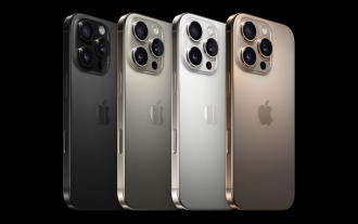 iPhone 16 Pro and iPhone 16 Pro Max official with new cameras, A18 Pro SoC and larger screens
Sep 10, 2024 am 06:50 AM
iPhone 16 Pro and iPhone 16 Pro Max official with new cameras, A18 Pro SoC and larger screens
Sep 10, 2024 am 06:50 AM
Apple has finally lifted the covers off its new high-end iPhone models. The iPhone 16 Pro and iPhone 16 Pro Max now come with larger screens compared to their last-gen counterparts (6.3-in on the Pro, 6.9-in on Pro Max). They get an enhanced Apple A1
 Apple iPhone 16 and iPhone 16 Plus launched with 48MP \'Fusion camera\', Camera Control and A18 chip
Sep 10, 2024 am 09:30 AM
Apple iPhone 16 and iPhone 16 Plus launched with 48MP \'Fusion camera\', Camera Control and A18 chip
Sep 10, 2024 am 09:30 AM
Apple has officially announced the iPhone 16 and iPhone 16 Plus, introducing key hardware updates with the new A18 chip. Both models come in two sizes—6.1 inches and 6.7 inches—with Super Retina XDR displays. They also feature aluminum designs and ar
 New Apple iPhone 16 design and colours shown in comparison video against iPhone 15
Aug 12, 2024 am 06:59 AM
New Apple iPhone 16 design and colours shown in comparison video against iPhone 15
Aug 12, 2024 am 06:59 AM
The launches of Apple's next iPhones are not expected for at least another month. Nonetheless, footage showing dummy iPhone 16 units in what are said to be official launch colours continues to emerge online. Incidentally, while Google previously rele
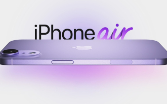 Apple analyst offers new insights into upcoming iPhone 16, iPhone SE 4 and even rumoured iPhone 17 Air releases
Aug 12, 2024 pm 10:01 PM
Apple analyst offers new insights into upcoming iPhone 16, iPhone SE 4 and even rumoured iPhone 17 Air releases
Aug 12, 2024 pm 10:01 PM
Apple's next-generation iPhones are right around the corner. While the company has not shared the date of a new launch event yet, all signs appear to point to a September release, just like last year's iPhone 15 series. Incidentally, footage of dummy
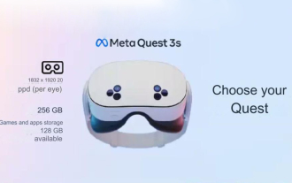 Analyst discusses launch pricing for rumoured Meta Quest 3S VR headset
Aug 27, 2024 pm 09:35 PM
Analyst discusses launch pricing for rumoured Meta Quest 3S VR headset
Aug 27, 2024 pm 09:35 PM
Over a year has now passed from Meta's initial release of the Quest 3 (curr. $499.99 on Amazon). Since then, Apple has shipped the considerably more expensive Vision Pro, while Byte Dance has now unveiled the Pico 4 Ultra in China. However, there is
 Pixel 9 Pro XL vs iPhone 15 Pro Max camera comparison reveals surprising Google wins in video and zoom performance
Aug 24, 2024 pm 12:32 PM
Pixel 9 Pro XL vs iPhone 15 Pro Max camera comparison reveals surprising Google wins in video and zoom performance
Aug 24, 2024 pm 12:32 PM
The Google Pixel 9 Pro and Pro XL are Google's answers to the likes of the Samsung Galaxy S24 Ultra and the Apple iPhone 15 Pro and Pro Max. Daniel Sin on YouTube(watch below) has compared the Google Pixel 9 Pro XL to the iPhone 15 Pro Max with some
