

Introduction to the specific use of FlatList in ReactNative

This article mainly introduces the specific use of FlatList in ReactNative. The editor thinks it is quite good. Now I will share it with you and give you a reference. Let’s follow the editor to take a look, I hope it can help everyone.
The component used before was ListView. At that time, we wanted to add a pull-down refresh and pull-up loading function, so we made some encapsulation of ListView. However, after reading the official documents, it was not recommended to use ListView anymore because of efficiency issues. Friends who have worked on Android know that Android's ListView will also have efficiency issues if you don't handle it yourself. So the official launched FlatList again, with its own pull-down function.
Function introduction
Completely cross-platform.
Supports horizontal layout mode.
Callback events can be configured when the row component is displayed or hidden.
Support separate header components.
Support separate tail components.
Supports custom line separators.
Support pull-down refresh.
Supports pull-up loading.
Supports jumping to the specified line (ScrollToIndex).
If you need to group/class/section (section), please use SectionList (we will introduce this in a later article)
Use
FlatList is also very simple if it is only used briefly. Here we will divide the difficulty level and introduce it gradually:
Use directly
<FlatList
data={[{key: 'a'}, {key: 'b'}]}
renderItem={({item}) => <Text>{item.key}</Text>}
/>It can be seen that it is very similar to the previous ListView, but the dataSource is missing. Here, we only need to pass the data, and the rest is handled by FlatList.
Property Description
ItemSeparatorComponent The separator component between rows. Does not appear before the first line or after the last line. Here you can insert a view as needed
ListEmptyComponent and render the component when the list is empty. It can be a React Component, a render function, or a rendered element.
ListFooterComponent tail component
ListHeaderComponent head component
columnWrapperStyle If a multi-column layout is set (That is, set the numColumns value to an integer greater than 1), you can additionally specify that this style acts on each row of containers.
data For the sake of simplicity, the data attribute currently only supports ordinary arrays. If you need to use other special data structures, such as immutable arrays, please use the lower-level VirtualizedList component directly.
extraData If there is data other than data used in the list (whether used in renderItem, Header or Footer), please specify it in this attribute. At the same time, when modifying this data, you also need to modify its reference address first (for example, copy it to a new Object or array first), and then modify its value, otherwise the interface may not be refreshed.
getItem gets each Item
getItemCount gets the Item attribute
getItemLayout is an optional Optimization to avoid the overhead of dynamically measuring content size, but only if you can know the height of the content in advance. If your row height is fixed, getItemLayout is efficient and simple to use, similar to the following: getItemLayout={(data, index) => ( {length: row height, offset: row height * index, index} )} Note that if you specify a SeparatorComponent, please take the size of the separator into account in the offset calculation.
horizontal is set to true to change to horizontal layout mode.
initialNumToRender specifies the number of elements to be rendered initially, preferably just enough to fill a screen, thus ensuring that visible content is presented to the user in the shortest possible time. Note that the first batch of rendered elements will not be unloaded during the sliding process. This is to ensure that the first batch of elements does not need to be re-rendered when the user returns to the top.
initialScrollIndex specifies the item index at which rendering starts
keyExtractor This function is used to generate a unique key for a given item. The function of Key is to enable React to distinguish different individuals of similar elements so that they can determine their changed positions when refreshing and reduce the cost of re-rendering. If this function is not specified, item.key will be extracted as the key value by default. If item.key does not exist either, the array subscript is used.
legacyImplementation is set to true to use the old ListView implementation.
numColumns multi-column layout can only be used in non-horizontal mode, that is, it must be horizontal={false}. At this time, the elements within the component will be arranged in a Z-shape from left to right and top to bottom, similar to the layout with flexWrap enabled. The elements within the component must be of equal height - waterfall layout is not supported yet.
onEndReached is called when the list is scrolled to a distance less than onEndReachedThreshold from the bottom of the content.
onEndReachedThreshold determines how far away from the bottom of the content the onEndReached callback is triggered. Note that this parameter is a ratio rather than a pixel unit. For example, 0.5 means that the distance from the bottom of the content is half of the visible length of the current list.
onRefresh如果设置了此选项,则会在列表头部添加一个标准的RefreshControl控件,以便实现“下拉刷新”的功能。同时你需要正确设置refreshing属性。
onViewableItemsChanged在可见行元素变化时调用。可见范围和变化频率等参数的配置请设置viewabilityconfig属性
refreshing在等待加载新数据时将此属性设为true,列表就会显示出一个正在加载的符号。
renderItem根据行数据data,渲染每一行的组件。这个参照下面的demo
viewabilityConfig请参考ViewabilityHelper 的源码来了解具体的配置。
方法
scrollToEnd
滚动到底部。如果不设置getItemLayout
属性的话,可能会比较卡。
scrollToIndex
滚动到指定index的item
如果不设置getItemLayout
属性的话,无法跳转到当前可视区域以外的位置。
scrollToItem
滚动到指定item,如果不设置getItemLayout
属性的话,可能会比较卡。
scrollToOffset
滚动指定距离
Demo:
import React, {Component} from 'react';
import {
StyleSheet,
View,
FlatList,
Text,
Button,
} from 'react-native';
var ITEM_HEIGHT = 100;
export default class FlatListDemo extends Component {
_flatList;
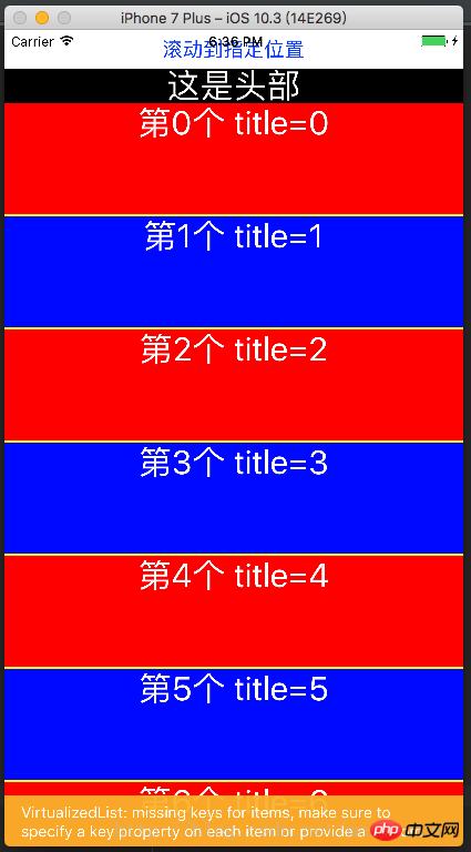
_renderItem = (item) => {
var txt = '第' + item.index + '个' + ' title=' + item.item.title;
var bgColor = item.index % 2 == 0 ? 'red' : 'blue';
return <Text style={[{flex:1,height:ITEM_HEIGHT,backgroundColor:bgColor},styles.txt]}>{txt}</Text>
}
_header = () => {
return <Text style={[styles.txt,{backgroundColor:'black'}]}>这是头部</Text>;
}
_footer = () => {
return <Text style={[styles.txt,{backgroundColor:'black'}]}>这是尾部</Text>;
}
_separator = () => {
return <View style={{height:2,backgroundColor:'yellow'}}/>;
}
render() {
var data = [];
for (var i = 0; i < 100; i++) {
data.push({key: i, title: i + ''});
}
return (
<View style={{flex:1}}>
<Button title='滚动到指定位置' onPress={()=>{
//this._flatList.scrollToEnd();
//this._flatList.scrollToIndex({viewPosition:0,index:8});
this._flatList.scrollToOffset({animated: true, offset: 2000});
}}/>
<View style={{flex:1}}>
<FlatList
ref={(flatList)=>this._flatList = flatList}
ListHeaderComponent={this._header}
ListFooterComponent={this._footer}
ItemSeparatorComponent={this._separator}
renderItem={this._renderItem}
//numColumns ={3}
//columnWrapperStyle={{borderWidth:2,borderColor:'black',paddingLeft:20}}
//horizontal={true}
//getItemLayout={(data,index)=>(
//{length: ITEM_HEIGHT, offset: (ITEM_HEIGHT+2) * index, index}
//)}
//onEndReachedThreshold={5}
//onEndReached={(info)=>{
//console.warn(info.distanceFromEnd);
//}}
//onViewableItemsChanged={(info)=>{
//console.warn(info);
//}}
data={data}>
</FlatList>
</View>
</View>
);
}
}
const styles = StyleSheet.create({
txt: {
textAlign: 'center',
textAlignVertical: 'center',
color: 'white',
fontSize: 30,
}
});效果图:
进阶使用
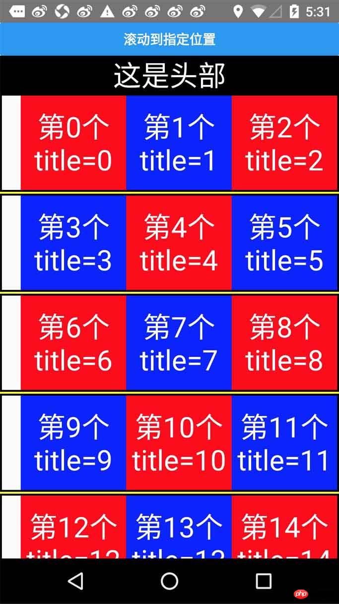
在这里我准备了一份代码示例:
const {width,height}=Dimensions.get('window')
export default class Main extends Component{
// 构造
constructor(props) {
super(props);
}
refreshing(){
let timer = setTimeout(()=>{
clearTimeout(timer)
alert('刷新成功')
},1500)
}
_onload(){
let timer = setTimeout(()=>{
clearTimeout(timer)
alert('加载成功')
},1500)
}
render() {
var data = [];
for (var i = 0; i < 100; i++) {
data.push({key: i, title: i + ''});
}
return (
<View style={{flex:1}}>
<Button title='滚动到指定位置' onPress={()=>{
this._flatList.scrollToOffset({animated: true, offset: 2000});
}}/>
<View style={{flex:1}}>
<FlatList
ref={(flatList)=>this._flatList = flatList}
ListHeaderComponent={this._header}
ListFooterComponent={this._footer}
ItemSeparatorComponent={this._separator}
renderItem={this._renderItem}
onRefresh={this.refreshing}
refreshing={false}
onEndReachedThreshold={0}
onEndReached={
this._onload
}
numColumns ={3}
columnWrapperStyle={{borderWidth:2,borderColor:'black',paddingLeft:20}}
//horizontal={true}
getItemLayout={(data,index)=>(
{length: 100, offset: (100+2) * index, index}
)}
data={data}>
</FlatList>
</View>
</View>
);
}
_renderItem = (item) => {
var txt = '第' + item.index + '个' + ' title=' + item.item.title;
var bgColor = item.index % 2 == 0 ? 'red' : 'blue';
return <Text style={[{flex:1,height:100,backgroundColor:bgColor},styles.txt]}>{txt}</Text>
}
_header = () => {
return <Text style={[styles.txt,{backgroundColor:'black'}]}>这是头部</Text>;
}
_footer = () => {
return <Text style={[styles.txt,{backgroundColor:'black'}]}>这是尾部</Text>;
}
_separator = () => {
return <View style={{height:2,backgroundColor:'yellow'}}/>;
}
}
const styles=StyleSheet.create({
container:{
},
content:{
width:width,
height:height,
backgroundColor:'yellow',
justifyContent:'center',
alignItems:'center'
},
cell:{
height:100,
backgroundColor:'purple',
alignItems:'center',
justifyContent:'center',
borderBottomColor:'#ececec',
borderBottomWidth:1
},
txt: {
textAlign: 'center',
textAlignVertical: 'center',
color: 'white',
fontSize: 30,
}
})运行效果如下:
总结
总体来说Flatlist还是比ListView用起来方便的,而且提供的功能更多。
相关推荐:
ReactNative中使用Redux架构总结_javascript技巧
The above is the detailed content of Introduction to the specific use of FlatList in ReactNative. For more information, please follow other related articles on the PHP Chinese website!

Hot AI Tools

Undresser.AI Undress
AI-powered app for creating realistic nude photos

AI Clothes Remover
Online AI tool for removing clothes from photos.

Undress AI Tool
Undress images for free

Clothoff.io
AI clothes remover

Video Face Swap
Swap faces in any video effortlessly with our completely free AI face swap tool!

Hot Article
Hot Tools

Notepad++7.3.1
Easy-to-use and free code editor

SublimeText3 Chinese version
Chinese version, very easy to use

Zend Studio 13.0.1
Powerful PHP integrated development environment

Dreamweaver CS6
Visual web development tools

SublimeText3 Mac version
God-level code editing software (SublimeText3)
Hot Topics


 How to use DirectX repair tool? Detailed usage of DirectX repair tool
Mar 15, 2024 am 08:31 AM
How to use DirectX repair tool? Detailed usage of DirectX repair tool
Mar 15, 2024 am 08:31 AM
The DirectX repair tool is a professional system tool. Its main function is to detect the DirectX status of the current system. If an abnormality is found, it can be repaired directly. There may be many users who don’t know how to use the DirectX repair tool. Let’s take a look at the detailed tutorial below. 1. Use repair tool software to perform repair detection. 2. If it prompts that there is an abnormal problem in the C++ component after the repair is completed, please click the Cancel button, and then click the Tools menu bar. 3. Click the Options button, select the extension, and click the Start Extension button. 4. After the expansion is completed, re-detect and repair it. 5. If the problem is still not solved after the repair tool operation is completed, you can try to uninstall and reinstall the program that reported the error.
 Introduction to HTTP 525 status code: explore its definition and application
Feb 18, 2024 pm 10:12 PM
Introduction to HTTP 525 status code: explore its definition and application
Feb 18, 2024 pm 10:12 PM
Introduction to HTTP 525 status code: Understand its definition and usage HTTP (HypertextTransferProtocol) 525 status code means that an error occurred on the server during the SSL handshake, resulting in the inability to establish a secure connection. The server returns this status code when an error occurs during the Transport Layer Security (TLS) handshake. This status code falls into the server error category and usually indicates a server configuration or setup problem. When the client tries to connect to the server via HTTPS, the server has no
 How to use Baidu Netdisk-How to use Baidu Netdisk
Mar 04, 2024 pm 09:28 PM
How to use Baidu Netdisk-How to use Baidu Netdisk
Mar 04, 2024 pm 09:28 PM
Many friends still don’t know how to use Baidu Netdisk, so the editor will explain how to use Baidu Netdisk below. If you are in need, hurry up and take a look. I believe it will be helpful to everyone. Step 1: Log in directly after installing Baidu Netdisk (as shown in the picture); Step 2: Then select "My Sharing" and "Transfer List" according to the page prompts (as shown in the picture); Step 3: In "Friend Sharing", you can share pictures and files directly with friends (as shown in the picture); Step 4: Then select "Share" and then select computer files or network disk files (as shown in the picture); Fifth Step 1: Then you can find friends (as shown in the picture); Step 6: You can also find the functions you need in the "Function Treasure Box" (as shown in the picture). The above is the editor’s opinion
 What is the KMS activation tool? How to use the KMS activation tool? How to use KMS activation tool?
Mar 18, 2024 am 11:07 AM
What is the KMS activation tool? How to use the KMS activation tool? How to use KMS activation tool?
Mar 18, 2024 am 11:07 AM
The KMS Activation Tool is a software tool used to activate Microsoft Windows and Office products. KMS is the abbreviation of KeyManagementService, which is key management service. The KMS activation tool simulates the functions of the KMS server so that the computer can connect to the virtual KMS server to activate Windows and Office products. The KMS activation tool is small in size and powerful in function. It can be permanently activated with one click. It can activate any version of the window system and any version of Office software without being connected to the Internet. It is currently the most successful and frequently updated Windows activation tool. Today I will introduce it Let me introduce to you the kms activation work
 How to correctly use the win10 command prompt for automatic repair operations
Dec 30, 2023 pm 03:17 PM
How to correctly use the win10 command prompt for automatic repair operations
Dec 30, 2023 pm 03:17 PM
The longer the computer is used, the more likely it is to malfunction. At this time, friends need to use their own methods to repair it. So what is the easiest way to do it? Today I will bring you a tutorial on how to repair using the command prompt. How to use win10 automatic repair command prompt: 1. Press "Win+R" and enter cmd to open the "command prompt" 2. Enter chkdsk to view the repair command 3. If you need to view other places, you can also add other partitions such as "d" 4. Enter the execution command chkdskd:/F. 5. If it is occupied during the modification process, you can enter Y to continue.
 Learn to copy and paste quickly
Feb 18, 2024 pm 03:25 PM
Learn to copy and paste quickly
Feb 18, 2024 pm 03:25 PM
How to use the copy-paste shortcut keys Copy-paste is an operation we often encounter when using computers every day. In order to improve work efficiency, it is very important to master the copy and paste shortcut keys. This article will introduce some commonly used copy and paste shortcut keys to help readers perform copy and paste operations more conveniently. Copy shortcut key: Ctrl+CCtrl+C is the shortcut key for copying. By holding down the Ctrl key and then pressing the C key, you can copy the selected text, files, pictures, etc. to the clipboard. To use this shortcut key,
 How to merge cells using shortcut keys
Feb 26, 2024 am 10:27 AM
How to merge cells using shortcut keys
Feb 26, 2024 am 10:27 AM
How to use the shortcut keys for merging cells In daily work, we often need to edit and format tables. Merging cells is a common operation that can merge multiple adjacent cells into one cell to improve the beauty of the table and the information display effect. In mainstream spreadsheet software such as Microsoft Excel and Google Sheets, the operation of merging cells is very simple and can be achieved through shortcut keys. The following will introduce the shortcut key usage for merging cells in these two software. exist
 How to use potplayer-How to use potplayer
Mar 04, 2024 pm 06:10 PM
How to use potplayer-How to use potplayer
Mar 04, 2024 pm 06:10 PM
Potplayer is a very powerful media player, but many friends still don’t know how to use potplayer. Today I will introduce how to use potplayer in detail, hoping to help everyone. 1. PotPlayer shortcut keys. The default common shortcut keys for PotPlayer player are as follows: (1) Play/pause: space (2) Volume: mouse wheel, up and down arrow keys (3) forward/backward: left and right arrow keys (4) bookmark: P- Add bookmarks, H-view bookmarks (5) full screen/restore: Enter (6) multiple speeds: C-accelerate, 7) Previous/next frame: D/
