
 Web Front-end
CSS Tutorial
Detailed example of how to write browser gradient background color using css3
Web Front-end
CSS Tutorial
Detailed example of how to write browser gradient background color using css3
Detailed example of how to write browser gradient background color using css3

This article mainly introduces the method of writing browser background gradient background color in CSS3. The editor thinks it is quite good. Now I will share it with you and give it as a reference. Let’s follow the editor to take a look, I hope it can help everyone.
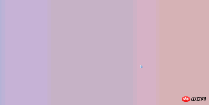
The effect is as follows:
Knowledge points: rgb full color cycle algorithm, HEX and RGB color conversion algorithm, CSS3 color gradient, CSS3 gradient color compatible ie method , timers and loops, function encapsulation, array applications, etc.
Source code:
<!doctype html>
<html lang="en">
<head>
<meta charset="UTF-8">
<meta name="Generator" content="EditPlus®">
<meta name="Author" content="">
<meta name="Keywords" content="">
<meta name="Description" content="">
<title>Document</title>
<style>
*{margin:0;padding:0;}
body#wrap{width:100%;height:500px;
}
</style>
</head>
<body id="wrap">
<script>
/* RGB 色盘变化
// 1.rgb颜色的变化只有 ++ -- ;
// 2.什么时候发生改变
// 3.阈值和变化规律:
{
if(R==255&&G==0){B++;}
if(B==255&&G==0){R--;}
if(B==255&&R==0){G++;}
if(R==0&&G==255){B--;}
if(G==255&&B==0){R++;}
if(R==255&&B==0){G--;}
}
// 4.数据分析归类
{
if(G==255&&B==0){R++;}
if(B==255&&R==0){G++;}
if(R==255&&G==0){B++;}
if(G==0&&B==255){R--;}
if(B==0&&R==255){G--;}
if(R==0&&G==255){B--;}
}
// 5.解决方案转化成代码
{
R , G , B
var color=[R,G,B]
` color[0] //R
利用数组操作原本应该是3个变量的值
++ , --
}
*/
(function(){
var oWrap=document.getElementById('wrap');
var max=220; /*存储封值*/
var min=180; /*存储谷值*/
var color=[max,min,min]; /*根据初始值红色来初始化数组*/
var timer=null;
var length=color.length;
var colorL,colorR
timer=setInterval(change,20);
/*不容许在机组运行中直接修改代码*/
function change(){
/*在定时器中每过20毫秒 执行一次代码*/
/*检测一次数组*/
for(var i=0;i<length;i++){
i%=length;
var arrX=(i+1)%length;
var arrY=(i+2)%length;
if(color[i]==max&&color[arrX]==min){
color[arrY]++;
}
if(color[i]== min&&color[arrX]==max){
color[arrY]--;
}
colorL='#'+convert(color[0])+''+convert(color[1])+''+convert(color[2])+'';
colorR='#'+convert(color[2])+''+convert(color[0])+''+convert(color[1])+'';
}
gColor(colorL,colorR);
}
function convert(sRgb){ /*rgb转换成HEX*/
var sRgb=sRgb;
var sHex=sRgb.toString(16);
sHex=sHex.length<2?'0'+sHex:sHex
/* 三目判断 判断条件 ? 符合条件 :不符合条件*/
return sHex;
}
function gColor(colorL,colorR){
if(navigator.userAgent.match(/Trident/i)&&navigator.userAgent.match(/MSIE [7|8|9].0/i)){
//通过正则检测浏览器信息是否是ie 并且 ie版本是不是 7或者8或者9 之一
oWrap.style.filter = "progid:DXImageTransform.Microsoft.gradient( startColorstr=" + colorL + ", endColorstr=" + colorR + ",GradientType=0 )";
}else{
oWrap.style.background='-webkit-linear-gradient(left,'+colorL+','+colorR+')' //谷歌
oWrap.style.background='-ms-linear-gradient(left,'+colorL+','+colorR+')' //ie 10 11
}
}
})();
</script>
</body>
</html>Related recommendations:
CSS3 gradient background color usage method is compatible with IE9+
JS method to achieve gradient background color when entering the page_javascript skills
Detailed explanation of how to make the background color gradient compatible with css
The above is the detailed content of Detailed example of how to write browser gradient background color using css3. For more information, please follow other related articles on the PHP Chinese website!

Hot AI Tools

Undresser.AI Undress
AI-powered app for creating realistic nude photos

AI Clothes Remover
Online AI tool for removing clothes from photos.

Undress AI Tool
Undress images for free

Clothoff.io
AI clothes remover

Video Face Swap
Swap faces in any video effortlessly with our completely free AI face swap tool!

Hot Article
Hot Tools

Notepad++7.3.1
Easy-to-use and free code editor

SublimeText3 Chinese version
Chinese version, very easy to use

Zend Studio 13.0.1
Powerful PHP integrated development environment

Dreamweaver CS6
Visual web development tools

SublimeText3 Mac version
God-level code editing software (SublimeText3)
Hot Topics


 How to achieve wave effect with pure CSS3? (code example)
Jun 28, 2022 pm 01:39 PM
How to achieve wave effect with pure CSS3? (code example)
Jun 28, 2022 pm 01:39 PM
How to achieve wave effect with pure CSS3? This article will introduce to you how to use SVG and CSS animation to create wave effects. I hope it will be helpful to you!
 How to remove Firefox Snap in Ubuntu Linux?
Feb 21, 2024 pm 07:00 PM
How to remove Firefox Snap in Ubuntu Linux?
Feb 21, 2024 pm 07:00 PM
To remove FirefoxSnap in Ubuntu Linux, you can follow these steps: Open a terminal and log in to your Ubuntu system as administrator. Run the following command to uninstall FirefoxSnap: sudosnapremovefirefox You will be prompted for your administrator password. Enter your password and press Enter to confirm. Wait for command execution to complete. Once completed, FirefoxSnap will be completely removed. Note that this will remove versions of Firefox installed via the Snap package manager. If you installed another version of Firefox through other means (such as the APT package manager), you will not be affected. Go through the above steps
 Use CSS skillfully to realize various strange-shaped buttons (with code)
Jul 19, 2022 am 11:28 AM
Use CSS skillfully to realize various strange-shaped buttons (with code)
Jul 19, 2022 am 11:28 AM
This article will show you how to use CSS to easily realize various weird-shaped buttons that appear frequently. I hope it will be helpful to you!
 How to hide elements in css without taking up space
Jun 01, 2022 pm 07:15 PM
How to hide elements in css without taking up space
Jun 01, 2022 pm 07:15 PM
Two methods: 1. Using the display attribute, just add the "display:none;" style to the element. 2. Use the position and top attributes to set the absolute positioning of the element to hide the element. Just add the "position:absolute;top:-9999px;" style to the element.
 How to implement lace borders in css3
Sep 16, 2022 pm 07:11 PM
How to implement lace borders in css3
Sep 16, 2022 pm 07:11 PM
In CSS, you can use the border-image attribute to achieve a lace border. The border-image attribute can use images to create borders, that is, add a background image to the border. You only need to specify the background image as a lace style; the syntax "border-image: url (image path) offsets the image border width inward. Whether outset is repeated;".
 How to enlarge the image by clicking the mouse in css3
Apr 25, 2022 pm 04:52 PM
How to enlarge the image by clicking the mouse in css3
Apr 25, 2022 pm 04:52 PM
Implementation method: 1. Use the ":active" selector to select the state of the mouse click on the picture; 2. Use the transform attribute and scale() function to achieve the picture magnification effect, the syntax "img:active {transform: scale(x-axis magnification, y Axis magnification);}".
 It turns out that text carousel and image carousel can also be realized using pure CSS!
Jun 10, 2022 pm 01:00 PM
It turns out that text carousel and image carousel can also be realized using pure CSS!
Jun 10, 2022 pm 01:00 PM
How to create text carousel and image carousel? The first thing everyone thinks of is whether to use js. In fact, text carousel and image carousel can also be realized using pure CSS. Let’s take a look at the implementation method. I hope it will be helpful to everyone!
 How to set animation rotation speed in css3
Apr 28, 2022 pm 04:32 PM
How to set animation rotation speed in css3
Apr 28, 2022 pm 04:32 PM
In CSS3, you can use the "animation-timing-function" attribute to set the animation rotation speed. This attribute is used to specify how the animation will complete a cycle and set the speed curve of the animation. The syntax is "element {animation-timing-function: speed attribute value;}".
