
 Web Front-end
CSS Tutorial
Detailed explanation of the usage of pseudo elements::before and ::after in CSS3
Web Front-end
CSS Tutorial
Detailed explanation of the usage of pseudo elements::before and ::after in CSS3
Detailed explanation of the usage of pseudo elements::before and ::after in CSS3
before and after are actually pseudo-elements attached to the front and back of the element. What it means to say it is a pseudo-element is that the element is not generated in the DOM, but is drawn when the browser rendering engine renders CSS. This article This article mainly introduces you to the usage of pseudo elements ::before and ::after in CSS3. Friends who need it can refer to it.
Preface
It is well known that the two pseudo-elements::before and ::after are actually the content in CSS3, but in fact in CSS2 There are already these two, but in CSS2 they are represented by a colon in front (:before and :after). Today I will mainly talk about how to use these two pseudo elements.
1. You can add styles to ordinary elements just like ordinary elements.
For example, if I want to add an icon in front of the text, if I use ordinary When writing elements, I can write like this:
/*CSS*/
.del{ font-size: 20px;}
.del i{ display: inline-block; width: 20px; height: 25px; margin-right: 2px; vertical-align: middle;
        background: url("imgs/delete.png") no-repeat center; background-size: 100%;}
.del span{ vertical-align: middle;}/*HTML*/ <p class="del"><i></i><span>删除</span></p>
But it always feels uncomfortable to put an empty i tag, so just remove it. Bar!
/*CSS*/
.del{ font-size: 20px;}
.del::before{ content: ""; display: inline-block; width: 20px; height: 25px; margin-right: 2px; vertical-align: middle;
        background: url("imgs/delete.png") no-repeat center; background-size: 100%;}
.del span{ vertical-align: middle;}/*HTML*/ <p class="del"><span>删除</span></p>
Here we directly use the ::before pseudo-element to replace the empty i tag. The two have the same effect:
Also taking advantage of this, we can use the ::after pseudo-element to solve the classic problem of clearing floats:
.clearfix::after{ display:block; clear: both; content: ""; overflow:hidden; height:0; }
Of course, if your website still needs to be compatible with IE8, then use :after, ::after is not compatible.
2. Insert text into elements
#Sometimes I may need to add the same text to many elements at the same time, then you can consider using These two pseudo elements. For example:
/*CSS*/
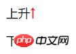
.up:after{ content: '↑'; color: #f00;}
.down:after{ content: '↓'; color: #0f0;}/*HTML*/ <p class="up">上升</p> <p class="down">下降</p>
The effect is as follows:
3. Insert images into elements
To achieve a picture plus text effect similar to the first example in this article, you can also use pseudo elements to directly insert pictures without using a background image , like this:
/*CSS*/
.del{ font-size: 20px;}
.del::before{ content: url("imgs/delete.png"); display: inline-block; margin-right: 2px; vertical-align: middle; }
.del span{ vertical-align: middle;}However, it is important to note that the image inserted in this way cannot change the size of the image by controlling the size of the pseudo element, only It can introduce fixed-size images (this is a bit tricky...), so I personally think it is better to use background images honestly.
4. Insert consecutive project numbers
Maybe you will say, isn’t it easy to add consecutive project numbers? Just use the ordered list directly!
Yes, it is indeed possible, just like this:
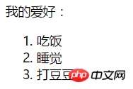
<p>我的爱好:</p>
<ol>
    <li>吃饭</li>
    <li>睡觉</li>
    <li>打豆豆</li>
</ol>This is the effect under Chrome:
Looks good, no problem, what if I want to bold the previous serial number? I'm confused...
Now you say, can't I just manually add labels and numbers before each text, and then add styles to the labels?
/*CSS*/
ul li{ list-style: none;}
ul li span{ font-weight: bold;}/*HTML*/
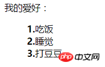
<p>我的爱好:</p>
<ul>
<li><span>1.</span>吃饭</li>
<li><span>2.</span>睡觉</li>
<li><span>3.</span>打豆豆</li>
</ul>Yes, there are three items now. What if there are thirty items or three hundred items? Add them one by one? (Very silly and naive...)
If you use pure CSS at this time, you have to use pseudo elements:
/*CSS*/
ul li{ list-style: none; counter-increment: number;}   //number相当于是个变量,随便取名就好,在伪元素中调用
ul li::before{ content: counter(number)"."; font-weight: bold;}  //注意这里不同于JS,counter(number)与"."之间不需要加任何东西,直接连接就好
/*HTML*/
<p>我的爱好:</p>
<ul>
    <li>吃饭</li>
    <li>睡觉</li>
    <li>打豆豆</li>
</ul>The effect is as follows:
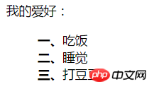
So if I don’t want Arabic numerals, can I just use Chinese numerals?
Can! Pseudo elements are nice and powerful!
ul li{ list-style: none; counter-increment: number;}
ul li::before{ content: counter(number,cjk-ideographic)"、"; font-weight: bold;}The effect is as follows:
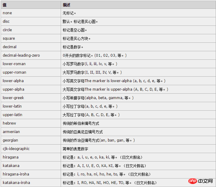
In addition to this cjk-ideographic, you can also use more CSS list- style-type attribute: (directly paste the table in w3cshool)
The above is the detailed content of Detailed explanation of the usage of pseudo elements::before and ::after in CSS3. For more information, please follow other related articles on the PHP Chinese website!

Hot AI Tools

Undresser.AI Undress
AI-powered app for creating realistic nude photos

AI Clothes Remover
Online AI tool for removing clothes from photos.

Undress AI Tool
Undress images for free

Clothoff.io
AI clothes remover

Video Face Swap
Swap faces in any video effortlessly with our completely free AI face swap tool!

Hot Article
Hot Tools

Notepad++7.3.1
Easy-to-use and free code editor

SublimeText3 Chinese version
Chinese version, very easy to use

Zend Studio 13.0.1
Powerful PHP integrated development environment

Dreamweaver CS6
Visual web development tools

SublimeText3 Mac version
God-level code editing software (SublimeText3)
Hot Topics
 1664
1664
 14
1423
52
1321
25
1269
29
1249
24
14
1423
52
1321
25
1269
29
1249
24

 How to achieve wave effect with pure CSS3? (code example)
Jun 28, 2022 pm 01:39 PM
How to achieve wave effect with pure CSS3? (code example)
Jun 28, 2022 pm 01:39 PM
How to achieve wave effect with pure CSS3? This article will introduce to you how to use SVG and CSS animation to create wave effects. I hope it will be helpful to you!
 Use CSS skillfully to realize various strange-shaped buttons (with code)
Jul 19, 2022 am 11:28 AM
Use CSS skillfully to realize various strange-shaped buttons (with code)
Jul 19, 2022 am 11:28 AM
This article will show you how to use CSS to easily realize various weird-shaped buttons that appear frequently. I hope it will be helpful to you!
 How to hide elements in css without taking up space
Jun 01, 2022 pm 07:15 PM
How to hide elements in css without taking up space
Jun 01, 2022 pm 07:15 PM
Two methods: 1. Using the display attribute, just add the "display:none;" style to the element. 2. Use the position and top attributes to set the absolute positioning of the element to hide the element. Just add the "position:absolute;top:-9999px;" style to the element.
 How to implement lace borders in css3
Sep 16, 2022 pm 07:11 PM
How to implement lace borders in css3
Sep 16, 2022 pm 07:11 PM
In CSS, you can use the border-image attribute to achieve a lace border. The border-image attribute can use images to create borders, that is, add a background image to the border. You only need to specify the background image as a lace style; the syntax "border-image: url (image path) offsets the image border width inward. Whether outset is repeated;".
 It turns out that text carousel and image carousel can also be realized using pure CSS!
Jun 10, 2022 pm 01:00 PM
It turns out that text carousel and image carousel can also be realized using pure CSS!
Jun 10, 2022 pm 01:00 PM
How to create text carousel and image carousel? The first thing everyone thinks of is whether to use js. In fact, text carousel and image carousel can also be realized using pure CSS. Let’s take a look at the implementation method. I hope it will be helpful to everyone!
 How to enlarge the image by clicking the mouse in css3
Apr 25, 2022 pm 04:52 PM
How to enlarge the image by clicking the mouse in css3
Apr 25, 2022 pm 04:52 PM
Implementation method: 1. Use the ":active" selector to select the state of the mouse click on the picture; 2. Use the transform attribute and scale() function to achieve the picture magnification effect, the syntax "img:active {transform: scale(x-axis magnification, y Axis magnification);}".
 How to set animation rotation speed in css3
Apr 28, 2022 pm 04:32 PM
How to set animation rotation speed in css3
Apr 28, 2022 pm 04:32 PM
In CSS3, you can use the "animation-timing-function" attribute to set the animation rotation speed. This attribute is used to specify how the animation will complete a cycle and set the speed curve of the animation. The syntax is "element {animation-timing-function: speed attribute value;}".
 Does css3 animation effect have deformation?
Apr 28, 2022 pm 02:20 PM
Does css3 animation effect have deformation?
Apr 28, 2022 pm 02:20 PM
The animation effect in css3 has deformation; you can use "animation: animation attribute @keyframes ..{..{transform: transformation attribute}}" to achieve deformation animation effect. The animation attribute is used to set the animation style, and the transform attribute is used to set the deformation style. .
