

How to implement multi-column layout using CSS
Several ways to implement multi-column layout with css
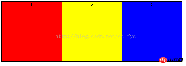
If the following three p's are displayed on the same line
<p >
<p style="background-color:red">1</p>
<p style="background-color:yellow">2</p>
<p style="background-color:blue">3</p>
</p>
1: float implements multi-column layout
The float attribute controls whether and how the target HTML component floats. After setting this property, the object will be treated as a block component.
A floating HTML component will float and follow its predecessor until it encounters a border, inner patch, outer patch, or another block.
        p>p{
            border:1px solid black;
            float:left;
            width:200px;
            height: 200px;
            text-align: center;
        }
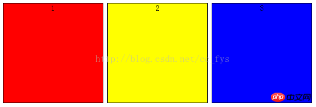
##2: inline-block box model
The elements of the inline-block box model will not occupy a single line, and also support specifying width and height using width and height. The inline-block box model will be bottom-aligned by default, and vertical-align:top can align its top.
        p>p{
            display:inline-block;
            border:1px solid black;
            text-align:center;
            width:200px;
            height: 200px;
            vertical-align: top;
}Inline-block There will be a gap between horizontally rendered elements when displayed in line breaks or separated by spaces. Remove the spaces and the gaps will disappear naturally.
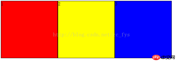
##3: display: flex Flexible Layout
FlexFlexibleThe layout function is relatively powerful and can provide the maximum flexibility for the box model to implement complex layouts. , any container can be designated as Flex layout.
flex-direction: column; Indicates vertical arrangement in the parent container. The above is the detailed content of How to implement multi-column layout using CSS. For more information, please follow other related articles on the PHP Chinese website! p{
display: flex;
flex-direction: row;
height:200px;
width: 600px;
}
p>p{
border:1px solid black;
}

Hot AI Tools

Undresser.AI Undress
AI-powered app for creating realistic nude photos

AI Clothes Remover
Online AI tool for removing clothes from photos.

Undress AI Tool
Undress images for free

Clothoff.io
AI clothes remover

Video Face Swap
Swap faces in any video effortlessly with our completely free AI face swap tool!

Hot Article
Hot Tools

Notepad++7.3.1
Easy-to-use and free code editor

SublimeText3 Chinese version
Chinese version, very easy to use

Zend Studio 13.0.1
Powerful PHP integrated development environment

Dreamweaver CS6
Visual web development tools

SublimeText3 Mac version
God-level code editing software (SublimeText3)
Hot Topics
 1661
1661
 14
1417
52
1311
25
1261
29
1234
24
14
1417
52
1311
25
1261
29
1234
24

 How to use bootstrap in vue
Apr 07, 2025 pm 11:33 PM
How to use bootstrap in vue
Apr 07, 2025 pm 11:33 PM
Using Bootstrap in Vue.js is divided into five steps: Install Bootstrap. Import Bootstrap in main.js. Use the Bootstrap component directly in the template. Optional: Custom style. Optional: Use plug-ins.
 Understanding HTML, CSS, and JavaScript: A Beginner's Guide
Apr 12, 2025 am 12:02 AM
Understanding HTML, CSS, and JavaScript: A Beginner's Guide
Apr 12, 2025 am 12:02 AM
WebdevelopmentreliesonHTML,CSS,andJavaScript:1)HTMLstructurescontent,2)CSSstylesit,and3)JavaScriptaddsinteractivity,formingthebasisofmodernwebexperiences.
 The Roles of HTML, CSS, and JavaScript: Core Responsibilities
Apr 08, 2025 pm 07:05 PM
The Roles of HTML, CSS, and JavaScript: Core Responsibilities
Apr 08, 2025 pm 07:05 PM
HTML defines the web structure, CSS is responsible for style and layout, and JavaScript gives dynamic interaction. The three perform their duties in web development and jointly build a colorful website.
 How to insert pictures on bootstrap
Apr 07, 2025 pm 03:30 PM
How to insert pictures on bootstrap
Apr 07, 2025 pm 03:30 PM
There are several ways to insert images in Bootstrap: insert images directly, using the HTML img tag. With the Bootstrap image component, you can provide responsive images and more styles. Set the image size, use the img-fluid class to make the image adaptable. Set the border, using the img-bordered class. Set the rounded corners and use the img-rounded class. Set the shadow, use the shadow class. Resize and position the image, using CSS style. Using the background image, use the background-image CSS property.
 How to write split lines on bootstrap
Apr 07, 2025 pm 03:12 PM
How to write split lines on bootstrap
Apr 07, 2025 pm 03:12 PM
There are two ways to create a Bootstrap split line: using the tag, which creates a horizontal split line. Use the CSS border property to create custom style split lines.
 How to set up the framework for bootstrap
Apr 07, 2025 pm 03:27 PM
How to set up the framework for bootstrap
Apr 07, 2025 pm 03:27 PM
To set up the Bootstrap framework, you need to follow these steps: 1. Reference the Bootstrap file via CDN; 2. Download and host the file on your own server; 3. Include the Bootstrap file in HTML; 4. Compile Sass/Less as needed; 5. Import a custom file (optional). Once setup is complete, you can use Bootstrap's grid systems, components, and styles to create responsive websites and applications.
 How to resize bootstrap
Apr 07, 2025 pm 03:18 PM
How to resize bootstrap
Apr 07, 2025 pm 03:18 PM
To adjust the size of elements in Bootstrap, you can use the dimension class, which includes: adjusting width: .col-, .w-, .mw-adjust height: .h-, .min-h-, .max-h-
 How to use bootstrap button
Apr 07, 2025 pm 03:09 PM
How to use bootstrap button
Apr 07, 2025 pm 03:09 PM
How to use the Bootstrap button? Introduce Bootstrap CSS to create button elements and add Bootstrap button class to add button text
