

What is BFC? A simple understanding of bfc

Introduction
Before talking about BFC, let’s take a look at an example
 1 <!DOCTYPE html> 2 <html lang="en"> 3 <head> 4
 <meta charset="UTF-8"> 5     <title>BFC</title> 6
 <style type="text/css"> 7
 .div1 {background-color: #FCE38A; width: 200px; height: 100px;} 8
 .div2 {background-color: #EAFFD0; width: 200px; height: 100px;} 9
 .div3 {background-color: #95E1D3; width: 200px; height: 100px;}10
 </style>11 </head>12 13 <body>14     <div class="div1">div1</div>15
 <div class="div2">div2</div>16     <div class="div3">div3</div>17 </body>18
 </html>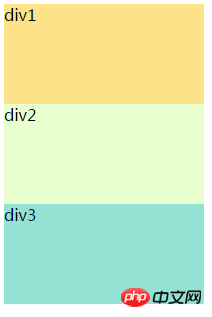
As you can see, block-level elements The order of arrangement is from top to bottom. Even if the width of the row can accommodate multiple elements, now add margins to div1 and div2 at the same time

CSS Study Notes 07 Box Model, so how to solve this kind of outer margin As for the phenomenon of distance merging, this involves the BFC to be introduced below.
What is BFCBlock Formatting Contexts is a block-level formatting context. It is an independent rendering area, only Block-level box Participation, it specifies how the internal Block-level Box (element with display attributes of block, list-item, table) is laid out, and has nothing to do with the outside of this area. Among them, Formatting Context is a container that determines how to render the document. Formatting context is a concept in the W3C CSS2.1 specification. It is a rendering area on the page and has a set of rendering rules that determine how its sub-elements will be positioned, as well as their relationship and interaction with other elements. The most common Formatting contexts are Block fomatting context (BFC) and Inline formatting context (IFC). There are only BFC and IFC in CSS2.1, and GFC and FFC are also added in CSS3.
In layman's terms, BFC is an independent box, and the layout in this independent box is not affected by the outside. Of course, it will not affect external elements.
When the document presentation starts, a BFC will be automatically created to lay out the entire page. When a new BFC is not created, the entire document will be this BFC. Rules of BFC- The internal boxes will be placed one after another in the vertical direction, starting from the top (as can be seen in the above example)
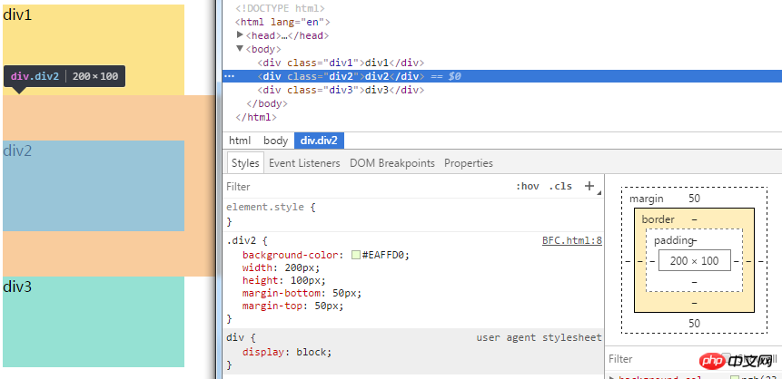
- In the same BFC, in two adjacent block-level elements, the vertical margin will collapse
- The left side of the margin box of each element, and The left sides of the containing block border box touch (for left-to-right formatting, otherwise the opposite), even if there are floats
- The area of BFC will not overlap with the float box
- BFC is an isolated independent container on the page. The sub-elements inside the container will not affect the elements outside and vice versa
- Calculation When the height of BFC is calculated, floating elements also participate in the calculation
- Root element
- The float attribute is not none (such as: left | right)
- The value of overflow is not visible (such as: hidden | auto | scroll)
- display attribute value is inline-block | flex | inline-flex | table-cell | table-caption ##position is absolute or fixed
- Apply BFC
Solve the margin overlay problem
It’s still the above example, because the elements of the page are in a standard flow at this time, so the body element is a BFC at this time, according to the rules
同一个BFC中,在两个相邻的块级元素中,垂直margin会发生折叠

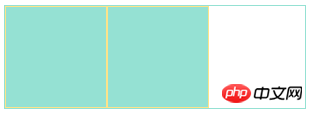
##At this time, due to div1 The element triggers BFC through display:inline-block. At this time, div1 is an independent BFC. According to the rules 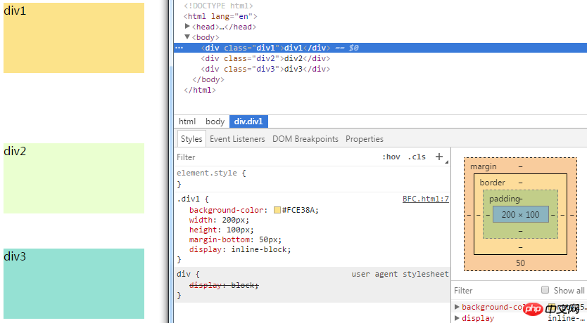
BFC就是页面上的一个隔离的独立容器,容器里面的子元素不会影响到外面的元素,反之亦然
1 <!DOCTYPE html> 2 <html lang="en"> 3 <head> 4 <meta charset="UTF-8"> 5 <title>BFC清除内部浮动</title> 6 <style type="text/css"> 7 .child {background-color: #95E1D3; border: 1px solid #FCE38A; width: 100px; height: 100px;} 8 .parent {width: 300px; border: 1px solid #95E1D3;} 9 </style>10 </head>11 <body>12 <div class="parent">13 <div class="child"></div>14 <div class="child"></div>15 </div>16 </body>17 </html>The parent container is supported by two child divs, now add a float to the child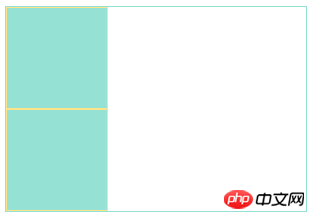

#At this time, the parent container has become two overlapping lines, that is, the height has become 0, which is the so-called height collapse. According to the rules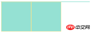
计算BFC的高度时,浮动元素也参与计算
这时候可以触发parent生成BFC,那么parent在计算高度时,parent内部的浮动元素child也会参与计算

布局
1 <!DOCTYPE html> 2 <html lang="en"> 3 <head> 4 <meta charset="UTF-8"> 5 <title>BFC布局</title> 6 <style type="text/css"> 7 .left {width: 100px; height: 100px; background-color: #FCE38A; float: left;} 8 .right {width: 300px; height: 150px; background-color: #95E1D3;} 9 10 </style>11 </head>12 <body>13 <div class="left"></div>14 <div class="right"></div>15 </body>16 </html>
根据规则
每个元素的margin box的左边, 与包含块border box的左边相接触(对于从左往右的格式化,否则相反),即使存在浮动也是如此
所以即使left设置了左浮动,right的的左边依然会与包含块的左边(即body)相接触。接着我们可以根据规则
BFC的区域不会与float box重叠
让right触发产生BFC,这样right就不会与left重叠了


这样就形成了常见的两列布局。
总之记住一点BFC就是页面上的一个隔离的独立容器,容器里面的子元素不会影响到外面的元素,同样的,外面的元素也不会影响到容器里面的子元素。
The above is the detailed content of What is BFC? A simple understanding of bfc. For more information, please follow other related articles on the PHP Chinese website!

Hot AI Tools

Undresser.AI Undress
AI-powered app for creating realistic nude photos

AI Clothes Remover
Online AI tool for removing clothes from photos.

Undress AI Tool
Undress images for free

Clothoff.io
AI clothes remover

Video Face Swap
Swap faces in any video effortlessly with our completely free AI face swap tool!

Hot Article
Hot Tools

Notepad++7.3.1
Easy-to-use and free code editor

SublimeText3 Chinese version
Chinese version, very easy to use

Zend Studio 13.0.1
Powerful PHP integrated development environment

Dreamweaver CS6
Visual web development tools

SublimeText3 Mac version
God-level code editing software (SublimeText3)
Hot Topics
 1653
1653
 14
1413
52
1306
25
1251
29
1224
24
14
1413
52
1306
25
1251
29
1224
24

 How to use bootstrap in vue
Apr 07, 2025 pm 11:33 PM
How to use bootstrap in vue
Apr 07, 2025 pm 11:33 PM
Using Bootstrap in Vue.js is divided into five steps: Install Bootstrap. Import Bootstrap in main.js. Use the Bootstrap component directly in the template. Optional: Custom style. Optional: Use plug-ins.
 Understanding HTML, CSS, and JavaScript: A Beginner's Guide
Apr 12, 2025 am 12:02 AM
Understanding HTML, CSS, and JavaScript: A Beginner's Guide
Apr 12, 2025 am 12:02 AM
WebdevelopmentreliesonHTML,CSS,andJavaScript:1)HTMLstructurescontent,2)CSSstylesit,and3)JavaScriptaddsinteractivity,formingthebasisofmodernwebexperiences.
 The Roles of HTML, CSS, and JavaScript: Core Responsibilities
Apr 08, 2025 pm 07:05 PM
The Roles of HTML, CSS, and JavaScript: Core Responsibilities
Apr 08, 2025 pm 07:05 PM
HTML defines the web structure, CSS is responsible for style and layout, and JavaScript gives dynamic interaction. The three perform their duties in web development and jointly build a colorful website.
 How to insert pictures on bootstrap
Apr 07, 2025 pm 03:30 PM
How to insert pictures on bootstrap
Apr 07, 2025 pm 03:30 PM
There are several ways to insert images in Bootstrap: insert images directly, using the HTML img tag. With the Bootstrap image component, you can provide responsive images and more styles. Set the image size, use the img-fluid class to make the image adaptable. Set the border, using the img-bordered class. Set the rounded corners and use the img-rounded class. Set the shadow, use the shadow class. Resize and position the image, using CSS style. Using the background image, use the background-image CSS property.
 How to write split lines on bootstrap
Apr 07, 2025 pm 03:12 PM
How to write split lines on bootstrap
Apr 07, 2025 pm 03:12 PM
There are two ways to create a Bootstrap split line: using the tag, which creates a horizontal split line. Use the CSS border property to create custom style split lines.
 How to set up the framework for bootstrap
Apr 07, 2025 pm 03:27 PM
How to set up the framework for bootstrap
Apr 07, 2025 pm 03:27 PM
To set up the Bootstrap framework, you need to follow these steps: 1. Reference the Bootstrap file via CDN; 2. Download and host the file on your own server; 3. Include the Bootstrap file in HTML; 4. Compile Sass/Less as needed; 5. Import a custom file (optional). Once setup is complete, you can use Bootstrap's grid systems, components, and styles to create responsive websites and applications.
 How to use bootstrap button
Apr 07, 2025 pm 03:09 PM
How to use bootstrap button
Apr 07, 2025 pm 03:09 PM
How to use the Bootstrap button? Introduce Bootstrap CSS to create button elements and add Bootstrap button class to add button text
 How to resize bootstrap
Apr 07, 2025 pm 03:18 PM
How to resize bootstrap
Apr 07, 2025 pm 03:18 PM
To adjust the size of elements in Bootstrap, you can use the dimension class, which includes: adjusting width: .col-, .w-, .mw-adjust height: .h-, .min-h-, .max-h-
