

CSS implementation of Tab layout example display
The following editor will bring you a simple example of using CSS to implement Tab layout (a must-read). The editor thinks it’s pretty good, so I’ll share it with you now and give it as a reference. Let’s follow the editor and take a look.
1. Layout method
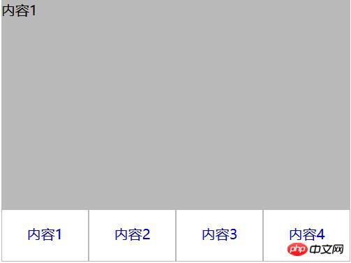
1. Separation of content and tabs
<p class="container">
   <p class="tab-content">
     <p id="item1" class="item">内容1</p>
     <p id="item2" class="item">内容2</p>
     <p id="item3" class="item">内容3</p>
     <p id="item4" class="item">内容4</p>
   </p>
   <p class="tab-control">
     <ul>
        <li><a href="#item1">内容1</a></li>
        <li><a href="#item2">内容2</a></li>
        <li><a href="#item3">内容3</a></li>
        <li><a href="#item4">内容4</a></li>
     </ul>
   </p>
</p>
ul,li{
  margin:0;
  padding:0;
  list-style:none;
}
.container{
  width:400px;
  height:300px;
  background-color:silver;
}
.tab-content{
  width:100%;
  height:80%;
  overflow:hidden;
}
.tab-content .item{
  width:100%;
  height:100%;
}
.tab-control{
  width:100%;
  height:20%;
}
.tab-control ul{
  height:100%;
}
.tab-control li{
  width:25%;
  height:100%;
  float:left;
  border:1px solid silver;
  box-sizing:border-box;
  background-color:white;
  cursor: pointer;
}
.tab-control li:hover{
  background-color:#7b7474
}
.tab-control a{
  display:inline-block;
  width:100%;
  height:100%;
  line-height:100%;
  text-align:center;
  text-decoration: none;
}
.tab-control a::after{
  content:"";
  display:inline-block;
  height:100%;
  vertical-align:middle;
}
.tab-content .item:target{
  background:yellow;
}
2. Content and tab are integrated
<p class="container">
   <ul>
     <li class="item active">
       <p class="title">1</p>
       <p class="content">1</p>
     </li>
     <li class="item">
       <p class="title">2</p>
       <p class="content ml1">2</p>
     </li>
     <li class="item">
       <p class="title">3</p>
       <p class="content ml2">3</p>
     </li>
     <li class="item">
       <p class="title">4</p>
       <p class="content ml3">4</p>
     </li>
   </ul>
</p>
ul,li,p{
  margin:0;
  padding:0;
  list-style:none;
}
.container{
  width:400px;
  height:300px;
  background-color:silver;
  border:1px solid silver;
}
.container ul{
  width:100%;
  height:100%;
  overflow:hidden;
}
.container .item{
  float:left;
  width:25%;
  height:100%;
  background-color:white;
}
.container .item .title{
  line-height:40px;
  border:1px solid silver;
  box-sizing:border-box;
  text-align:center;
  cursor:pointer;
}
.container .item .content{
  width:400%;
  height:100%;
  background-color:yellow;
}
.ml1{
  margin-left:-100%;
}
.ml2{
  margin-left:-200%;
}
.ml3{
  margin-left:-300%;
}
.active{
  position:relative;
  z-index:1
}
.container .item:hover{
  position:relative;
  z-index:1
}
.container .item:hover .title{
  border-bottom:none;
  background-color:yellow;
}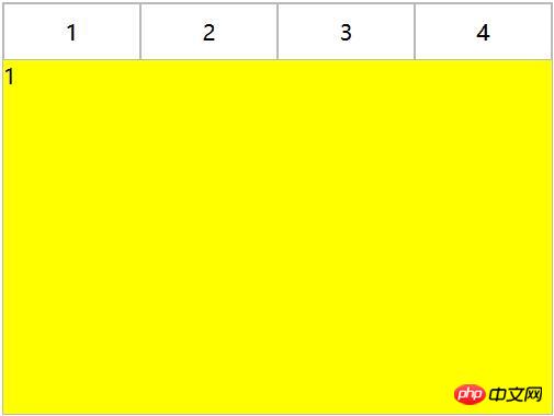
Use negative margin to align the content area, and then add a background color to the content to avoid perspective overlap of areas corresponding to different tabs.
2. CSS interaction
1. Anchor implementation (target)
(1) For layout one: items are arranged from top to bottom, and the parent element tab-content is added with overflow:hidden. Using anchor points, when you click on different a tags, the item with the corresponding ID will switch to the tab-content view, and then use hover to add a switching style to the tab button.
<p class="container">
   <p class="tab-content">
     <p id="item1" class="item">内容1</p>
     <p id="item2" class="item">内容2</p>
     <p id="item3" class="item">内容3</p>
     <p id="item4" class="item">内容4</p>
   </p>
   <p class="tab-control">
     <ul>
        <li><a href="#item1">内容1</a></li>
        <li><a href="#item2">内容2</a></li>
        <li><a href="#item3">内容3</a></li>
        <li><a href="#item4">内容4</a></li>
     </ul>
   </p>
</p>
##
ul,li{
  margin:0;
  padding:0;
  list-style:none;
}
.container{
  width:400px;
  height:300px;
  background-color:silver;
}
.tab-content{
  width:100%;
  height:80%;
  overflow:hidden;
}
.tab-content .item{
  width:100%;
  height:100%;
}
.tab-control{
  width:100%;
  height:20%;
}
.tab-control ul{
  height:100%;
}
.tab-control li{
  width:25%;
  height:100%;
  float:left;
  border:1px solid silver;
  box-sizing:border-box;
  background-color:white;
  cursor: pointer;
}
.tab-control li:hover{
  background-color:#7b7474
}
.tab-control a{
  display:inline-block;
  width:100%;
  height:100%;
  line-height:100%;
  text-align:center;
  text-decoration: none;
}
.tab-control a::after{
  content:"";
  display:inline-block;
  height:100%;
  vertical-align:middle;
}ul,li{
margin:0;
padding:0;
list-style:none;
}
.container{
width:400px;
height:300px;
background-color:silver;
}
.tab-content{
position:relative;
width:100%;
height:80%;
overflow:hidden;
}
.tab-content .item{
position:absolute;
left:0;
top:0;
width:100%;
height:100%;
}
.tab-control{
width:100%;
height:20%;
}
.tab-control ul{
height:100%;
}
.tab-control li{
width:25%;
height:100%;
float:left;
border:1px solid silver;
box-sizing:border-box;
background-color:white;
cursor: pointer;
}
.tab-control li:hover{
background-color:#7b7474
}
.tab-control a{
display:inline-block;
width:100%;
height:100%;
line-height:100%;
text-align:center;
text-decoration: none;
}
.tab-control a::after{
content:"";
display:inline-block;
height:100%;
vertical-align:middle;
}
.tab-content .item:target{
z-index:1;
background-color:yellow;
}(2) For layout two:
<p class="container">
   <ul>
     <li class="item active" id="item1">
       <p class="title"><a href="#item1">1</a></p>
       <p class="content">1</p>
     </li>
     <li class="item" id="item2">
       <p class="title"><a href="#item2">2</a></p>
       <p class="content ml1">2</p>
     </li>
     <li class="item" id="item3">
       <p class="title"><a href="#item3">3</a></p>
       <p class="content ml2">3</p>
     </li>
     <li class="item" id="item4">
       <p class="title"><a href="#item4">4</a></p>
       <p class="content ml3">4</p>
     </li>
   </ul>
</p>ul,
li,
p {
margin: 0;
padding: 0;
list-style: none;
}
.container {
width: 400px;
height: 300px;
background-color: silver;
border: 1px solid silver;
}
.container ul {
width: 100%;
height: 100%;
overflow: hidden;
}
.container .item {
float: left;
width: 25%;
height: 100%;
background-color: white;
}
.container .item .title {
line-height: 40px;
border: 1px solid silver;
box-sizing: border-box;
text-align: center;
cursor: pointer;
}
.container .item a {
display:inline-block;
width:100%;
height:100%;
text-decoration: none;
}
.container .item .content {
width: 400%;
height: 100%;
background-color: yellow;
}
.ml1 {
margin-left: -100%;
}
.ml2 {
margin-left: -200%;
}
.ml3 {
margin-left: -300%;
}
.active {
position: relative;
z-index: 1
}
.container .item:target {
position: relative;
z-index: 1
}
.container .item:target .title {
border-bottom: none;
background-color: yellow;
}2. Hover implementation
(1) For Layout 1:
cannot be achieved simply through CSS(2) For Layout 2:
<p class="container">
   <ul>
     <li class="item active">
       <p class="title">1</p>
       <p class="content">1</p>
     </li>
     <li class="item">
       <p class="title">2</p>
       <p class="content ml1">2</p>
     </li>
     <li class="item">
       <p class="title">3</p>
       <p class="content ml2">3</p>
     </li>
     <li class="item">
       <p class="title">4</p>
       <p class="content ml3">4</p>
     </li>
   </ul>
</p>ul,li,p{
margin:0;
padding:0;
list-style:none;
}
.container{
width:400px;
height:300px;
background-color:silver;
border:1px solid silver;
}
.container ul{
width:100%;
height:100%;
overflow:hidden;
}
.container .item{
float:left;
width:25%;
height:100%;
background-color:white;
}
.container .item .title{
line-height:40px;
border:1px solid silver;
box-sizing:border-box;
text-align:center;
cursor:pointer;
}
.container .item .content{
width:400%;
height:100%;
background-color:yellow;
}
.ml1{
margin-left:-100%;
}
.ml2{
margin-left:-200%;
}
.ml3{
margin-left:-300%;
}
.active{
position:relative;
z-index:1
}
.container .item:hover{
position:relative;
z-index:1
}
.container .item:hover .title{
border-bottom:none;
background-color:yellow;
}3. label and :checked implements
(1) For layout one:
<p class="container">
  <p class="tab-content">
    <input type="radio" name="item" class="radio-item" id="item1" checked/>
    <p class="item">内容1</p>
    <input type="radio" name="item" class="radio-item" id="item2" />
    <p class="item">内容2</p>
    <input type="radio" name="item" class="radio-item" id="item3" />
    <p class="item">内容3</p>
    <input type="radio" name="item" class="radio-item" id="item4" />
    <p class="item">内容4</p>
  </p>
  <p class="tab-control">
    <ul>
      <li><label for="item1">内容1</label></li>
      <li><label for="item2">内容2</label></li>
      <li><label for="item3">内容3</label></li>
      <li><label for="item4">内容4</label></li>
    </ul>
  </p>
</p>ul,
li {
margin: 0;
padding: 0;
list-style: none;
}
.container {
width: 400px;
height: 300px;
background-color: silver;
}
.tab-content {
position: relative;
width: 100%;
height: 80%;
overflow: hidden;
}
input {
margin: 0;
width: 0;
}
.tab-content .item {
position: absolute;
left: 0;
top: 0;
width: 100%;
height: 100%;
}
.tab-control {
width: 100%;
height: 20%;
}
.tab-control ul {
height: 100%;
}
.tab-control li {
width: 25%;
height: 100%;
float: left;
border: 1px solid silver;
box-sizing: border-box;
background-color: white;
}
.tab-control li:hover {
background-color: #7b7474
}
.tab-control label {
display: inline-block;
width: 100%;
height: 100%;
line-height: 100%;
text-align: center;
text-decoration: none;
cursor: pointer;
}
.tab-control label::after {
content: "";
display: inline-block;
height: 100%;
vertical-align: middle;
}
.tab-content .radio-item{
display:none;
}
.tab-content .radio-item:checked+.item {
z-index: 1;
background-color: yellow;
}(2) For layout two:
<p class="container">
   <ul>
     <li class="item active">
       <input type="radio" name="item" class="radio-item" id="item1" checked/>
       <label class="title" for="item1">1</label>
       <p class="content">1</p>
     </li>
     <li class="item">
       <input type="radio" name="item" class="radio-item" id="item2" />
       <label class="title" for="item2">2</label>
       <p class="content ml1">2</p>
     </li>
     <li class="item">
       <input type="radio" name="item" class="radio-item" id="item3" />
       <label class="title" for="item3">3</label>
       <p class="content ml2">3</p>
     </li>
     <li class="item">
       <input type="radio" name="item" class="radio-item" id="item4" />
       <label class="title" for="item4">4</label>
       <p class="content ml3">4</p>
     </li>
   </ul>
</p>
ul,li,p{
  margin:0;
  padding:0;
  list-style:none;
}
.container{
  width:400px;
  height:300px;
  background-color:silver;
  border:1px solid silver;
}
.container ul{
  width:100%;
  height:100%;
  overflow:hidden;
}
.container .item{
  float:left;
  width:25%;
  height:100%;
  background-color:white;
}
.container .item .title{
  display:inline-block;
  width:100%;
  line-height:40px;
  border:1px solid silver;
  box-sizing:border-box;
  text-align:center;
  cursor:pointer;
}
.container .item .content{
  position:relative;
  width:400%;
  height:100%;
  background-color:yellow;
}
.ml1{
  margin-left:-100%;
}
.ml2{
  margin-left:-200%;
}
.ml3{
  margin-left:-300%;
}
.radio-item{
  display:none;
}
.radio-item:checked~.title{
  background-color:yellow;
  border-bottom:none;
}
.radio-item:checked~.content{
  background-color:yellow;
  z-index:1;
}The above is the detailed content of CSS implementation of Tab layout example display. For more information, please follow other related articles on the PHP Chinese website!

Hot AI Tools

Undresser.AI Undress
AI-powered app for creating realistic nude photos

AI Clothes Remover
Online AI tool for removing clothes from photos.

Undress AI Tool
Undress images for free

Clothoff.io
AI clothes remover

Video Face Swap
Swap faces in any video effortlessly with our completely free AI face swap tool!

Hot Article
Hot Tools

Notepad++7.3.1
Easy-to-use and free code editor

SublimeText3 Chinese version
Chinese version, very easy to use

Zend Studio 13.0.1
Powerful PHP integrated development environment

Dreamweaver CS6
Visual web development tools

SublimeText3 Mac version
God-level code editing software (SublimeText3)
Hot Topics
 1663
1663
 14
1419
52
1313
25
1264
29
1237
24
14
1419
52
1313
25
1264
29
1237
24

 How to use bootstrap in vue
Apr 07, 2025 pm 11:33 PM
How to use bootstrap in vue
Apr 07, 2025 pm 11:33 PM
Using Bootstrap in Vue.js is divided into five steps: Install Bootstrap. Import Bootstrap in main.js. Use the Bootstrap component directly in the template. Optional: Custom style. Optional: Use plug-ins.
 Understanding HTML, CSS, and JavaScript: A Beginner's Guide
Apr 12, 2025 am 12:02 AM
Understanding HTML, CSS, and JavaScript: A Beginner's Guide
Apr 12, 2025 am 12:02 AM
WebdevelopmentreliesonHTML,CSS,andJavaScript:1)HTMLstructurescontent,2)CSSstylesit,and3)JavaScriptaddsinteractivity,formingthebasisofmodernwebexperiences.
 The Roles of HTML, CSS, and JavaScript: Core Responsibilities
Apr 08, 2025 pm 07:05 PM
The Roles of HTML, CSS, and JavaScript: Core Responsibilities
Apr 08, 2025 pm 07:05 PM
HTML defines the web structure, CSS is responsible for style and layout, and JavaScript gives dynamic interaction. The three perform their duties in web development and jointly build a colorful website.
 How to insert pictures on bootstrap
Apr 07, 2025 pm 03:30 PM
How to insert pictures on bootstrap
Apr 07, 2025 pm 03:30 PM
There are several ways to insert images in Bootstrap: insert images directly, using the HTML img tag. With the Bootstrap image component, you can provide responsive images and more styles. Set the image size, use the img-fluid class to make the image adaptable. Set the border, using the img-bordered class. Set the rounded corners and use the img-rounded class. Set the shadow, use the shadow class. Resize and position the image, using CSS style. Using the background image, use the background-image CSS property.
 How to write split lines on bootstrap
Apr 07, 2025 pm 03:12 PM
How to write split lines on bootstrap
Apr 07, 2025 pm 03:12 PM
There are two ways to create a Bootstrap split line: using the tag, which creates a horizontal split line. Use the CSS border property to create custom style split lines.
 How to set up the framework for bootstrap
Apr 07, 2025 pm 03:27 PM
How to set up the framework for bootstrap
Apr 07, 2025 pm 03:27 PM
To set up the Bootstrap framework, you need to follow these steps: 1. Reference the Bootstrap file via CDN; 2. Download and host the file on your own server; 3. Include the Bootstrap file in HTML; 4. Compile Sass/Less as needed; 5. Import a custom file (optional). Once setup is complete, you can use Bootstrap's grid systems, components, and styles to create responsive websites and applications.
 How to resize bootstrap
Apr 07, 2025 pm 03:18 PM
How to resize bootstrap
Apr 07, 2025 pm 03:18 PM
To adjust the size of elements in Bootstrap, you can use the dimension class, which includes: adjusting width: .col-, .w-, .mw-adjust height: .h-, .min-h-, .max-h-
 How to use bootstrap button
Apr 07, 2025 pm 03:09 PM
How to use bootstrap button
Apr 07, 2025 pm 03:09 PM
How to use the Bootstrap button? Introduce Bootstrap CSS to create button elements and add Bootstrap button class to add button text
