

Force the page to horizontal screen

Recently, the company is going to develop a mobile development web game (just click on various buttons and you will find a girlfriend in the end =. =), which requires horizontal screen display, not vertical screen.
If you have experience, you will definitely know that when the user opens the screen vertically, it is very silly to be prompted that you need to turn the phone around. At this time, if the user has not turned on the landscape mode on the phone, the user will be forced to turn it on. At this time, the user has already impatiently turned off your game.
I conducted research first to see if there was any ready-made api. After referring to screen's API and manifest method, the experimental results are of course not good.
The only solution I can think of now is to write a horizontal p in portrait mode and then turn it around.
Okay, my test page structure is as follows:
<body class="webpBack">
  <p id="print">
      <p>lol</p>
   </p>
</body>
It’s very simple, right? The final ideal state is to turn lol horizontally in a very harmonious way.
Okay, let’s take a look at the css that distinguishes horizontal and vertical screens:
@media screen and (orientation: portrait) {
      html{
         width : 100% ;
         height : 100% ;
          background-color: white ;
          overflow : hidden;
      }
      body{
          width : 100% ;
         height : 100% ;
         background-color: red ;
          overflow : hidden;
      }
      #print{
         position : absolute ;
         background-color: yellow ;
      }
}
@media screen and (orientation: landscape) {
       html{
         width : 100% ;
         height : 100% ;
         background-color: white ;
      }
       body{
          width : 100% ;
         height : 100% ;
         background-color: white ;
      }
           #print{
            position : absolute ;
            top : 0 ;
            left : 0 ;
            width : 100% ;
            height : 100% ;
            background-color: yellow ;
         }
}
#print p{
        margin: auto ;
        margin-top : 20px ;
        text-align: center;
}To put it bluntly, the print p should be turned horizontally in portrait mode and unchanged in landscape mode. So under portrait, its width and height are not defined. It will be filled in through the following js.
var width = document.documentElement.clientWidth;
var height = document.documentElement.clientHeight;
if( width < height ){
console.log(width + " " + height);
$print = $('#print');
$print.width(height);
$print.height(width);
$print.css('top', (height-width)/2 );
$print.css('left', 0-(height-width)/2 );
$print.css('transform' , 'rotate(90deg)');
$print.css('transform-origin' , '50% 50%');
}Here we first obtain the width and height of the available area on the screen, and then determine whether it is a horizontal or vertical screen based on the relationship between the width and height. If it is a portrait screen, set the width and height of the print p, align it, and then rotate it.
The final effect is as follows:
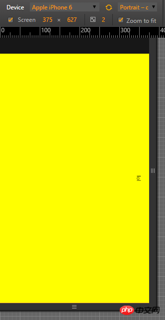
Vertical screen
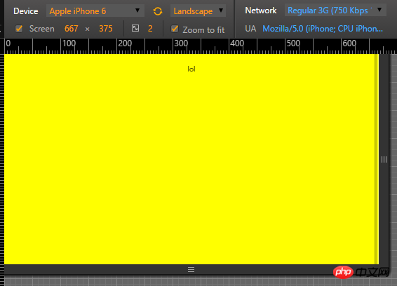
Horizontal screen
Finally, the consequence of this is that if the rotate screen button of the user's phone is turned on, then when the phone is turned sideways, it will cause a certain tragedy. The solution is as follows:
 var evt = "onorientationchange" in window ? "orientationchange" : "resize";

    window.addEventListener(evt, function() {
        console.log(evt);
        var width = document.documentElement.clientWidth;
         var height =  document.documentElement.clientHeight;
          $print =  $('#print');
         if( width > height ){

            $print.width(width);
            $print.height(height);
            $print.css('top',  0 );
            $print.css('left',  0 );
            $print.css('transform' , 'none');
            $print.css('transform-origin' , '50% 50%');
         }
         else{
            $print.width(height);
            $print.height(width);
            $print.css('top',  (height-width)/2 );
            $print.css('left',  0-(height-width)/2 );
            $print.css('transform' , 'rotate(90deg)');
            $print.css('transform-origin' , '50% 50%');
         }

    }, false);
The above is the detailed content of Force the page to horizontal screen. For more information, please follow other related articles on the PHP Chinese website!

Hot AI Tools

Undresser.AI Undress
AI-powered app for creating realistic nude photos

AI Clothes Remover
Online AI tool for removing clothes from photos.

Undress AI Tool
Undress images for free

Clothoff.io
AI clothes remover

Video Face Swap
Swap faces in any video effortlessly with our completely free AI face swap tool!

Hot Article
Hot Tools

Notepad++7.3.1
Easy-to-use and free code editor

SublimeText3 Chinese version
Chinese version, very easy to use

Zend Studio 13.0.1
Powerful PHP integrated development environment

Dreamweaver CS6
Visual web development tools

SublimeText3 Mac version
God-level code editing software (SublimeText3)
Hot Topics
 1657
1657
 14
1415
52
1309
25
1257
29
1230
24
14
1415
52
1309
25
1257
29
1230
24

 Google Fonts Variable Fonts
Apr 09, 2025 am 10:42 AM
Google Fonts Variable Fonts
Apr 09, 2025 am 10:42 AM
I see Google Fonts rolled out a new design (Tweet). Compared to the last big redesign, this feels much more iterative. I can barely tell the difference
 How to Create an Animated Countdown Timer With HTML, CSS and JavaScript
Apr 11, 2025 am 11:29 AM
How to Create an Animated Countdown Timer With HTML, CSS and JavaScript
Apr 11, 2025 am 11:29 AM
Have you ever needed a countdown timer on a project? For something like that, it might be natural to reach for a plugin, but it’s actually a lot more
 HTML Data Attributes Guide
Apr 11, 2025 am 11:50 AM
HTML Data Attributes Guide
Apr 11, 2025 am 11:50 AM
Everything you ever wanted to know about data attributes in HTML, CSS, and JavaScript.
 How We Created a Static Site That Generates Tartan Patterns in SVG
Apr 09, 2025 am 11:29 AM
How We Created a Static Site That Generates Tartan Patterns in SVG
Apr 09, 2025 am 11:29 AM
Tartan is a patterned cloth that’s typically associated with Scotland, particularly their fashionable kilts. On tartanify.com, we gathered over 5,000 tartan
 A Proof of Concept for Making Sass Faster
Apr 16, 2025 am 10:38 AM
A Proof of Concept for Making Sass Faster
Apr 16, 2025 am 10:38 AM
At the start of a new project, Sass compilation happens in the blink of an eye. This feels great, especially when it’s paired with Browsersync, which reloads
 How to Build Vue Components in a WordPress Theme
Apr 11, 2025 am 11:03 AM
How to Build Vue Components in a WordPress Theme
Apr 11, 2025 am 11:03 AM
The inline-template directive allows us to build rich Vue components as a progressive enhancement over existing WordPress markup.
 PHP is A-OK for Templating
Apr 11, 2025 am 11:04 AM
PHP is A-OK for Templating
Apr 11, 2025 am 11:04 AM
PHP templating often gets a bad rap for facilitating subpar code — but that doesn't have to be the case. Let’s look at how PHP projects can enforce a basic
 Programming Sass to Create Accessible Color Combinations
Apr 09, 2025 am 11:30 AM
Programming Sass to Create Accessible Color Combinations
Apr 09, 2025 am 11:30 AM
We are always looking to make the web more accessible. Color contrast is just math, so Sass can help cover edge cases that designers might have missed.
