A new beginning for div+css web layout design (9)
The introduction to floating is almost finished, here are some screenshots for reference

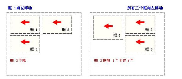
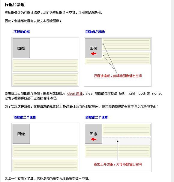
The following will introduce absolute positioning
Set to absolute positioning The element box is completely removed from the document flow and positioned relative to its containing block, which may be another element in the document or the initial containing block. The space previously occupied by the element in normal document flow is closed, as if the element did not exist. The element generates a block-level box after positioning, regardless of what type of box it originally generated in the normal flow.
Absolute positioning makes the position of the element independent of the document flow, so it does not occupy space. This is different from relative positioning, which is actually considered part of the normal flow positioning model because the element's position is relative to its position in the normal flow.
Let’s put aside the concept. Simply put
Absolute positioning means that margin and float are no longer needed for positioning, but positioning based on coordinates
Where is the starting point of the coordinates, it is the browser The point in the upper left corner
<html>
<head>
<style type="text/css">
body{
margin:0;
padding:0;
} #a{
width:500px;
height:500px;
border:solid;
margin-left:50px;
} #b{
width:100px;
height:100px;
border:soild;
background:green;
position: absolute;
left:30px;
top: 20px; } </style>
<head>
<body>
<div id="a">
<div id="b"></div> </div>
</body>
</html>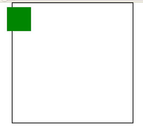
But what happens if the parent div also defines absolute positioning or relative positioning?
<html>
<head>
<style type="text/css">
body{
margin:0;
padding:0;
} #a{
width:500px;
height:500px;
border:solid;
margin-left:50px;
position: absolute;
} #b{
width:100px;
height:100px;
border:soild;
background:green;
position: absolute;
left:30px;
top: 20px; } </style>
<head>
<body>
<div id="a">
<div id="b"></div> </div>
</body>
</html>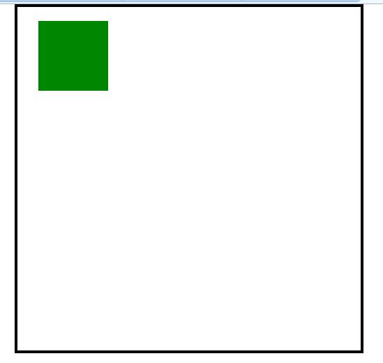
In other words, if an absolute definition is It makes no sense for a positioned layer to be contained by a non-absolute or relatively positioned layer. It is equivalent to a completely independent div and is not constrained by non-absolute or relatively positioned layers.
In fact, absolute positioning is better than absolute positioning Margin positioning is much more fun. Margin positioning needs to use the surrounding divs as reference objects, while absolute positioning only needs to adjust the coordinates according to the upper left corner.
Absolute positioning is separated from the text flow. It can go to any area, even that area. There is already a div occupying it
<html>
<head>
<style type="text/css">
body{
margin:0;
padding:0;
} #a{
width:500px;
height:500px;
border:solid;
margin-left:50px;
position: relative; } #b{
width:100px;
height:100px;
border:soild;
background:green;
position: absolute;
left:30px;
top: 20px; } #c{
width:100px;
height:100px;
border:soild;
background:red; } </style>
<head>
<body>
<div id="a">
<div id="c"></div>
<div id="b"></div> </div>
</body>
</html>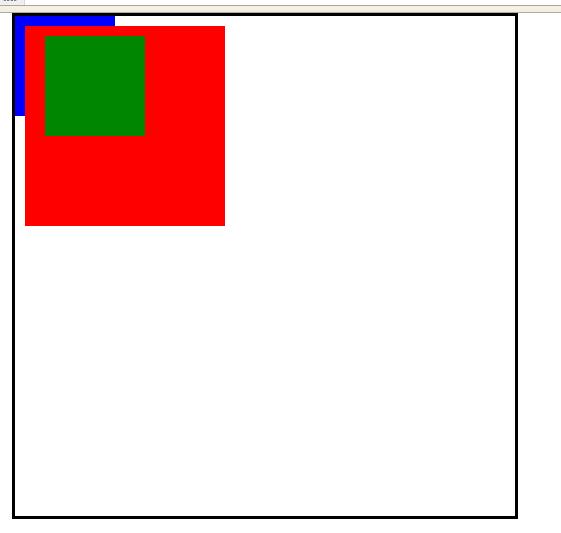
So will it also cover the floating div?
<html>
<head>
<style type="text/css">
body{
margin:0;
padding:0;
} #a{
width:500px;
height:500px;
border:solid;
margin-left:50px;
position: relative; } #b{
width:100px;
height:100px;
border:soild;
background:green;
position: absolute;
left:30px;
top: 20px; } #c{
width:200px;
height:200px;
border:soild;
background:red;
float:left;
margin:10px;
}
#d{
width:100px;
height:100px;
border:soild;
background:blue; } </style>
<head>
<body>
<div id="a">
<div id="c"></div>
<div id="d"></div>
<div id="b"></div> </div>
</body>
</html>
It can be seen that the absolutely positioned div is at the highest level and can cover all
That is to say, ordinary divs follow the flow pattern on the ground.
Floating divs follow the flow pattern in the air. One is an airplane on the ground and the other is an airplane in the air.
Then the absolutely positioned div is equivalent to an airship. It flies higher than an airplane and can move freely
Now let’s see what happens when two absolutely positioned divs meet together
<html>
<head>
<style type="text/css">
body{
margin:0;
padding:0;
} #a{
width:500px;
height:500px;
border:solid;
margin-left:50px;
position: relative; } #b{
width:100px;
height:100px;
border:soild;
background:green;
position: absolute;
left:30px;
top: 20px; } #c{
width:100px;
height:100px;
border:soild;
background:red;
position: absolute;
left:60px;
top: 20px;
}
</style>
<head>
<body>
<div id="a">
<div id="c"></div>
<div id="b"></div> </div>
</body>
</html>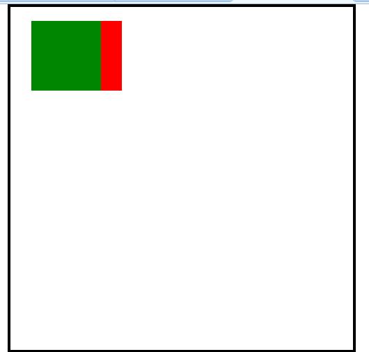
They treat each other as if they do not exist, and do not care which area is occupied
Why is it green? Covering red, not red covering green?
Because here
Because the red div is in front, Green comes last, and the web page is parsed from top to bottom, left to right, so when the red div appears first, the green will cover it
In short, the farther back the absolutely positioned div is, the farther it flies. High, it can cover the previous absolutely positioned div
If you turn these two around, you will find that the red covers the green
Another way is to use the z-index attribute, The higher the z-index level, the higher it will fly. If not set, it will default to 0
<html>
<head>
<style type="text/css">
body{
margin:0;
padding:0;
} #a{
width:500px;
height:500px;
border:solid;
margin-left:50px;
position: relative; } #b{
width:100px;
height:100px;
border:soild;
background:green;
position: absolute;
left:30px;
top: 20px; } #c{
width:100px;
height:100px;
border:soild;
background:red;
position: absolute;
left:60px;
top: 20px;
z-index:1;
}
</style>
<head>
<body>
<div id="a">
<div id="c"></div>
<div id="b"></div> </div>
</body>
</html>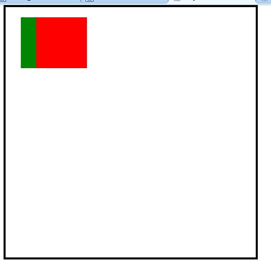

Hot AI Tools

Undresser.AI Undress
AI-powered app for creating realistic nude photos

AI Clothes Remover
Online AI tool for removing clothes from photos.

Undress AI Tool
Undress images for free

Clothoff.io
AI clothes remover

Video Face Swap
Swap faces in any video effortlessly with our completely free AI face swap tool!

Hot Article

Hot Tools

Notepad++7.3.1
Easy-to-use and free code editor

SublimeText3 Chinese version
Chinese version, very easy to use

Zend Studio 13.0.1
Powerful PHP integrated development environment

Dreamweaver CS6
Visual web development tools

SublimeText3 Mac version
God-level code editing software (SublimeText3)

Hot Topics
 Vue 3
Apr 02, 2025 pm 06:32 PM
It's out! Congrats to the Vue team for getting it done, I know it was a massive effort and a long time coming. All new docs, as well.
 Can you get valid CSS property values from the browser?
Apr 02, 2025 pm 06:17 PM
I had someone write in with this very legit question. Lea just blogged about how you can get valid CSS properties themselves from the browser. That's like this.
 A bit on ci/cd
Apr 02, 2025 pm 06:21 PM
I'd say "website" fits better than "mobile app" but I like this framing from Max Lynch:
 Stacked Cards with Sticky Positioning and a Dash of Sass
Apr 03, 2025 am 10:30 AM
The other day, I spotted this particularly lovely bit from Corey Ginnivan’s website where a collection of cards stack on top of one another as you scroll.
 Using Markdown and Localization in the WordPress Block Editor
Apr 02, 2025 am 04:27 AM
If we need to show documentation to the user directly in the WordPress editor, what is the best way to do it?
 Comparing Browsers for Responsive Design
Apr 02, 2025 pm 06:25 PM
There are a number of these desktop apps where the goal is showing your site at different dimensions all at the same time. So you can, for example, be writing
 How to Use CSS Grid for Sticky Headers and Footers
Apr 02, 2025 pm 06:29 PM
CSS Grid is a collection of properties designed to make layout easier than it’s ever been. Like anything, there's a bit of a learning curve, but Grid is
 Why are the purple slashed areas in the Flex layout mistakenly considered 'overflow space'?
Apr 05, 2025 pm 05:51 PM
Questions about purple slash areas in Flex layouts When using Flex layouts, you may encounter some confusing phenomena, such as in the developer tools (d...


