简介
此样式基于bootstrap-3.3.0,样式文件里的源码行数都是指的这个版本.CSS源文件放到了Content文件夹下的bootstrap.css
WPF样式和CSS还是不太相同,所以有些内容实现上稍有出入,有些内容用法不太一样,有些内容并没有实现
但至少,一些概念,尺寸和取色,还是很好的借鉴
博客说明按Bootstrap官方文档的顺序来写
App.xaml里引用Bootstrap.xaml资源
<Application.Resources>
<ResourceDictionary>
<ResourceDictionary.MergedDictionaries>
<ResourceDictionary Source="pack://application:,,,/BootstrapWpfStyle;component/Styles/Bootstrap.xaml"/>
</ResourceDictionary.MergedDictionaries>
</ResourceDictionary>
</Application.Resources>
排版
标题
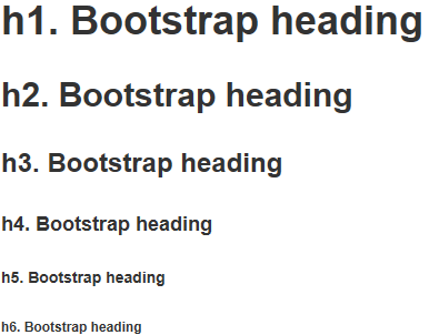
<Label>样式 h1到h6
效果
代码
<Label Content="h1. Bootstrap heading" Style="{DynamicResource h1}"></Label>
<Label Content="h2. Bootstrap heading" Style="{DynamicResource h2}"></Label>
<Label Content="h3. Bootstrap heading" Style="{DynamicResource h3}"></Label>
<Label Content="h4. Bootstrap heading" Style="{DynamicResource h4}"></Label>
<Label Content="h5. Bootstrap heading" Style="{DynamicResource h5}"></Label>
<Label Content="h6. Bootstrap heading" Style="{DynamicResource h6}"></Label>
副标题
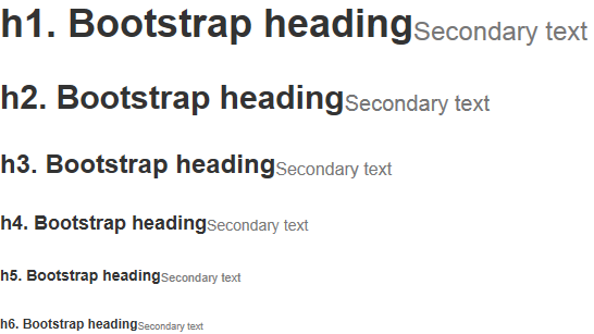
<Label>样式 h1 small到h6 small.使用时 和标题放到一个<StackPanel>里 方便对齐
效果
代码
<StackPanel Orientation="Horizontal">
<Label Content="h1. Bootstrap heading" Style="{DynamicResource h1}"></Label>
<Label Content="Secondary text" Style="{DynamicResource h1 small}"></Label>
</StackPanel>
<StackPanel Orientation="Horizontal">
<Label Content="h2. Bootstrap heading" Style="{DynamicResource h2}"></Label>
<Label Content="Secondary text" Style="{DynamicResource h2 small}"></Label>
</StackPanel>
<StackPanel Orientation="Horizontal">
<Label Content="h3. Bootstrap heading" Style="{DynamicResource h3}"></Label>
<Label Content="Secondary text" Style="{DynamicResource h3 small}"></Label>
</StackPanel>
<StackPanel Orientation="Horizontal">
<Label Content="h4. Bootstrap heading" Style="{DynamicResource h4}"></Label>
<Label Content="Secondary text" Style="{DynamicResource h4 small}"></Label>
</StackPanel>
<StackPanel Orientation="Horizontal">
<Label Content="h5. Bootstrap heading" Style="{DynamicResource h5}"></Label>
<Label Content="Secondary text" Style="{DynamicResource h5 small}"></Label>
</StackPanel>
<StackPanel Orientation="Horizontal">
<Label Content="h6. Bootstrap heading" Style="{DynamicResource h6}"></Label>
<Label Content="Secondary text" Style="{DynamicResource h6 small}"></Label>
</StackPanel>
代码
内联代码
<Label>样式 code.使用时 和其他<Label>放到一个<StackPanel>里
效果

代码
<StackPanel Orientation="Horizontal">
<Label Content="内联代码:For example, "></Label>
<Label Content="<section>" Style="{DynamicResource code}"></Label>
<Label Content=" should be wrapped as inline."></Label>
</StackPanel>
用户输入
<Label>样式 kbd.使用时 和其他<Label>放到一个<StackPanel>里
效果

代码
<StackPanel Orientation="Horizontal">
<Label Content="用户输入:To edit settings, press "></Label>
<Label Content="ctrl + ," Style="{DynamicResource kbd}"></Label>
</StackPanel>
代码块
<Label>样式 pre
效果

代码
<Label xml:space="preserve" Style="{DynamicResource pre}">代码块:
Foreground:#333
Background:#f5f5f5
BorderBrush:#ccc</Label>
辅助文本
<Label>样式 help-block.注:辅助文本在Bootstrap表单样式里,原本的解释:针对表单控件的“块(block)”级辅助文本.我并没有建一个表单窗体,所以就写在了这里
效果

代码
<Label Content="辅助文本:上面为代码块" Style="{DynamicResource help-block}"></Label>
表格
<DataGrid>样式 默认就这一组样式,不用引用
代码
<DataGrid AutoGenerateColumns="False" DataContext="{Binding Source={StaticResource SampleDataSource}}" ItemsSource="{Binding Collection}">
<DataGrid.Columns>
<DataGridTextColumn Binding="{Binding Property1}" Header="Property1" ElementStyle="{StaticResource DataGridTextCenter}"/>
<DataGridTextColumn Binding="{Binding Property2}" Header="Property2" ElementStyle="{StaticResource DataGridTextCenter}"/>
<DataGridTextColumn Binding="{Binding Property3}" Header="Property3" ElementStyle="{StaticResource DataGridTextCenter}"/>
</DataGrid.Columns>
</DataGrid>
表单
WPF没有表单的概念,所以说明就不按官方文档的顺序了
文本输入框
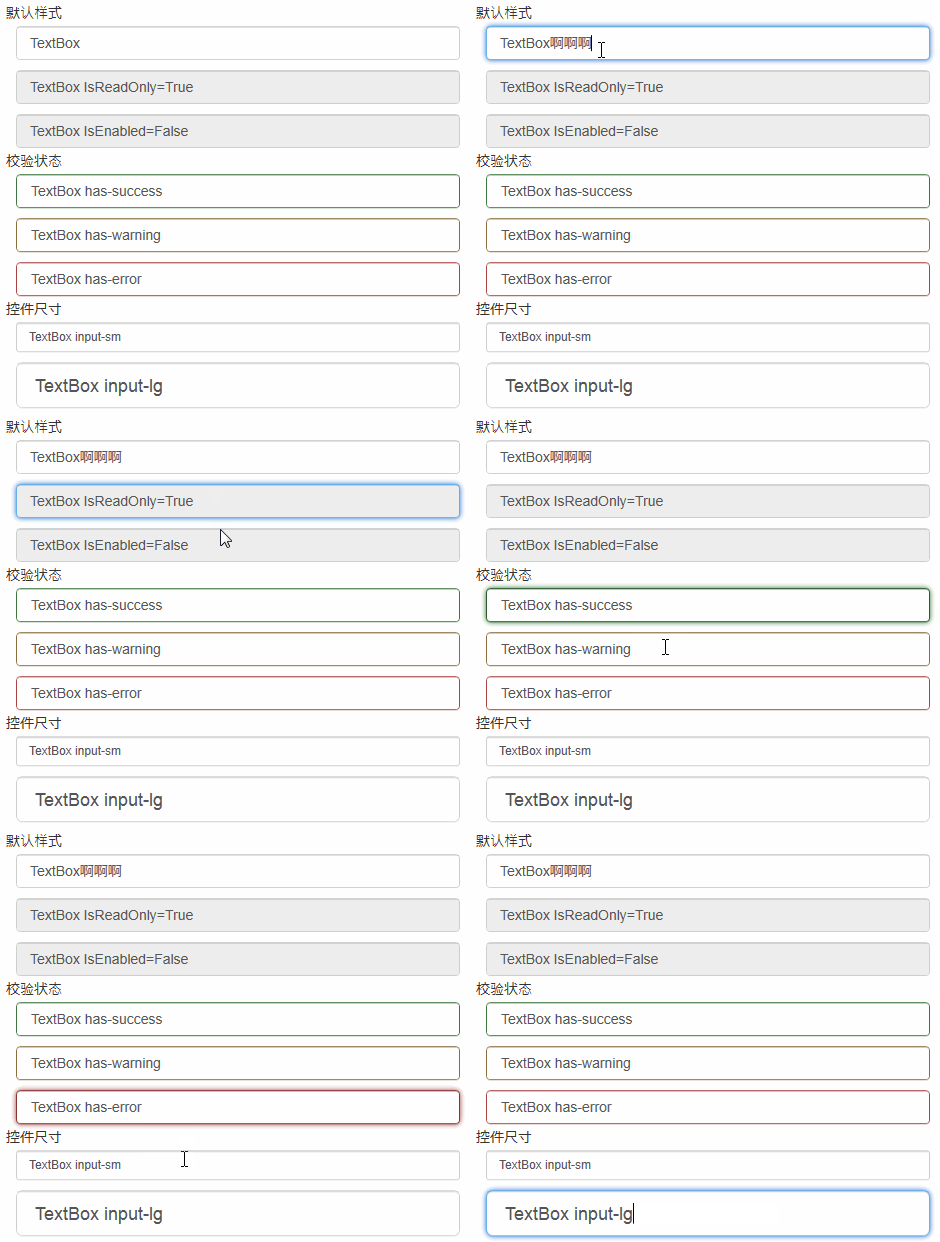
<TextBox>样式 控件尺寸只支持默认样式
效果
密码框
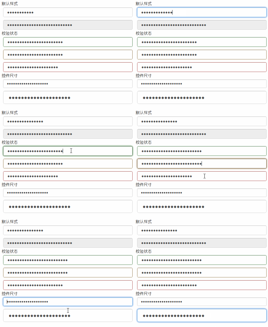
<PasswordBox>样式 控件尺寸只支持默认样式
效果
代码
<PasswordBox Password="PasswordBox"/>
<PasswordBox Password="PasswordBox IsEnabled=False" IsEnabled="False"/>
<PasswordBox Password="PasswordBox has-success" Style="{StaticResource has-success}"/>
<PasswordBox Password="PasswordBox has-warning" Style="{StaticResource has-warning}"/>
<PasswordBox Password="PasswordBox has-error" Style="{StaticResource has-error}"/>
<PasswordBox Password="PasswordBox input-sm" Style="{StaticResource input-sm}"/>
<PasswordBox Password="PasswordBox input-lg" Style="{StaticResource input-lg}"/>
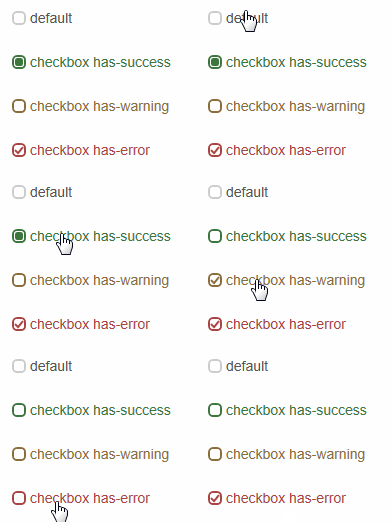
<CheckBox>样式 checkbox 和Bootstrap有些不同 自己写的样式
效果
代码
<CheckBox Content="default"></CheckBox>
<CheckBox Content="checkbox has-success" Style="{DynamicResource checkbox has-success}" IsChecked="{x:Null}"></CheckBox>
<CheckBox Content="checkbox has-warning" Style="{DynamicResource checkbox has-warning}" IsChecked="False"></CheckBox>
<CheckBox Content="checkbox has-error" Style="{DynamicResource checkbox has-error}" IsChecked="True"></CheckBox>
单选框
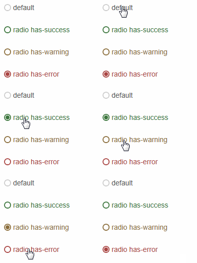
<RadioButton>样式 radio 和Bootstrap有些不同 自己写的样式
效果
代码
<RadioButton Content="default"></RadioButton>
<RadioButton Content="radio has-success" Style="{DynamicResource radio has-success}"></RadioButton>
<RadioButton Content="radio has-warning" Style="{DynamicResource radio has-warning}"></RadioButton>
<RadioButton Content="radio has-error" Style="{DynamicResource radio has-error}" IsChecked="True"></RadioButton>
下拉框
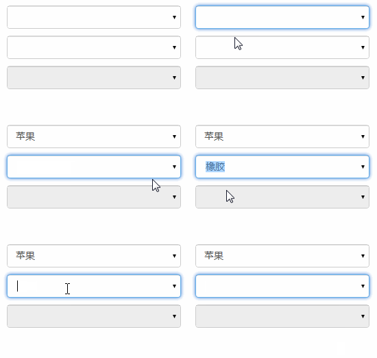
<ComboBox>样式 默认就这一组样式,不用引用 gif截图的原因,看不到下拉
效果
代码
<ComboBox>
<ComboBoxItem>苹果</ComboBoxItem>
<ComboBoxItem>橡胶</ComboBoxItem>
<ComboBoxItem>桔子</ComboBoxItem>
</ComboBox>
<ComboBox IsEditable="True">
<ComboBoxItem>苹果</ComboBoxItem>
<ComboBoxItem>橡胶</ComboBoxItem>
<ComboBoxItem>桔子</ComboBoxItem>
</ComboBox>
<ComboBox IsEnabled="False">
<ComboBoxItem>苹果</ComboBoxItem>
<ComboBoxItem>橡胶</ComboBoxItem>
<ComboBoxItem>桔子</ComboBoxItem>
</ComboBox>
按钮
<Button>样式 btn
代码
<Button Content="default"></Button>
<Button Content="primary" Style="{DynamicResource btn-primary}"></Button>
<Button Content="success" Style="{DynamicResource btn-success}"></Button>
<Button Content="info" Style="{DynamicResource btn-info}"></Button>
<Button Content="warning" Style="{DynamicResource btn-warning}"></Button>
<Button Content="danger" Style="{DynamicResource btn-danger}"></Button>
切换按钮
<ToggleButton>样式 tbtn.Bootstrap中没有切换按钮,这里做成和按钮一样,按下去的效果就是按钮<Button>点击的效果
效果

代码
<ToggleButton Content="default"></ToggleButton>
<ToggleButton Content="primary" Style="{DynamicResource tbtn-primary}"></ToggleButton>
<ToggleButton Content="success" Style="{DynamicResource tbtn-success}"></ToggleButton>
<ToggleButton Content="info" Style="{DynamicResource tbtn-info}"></ToggleButton>
<ToggleButton Content="warning" Style="{DynamicResource tbtn-warning}"></ToggleButton>
<ToggleButton Content="danger" Style="{DynamicResource tbtn-danger}"></ToggleButton>
辅助类
Contextual colors
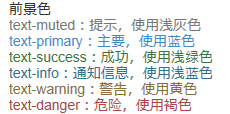
<Label>样式 text 语境
效果
代码
<Label Content="text-muted:提示,使用浅灰色" Style="{DynamicResource text-muted}"></Label>
<Label Content="text-primary:主要,使用蓝色" Style="{DynamicResource text-primary}"></Label>
<Label Content="text-success:成功,使用浅绿色" Style="{DynamicResource text-success}"></Label>
<Label Content="text-info:通知信息,使用浅蓝色" Style="{DynamicResource text-info}"></Label>
<Label Content="text-warning:警告,使用黄色" Style="{DynamicResource text-warning}"></Label>
<Label Content="text-danger:危险,使用褐色" Style="{DynamicResource text-danger}"></Label>
Contextual backgrounds
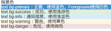
<Label>样式 text bg 语境
效果
代码
<Label Content="text bg-primary:主要,使用蓝色,Foreground使用白色" Style="{DynamicResource text bg-primary}"></Label>
<Label Content="text bg-success:成功,使用浅绿色" Style="{DynamicResource text bg-success}"></Label>
<Label Content="text bg-info:通知信息,使用浅蓝色" Style="{DynamicResource text bg-info}"></Label>
<Label Content="text bg-warning:警告,使用黄色" Style="{DynamicResource text bg-warning}"></Label>
<Label Content="text bg-danger:危险,使用褐色" Style="{DynamicResource text bg-danger}"></Label>
输入框组
插件
<TextBox>样式 input-group-addon 输入框里带个<Label>,其实并不是插件,addon这个单词,使用百度翻译,翻译成插件.<Label>里显示的内容绑定到Tag属性
效果

代码
<TextBox Text="左边带插件的输入组" Tag="@" Style="{DynamicResource input-group-addon left}"></TextBox>
<TextBox Text="右边带插件的输入组" Tag=".00" Style="{DynamicResource input-group-addon right}"></TextBox>
作为额外元素的按钮
<TextBox>样式 input-group-btn 输入框里带个<Button>,<Button>里显示的内容绑定到Tag属性
效果

代码
xmal代码:
<TextBox Text="左边带按钮的输入组" Tag="GO!" Style="{DynamicResource input-group-btn left}" Button.Click="InputGroupButton_Click"></TextBox>
<TextBox Text="右边带按钮的输入组" Style="{DynamicResource input-group-btn right}" Button.Click="InputGroupButton_Click">
<TextBox.Tag>
<Path Style="{DynamicResource InputGroupPathStyle}" Data="{DynamicResource PathDataSearch}"></Path>
</TextBox.Tag>
</TextBox>
后台代码C#:
private void InputGroupButton_Click(object sender, RoutedEventArgs e)
{
MessageBox.Show(((TextBox)sender).Text);
}
进度条
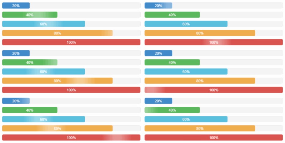
<ProgressBar>样式 progress-bar
效果
代码
<ProgressBar Value="20" Style="{DynamicResource progress-bar}"></ProgressBar>
<ProgressBar Value="40" Style="{DynamicResource progress-bar-success}"></ProgressBar>
<ProgressBar Value="60" Style="{DynamicResource progress-bar-info}"></ProgressBar>
<ProgressBar Value="80" Style="{DynamicResource progress-bar-warning}"></ProgressBar>
<ProgressBar Value="100" Style="{DynamicResource progress-bar-danger}"></ProgressBar>
面板
<ContentControl>样式 panel
基本实例
效果

代码
<ContentControl Style="{StaticResource panel-default}">
<ContentControl Style="{StaticResource panel-body}" Content="内容 Padding=15"/>
</ContentControl>
带标题的面版
效果

代码
<ContentControl Style="{StaticResource panel-default}">
<StackPanel>
<ContentControl Style="{StaticResource panel-heading-default}" Content="标题 Padding=15,10"/>
<ContentControl Style="{StaticResource panel-body}" Content="内容"/>
</StackPanel>
</ContentControl>
带脚注的面版
效果

代码
<ContentControl Style="{StaticResource panel-default}">
<StackPanel>
<ContentControl Style="{StaticResource panel-body}" Content="内容"/>
<ContentControl Style="{StaticResource panel-footer-default}" Content="脚标 Padding=15,10"/>
</StackPanel>
</ContentControl>
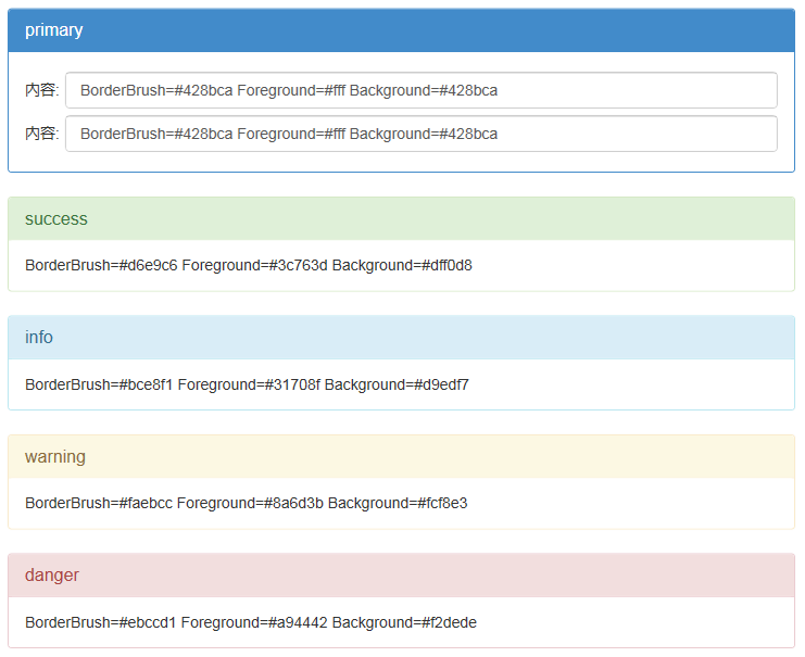
情境效果
效果
代码
<ContentControl Style="{StaticResource panel-primary}">
<StackPanel>
<ContentControl Style="{StaticResource panel-heading-primary}" Content="primary"/>
<ContentControl Style="{StaticResource panel-body}">
<ContentControl.Content>
<Grid>
<Grid.ColumnDefinitions>
<ColumnDefinition Width="auto"></ColumnDefinition>
<ColumnDefinition></ColumnDefinition>
</Grid.ColumnDefinitions>
<Grid.RowDefinitions>
<RowDefinition Height="40"></RowDefinition>
<RowDefinition Height="40"></RowDefinition>
</Grid.RowDefinitions>
<Label Grid.Column="0" Grid.Row="0" Content="内容:" VerticalAlignment="Center"></Label>
<TextBox Grid.Column="1" Grid.Row="0" Margin="5,0,0,0" Text="BorderBrush=#428bca Foreground=#fff Background=#428bca"></TextBox>
<Label Grid.Column="0" Grid.Row="1" Content="内容:" VerticalAlignment="Center"></Label>
<TextBox Grid.Column="1" Grid.Row="1" Margin="5,0,0,0" Text="BorderBrush=#428bca Foreground=#fff Background=#428bca"></TextBox>
</Grid>
</ContentControl.Content>
</ContentControl>
</StackPanel>
</ContentControl>
<ContentControl Style="{StaticResource panel-success}">
<StackPanel>
<ContentControl Style="{StaticResource panel-heading-success}" Content="success"/>
<ContentControl Style="{StaticResource panel-body}" Content="BorderBrush=#d6e9c6 Foreground=#3c763d Background=#dff0d8"/>
</StackPanel>
</ContentControl>
<ContentControl Style="{StaticResource panel-info}">
<StackPanel>
<ContentControl Style="{StaticResource panel-heading-info}" Content="info"/>
<ContentControl Style="{StaticResource panel-body}" Content="BorderBrush=#bce8f1 Foreground=#31708f Background=#d9edf7"/>
</StackPanel>
</ContentControl>
<ContentControl Style="{StaticResource panel-warning}">
<StackPanel>
<ContentControl Style="{StaticResource panel-heading-warning}" Content="warning"/>
<ContentControl Style="{StaticResource panel-body}" Content="BorderBrush=#faebcc Foreground=#8a6d3b Background=#fcf8e3"/>
</StackPanel>
</ContentControl>
<ContentControl Style="{StaticResource panel-danger}">
<StackPanel>
<ContentControl Style="{StaticResource panel-heading-danger}" Content="danger"/>
<ContentControl Style="{StaticResource panel-body}" Content="BorderBrush=#ebccd1 Foreground=#a94442 Background=#f2dede"/>
</StackPanel>
</ContentControl>
更多Bootstrap风格的WPF样式相关文章请关注PHP中文网!