







如何用 Flex 布局实现水平时间轴
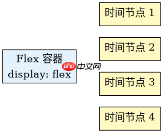
使用 display: flex 结合 flex-direction: row 和 justify-content: space-between 即可快速构建水平时间轴。核心做法是创建一个容器,内部放置多个代表时间节点的元素,通过弹性盒子的对齐属性自动分配空间,无需计算具体像素值。
如何添加连接线和节点样式
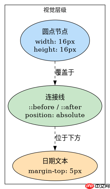
在基础布局之上,利用伪元素 ::before 或 ::after 绘制连接线,并通过绝对定位将圆形节点置于线条中央。这种方法保持了 DOM 结构的扁平化,同时实现了视觉上的连贯性。
当节点数量超过容器宽度时如何处理
当节点数量较多导致溢出时,默认行为是换行或溢出隐藏。可通过设置 flex-wrap: nowrap 配合 overflow-x: auto 实现横向滚动,或者调整 gap 间距以适应屏幕。以下代码展示了完整的实现方案及不同场景下的表现。
立即学习“前端免费学习笔记(深入)”;

Lightning CSS 是由 Parcel 团队开发的基于 Rust 的 CSS 解析器、转换器、打包工具和压缩工具。此技能适用于需要优化样式表、为目标浏览器降低现代 CSS 语法以及将快速 CSS 处理集成到构建或重构工作流中的代理。
以下是构建水平时间轴的完整 HTML 和 CSS 代码。该示例创建了一个包含四个时间节点的容器,每个节点包含一个日期标签和一个状态指示器。
.timeline-container {
  display: flex;
  justify-content: space-between;
  align-items: center;
  padding: 20px;
  background-color: #f5f5f5;
  border-radius: 8px;
}

.timeline-item {
  position: relative;
  text-align: center;
  flex: 1;
}

.timeline-dot {
  width: 16px;
  height: 16px;
  background-color: #007bff;
  border-radius: 50%;
  margin: 0 auto 10px;
  position: relative;
  z-index: 2;
}

.timeline-line {
  position: absolute;
  top: 8px; /* Half of dot height */
  left: 50%;
  width: 100%;
  height: 2px;
  background-color: #ddd;
  z-index: 1;
}

/* Remove line from the last item */
.timeline-item:last-child .timeline-line {
  display: none;
}

/* Add line to the right half of each item except the last */
.timeline-item:not(:last-child) .timeline-line {
  width: 100%;
  left: 0;
}

/* Adjust for centered alignment */
.timeline-item {
  display: flex;
  flex-direction: column;
  align-items: center;
}

.timeline-date {
  font-size: 14px;
  color: #333;
  margin-top: 5px;
}
预期结果:页面渲染出一个灰色背景的圆角矩形容器,内部均匀分布着四个蓝色圆点,圆点之间由浅灰色细线连接,每个圆点下方显示对应的日期文本。若容器宽度不足,由于未设置 flex-wrap,节点会保持在一行,可能导致内容重叠或需要父级设置 overflow-x: auto 来支持滚动。
上述代码中,.timeline-line 的定位逻辑是关键。每个 .timeline-item 内部的线条从左侧边缘延伸到右侧边缘,但由于 .timeline-item 本身占据均等空间,视觉上线条正好连接相邻的圆点中心。最后一个元素的线条被隐藏,避免向右延伸出无效区域。
如果需要在移动端适配,可以修改 .timeline-container 的样式,添加 flex-wrap: wrap 并调整 gap,使节点在窄屏下自动换行排列,从而提升可读性。