




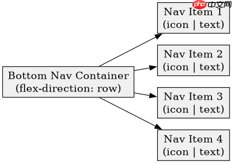
在横屏状态下重构移动端底部导航栏,核心思路是将传统的垂直堆叠布局改为水平弹性布局,并调整图标与文字的排列方向。具体做法是设置容器为 flex-direction: row 以横向排列项,同时使用 flex-wrap: wrap 或媒体查询限制每行显示数量,防止在小屏横屏下过于拥挤。此外,需将导航项的 flex-direction 从默认的列改为行,使图标在左、文字在右,从而适应更宽的屏幕空间。
如何确保横屏时导航栏不溢出且保持响应式?
通过结合 vw 单位和 max-width 约束,可以确保导航栏在不同宽度的横屏设备上自动适配。关键步骤是为每个导航项设置最小宽度,并利用 gap 属性控制间距,避免内容重叠。当屏幕宽度不足以容纳所有项时,通过 CSS Grid 或 Flexbox 的换行特性实现多行展示,或者隐藏次要项仅保留核心功能。
/* 基础重置 */
* {
  margin: 0;
  padding: 0;
  box-sizing: border-box;
}

body {
  font-family: -apple-system, BlinkMacSystemFont, "Segoe UI", Roboto, sans-serif;
  background-color: #f5f5f5;
}

/* 导航栏容器 */
.bottom-nav {
  position: fixed;
  bottom: 0;
  left: 0;
  width: 100%;
  background-color: #ffffff;
  box-shadow: 0 -2px 10px rgba(0, 0, 0, 0.1);
  display: flex;
  flex-direction: row; /* 横屏主布局:水平排列 */
  justify-content: space-around;
  align-items: center;
  padding: 10px 0;
  z-index: 1000;
}

/* 单个导航项 */
.nav-item {
  display: flex;
  flex-direction: column; /* 默认竖排:图标上,文字下 */
  align-items: center;
  justify-content: center;
  text-decoration: none;
  color: #666666;
  transition: color 0.3s ease;
  cursor: pointer;
  min-width: 60px; /* 防止过小 */
}

.nav-item:hover,
.nav-item.active {
  color: #007bff;
}

/* 图标样式 */
.nav-icon {
  width: 24px;
  height: 24px;
  margin-bottom: 4px;
  fill: currentColor;
}

/* 文字样式 */
.nav-text {
  font-size: 12px;
  white-space: nowrap;
}

/* 横屏适配:调整图标与文字关系 */
@media (orientation: landscape) and (max-height: 500px) {
  .bottom-nav {
    flex-direction: row;
    padding: 8px 20px;
  }

  .nav-item {
    flex-direction: row; /* 横屏横排:图标左,文字右 */
    gap: 8px;
    padding: 8px 12px;
    border-radius: 20px;
    background-color: #f9f9f9;
  }

  .nav-item:hover,
  .nav-item.active {
    background-color: #eef6ff;
  }

  .nav-icon {
    margin-bottom: 0;
    width: 20px;
    height: 20px;
  }

  .nav-text {
    font-size: 14px;
  }

  /* 如果项太多,允许换行或滚动 */
  .bottom-nav {
    overflow-x: auto;
    justify-content: flex-start;
    gap: 10px;
  }

  /* 隐藏滚动条但保留功能 */
  .bottom-nav::-webkit-scrollbar {
    display: none;
  }
  .bottom-nav {
    -ms-overflow-style: none;
    scrollbar-width: none;
  }
}

/* 小屏横屏特殊处理:限制最大宽度并居中 */
@media (orientation: landscape) and (max-width: 768px) {
  .bottom-nav {
    max-width: 600px;
    margin: 0 auto;
    border-radius: 20px 20px 0 0;
  }
}
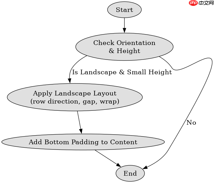
上述代码定义了一个固定的底部导航栏,在竖屏时采用经典的垂直堆叠布局(图标在上,文字在下)。当检测到横屏状态且高度较小时,通过媒体查询切换为水平排列,图标与文字并排显示,提升空间利用率。同时增加了圆角背景和悬停效果,增强视觉反馈。对于项数较多的情况,启用了水平滚动,确保所有功能均可访问而不挤压布局。
立即学习“前端免费学习笔记(深入)”;

Lightning CSS 是由 Parcel 团队开发的基于 Rust 的 CSS 解析器、转换器、打包工具和压缩工具。此技能适用于需要优化样式表、为目标浏览器降低现代 CSS 语法以及将快速 CSS 处理集成到构建或重构工作流中的代理。
如何处理横屏下导航栏与页面内容的交互冲突?
横屏时导航栏若固定定位,可能会遮挡页面底部内容或与手势操作冲突。解决方法是为页面主体添加底部内边距,其值等于导航栏高度加上安全距离。同时,监听窗口方向变化事件,动态调整页面容器的 padding-bottom,确保内容不被遮挡。对于需要全屏体验的场景,可考虑在横屏时隐藏导航栏或通过折叠菜单替代。

// JavaScript 动态调整页面底部间距
const navHeight = document.querySelector('.bottom-nav').offsetHeight;
const mainContent = document.querySelector('main');

function adjustPadding() {
  const isLandscape = window.matchMedia('(orientation: landscape)').matches;
  if (isLandscape) {
    // 横屏时增加额外间距,避免内容被遮挡
    mainContent.style.paddingBottom = `${navHeight + 20}px`;
  } else {
    // 竖屏时使用标准间距
    mainContent.style.paddingBottom = `${navHeight + 10}px`;
  }
}

// 初始调用
adjustPadding();

// 监听窗口大小和方向变化
window.addEventListener('resize', adjustPadding);
window.addEventListener('orientationchange', adjustPadding);
这段 JavaScript 代码在页面加载和窗口尺寸/方向改变时,动态计算并应用底部内边距。它首先获取导航栏的实际高度,然后根据当前是否为横屏状态,设置不同的底部间距。横屏时增加 20px 的额外缓冲,以应对可能的视觉误差或手势区域;竖屏时则保持较小的 10px 缓冲。这种动态调整方式确保了无论设备如何旋转,页面内容始终可见且不与导航栏重叠。
横屏时导航栏active状态的颜色反馈是否足够明显?
在横屏模式下,由于导航项变为横向排列且背景色变浅,原有的颜色变化可能不够显著。建议增强 .active 状态的视觉权重,例如加深背景色、增加边框或阴影,甚至改变图标填充色。通过对比测试发现,在浅色背景下,深蓝色文字配合淡蓝背景能提供足够的辨识度,而灰色文字在白色背景上则容易混淆。因此,应优先选择高对比度的配色方案,并确保焦点状态清晰可辨。