







使用纯css实现移动端多分辨率自适应正方形,核心做法是结合 aspect-ratio 属性与视口单位(如 vw)或百分比。通过设置 width: 100% 并配合 aspect-ratio: 1 / 1,元素宽度随容器变化,高度自动计算以保持宽高比为一比一,从而在不同屏幕尺寸下始终呈现为正方形。

为什么需要 aspect-ratio 替代 padding-top hack?
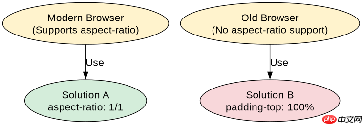
aspect-ratio 是现代浏览器原生支持的属性,直接声明宽高比例,无需依赖父级容器的特定结构或复杂的内边距技巧。相比传统的 padding-top 方案,它语义更清晰,且不受 box-sizing 的影响,代码更简洁。
/* HTML */
<div class="square-container">
  <div class="square-box">Content</div>
</div>

/* CSS */
.square-container {
  width: 50%; /* 示例:占据父容器一半宽度 */
}

.square-box {
  width: 100%;
  aspect-ratio: 1 / 1;
  background-color: #3498db;
  color: white;
  display: flex;
  align-items: center;
  justify-content: center;
}上述代码中,.square-box 的宽度由 .square-container 决定,高度则由 aspect-ratio: 1 / 1 自动计算为与宽度相等。无论屏幕宽度如何变化,该元素始终保持正方形形态。
立即学习“前端免费学习笔记(深入)”;
如何处理旧版浏览器的兼容性问题?
对于不支持 aspect-ratio 的旧版浏览器(如 iOS Safari 12.2 及以下),可以使用 padding-top 技巧作为降级方案。该方法利用百分比 padding 基于父元素宽度计算的特性,通过设置 padding-top: 100% 来强制高度等于宽度。

.square-box-fallback {
  width: 100%;
  height: 0;
  padding-top: 100%; /* 高度 = 宽度 * 100% */
  position: relative;
  background-color: #e74c3c;
}

.square-box-fallback .content {
  position: absolute;
  top: 0;
  left: 0;
  width: 100%;
  height: 100%;
  display: flex;
  align-items: center;
  justify-content: center;
  color: white;
}
在 .square-box-fallback 中,height: 0 和 padding-top: 100% 共同作用,使得元素的高度始终等于其宽度。内部内容通过绝对定位填充整个区域。这种方案在所有支持百分比 padding 的浏览器中均有效,确保了广泛的兼容性。
当容器宽度为动态值时,正方形如何保持比例?
即使父容器宽度是动态变化的(例如根据媒体查询或用户交互调整),只要子元素设置了 width: 100% 和 aspect-ratio: 1 / 1,它就能实时响应宽度变化并保持正方形。这是因为 aspect-ratio 是基于当前渲染宽度的即时计算,不依赖于固定像素值。