Tips you don't know in css
The cascade in CSS can be described as blissful or painful at the same time. Usually works very well, but when there are problems, it also makes people very excited, even in the event that there is no CSS. We are not only talking about CSS cascades but also CSS weights. It’s not that it’s only difficult when you encounter special problems. It can be said that the difficulties of CSS are everywhere.
In this article, I will show you some CSS tips through some examples, so that you can know how to use CSS cascade to become more friendly, reduce unnecessary requirements, and thus reduce weight. troubles encountered.
Tip 1
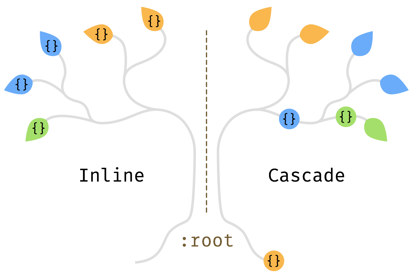
Whenever you write CSS, you want to get back to the top of the tree as much as possible. In other words, go back to :root.
For example, our website has a sidebar and we would like to add a short personal introduction to this sidebar. The structure of the HTML may look like this:
<body>
    <main class=“Posts”>
    <aside class=“SideBar”>
        <nav class=“Nav”>
<p class=“Bio”>The CSS is written like this:
.Bio {
    font-size: .8em;
    line-height: 1.5;
    color: #888;
}Written like this, it can work normally and there is no style problem. However, the sidebar also has a navigation nav, and it's likely that they have some styles that are the same. In our example font-size and color are the same. Let's extract these properties from nav and .Bio and add them to its parent element .SideBar:
.SideBar {
    font-size: .8em;
    color: #888;
}It turns out that line-height:1.5; is already set in .Posts. It seems that the entire page uses the same line-height, then we can move the line-height in .Bio and .Posts into the root element:
:root {
    line-height: 1.5;
}This seems to be a CSS common sense, but he will not pay too much attention to the brother Element defines the same thing. This also allows you to find that some code is duplicated. In fact, this is not terrible, because we only need to spend some time to refactor the code, but this maintains the health of CSS code processing.

Write styles on tree branches, not on leaves
Tip 2
Styles always appear as a specific combination of attributes
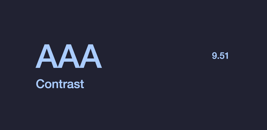
A good example is the combination of color and Bakground-Color. Unless you are only making small adjustments, you need to adjust them all together. When adding a background color to an element, it may not contain any text, but may have some child elements. Therefore, by setting the foreground-color and background-color together, we can always be sure that these elements will not encounter any legibility and contrast problems. Next time we change the background color, we don’t have to look around for the text color to change because they all appear together as a group.

Tip 3
Use dynamic values, such as currentColor and em, etc.
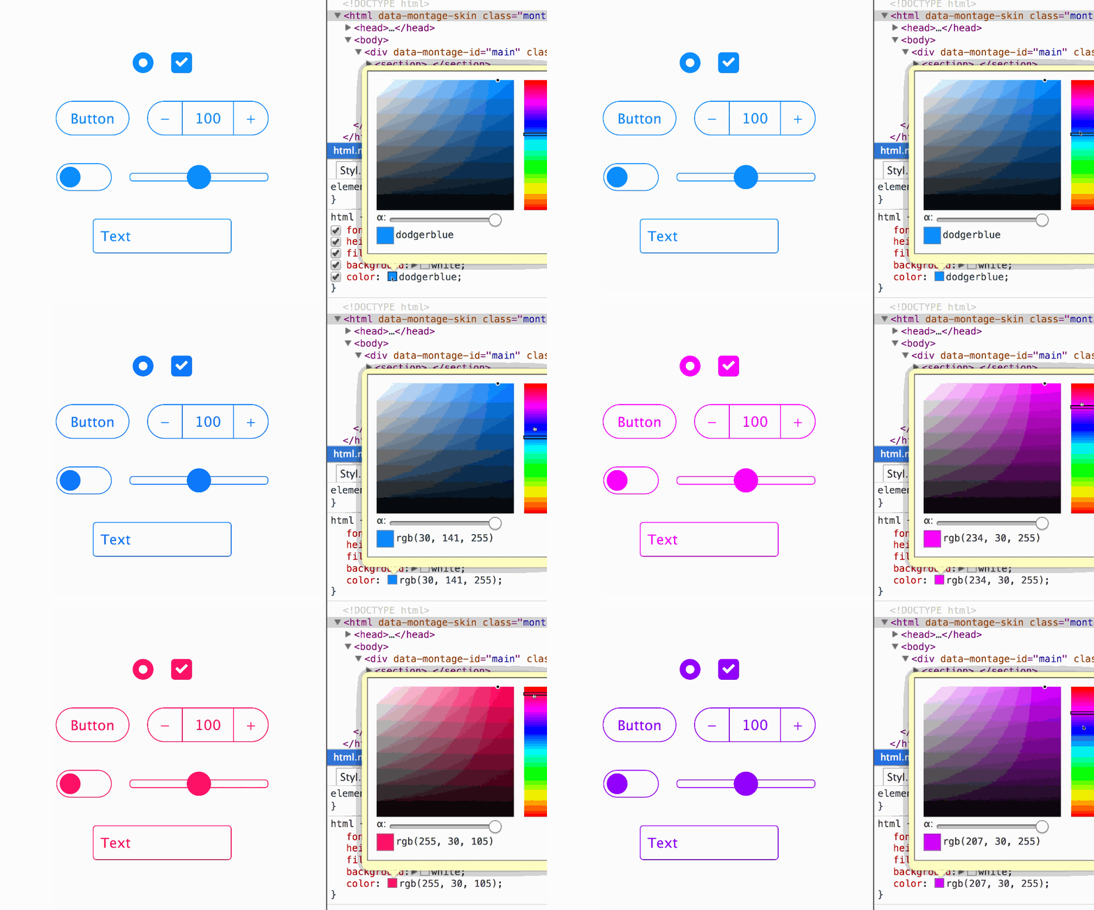
Sometimes text color is also used on other attributes. For example, border, box-shadow or fill in SVG icons. An alternative to defining the same color is to use currentColor directly. By default, color is inheritable, and you only need to modify it in one place to change the color of other properties.
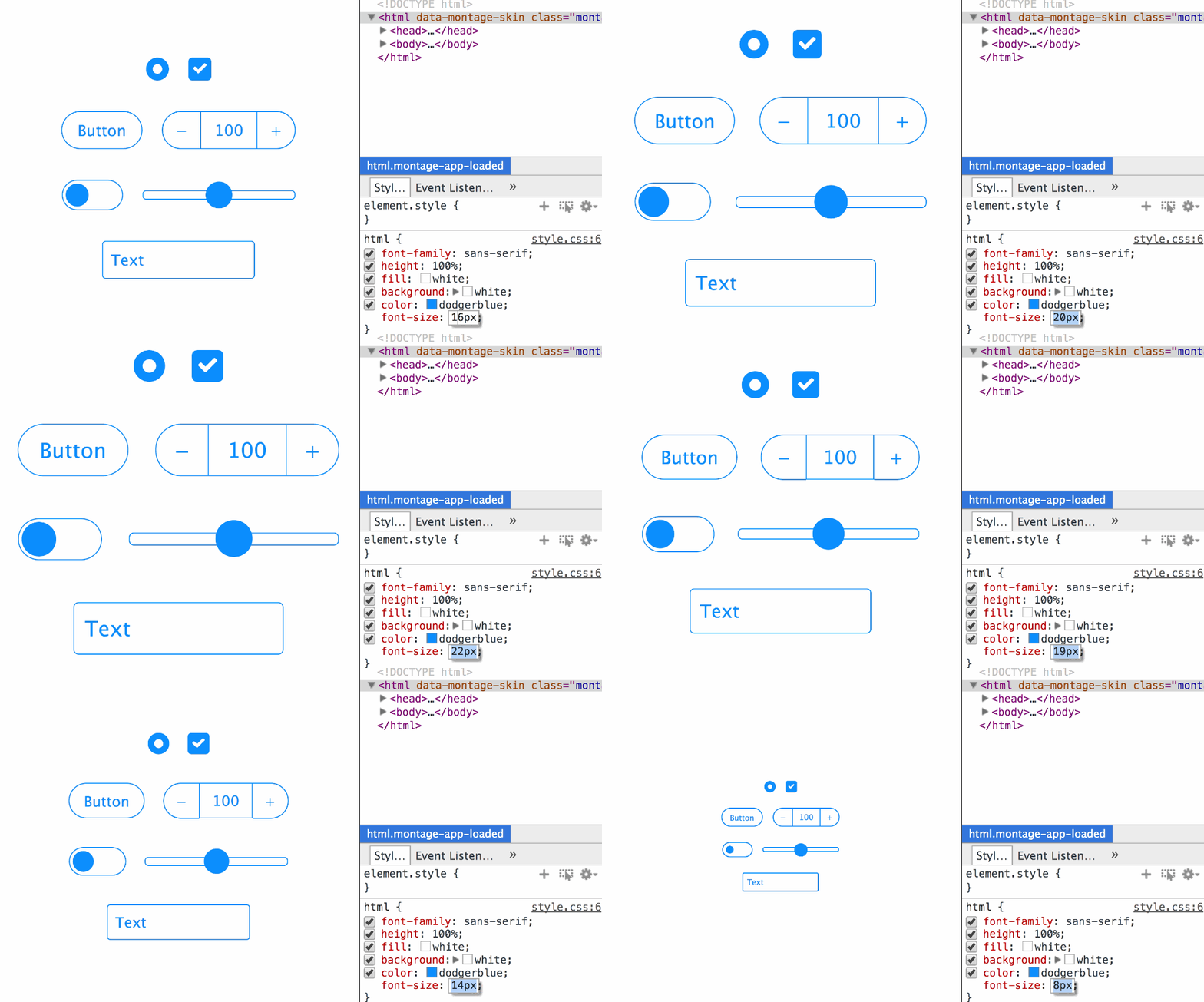
Similarly, using em units for the font-size attribute allows you to change the box model size of the element by just modifying the font-size of :root.
For more details about this, you can check out the article "Setting styles using strings (STRINGS)".

Tip 4
Use the inherit attribute value to inherit the style of its parent element to override the UA's own style.
For form controls like buttons and inputs, different browsers will have their own styles (UA style). We can use inherit to inherit the style of its parent element, thereby overriding the browser's UA style.
button,
input,
select,
textarea {
    color: inherit;
    font-family: inherit;
    font-style: inherit;
    font-weight: inherit;
}The above example code is taken from sanitize.css. normalize.css is also used in this way. If you don’t use it this way, it means you have...
You can also try to directly use the currentColor attribute introduced earlier on elements such as input[type="range"], input[type="radio"] and input[type="checkbox"] to automatically match colors. Maybe you don't need to change anything, you can change a bright color to a dark color.

Summary
These are good things, of course they are not forced on everyone to use. I want to say that these tips are simple and practical, so that your website can get the maximum benefit. Even if you use a CSS preprocessor, they won't hurt the output of the code and may even save you a few variables.
Also suitable for single class names, such as Tachyons. Perhaps also reduce complexity and required classes.
Another interesting thing is coming, you can also customize properties in CSS, which are CSS variables. Unlike preprocessors, when overriding a custom property, it only affects the current selection range. So in a sense, they are "cascading variables".

Hot AI Tools

Undresser.AI Undress
AI-powered app for creating realistic nude photos

AI Clothes Remover
Online AI tool for removing clothes from photos.

Undress AI Tool
Undress images for free

Clothoff.io
AI clothes remover

Video Face Swap
Swap faces in any video effortlessly with our completely free AI face swap tool!

Hot Article

Hot Tools

Notepad++7.3.1
Easy-to-use and free code editor

SublimeText3 Chinese version
Chinese version, very easy to use

Zend Studio 13.0.1
Powerful PHP integrated development environment

Dreamweaver CS6
Visual web development tools

SublimeText3 Mac version
God-level code editing software (SublimeText3)

Hot Topics
 1662
1662
 14
14
 1419
1419
 52
52
 1312
1312
 25
25
 1262
1262
 29
29
 1235
1235
 24
24
 How to use bootstrap in vue
Apr 07, 2025 pm 11:33 PM
Using Bootstrap in Vue.js is divided into five steps: Install Bootstrap. Import Bootstrap in main.js. Use the Bootstrap component directly in the template. Optional: Custom style. Optional: Use plug-ins.
 Understanding HTML, CSS, and JavaScript: A Beginner's Guide
Apr 12, 2025 am 12:02 AM
WebdevelopmentreliesonHTML,CSS,andJavaScript:1)HTMLstructurescontent,2)CSSstylesit,and3)JavaScriptaddsinteractivity,formingthebasisofmodernwebexperiences.
 The Roles of HTML, CSS, and JavaScript: Core Responsibilities
Apr 08, 2025 pm 07:05 PM
HTML defines the web structure, CSS is responsible for style and layout, and JavaScript gives dynamic interaction. The three perform their duties in web development and jointly build a colorful website.
 How to insert pictures on bootstrap
Apr 07, 2025 pm 03:30 PM
There are several ways to insert images in Bootstrap: insert images directly, using the HTML img tag. With the Bootstrap image component, you can provide responsive images and more styles. Set the image size, use the img-fluid class to make the image adaptable. Set the border, using the img-bordered class. Set the rounded corners and use the img-rounded class. Set the shadow, use the shadow class. Resize and position the image, using CSS style. Using the background image, use the background-image CSS property.
 How to write split lines on bootstrap
Apr 07, 2025 pm 03:12 PM
There are two ways to create a Bootstrap split line: using the tag, which creates a horizontal split line. Use the CSS border property to create custom style split lines.
 How to set up the framework for bootstrap
Apr 07, 2025 pm 03:27 PM
To set up the Bootstrap framework, you need to follow these steps: 1. Reference the Bootstrap file via CDN; 2. Download and host the file on your own server; 3. Include the Bootstrap file in HTML; 4. Compile Sass/Less as needed; 5. Import a custom file (optional). Once setup is complete, you can use Bootstrap's grid systems, components, and styles to create responsive websites and applications.
 How to resize bootstrap
Apr 07, 2025 pm 03:18 PM
To adjust the size of elements in Bootstrap, you can use the dimension class, which includes: adjusting width: .col-, .w-, .mw-adjust height: .h-, .min-h-, .max-h-
 How to use bootstrap button
Apr 07, 2025 pm 03:09 PM
How to use the Bootstrap button? Introduce Bootstrap CSS to create button elements and add Bootstrap button class to add button text


