








Tailwind CSS中如何通过CSS变量无缝实现多品牌换肤方案
通过配置tailwind的`theme.extend.colors`并绑定css自定义属性,可以在不修改html结构的前提下实现多品牌换肤。具体做法是在`tailwind.config.js`中将颜色值定义为css变量引用,然后在页面根元素或特定容器上切换这些变量的值,即可实时改变所有使用该颜色的组件样式。

如何在运行时动态切换不同品牌的主题色
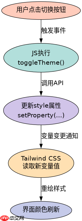
在运行时切换主题的核心是操作DOM上的CSS变量。开发者只需获取目标容器元素,并通过JavaScript修改其`style`属性中的自定义变量值,Tailwind生成的CSS会自动读取新值并应用。这种方法比重新加载整个样式表要高效得多,且能保持状态。
当使用深色模式时如何确保变量正确映射
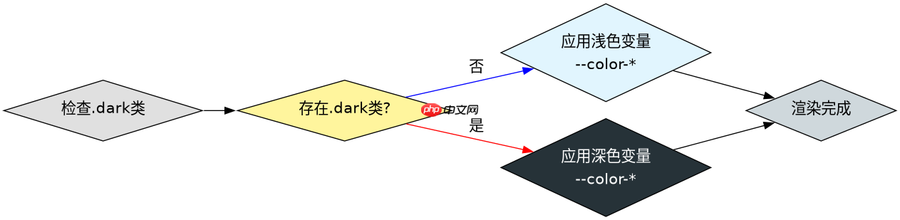
在深色模式下,需要为同一组品牌变量提供另一套颜色值。通过在`tailwind.config.js`中配置`darkMode: 'class'`,并在HTML元素上添加`dark`类,Tailwind会优先查找以`dark:`前缀定义的变量或直接在媒体查询中覆盖变量。关键在于确保深色模式的变量名与浅色模式一致,以便JS切换逻辑无需改动。
立即学习“前端免费学习笔记(深入)”;
// tailwind.config.js
module.exports = {
  theme: {
    extend: {
      colors: {
        brand: {
          primary: 'var(--color-brand-primary)',
          secondary: 'var(--color-brand-secondary)',
        },
        darkBrand: {
          primary: 'var(--color-dark-brand-primary)',
          secondary: 'var(--color-dark-brand-secondary)',
        }
      }
    }
  },
  darkMode: 'class',
}
<!-- index.html -->
<div id="app" class="bg-brand-primary text-white p-4"
style="--color-brand-primary: #ff0000; --color-brand-secondary: #00ff00;"
data-theme="light"
>
<button class="bg-brand-secondary hover:opacity-80"
onclick="toggleTheme()"
>
Switch Theme
</button>
</div>
<script>
const themes = {
light: { '--color-brand-primary': '#ff0000', '--color-brand-secondary': '#00ff00' },
dark: { '--color-brand-primary': '#0000ff', '--color-brand-secondary': '#ffff00' }
};
function toggleTheme() {
const app = document.getElementById('app');
const current = app.getAttribute('data-theme');
const next = current === 'light' ? 'dark' : 'light';
// Toggle dark mode class for Tailwind's dark: prefix
if (next === 'dark') {
app.classList.add('dark');
} else {
app.classList.remove('dark');
}
// Apply CSS variables
Object.entries(themes[next]).forEach(([key, value]) => {
app.style.setProperty(key, value);
});
app.setAttribute('data-theme', next);
}
</script>