
 Web Front-end
JS Tutorial
Competition between the two major components of bootstrap multiselect in JS components_javascript skills
Web Front-end
JS Tutorial
Competition between the two major components of bootstrap multiselect in JS components_javascript skills
Competition between the two major components of bootstrap multiselect in JS components_javascript skills

The general styles and functions of these two components are basically the same. This article will show you how to use these two components.
1. Component description and API
1. The first component - multiple-select. This component has a simple style, complete documentation, and powerful functions. But I feel that the selected effect is not very good. We will leave the display of its effects behind.
2. The second component-bootstrap-multiselect. The style of this component is very similar to the first one, and the documentation is quite comprehensive.
2. Multiple-select component
1. Component Description
This component requires the following browser support:
- IE 7+
- Chrome 8+
- Firefox 10+
- Safari 3+
-
Opera 10.6+
Fortunately, most mainstream browsers can support it.
2. Effect preview
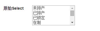
(1) Original MultiSelect
(2) Initialized Multiple Select
(3) Set selected and disabled
(4) Set grouping
(5) Set the unselected initial value: Please select
(6) Initialized to radio selection
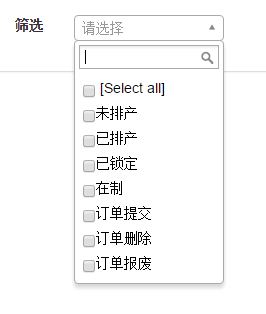
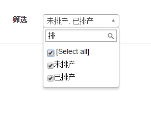
(7) Set the filtering function of the component
3. Code example
Since it is a bootstrap component, it definitely needs bootstrap support. Let’s take a look at the js that needs to be quoted
 @*Jquery*@
 <script src="~/Scripts/jquery-1.10.2.min.js"></script>

 @*bootstrap*@
 <script src="~/Content/bootstrap/js/bootstrap.min.js"></script>
 <link href="~/Content/bootstrap/css/bootstrap.min.css" rel="stylesheet" />

 @*multiple-select*@
 <script src="~/Content/multiselect_wenzhixin/multiple-select-master/multiple-select.js"></script>
 <link href="~/Content/multiselect_wenzhixin/multiple-select-master/multiple-select.css" rel="stylesheet" />

 @*页面js*@
 <script src="~/Scripts/Home/Index_wenzhixin.js"></script>
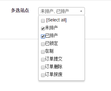
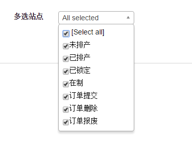
(1) Original initialization
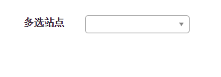
<label class="control-label col-xs-1" for="sel_search_orderstatus">多选站点</label>
      <div class="col-xs-2" style="margin-top:7px;">
       <select id="sel_search_orderstatus" style="width:150px" multiple="multiple">
        <option value="0">未排产</option>
        <option value="5">已排产</option>
        <option value="10">已锁定</option>
        <option value="25">在制</option>
        <option value="20">订单提交</option>
        <option value="30">订单删除</option>
        <option value="50">订单报废</option>
       </select>
      </div>
$(function () {
 $('#sel_search_orderstatus').multipleSelect();
})
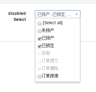
(2) Set selected and disabled
<label class="control-label col-xs-1" for="sel_search_orderstatus2">disabled Select</label>
<div class="col-xs-2" style="margin-top:7px;">
<select id="sel_search_orderstatus2" style="width:150px" multiple="multiple">
......
</select>
</div>
$(function () {
$('#sel_search_orderstatus2').multipleSelect();
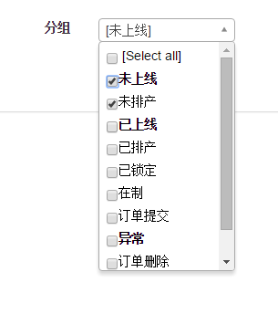
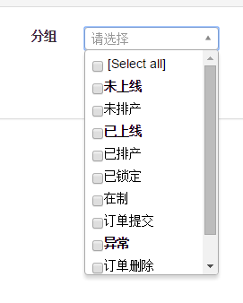
})(3) Set grouping and initial value
<label class="control-label col-xs-1" for="sel_search_orderstatus3">分组</label>
      <div class="col-xs-2" style="margin-top:7px;">
       <select id="sel_search_orderstatus3" style="width:150px" multiple="multiple">
        <optgroup label="未上线">
         <option value="0">未排产</option>
        </optgroup>
        <optgroup label="已上线">
         <option value="5">已排产</option>
         <option value="10">已锁定</option>
         <option value="25">在制</option>
         <option value="20">订单提交</option>
        </optgroup>
        <optgroup label="异常">
         <option value="30">订单删除</option>
         <option value="50">订单报废</option>
        </optgroup>
       </select>
      </div>

$(function () {
 $('#sel_search_orderstatus3').multipleSelect({
  placeholder: "请选择"
 });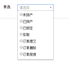
})(4) Single choice
<label class="control-label col-xs-1" for="sel_search_orderstatus4">单选</label>
      <div class="col-xs-2" style="margin-top:7px;">
       <select id="sel_search_orderstatus4" style="width:150px" multiple="multiple">
        .......
       </select>
      </div>
$(function () {
 $('#sel_search_orderstatus4').multipleSelect({
  placeholder: "请选择",
  single: true
 });
})(5) Filter
<label class="control-label col-xs-1" for="sel_search_orderstatus5">筛选</label>
      <div class="col-xs-2" style="margin-top:7px;">
       <select id="sel_search_orderstatus5" style="width:150px" multiple="multiple">
        ......
       </select>
      </div>
$(function () {
 $('#sel_search_orderstatus5').multipleSelect({
  placeholder: "请选择",
  filter: true
 });
})
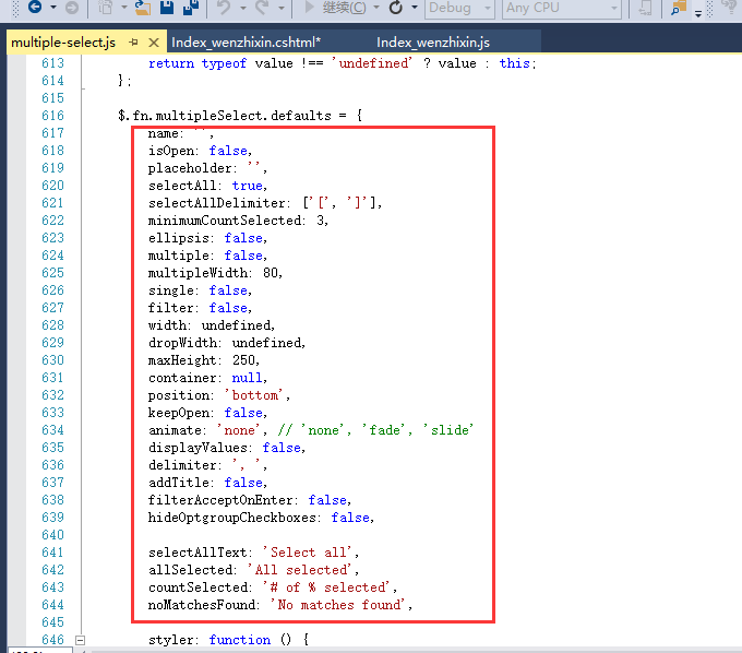
(6) If your multiple select does not want the default initial value, you can set their values during initialization. The following is the default parameter list in the source code.
3. Bootstrap-multiselect component
1. Code example
The initialization process is similar to the above, first refer to the file.
<script src="~/Scripts/jquery-1.10.2.min.js"></script>

 <script src="~/Content/bootstrap/js/bootstrap.min.js"></script>
 <link href="~/Content/bootstrap/css/bootstrap.min.css" rel="stylesheet" />

 <script src="~/Content/multiselect_davidstutz/js/bootstrap-multiselect.js"></script>
 <link href="~/Content/multiselect_davidstutz/css/bootstrap-multiselect.css" rel="stylesheet" />

 <script src="~/Scripts/Home/Index_davidstutz.js"></script>
(1) The most primitive initialization
 <label class="control-label col-xs-1" for="sel_search_orderstatus">多选站点</label>
      <div class="col-xs-2" style="margin-top:7px;">
       <select id="sel_search_orderstatus" style="width:150px" multiple="multiple">
        <option value="0">未排产</option>
        <option value="5">已排产</option>
        <option value="10">已锁定</option>
        <option value="25">在制</option>
        <option value="20">订单提交</option>
        <option value="30">订单删除</option>
        <option value="50">订单报废</option>
       </select>
      </div>

$(function () {
 $('#sel_search_orderstatus').multiselect();
});(2) Set selected and disabled
<label class="control-label col-xs-1" for="sel_search_orderstatus2">disabled Select</label>
      <div class="col-xs-2" style="margin-top:7px;">
       <select id="sel_search_orderstatus2" style="width:150px" multiple="multiple">
        <option value="0">未排产</option>
        <option value="5" selected="selected">已排产</option>
        <option value="10" selected="selected">已锁定</option>
        <option value="25" disabled="disabled">在制</option>
        <option value="20" disabled="disabled">订单提交</option>
        <option value="30" disabled="disabled" selected="selected">订单删除</option>
        <option value="50">订单报废</option>
       </select>
      </div>
(3) Grouping
<label class="control-label col-xs-1" for="sel_search_orderstatus3">分组</label>
      <div class="col-xs-2" style="margin-top:7px;">
       <select id="sel_search_orderstatus3" style="width:150px" multiple="multiple">
        <optgroup label="未上线">
         <option value="0">未排产</option>
        </optgroup>
        <optgroup label="已上线">
         <option value="5">已排产</option>
         <option value="10" selected="selected">已锁定</option>
         <option value="25" disabled="disabled">在制</option>
         <option value="20">订单提交</option>
        </optgroup>
        <optgroup label="异常">
         <option value="30">订单删除</option>
         <option value="50">订单报废</option>
        </optgroup>
       </select>
      </div>

$(function () {
 $('#sel_search_orderstatus3').multiselect({
  enableCollapsibleOptGroups: true
 });
});
The codes for other effects will not be shown one by one. The code is very simple and there is basically no problem if you look at the documentation.
The above is the effect display of the two multi-select components and simple code examples. As for which one is better, it all depends on your own feeling. They are quite simple to use and have basically similar functions. I hope this article will be helpful to everyone's learning.

Hot AI Tools

Undresser.AI Undress
AI-powered app for creating realistic nude photos

AI Clothes Remover
Online AI tool for removing clothes from photos.

Undress AI Tool
Undress images for free

Clothoff.io
AI clothes remover

Video Face Swap
Swap faces in any video effortlessly with our completely free AI face swap tool!

Hot Article
Hot Tools

Notepad++7.3.1
Easy-to-use and free code editor

SublimeText3 Chinese version
Chinese version, very easy to use

Zend Studio 13.0.1
Powerful PHP integrated development environment

Dreamweaver CS6
Visual web development tools

SublimeText3 Mac version
God-level code editing software (SublimeText3)
Hot Topics
 1664
1664
 14
1421
52
1316
25
1266
29
1239
24
14
1421
52
1316
25
1266
29
1239
24

 How to use bootstrap in vue
Apr 07, 2025 pm 11:33 PM
How to use bootstrap in vue
Apr 07, 2025 pm 11:33 PM
Using Bootstrap in Vue.js is divided into five steps: Install Bootstrap. Import Bootstrap in main.js. Use the Bootstrap component directly in the template. Optional: Custom style. Optional: Use plug-ins.
 How to get the bootstrap search bar
Apr 07, 2025 pm 03:33 PM
How to get the bootstrap search bar
Apr 07, 2025 pm 03:33 PM
How to use Bootstrap to get the value of the search bar: Determines the ID or name of the search bar. Use JavaScript to get DOM elements. Gets the value of the element. Perform the required actions.
 How to do vertical centering of bootstrap
Apr 07, 2025 pm 03:21 PM
How to do vertical centering of bootstrap
Apr 07, 2025 pm 03:21 PM
Use Bootstrap to implement vertical centering: flexbox method: Use the d-flex, justify-content-center, and align-items-center classes to place elements in the flexbox container. align-items-center class method: For browsers that do not support flexbox, use the align-items-center class, provided that the parent element has a defined height.
 How to insert pictures on bootstrap
Apr 07, 2025 pm 03:30 PM
How to insert pictures on bootstrap
Apr 07, 2025 pm 03:30 PM
There are several ways to insert images in Bootstrap: insert images directly, using the HTML img tag. With the Bootstrap image component, you can provide responsive images and more styles. Set the image size, use the img-fluid class to make the image adaptable. Set the border, using the img-bordered class. Set the rounded corners and use the img-rounded class. Set the shadow, use the shadow class. Resize and position the image, using CSS style. Using the background image, use the background-image CSS property.
 How to write split lines on bootstrap
Apr 07, 2025 pm 03:12 PM
How to write split lines on bootstrap
Apr 07, 2025 pm 03:12 PM
There are two ways to create a Bootstrap split line: using the tag, which creates a horizontal split line. Use the CSS border property to create custom style split lines.
 How to set up the framework for bootstrap
Apr 07, 2025 pm 03:27 PM
How to set up the framework for bootstrap
Apr 07, 2025 pm 03:27 PM
To set up the Bootstrap framework, you need to follow these steps: 1. Reference the Bootstrap file via CDN; 2. Download and host the file on your own server; 3. Include the Bootstrap file in HTML; 4. Compile Sass/Less as needed; 5. Import a custom file (optional). Once setup is complete, you can use Bootstrap's grid systems, components, and styles to create responsive websites and applications.
 How to resize bootstrap
Apr 07, 2025 pm 03:18 PM
How to resize bootstrap
Apr 07, 2025 pm 03:18 PM
To adjust the size of elements in Bootstrap, you can use the dimension class, which includes: adjusting width: .col-, .w-, .mw-adjust height: .h-, .min-h-, .max-h-
 How to use bootstrap button
Apr 07, 2025 pm 03:09 PM
How to use bootstrap button
Apr 07, 2025 pm 03:09 PM
How to use the Bootstrap button? Introduce Bootstrap CSS to create button elements and add Bootstrap button class to add button text
