
 Web Front-end
JS Tutorial
Detailed explanation of how to use Bootstrap tree control_javascript skills
Web Front-end
JS Tutorial
Detailed explanation of how to use Bootstrap tree control_javascript skills
Detailed explanation of how to use Bootstrap tree control_javascript skills

1. JQuery tree control
Jquery tree control is a very lightweight control based on JQuery+bootstrap, completely handwritten with js and styles. Its shadow can be seen in many places on the Internet. It has simple functions and a good user experience. It is more practical to display some simple hierarchical relationships, but it is not easy to add, delete or modify nodes. If you have to do it, you may need to encapsulate it yourself.
1. First glimpse
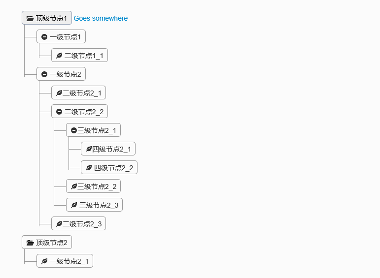
Collapse all
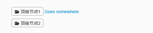
Expand one level
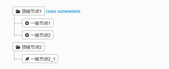
Expand all
2. Code example
This control is also very simple to implement, you only need to reference jQuery and bootstrap components.
<link href="~/Content/Tree1/css/bootstrap.min.css" rel="stylesheet" />
  <link href="~/Content/Tree1/css/style.css" rel="stylesheet" />

  <script src="~/Scripts/jquery-1.10.2.js"></script>
  <script type="text/javascript">
  $(function(){
    $('.tree li:has(ul)').addClass('parent_li').find(' > span').attr('title', 'Collapse this branch');
    $('.tree li.parent_li > span').on('click', function (e) {
       var children = $(this).parent('li.parent_li').find(' > ul > li');
      if (children.is(":visible")) {
        children.hide('fast');
        $(this).attr('title', 'Expand this branch').find(' > i').addClass('icon-plus-sign').removeClass('icon-minus-sign');
      } else {
        children.show('fast');
        $(this).attr('title', 'Collapse this branch').find(' > i').addClass('icon-minus-sign').removeClass('icon-plus-sign');
      }
      e.stopPropagation();
    });
  });
  </script>
<div class="tree well">
    <ul>
      <li>
        <span><i class="icon-folder-open"></i> 顶级节点1</span> <a href="">Goes somewhere</a>
        <ul>
          <li>
            <span><i class="icon-minus-sign"></i> 一级节点1</span> <a href=""></a>
            <ul>
              <li>
                <span><i class="icon-leaf"></i> 二级节点1_1</span> <a href=""></a>
              </li>
            </ul>
          </li>
          <li>
            <span><i class="icon-minus-sign"></i> 一级节点2</span> <a href=""></a>
            <ul>
              <li>
                <span><i class="icon-leaf"></i>二级节点2_1</span> <a href=""></a>
              </li>
              <li>
                <span><i class="icon-minus-sign"></i> 二级节点2_2</span> <a href=""></a>
                <ul>
                  <li>
                    <span><i class="icon-minus-sign"></i>三级节点2_1</span> <a href=""></a>
                    <ul>
                      <li>
                        <span><i class="icon-leaf"></i>四级节点2_1</span> <a href=""></a>
                      </li>
                      <li>
                        <span><i class="icon-leaf"></i> 四级节点2_2</span> <a href=""></a>
                      </li>
                    </ul>
                  </li>
                  <li>
                    <span><i class="icon-leaf"></i>三级节点2_2</span> <a href=""></a>
                  </li>
                  <li>
                    <span><i class="icon-leaf"></i> 三级节点2_3</span> <a href=""></a>
                  </li>
                </ul>
              </li>
              <li>
                <span><i class="icon-leaf"></i>二级节点2_3</span> <a href=""></a>
              </li>
            </ul>
          </li>
        </ul>
      </li>
      <li>
        <span><i class="icon-folder-open"></i> 顶级节点2</span> <a href=""></a>
        <ul>
          <li>
            <span><i class="icon-leaf"></i> 一级节点2_1</span> <a href=""></a>
          </li>
        </ul>
      </li>
    </ul>
  </div>
这些代码都是直接从网上down下来的,节点上面的图标可以通过样式修改,图标样式也是基于bootstrap的。如果需要动态添加节点,可以自己封装组件去拼html,实现起来应该也比较简单。由以上可知此组件的轻量级,如果你需要对节点作增删改或者选择等操作,不要急,下面的控件可能比较适用。
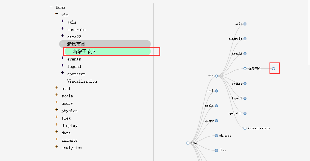
二、文件树编辑插件Treed
这个组件是从网上找到的,最初演示,组内成员一致觉得效果很赞。因为它通过树形展示,方便的提供了节点的增删改。节点的伸缩效果也比较好。好了来看看。
1、初见Treed
默认展开一级
点击左边的“+”号和右边的节点都会去展开子节点
多级展开
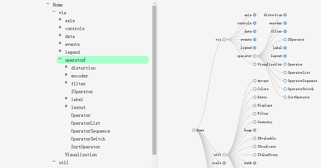
在左边可以编辑节点名称
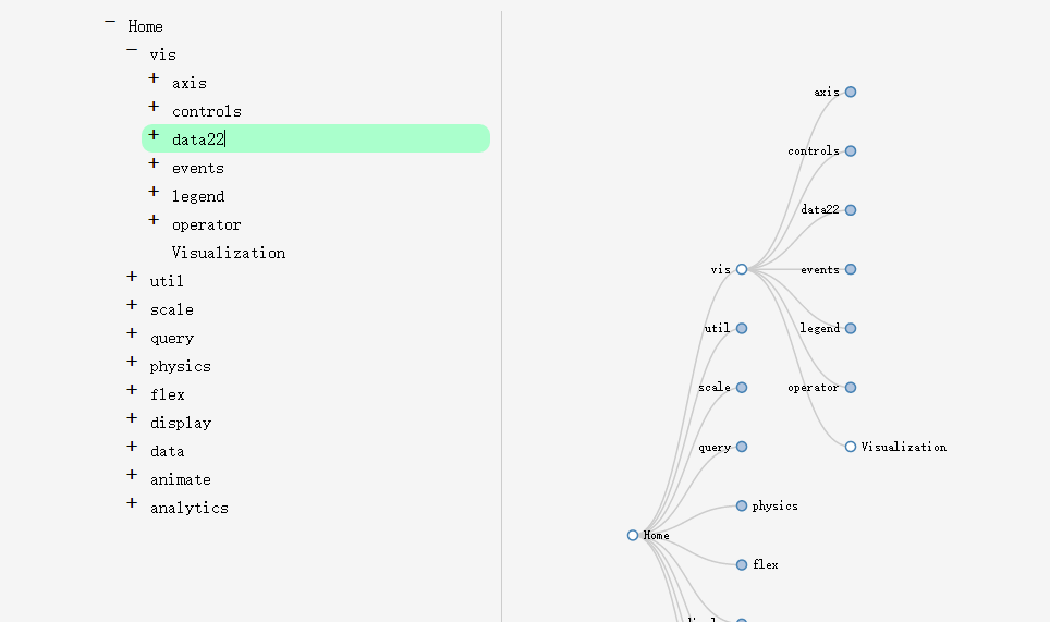
按Enter键换行新增兄弟节点,同样删除换行就可以删除节点。
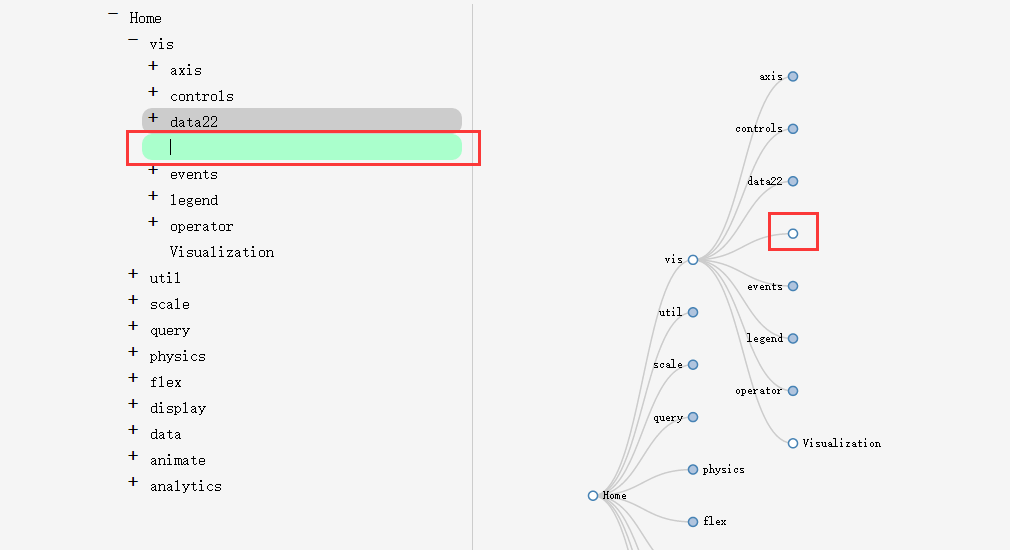
按Enter键后再按下Tab键可以新增子节点
很强大有木有。审核元素可知它使用的是html5的svg标签来实现的,所以对浏览器有一定的要求。
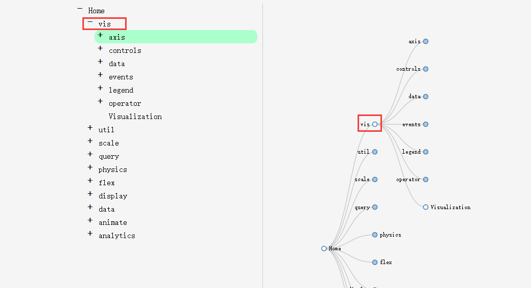
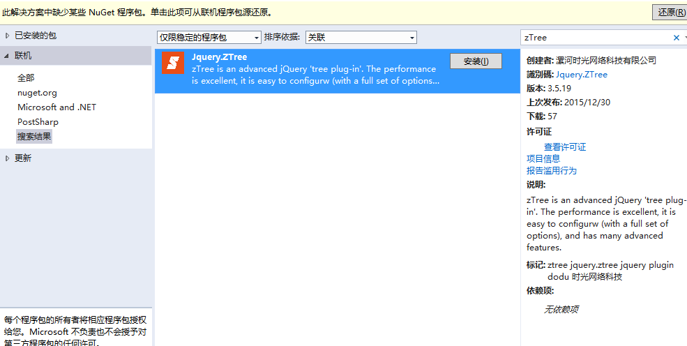
三、通用树形控件——zTree
ztree是一个传统的树形组件,其强大的功能决定他在树形控件界的地位。不管是树形展示,还是编辑,又或者是节点单选和多选,它都提供了强大的功能API。但是,由于它界面效果不太好看,所以很多公司使用它的时候都会有一定的犹豫。所幸,至从出了扁平化风格后,ztree也做了一定的美化,比如它的Metro风格的组件和bootstrap风格就非常相像。今天就来结合Metro风格的ztree来介绍下这个组件的一些用法。
1、组件使用
此组件可直接通过Nuget去添加。
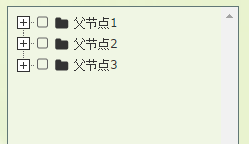
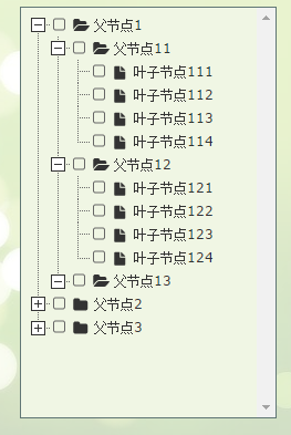
2、组件效果
节点全部收起
节点展开
节点选中,当然如果需要可以变成单选。
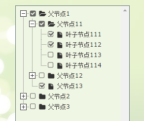
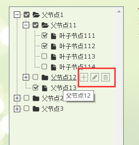
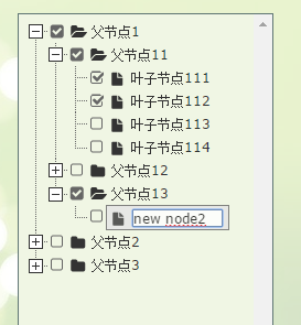
可以增删改节点
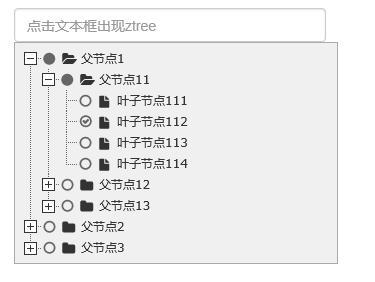
点击文本框出现树
3、代码示例
3.1 直接在界面显示文本框
需要引用的js和css文件
  <script src="~/Scripts/jquery-1.10.2.js"></script>
  <script src="~/Content/bootstrap/js/bootstrap.js"></script>
  <link href="~/Content/bootstrap/css/bootstrap.css" rel="stylesheet" />

  <script src="~/Scripts/jquery.ztree.all-3.5.js"></script>
  <link href="~/Content/zTree.theme.metro.css" rel="stylesheet" />
页面html
<div id="menuContent" class="menuContent" style="width:95%;border:1px solid rgb(170,170,170);z-index:10;">
     <ul id="treeDemo" class="ztree" style="margin-top:0; width:100%; height:auto;"></ul>
  </div>
Js初始化
var setting = {
  view: {
    addHoverDom: addHoverDom,
    removeHoverDom: removeHoverDom,
    selectedMulti: false
  },
  check: {
    enable: true
  },
  data: {
    simpleData: {
      enable: true
    }
  },
  edit: {
    enable: false
  }
};

var zNodes = [
  { id: 1, pId: 0, name: "父节点1", open: true },
  { id: 11, pId: 1, name: "父节点11" },
  { id: 111, pId: 11, name: "叶子节点111" },
  { id: 112, pId: 11, name: "叶子节点112" },
  { id: 113, pId: 11, name: "叶子节点113" },
  { id: 114, pId: 11, name: "叶子节点114" },
  { id: 12, pId: 1, name: "父节点12" },
  { id: 121, pId: 12, name: "叶子节点121" },
  { id: 122, pId: 12, name: "叶子节点122" },
  { id: 123, pId: 12, name: "叶子节点123" },
  { id: 124, pId: 12, name: "叶子节点124" },
  { id: 13, pId: 1, name: "父节点13", isParent: true },
  { id: 2, pId: 0, name: "父节点2" },
  { id: 21, pId: 2, name: "父节点21", open: true },
  { id: 211, pId: 21, name: "叶子节点211" },
  { id: 212, pId: 21, name: "叶子节点212" },
  { id: 213, pId: 21, name: "叶子节点213" },
  { id: 214, pId: 21, name: "叶子节点214" },
  { id: 22, pId: 2, name: "父节点22" },
  { id: 221, pId: 22, name: "叶子节点221" },
  { id: 222, pId: 22, name: "叶子节点222" },
  { id: 223, pId: 22, name: "叶子节点223" },
  { id: 224, pId: 22, name: "叶子节点224" },
  { id: 23, pId: 2, name: "父节点23" },
  { id: 231, pId: 23, name: "叶子节点231" },
  { id: 232, pId: 23, name: "叶子节点232" },
  { id: 233, pId: 23, name: "叶子节点233" },
  { id: 234, pId: 23, name: "叶子节点234" },
  { id: 3, pId: 0, name: "父节点3", isParent: true }
];

$(document).ready(function () {
  $.fn.zTree.init($("#treeDemo"), setting, zNodes);
});

function addHoverDom(treeId, treeNode) {
  var sObj = $("#" + treeNode.tId + "_span");
  if (treeNode.editNameFlag || $("#addBtn_" + treeNode.tId).length > 0) return;
  var addStr = "<span class='button add' id='addBtn_" + treeNode.tId
    + "' title='add node' onfocus='this.blur();'></span>";
  sObj.after(addStr);
  var btn = $("#addBtn_" + treeNode.tId);
  if (btn) btn.bind("click", function () {
    var zTree = $.fn.zTree.getZTreeObj("treeDemo");
    zTree.addNodes(treeNode, { id: (100 + newCount), pId: treeNode.id, name: "new node" + (newCount++) });
    return false;
  });
};
function removeHoverDom(treeId, treeNode) {
  $("#addBtn_" + treeNode.tId).unbind().remove();
};
3.2 默认隐藏,触发某个事件的时候出现树。这种场景在项目里面非常常见,一般用于选择树节点。所以博主把这个也单独拿出来说下吧。
div默认是隐藏的。
<input type="text" class="form-control" id="txt_ztree" placeholder="点击文本框出现ztree" onclick="showMenu()" />
      <div id="menuContent2" class="menuContent" style="display:none;position: absolute;width:95%;border:1px solid rgb(170,170,170);z-index:10;">
        <ul id="treeDemo2" class="ztree" style="margin-top:0; width:160px; height:auto;"></ul>
      </div>
在js里面初始化树以及注册showMenu()方法
var setting2 = {
  check: {
    enable: true,
    chkStyle: "radio",
    radioType: "all"
  },
  view: {
    dblClickExpand: false
  },
  data: {
    simpleData: {
      enable: true
    }
  },
  callback: {
    onClick: onClickNode,
    onCheck: onCheck
  }
};

var zNodes = [
  { id: 1, pId: 0, name: "父节点1", open: true },
  { id: 11, pId: 1, name: "父节点11" },
  { id: 111, pId: 11, name: "叶子节点111" },
  { id: 112, pId: 11, name: "叶子节点112" },
  { id: 113, pId: 11, name: "叶子节点113" },
  { id: 114, pId: 11, name: "叶子节点114" },
  { id: 12, pId: 1, name: "父节点12" },
  { id: 121, pId: 12, name: "叶子节点121" },
  { id: 122, pId: 12, name: "叶子节点122" },
  { id: 123, pId: 12, name: "叶子节点123" },
  { id: 124, pId: 12, name: "叶子节点124" },
  { id: 13, pId: 1, name: "父节点13", isParent: true },
  { id: 2, pId: 0, name: "父节点2" },
  { id: 21, pId: 2, name: "父节点21", open: true },
  { id: 211, pId: 21, name: "叶子节点211" },
  { id: 212, pId: 21, name: "叶子节点212" },
  { id: 213, pId: 21, name: "叶子节点213" },
  { id: 214, pId: 21, name: "叶子节点214" },
  { id: 22, pId: 2, name: "父节点22" },
  { id: 221, pId: 22, name: "叶子节点221" },
  { id: 222, pId: 22, name: "叶子节点222" },
  { id: 223, pId: 22, name: "叶子节点223" },
  { id: 224, pId: 22, name: "叶子节点224" },
  { id: 23, pId: 2, name: "父节点23" },
  { id: 231, pId: 23, name: "叶子节点231" },
  { id: 232, pId: 23, name: "叶子节点232" },
  { id: 233, pId: 23, name: "叶子节点233" },
  { id: 234, pId: 23, name: "叶子节点234" },
  { id: 3, pId: 0, name: "父节点3", isParent: true }
];

//初始化
$(document).ready(function () {
  $.fn.zTree.init($("#treeDemo2"), setting2, zNodes);
});

//显示菜单
function showMenu() {
  $("#menuContent2").css({ left: "15px", top: "34px" }).slideDown("fast");

  $("body").bind("mousedown", onBodyDown);
}
//隐藏菜单
function hideMenu() {
  $("#menuContent2").fadeOut("fast");
  $("body").unbind("mousedown", onBodyDown);
}
function onBodyDown(event) {
  if (!(event.target.id == "menuBtn" || event.target.id == "menuContent2" || event.target.id == "txt_ztree" || $(event.target).parents("#menuContent2").length > 0)) {
    hideMenu();
  }
}

//节点点击事件
function onClickNode(e, treeId, treeNode) {
  var zTree = $.fn.zTree.getZTreeObj("treeDemo");
  zTree.checkNode(treeNode, !treeNode.checked, null, true);
  return false;
}

//节点选择事件
function onCheck(e, treeId, treeNode) {
  var zTree = $.fn.zTree.getZTreeObj("treeDemo"),
  nodes = zTree.getCheckedNodes(true),
  v = "";
  var parentid = "";
  var parentlevel = "";
  for (var i = 0, l = nodes.length; i < l; i++) {
    v += nodes[i].name + ",";
    parentid += nodes[i].id + ",";
    parentlevel += nodes[i].menu_level + ",";
  }
  if (v.length > 0) {
    v = v.substring(0, v.length - 1);
    parentid = parentid.substring(0, parentid.length - 1);
    parentlevel = parentlevel.substring(0, parentlevel.length - 1);
  }
  else {
    return;
  }

  hideMenu();
}
由于以上都是静态数据,如果需要从后台取数据动态加载树节点,可以去后台构造zNodes这种结构的数组即可。
以上三种树形组件,各有千秋,可以根据需求选用不同的组件,希望本文所述对大家学习树形控件有所帮助。

Hot AI Tools

Undresser.AI Undress
AI-powered app for creating realistic nude photos

AI Clothes Remover
Online AI tool for removing clothes from photos.

Undress AI Tool
Undress images for free

Clothoff.io
AI clothes remover

Video Face Swap
Swap faces in any video effortlessly with our completely free AI face swap tool!

Hot Article
Hot Tools

Notepad++7.3.1
Easy-to-use and free code editor

SublimeText3 Chinese version
Chinese version, very easy to use

Zend Studio 13.0.1
Powerful PHP integrated development environment

Dreamweaver CS6
Visual web development tools

SublimeText3 Mac version
God-level code editing software (SublimeText3)
Hot Topics


 How to use bootstrap in vue
Apr 07, 2025 pm 11:33 PM
How to use bootstrap in vue
Apr 07, 2025 pm 11:33 PM
Using Bootstrap in Vue.js is divided into five steps: Install Bootstrap. Import Bootstrap in main.js. Use the Bootstrap component directly in the template. Optional: Custom style. Optional: Use plug-ins.
 How to get the bootstrap search bar
Apr 07, 2025 pm 03:33 PM
How to get the bootstrap search bar
Apr 07, 2025 pm 03:33 PM
How to use Bootstrap to get the value of the search bar: Determines the ID or name of the search bar. Use JavaScript to get DOM elements. Gets the value of the element. Perform the required actions.
 How to do vertical centering of bootstrap
Apr 07, 2025 pm 03:21 PM
How to do vertical centering of bootstrap
Apr 07, 2025 pm 03:21 PM
Use Bootstrap to implement vertical centering: flexbox method: Use the d-flex, justify-content-center, and align-items-center classes to place elements in the flexbox container. align-items-center class method: For browsers that do not support flexbox, use the align-items-center class, provided that the parent element has a defined height.
 How to set up the framework for bootstrap
Apr 07, 2025 pm 03:27 PM
How to set up the framework for bootstrap
Apr 07, 2025 pm 03:27 PM
To set up the Bootstrap framework, you need to follow these steps: 1. Reference the Bootstrap file via CDN; 2. Download and host the file on your own server; 3. Include the Bootstrap file in HTML; 4. Compile Sass/Less as needed; 5. Import a custom file (optional). Once setup is complete, you can use Bootstrap's grid systems, components, and styles to create responsive websites and applications.
 How to write split lines on bootstrap
Apr 07, 2025 pm 03:12 PM
How to write split lines on bootstrap
Apr 07, 2025 pm 03:12 PM
There are two ways to create a Bootstrap split line: using the tag, which creates a horizontal split line. Use the CSS border property to create custom style split lines.
 How to insert pictures on bootstrap
Apr 07, 2025 pm 03:30 PM
How to insert pictures on bootstrap
Apr 07, 2025 pm 03:30 PM
There are several ways to insert images in Bootstrap: insert images directly, using the HTML img tag. With the Bootstrap image component, you can provide responsive images and more styles. Set the image size, use the img-fluid class to make the image adaptable. Set the border, using the img-bordered class. Set the rounded corners and use the img-rounded class. Set the shadow, use the shadow class. Resize and position the image, using CSS style. Using the background image, use the background-image CSS property.
 How to use bootstrap button
Apr 07, 2025 pm 03:09 PM
How to use bootstrap button
Apr 07, 2025 pm 03:09 PM
How to use the Bootstrap button? Introduce Bootstrap CSS to create button elements and add Bootstrap button class to add button text
 How to resize bootstrap
Apr 07, 2025 pm 03:18 PM
How to resize bootstrap
Apr 07, 2025 pm 03:18 PM
To adjust the size of elements in Bootstrap, you can use the dimension class, which includes: adjusting width: .col-, .w-, .mw-adjust height: .h-, .min-h-, .max-h-
