



本文教你使用现代 css flexbox 实现左侧头像、右侧标题+详情的简洁人物信息面板,解决传统浮动或绝对定位导致的尺寸错乱问题,并提供可复用的 html/css 结构与关键样式说明。
本文教你使用现代 css flexbox 实现左侧头像、右侧标题+详情的简洁人物信息面板,解决传统浮动或绝对定位导致的尺寸错乱问题,并提供可复用的 html/css 结构与关键样式说明。
构建一个结构清晰、视觉平衡的人物信息面板,核心在于语义化布局 + Flexbox 精确控制。你原先尝试用 <ul> 和 <li> 组织内容,虽具语义潜力,但嵌套层级混乱(如 <div> 写在 <li> 内)、缺乏容器级布局控制,导致尺寸和对齐失效。正确做法是:将面板划分为逻辑区域(左图 / 右文),再用 display: flex 主动协调子元素流。
以下是推荐实现方案:
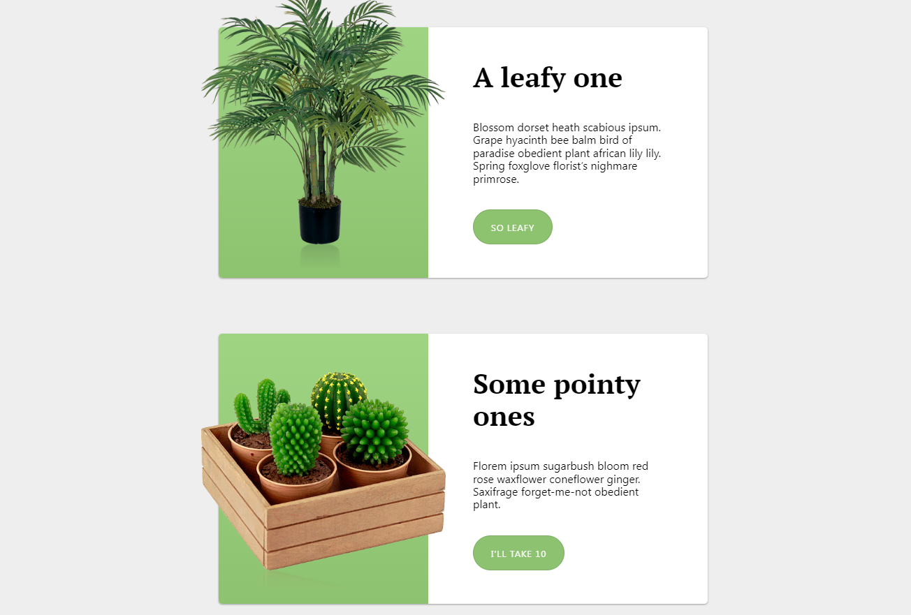
✅ 推荐 HTML 结构(语义清晰、层级扁平)
<div class="role">
  <div class="info-panel">
    <div class="left-side">
      <img src="../images/sinswordace150.png" alt="SinSwordAce's Profile Picture" width="150" height="150">
    </div>
    <div class="right-side">
      <div class="title">
        <h3>SinSwordAce</h3>
      </div>
      <div class="details">
        <ul>
          <li><strong>Role:</strong> Owner of Syndel</li>
          <li><strong>Status:</strong> Active Member</li>
          <li><strong>Joined:</strong> Jan 2022</li>
        </ul>
      </div>
    </div>
  </div>
</div>
✅ 关键 CSS(Flexbox 驱动布局)
.role {
  margin-top: 20px;
}

.info-panel {
  display: flex;
  width: 900px;
  height: 300px;
  border-radius: 20px;
  border: 7px solid rgba(169, 169, 169, 0.25);
  background: rgba(255, 255, 255, 0.05);
  overflow: hidden; /* 防止内容溢出圆角 */
}

.left-side {
  flex: 0 0 45%; /* 固定宽度占比,避免拉伸 */
  display: flex;
  align-items: center;
  justify-content: center;
  padding: 20px;
  background-color: #1e1e2e; /* 可选背景色,增强视觉区分 */
}

.left-side img {
  max-width: 100%;
  max-height: 100%;
  border-radius: 12px;
  box-shadow: 0 4px 12px rgba(0, 0, 0, 0.2);
}

.right-side {
  flex: 1; /* 剩余空间自适应 */
  display: flex;
  flex-direction: column;
  padding: 24px;
}

.title {
  margin-bottom: 16px;
}

.title h3 {
  margin: 0;
  font-size: 1.8rem;
  font-weight: 700;
  color: #e6e6e6;
}

.details ul {
  list-style: none;
  padding: 0;
  margin: 0;
}

.details li {
  padding: 8px 0;
  font-size: 1.1rem;
  line-height: 1.5;
  color: #a6adc8;
}
⚠️ 注意事项与优化建议
- 避免滥用 <ul> 包裹非列表内容:标题和详情本质是分组信息,用 <div> 更合理;若需列表语义(如多条属性),则 <ul> 仅包裹 <li>,不嵌套 <div>;
- 图片尺寸控制:为头像添加 width/height 或使用 object-fit: cover 保证比例,防止拉伸变形;
- 响应式增强:在小屏设备上,可添加媒体查询将 flex-direction: column,使头像居上、文字居下;
- 可访问性提升:确保 <img> 的 alt 描述准确;标题使用 <h3> 符合文档大纲;文本颜色对比度 ≥ 4.5:1(当前示例色值已满足)。
该方案摒弃了冗余的 <ul> 布局陷阱,以 Flexbox 为驱动,既精准控制左右分区比例,又天然支持内容垂直居中与弹性伸缩,是构建现代信息卡片的可靠范式。














