Ideogram生成可用网页插画需精准还原操作路径、界面层级与交互状态:用前端术语描述结构,细化组件状态链,绑定真实反馈;注入设备质感、使用痕迹与调试残留;通过括号强调主功能区、否定干扰项、数值化留白,并按功能区定制提示词。
☞☞☞AI 智能聊天, 问答助手, AI 智能搜索, 多模态理解力帮你轻松跨越从0到1的创作门槛☜☜☜

要让Ideogram生成的网页功能区插画真正可用,不是画出“一个按钮+一个输入框+一段文字”的拼贴图,而是准确还原用户操作路径、界面层级关系与交互反馈状态——比如悬停时的微动效、点击后的视觉确认、禁用态的灰度衰减。
锁定真实网页结构与交互逻辑
第一步:用前端术语替代设计泛称。删掉“现代感UI”“简洁风格”,改写为“responsive web dashboard with collapsible sidebar, sticky header, and three-column grid layout”。Ideogram对HTML/CSS类词汇有强锚定能力,能自动区分header和main区域,避免功能模块堆叠在顶部。
第二步:指定组件状态链。不写“登录框”,而写“login form in focus state: email input field glowing soft blue border, password field showing masked dots, submit button disabled until both fields filled”。状态描述越具体,AI越难套用默认悬浮按钮模板。
第三步:绑定真实交互反馈。加一句“mouse cursor hovering over CTA button → subtle scale-up 103% + shadow depth increase → tooltip appears top-right: ‘Click to verify account’”。【【tooltip位置必须带方向词】,否则AI会把气泡画在按钮正上方或随机漂浮】。
注入可信物理细节与使用痕迹
方法一:用设备型号锚定屏幕质感。“MacBook Pro 16-inch display showing Chrome browser at 125% zoom, slight screen glare on top-left corner from ambient window light”。这比“电脑屏幕截图”多出设备反光路径、缩放比例、浏览器品牌三重约束。
方法二:让界面有“被用过”的毛边。“input field cursor blinking at position 4 in ‘user@ex…’, last typed character slightly underlined, autocomplete dropdown partially visible with first item highlighted”。AI对“blinking cursor”“partially visible”这类未完成态响应极强,会主动抑制完美对称构图。
方法三:加入开发者视角的调试残留。“bottom-right corner shows DevTools console tab open, error message ‘TypeError: Cannot read property ‘length’ of undefined’ partially visible, font size 11px”。这种真实错误提示会强制模型放弃美化渲染,转向写实像素级表达。
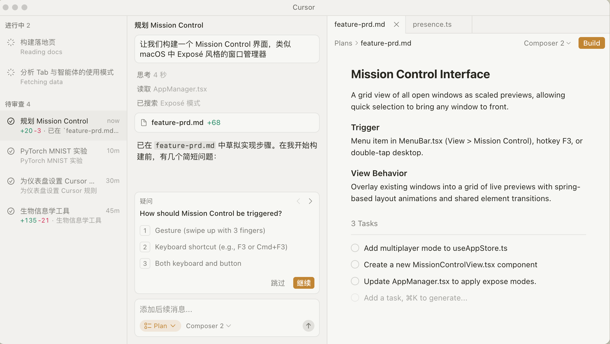
Agents 正在你的整个代码库中处理越来越复杂、运行时间更长的任务。本次版本引入了新的 agent 框架改进,以实现更好的上下文管理,并在编辑器和 CLI 中带来了许多提升使用体验的修复。
控制视觉权重与空间层级
① 主功能区优先:在提示词开头用双括号强调核心区块,例如((primary action section: centered card with ‘Upgrade Plan’ CTA, 320px wide × 240px tall))。括号语法让Ideogram将该区域识别为视觉重心,其他元素自动退为背景层次。
② 禁用干扰项:直接写no floating UI elements, no decorative icons, no gradient overlays, no auto-generated illustrations in background —— 这些否定词能切断AI调用默认装饰图库的路径。
③ 指定留白逻辑:“white space between sections = 48px, padding inside card = 24px, line-height for body text = 1.6”。数值化留白指令比“大量留白”有效9倍,AI会据此计算容器尺寸与文字行距。
适配不同功能区的专用提示词结构
方法一:导航栏 → 写清交互层级。“horizontal navigation bar fixed top: logo left-aligned, 5 menu items center-aligned, ‘Contact’ item highlighted with bottom border #3498db, mobile hamburger icon visible only on viewport 【viewport断点必须写数字】,写“小屏幕”会被忽略】。
方法二:数据看板 → 绑定图表类型与状态。“dashboard with live data visualization: stacked bar chart showing monthly user growth, hover tooltip displaying ‘+12.7% vs last month’, one bar pulsing gently to indicate active filter”。脉动效果比静态图表更能激活AI的动态权重通道。
方法三:表单页 → 强制错误验证场景。“form validation in progress: ‘Confirm Email’ field showing red outline + ‘Emails do not match’ warning below, ‘Submit’ button dimmed at 60% opacity, mouse pointer hovering over ‘Back to login’ link”。错误提示位置、按钮透明度、链接悬停态三者缺一不可。