

Mootools 1.2 Accordion Tutorial_Mootools

Creating and configuring a basic accordion is simple, but you should be sure to read the entire article carefully as the more advanced options can be somewhat complex.
Basics
Creating a new accordion
To create a new accordion, you need to select some pairs of elements - containing a title and content. Therefore, first of all, you need to assign a css class name to each title and each content block:
Reference code:
Toggle 1
Here is the content of toggle 1
Toggle 2
Here is the content of toggle 2
Now, we select all elements with the css class name "togglers" and all elements with the css class name "elements", assign them to variables, and then initialize an accordion object.
Reference code:
var toggles = $$( '.togglers');
var content = $$('.elements');
// Create your object variables
// Use "new" to create a new accordion object
/ / Set the switch (toogle) array
// Set the content array
var AccordionObject = new Accordion(toggles, content);
The default settings of the accordion may give you this effect :
Toggle 1
Here is the content of toggle 1
Toggle 2
Here is the content of toggle 2
Toggle 3
Here is the content of toggle 3
Options
Of course, if you want something other than the accordion's default effect, you'll need to tweak the options. Here we will explain them one by one.
display
Defaults to 0
This option determines which element will be displayed when the page loads. The default value is 0, so the first element is displayed. If you want to set it to another element, you only need to set it to the index value of another element (an integer). Unlike "show", "display" will use a gradient animation to expand the element.
Reference code:
var AccordionObject = new Accordion( toggles, content {
display: 0 // Default is 0
});
show
Default is 0
is very similar to "display", "show" Determines which element will expand when the page loads, but it does not have a gradient animation. It is only displayed after the page loads without using any gradient animation.
Reference code:
var AccordionObject = new Accordion( toggles, content {
display: 0 // Default is 0
});
height
Default is true
When set to true, the content will be displayed. There is a high gradient animation effect. This is the same as you saw above, a standard accordion setup.
Reference code:
var AccordionObject = new Accordion( toggles, content {
height: true // Default is true
});
width
Default is false
Similar to "height", but instead of using height Gradient animation to display content, instead use width gradient animation to display content. If you use the "width" option along with the other standard settings we've seen, the distance between individual title switches will remain the same, based solely on the height of the content. The content div will gradually become wider from left to right to display the content.
Reference code:
var AccordionObject = new Accordion( toggles, content {
width: false // Defaults to false
});
opacity
Defaults to true
This option sets when you hide or show content , whether to use the opacity gradient effect. Since we used the default settings above, you can see the effect.
Reference code:
var AccordionObject = new Accordion(toggles, content {
opacity: true // Default is true
});
fixedHeight
Default is false
To set a fixed height, you can set an integer here (for example, you can set 100, which will make the height of the content 100px). If the height you plan to set is less than the height of the content, you need to set the overflow attribute of the content in CSS. As you might expect, when you use the "show" option, it is not registered when the page first loads.
Reference code:
var AccordionObject = new Accordion( toggles, content {
fixedHeight: false // Default is false
});
fixedWidth
Default is false
Similar to "fixedHeight" above, if you This option is given an integer, which will set its width.
Reference code:
var AccordionObject = new Accordion( toggles, content {
fixedWidth: false // Default is false
});
alwaysHide
Default is false
This option allows you to add a toggle to the title . By setting this option to true, when you click on a header whose content has expanded, it will close the content block, but will not expand any elements. You can see it right away in the example below.
Reference code:
var AccordionObject = new Accordion( toggles, content {
alwaysHide: false // Default is false
});
Event
onActive
This event is triggered when you toggle an element. He will pass the switch control element and content element, as well as the switch state as parameters.
Reference code:
var AccordionObject = new Accordion( toggles, content {
onActive: function(toggler, element) {
toggler.highlight('#76C83D'); // Green
element.highlight('#76C83D');
}
});
onBackground
This event is triggered when the ige element starts to hide, it will pass all other regular closed elements as parameters, not the expanded elements.
Reference code:
var AccordionObject = new Accordion( toggles, content {
onBackground: function(toggler, element) {
toggler.highlight('#DC4F4D'); // Red
element.highlight('#DC4F4D');
}
});
onComplete
This is a standard onComplete event. It is passed a variable containing the content element. Here is another better way to get these things, if anyone knows, please make a note.
Reference code:
var AccordionObject = new Accordion( toggles, content {
onComplete: function(one, two, three, four){
one.highlight('#5D80C8'); // blue
two.highlight('#5D80C8');
three.highlight('#5D80C8');
four.highlight('#5D80C8');
}
});
Methods
.addSection();
With this method you can add a section (a title/content element pair) in the middle. This is the same as many other methods we've seen. First, we reference an accordion object, followed by .addSection, then you can call the id of the title, the id of the content, and finally specify a position for it - the position where this new element will appear (0 is the first position) .
Reference code: [Copy code] [Save code]
AccordionObject.addSection('togglersID', 'elementsID', 2);
Note: When you add a section this way, although it will The index value 2 is displayed, but its real index should be the last index value plus 1. If you have 5 items in an array and you add a sixth, its index will be 5, regardless of where you added it via the .addSection(); method.
.display();
This method allows you to expand a specified element. You select the element by its index (if you add a new pair of elements and you want to expand them, you need to use a new index).
Reference code:
AccordionObject.display(5) ; // This will display your newly added element
Example
Here we have a fully functional accordion, using all the events and methods we saw above, and much more options. Carefully read the code below and the related comments within the code to see how they are used.
Reference code:
// Assign the toggle elements and content elements to two variables
var toggles = $$('.togglers');
var content = $$('.elements');
// Create an object variable
// Use new to create a new accordion object
// Set the switch array
// Set the content array
// Set related options and events
var AccordionObject = new Accordion(toggles, content, {
// When the page loads
// This will show the content element (the element corresponding to the index)
// without any gradient animation, Just expand
// Also note: if you use "fixedHeight",
// the show option will not work when the page first loads
// the "show" option will override "display" option
show: 0,
// When the page loads
// This will display (display) the content element (the element corresponding to the index)
// When the content is expanded there will be Gradient animation
// If the display option and show option are set at the same time
// The show option will override the display option
// display: 0,
// The default is true
// This A vertical accordion will be created
height : true,
// This is the horizontal accordion parameter used
// This will be more complicated due to the involvement of CSS
// We will discuss it later Let’s talk about it again?
width: false,
// Default is true
// This will give the content an opacity gradient effect
opacity: true,
// Default It is false, or it can be an integer -
// The height of all content blocks will be fixed
// You need to set the overflow rule in css
// If "show" is used, the first page on the page It will not take effect when loading for the first time
fixedHeight: false,
// It can be false or an integer
// Similar to the fixedHeight above,
// But this is a setting for a horizontal accordion
fixedWidth: false,
// Allows you to toggle an expanded item
alwaysHide: true,
// Standard onComplete event
// Pass a variable for each content block element
onComplete: function(one, two, three, four, five){
one.highlight('#5D80C8'); // blue
two.highlight('#5D80C8');
three.highlight('#5D80C8');
four.highlight('#5D80C8');
five.highlight('#5D80C8'); // This is the added section
$('complete ').highlight('#5D80C8');
},
// This event will be triggered when you switch an element
// will pass the switch element being opened
// and Content element
onActive: function(toggler, element) {
toggler.highlight('#76C83D'); // Green
element.highlight('#76C83D');
$('active ').highlight('#76C83D');
},
// This event will be triggered when an element starts to hide
// Will pass all closing elements
// or Unexpanded element
onBackground: function(toggler, element) {
toggler.highlight('#DC4F4D'); // Red
element.highlight('#DC4F4D');
$( 'background').highlight('#DC4F4D');
}
});
$('add_section').addEvent('click', function(){
// New addition The sections are in pairs
// (including the id of the switch and the id of the related content)
// followed by the index of where they are to be placed
AccordionObject.addSection('togglersID', 'elementsID ', 0);
});
$('display_section').addEvent('click', function(){
// Will determine which element is displayed when the page is first loaded
// Will override the display option settings
AccordionObject.display(4);
});
Here you can see when the event was triggered.
onCompleteonActivonBackground
You can try adding a pair of content using the button below.
Toggle 1
Here is the content of toggle 1 Here is the content of toggle 1 Here is the content of toggle 1 Here is the content of toggle 1 Here is the content of toggle 1 Here is the content of toggle 1 Here is the content of toggle 1
Toggle 2
Here is the content of toggle 2
Toggle 3
Here is the content of toggle 3
Toggle 4
Here is the content of toggle 4
Toggle Add
Here is the content of toggle 4
Things to note
.display can identify the index, but If you use the addSection method, then this section will use the last index
If you use the "fixedHeight" option, it will not have any effect under the "show" option, but it will have an effect under the "display" option
More accordion options, events and methods
The Accordion class inherits from the Fx.Element class, which in turn inherits from the Fx class. You can use various options of these classes to optimize your accordion. Although it may seem like a simple thing, the accordion is a very useful and powerful plug-in. I'd love to see any effects someone makes with this.
Learn more
Refer to the accordion section in the documentation, as well as Fx.Elements and FxThese two sections. You can also take a look at the use of accordion in the official demo of MooTools .
Download a zip package with everything you need to get started
Includes MooTools 1.2's core library and extension (more) libraries, the example above, an external JavaScript file, a simple HTML page and a CSS file.

Hot AI Tools

Undresser.AI Undress
AI-powered app for creating realistic nude photos

AI Clothes Remover
Online AI tool for removing clothes from photos.

Undress AI Tool
Undress images for free

Clothoff.io
AI clothes remover

Video Face Swap
Swap faces in any video effortlessly with our completely free AI face swap tool!

Hot Article
Hot Tools

Notepad++7.3.1
Easy-to-use and free code editor

SublimeText3 Chinese version
Chinese version, very easy to use

Zend Studio 13.0.1
Powerful PHP integrated development environment

Dreamweaver CS6
Visual web development tools

SublimeText3 Mac version
God-level code editing software (SublimeText3)
Hot Topics
 1663
1663
 14
1420
52
1313
25
1266
29
1239
24
14
1420
52
1313
25
1266
29
1239
24

 Demystifying JavaScript: What It Does and Why It Matters
Apr 09, 2025 am 12:07 AM
Demystifying JavaScript: What It Does and Why It Matters
Apr 09, 2025 am 12:07 AM
JavaScript is the cornerstone of modern web development, and its main functions include event-driven programming, dynamic content generation and asynchronous programming. 1) Event-driven programming allows web pages to change dynamically according to user operations. 2) Dynamic content generation allows page content to be adjusted according to conditions. 3) Asynchronous programming ensures that the user interface is not blocked. JavaScript is widely used in web interaction, single-page application and server-side development, greatly improving the flexibility of user experience and cross-platform development.
 The Evolution of JavaScript: Current Trends and Future Prospects
Apr 10, 2025 am 09:33 AM
The Evolution of JavaScript: Current Trends and Future Prospects
Apr 10, 2025 am 09:33 AM
The latest trends in JavaScript include the rise of TypeScript, the popularity of modern frameworks and libraries, and the application of WebAssembly. Future prospects cover more powerful type systems, the development of server-side JavaScript, the expansion of artificial intelligence and machine learning, and the potential of IoT and edge computing.
 JavaScript Engines: Comparing Implementations
Apr 13, 2025 am 12:05 AM
JavaScript Engines: Comparing Implementations
Apr 13, 2025 am 12:05 AM
Different JavaScript engines have different effects when parsing and executing JavaScript code, because the implementation principles and optimization strategies of each engine differ. 1. Lexical analysis: convert source code into lexical unit. 2. Grammar analysis: Generate an abstract syntax tree. 3. Optimization and compilation: Generate machine code through the JIT compiler. 4. Execute: Run the machine code. V8 engine optimizes through instant compilation and hidden class, SpiderMonkey uses a type inference system, resulting in different performance performance on the same code.
 JavaScript: Exploring the Versatility of a Web Language
Apr 11, 2025 am 12:01 AM
JavaScript: Exploring the Versatility of a Web Language
Apr 11, 2025 am 12:01 AM
JavaScript is the core language of modern web development and is widely used for its diversity and flexibility. 1) Front-end development: build dynamic web pages and single-page applications through DOM operations and modern frameworks (such as React, Vue.js, Angular). 2) Server-side development: Node.js uses a non-blocking I/O model to handle high concurrency and real-time applications. 3) Mobile and desktop application development: cross-platform development is realized through ReactNative and Electron to improve development efficiency.
 Python vs. JavaScript: The Learning Curve and Ease of Use
Apr 16, 2025 am 12:12 AM
Python vs. JavaScript: The Learning Curve and Ease of Use
Apr 16, 2025 am 12:12 AM
Python is more suitable for beginners, with a smooth learning curve and concise syntax; JavaScript is suitable for front-end development, with a steep learning curve and flexible syntax. 1. Python syntax is intuitive and suitable for data science and back-end development. 2. JavaScript is flexible and widely used in front-end and server-side programming.
 How to Build a Multi-Tenant SaaS Application with Next.js (Frontend Integration)
Apr 11, 2025 am 08:22 AM
How to Build a Multi-Tenant SaaS Application with Next.js (Frontend Integration)
Apr 11, 2025 am 08:22 AM
This article demonstrates frontend integration with a backend secured by Permit, building a functional EdTech SaaS application using Next.js. The frontend fetches user permissions to control UI visibility and ensures API requests adhere to role-base
 From C/C to JavaScript: How It All Works
Apr 14, 2025 am 12:05 AM
From C/C to JavaScript: How It All Works
Apr 14, 2025 am 12:05 AM
The shift from C/C to JavaScript requires adapting to dynamic typing, garbage collection and asynchronous programming. 1) C/C is a statically typed language that requires manual memory management, while JavaScript is dynamically typed and garbage collection is automatically processed. 2) C/C needs to be compiled into machine code, while JavaScript is an interpreted language. 3) JavaScript introduces concepts such as closures, prototype chains and Promise, which enhances flexibility and asynchronous programming capabilities.
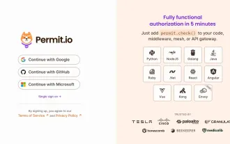 Building a Multi-Tenant SaaS Application with Next.js (Backend Integration)
Apr 11, 2025 am 08:23 AM
Building a Multi-Tenant SaaS Application with Next.js (Backend Integration)
Apr 11, 2025 am 08:23 AM
I built a functional multi-tenant SaaS application (an EdTech app) with your everyday tech tool and you can do the same. First, what’s a multi-tenant SaaS application? Multi-tenant SaaS applications let you serve multiple customers from a sing
