

CSS3新特性,兼容性,兼容方法总结_html/css_WEB-ITnose

CSS3新特性,兼容性,兼容方法总结
css3手册 css3手册
边框
border-radius
用于添加圆角效果
语法:
border-radius:[
实例:
border-radius:10px;
border-radius:5px 10px 15px 20px; //顺序是顺时针 border-radius:26px 106px 162px 32px/28px 80px 178px 26px; //标准语法格式border-radius:50%; //是相对于元素占据尺寸的百分比,即包含边框和padding后的尺寸
.radius{ border-top-left-radius:5px; //左上角,注意顺序是先上下后左右 border-top-right-radius:10px; //左上角 border-bottom-left-radius:15px; //左下角 border-bottom-left-radius:20px; //右上角 background-color:red; //即使元素没有边框,圆角也可以用到 background 上面,具体效果受 background-clip 影响。}兼容性:
IE9+,Firefox4+,Chrome5+,Safari5+,Opera01.5+,iOS Safari4+,Android Browser2.2+ ,Android Chrome18+
兼容方法:
低版本的chrome: -webkit-border-radius:10px; 低版本的firefox: -moz-border-radius:10px;
IE6/7/8:引入ie-css3兼容文件,不支持除了黑色(#000)以外的其他颜色
详情参阅 让IE6/IE7/IE8浏览器支持CSS3属性
详情参阅 border-radius
box-shadow
用于添加阴影效果
语法:
box-shadow:none|[inset? && [ inset:设置对象的阴影类型为内阴影。该值为空时,则对象的阴影类型为外阴影
实例:
box-shadow: 10px 10px 5px #888;
box-shadow: 3px 3px green, -1em 0 0.4em gold;兼容性:
IE9.0+,Firefox4.0+,Chrome10.0+,Safari5.1+,Opera10.5+,iOS Safari5.0+,Android Browser4.0+,Android Chrome18.0+
兼容方法:
低版本的chrome: -webkit-box-shadow:10px 10px 5px #888; 低版本的firefox: -moz-box-shadow:10px 10px 5px #888;
IE6/7/8:引入ie-css3兼容文件,不支持除了黑色(#000)以外的其他颜色
详情参阅 让IE6/IE7/IE8浏览器支持CSS3属性
详情参阅 box-shadow
border-image
用来给元素边框添加背景图片
语法:
border-image:<' border-image-source '> || <' border-image-slice '> [ / <' border-image-width '> | / <' border-image-width '>? / <' border-image-outset '> ]? || <' border-image-repeat '>
<' border-image-source '>:设置或检索对象的边框是否用图像定义样式或图像来源路径。
<' border-image-slice '>: 设置或检索对象的边框背景图的分割方式,该属性指定从上,右,下,左方位来分隔图像,将图像分成4个角,4条边和中间区域共9份,中间区域始终是透明的(即没图像填充),除非加上关键字 fill。
<' border-image-width '>: 设置或检索对象的边框厚度。
<' border-image-outset '>:设置或检索对象的边框图像可超出边框盒的大小。
<' border-image-repeat '>:设置或检索对象的边框图像的平铺方式repeat,round,stretch。
实例:
border-image:url("http://www.w3school.com.cn/i/border.png") 30 30 round;
border-image:url("http://www.w3school.com.cn/i/border.png") 30 30 stretch;兼容性:
IE11+, Firefox15+, Chrome16+ , Safari6+,Opera15+,iOS Safari6+,Android Browser4.4+, Android Chrome18+
兼容方法:
低版本的chrome: -webkit-border-image:url("http://www.w3school.com.cn/i/border.png") 30 30 stretch; 低版本的firefox: -moz-border-image:url("http://www.w3school.com.cn/i/border.png") 30 30 stretch; 低版本的Opera: -o-border-image:url("http://www.w3school.com.cn/i/border.png") 30 30 stretch;
IE未解决
详情参阅 border-image , border-image
背景
background-size
设置背景图片大小。
语法:
background-size: auto:背景图像的真实大小。 cover:将背景图像等比缩放到 完全覆盖容器 ,背景图像有可能超出容器。 contain:将背景图像等比缩放到宽度或高度与容器的宽度或高度相等,背景图像始终被 包含在容器内 。
实例:
background-size: cover;
background-size: contain;兼容性:
IE9+,Firefox4+, Chrome15+,Safari7+, Opera15+, iOS Safari7+, Android Browser4.4+, Android Chrome18+
兼容方法:
低版本的chrome: -webkit-background-size:10px 10px 5px #888; 不支持background简写
低版本的firefox: -moz-background-size:10px 10px 5px #888;IE8:
-
方法一(推荐)、引入backgroundsize.min.htc兼容文件
.size {width: 400px;height: 400px;margin: 20px auto 0;background: green url(img/1.jpg) no-repeat scroll center 0;background-size: cover;-ms-behavior: url(js/backgroundsize.min.htc);}Copy after login -
方法二、针对IE8的hack
<!--[if IE 8]> <style type="text/css"> .size{ -ms-filter: "progid:DXImageTransform.Microsoft.AlphaImageLoader(src='img/1.jpg', sizingMethod='scale')"; } //该函数只能模仿cover值,IE8下效果与IE9/10稍有不同,图片占满背景大小且不超出 </style><![endif]-->Copy after login详情参阅 background-size
background-origin
指定背景图片background-image 属性的原点位置的背景相对区域,当使用 background-attachment 为fixed时,该属性将被忽略不起作用
语法:
background-origin: padding-box:从padding区域(含padding)开始显示背景图像。 border-box: 从border区域(含border)开始显示背景图像。 content-box:从content区域开始显示背景图像
实例:
background-origin:content-box;padding:10px;
111111111111111111111111111
background-origin:border-box;padding:10px;border:15px solid transparent;111111111111111111
兼容性:
IE9+,Firefox4.0+ Chrome4.0+ Safari6.0+, iOS Safari6.0+, Android Browser3.0+, Android Chrome18+
兼容方法:
firefox4.0以下: -moz-background-origin:padding | border; 没有content
IE8下background-origin默认为padding-box
详情参阅 background-origin
background-clip
设置元素的背景(背景图片或颜色)是否延伸到边框下面。
语法:
background-clip: border-box背景延伸到边框外沿(但是在边框之下)。 padding-box边框下面没有背景,即背景延伸到内边距外沿。 content-box背景裁剪到内容区 (content-box) 外沿。
实例:
background-clip:border-box;
111111111111111
兼容性:
IE9+,Firefox4.0+, Chrome4.0+, Safari6.0+,iOS Safari6.0+, Android Browser3.0+, Android Chrome18.0+
兼容方法:
firefox4.0以下: -moz-background-origin:padding | border; 没有content
IE8下background-origin默认为padding-box
multiple backgrounds
语法:
background:[
实例:
background: url(test1.jpg) no-repeat scroll 10px 20px/50px 60px padding-box, url(test1.jpg) no-repeat scroll 10px 20px/70px 90px padding-box, url(test1.jpg) no-repeat scroll 10px 20px/110px 130px padding-box #aaa;
兼容性:
IE9+,Firefox3.6+, Chrome4.0+, Safari3.1+
兼容方法:
未解决
文本
text-shadow
为文字添加阴影
语法:
textshadow:none | [inset? && [ inset:设置对象的阴影类型为内阴影。该值为空时,则对象的阴影类型为外阴影
实例:
text-shadow:1px 1px 2px red;
12212121
兼容性:
IE10+, Firefox3.5+, Chrome4.0+, Safari6.0+
兼容方法:
低版本的chrome: -webkit-text-shadow:1px 1px 1px #000; 低版本的firefox: -moz-text-shadow:1px 1px 1px #000;
IE6/7/8:引入ie-css3兼容文件,不支持除了黑色(#000)以外的其他颜色
详情参阅 让IE6/IE7/IE8浏览器支持CSS3属性
word-wrap
浏览器是否允许单词中断换行
word-wrap 属性原本属于微软的一个私有属性,在 CSS3 现在的文本规范草案中已经被重名为 overflow-wrap
当你使用 <' overflow-wrap '> 时,最好同时使用 <' word-wrap '> 作为备选,作向前兼容。
语法:
word-wrap:normal | break-word
实例:
word-wrap: break-word;
FStrPrivFinÄndG (Gesetz zur Änderung des Fernstraßenbauprivatfinanzierungsgesetzes und straßenverkehrsrechtlicher Vorschriften)
兼容性:
IE6+,Firefox3.5+, Chrome4+, Safari6+, iOS Safari6+, Android Browser2.1+, Android Chrome18+
兼容方法:
文字
@font-face
能够加载服务器端的字体文件,让客户端显示客户端所没有安装的字体。
语法:
@font-face { font-family: <YourWebFontName>; src: <source> [<format>][,<source> [<format>]]*; [font-weight: <weight>]; [font-style: <style>];}实例:
@font-face { font-family: 'YourWebFontName'; src: url('YourWebFontName.eot'); /* IE9 Compat Modes */ src: url('YourWebFontName.eot?#iefix') format('embedded-opentype'), /* IE6-IE8 */ url('YourWebFontName.woff') format('woff'), /* Modern Browsers */ url('YourWebFontName.ttf') format('truetype'), /* Safari, Android, iOS */ url('YourWebFontName.svg#YourWebFontName') format('svg'); /* Legacy iOS */ font-weight: normal; font-style: normal;}兼容性:
几乎所有浏览器也支持的网络字体@font-face的用法
兼容方法:
详情参阅 @font-face
2D3D转换
transform
元素可以按照设定的值变形、旋转、缩放、倾斜
语法:
transform : none |
- matrix() = matrix(
[, ]{5,5}) - matrix3d() = matrix3d(
[, ]{15,15}) - translate() = translate(
[, ]?) - translate3d() = translate3d(
, , ) - translatex() = translatex(
) - translatey() = translatey(
) - translatez() = translatez(
) - rotate() = rotate(
) - rotate3d() = rotate3d(
, , , ) - rotatex() = rotatex(
) - rotatey() = rotatey(
) - rotatez() = rotatez(
) - scale() = scale(
[, ]?) - scale3d() = scale3d(
, , ) - scalex() = scalex(
) - scaley() = scaley(
) - scalez() = scalez(
) - skew() = skew(
[, ]?) - skewx() = skewx(
) - skewy() = skewy(
) - perspective() = perspective(
) -
= | 实例:
transform:none;
transform:rotate(30deg) scale(0.5);//大家记住了是空格隔开 transform:skew(45deg); transform:translate(100px 20px);
兼容性:
IE9+, Firefox3.5+, Chrome4.0+, Safari6.0+, iOS Safari8.4+, Android Browser4.4+, Android Chrome34+
兼容方法:
.transform{ -webkit-transform: x,y; -moz-transform: x,y; -ms-transform: x,y; -o-transform: x,y; transform: x,y;}
IE9以下不支持
详情参阅 transform
过渡
transition
css的属性值在一定的时间区间内平滑地过渡
语法:
transition :[<'transition-property'> || <'transition-duration'> || <'transition-timing-function'> || <'transition-delay'> [, [<'transition-property'> || <'transition-duration'> || <'transition-timing-function'> || <'transition-delay'>]]*
transition-property : none | all | [
transition-duration :
transition-timing-function : ease | linear | ease-in | ease-out | ease-in-out | cubic-bezier(
transition-delay :
实例:
transition: all .5s ease-in-out 1s;
兼容性:
IE10+, Firefox16+, Chrome26+ ,Safari6.1+ , iOS Safari7+, Android Browser4.4+, Android Chrome25+
兼容方法:
p { -webkit-transition: all .5s ease-in-out 1s; -moz-transition: all .5s ease-in-out 1s; -o-transition: all .5s ease-in-out 1s; transition: all .5s ease-in-out 1s;}
IE9以及更早的版本,不支持 transition 属性。
详情参阅 transition
动画
animation
检索或设置对象所应用的动画特效。
语法:
animation:
实例:
.animation:hover{ -webkit-animation:animated_div 5s 1; -moz-animation:animated_div 5s 1; animation:animated_div 5s 1;}@keyframes animated_div{ 0% {transform: rotate(0deg);left:0px;} 25% {transform: rotate(20deg);left:0px;} 50% {transform: rotate(0deg);left:500px;} 55% {transform: rotate(0deg);left:500px;} 70% {transform: rotate(0deg);left:500px;background:#1ec7e6;} 100% {transform: rotate(-360deg);left:0px;}}兼容性:
IE10+,Firefox16+, Chrome43+, Safari9+
兼容方法:
低版本的chrome:-webkit-
低版本的firefox:-moz-
IE9及以下不支持
详情参阅 animation
@keyframes
用于创建动画
语法:
@keyframes IDENT { 0% { Properties:Properties value; } Percentage { Properties:Properties value; } 100% { Properties:Properties value; }}实例:
见上例
兼容性:
IE10+,Firefox16+, Chrome43+, Safari9+
兼容方法:
低版本的chrome:-webkit-
低版本的firefox:-moz-
IE9及以下不支持
详情参阅 animation
颜色
linear-gradient radial-gradient
实现真实的渐变效果。
语法:
实例:
background:linear-gradient(to bottom, #fff 0%, red 100%);
background:radial-gradient(#fff 0%, red 100%);兼容性:
IE10+, Firefox16+, Chrome26+, Safari6.1+
兼容方法:
低版本的chrome:-webkit-
低版本的firefox:-moz-
IE9及以下不支持
详情参阅 gradient
rgba(r,g,b,a)
设置颜色red+green+blue+alpha
语法:
rgba(r,g,b,alpha)
实例:
rgba(255,0,0,.2)
兼容性:
IE9+, Firefox2+, Chrome4+, Safari3+, iOS Safari3.2+, Android Browser2.1+, Android Chrome18+
兼容方法:
IE6/7/8不支持使用 rgba 模式实现透明度,可使用 IE 滤镜处理
-m-filter:progid:DXImageTransform.Microsoft.gradient(startColorstr=#7f000000,endColorstr=#7f000000);详情参阅 IE8下兼容rgba颜色的半透明背景
flex布局
Flex元素是可以让你的布局根据浏览器的大小变化进行自动伸缩。
flex
设置或检索弹性盒模型对象的子元素如何分配空间。用在子容器上
语法:
flex:none | <' flex-grow '> <' flex-shrink >'? || <' flex-basis '> 默认值为0 1 auto,建议优先使用这个属性,而不是单独写三个分离的属性,因为浏览器会推算相关值。 flex-grow:
实例:
.parent{ display:-webkit-flex; //低版本的chrome display:-moz-box; //低版本的firefox display:-ms-flexbox; //IE10 display:flex; width:600px; height:100px;border:1px solid #000; }.parent div{ -webkit-flex:1; -moz-box-flex:1; -ms-flex:1; flex:1; border:1px solid red;}
children1
children2
children3
兼容性:
IE11+,Firefox22+, Chrome21+, Safari6.1+
兼容方法:
低版本的chrome:-webkit- 或者 -webkit-box-flex
低版本的firefox:-moz-box-flex:1;
IE10:-ms-flex:1;
box-flex效果类似于过渡版本和新版本的flex属性;
详情参阅 flex
flex-flow
设置或检索弹性盒模型对象的子元素排列方式。用在父容器上
语法:
flex-flow:<' flex-direction '> || <' flex-wrap '> <' flex-direction '>:定义弹性盒子元素的排列方向。 flex-direction:row | row-reverse | column | column-reverse
- row:主轴与行内轴方向作为默认的书写模式。即横向从左到右排列(左对齐)。
- row-reverse:对齐方式与row相反。
- column:主轴与块轴方向作为默认的书写模式。即纵向从上往下排列(顶对齐)。
- column-reverse:对齐方式与column相反。
<' flex-wrap '>控制flex容器是单行或者多行. flex-wrap:nowrap | wrap | wrap-reverse
- nowrap:flex容器为单行。该情况下flex子项可能会溢出容器
- wrap:flex容器为多行。该情况下flex子项溢出的部分会被放置到新行,子项内部会发生断行
- wrap-reverse:反转 wrap 排列。
实例:
flex-flow:row nowrap
- a
- b
- c
flex-flow:row wrap-reverse
- a
- b
- c
flex-flow:column wrap-reverse;
- a
- b
- c
兼容性:
IE11+, Firefox28+, Chrome29+, Safari9+
兼容方法:
可以通过box-orient:horizontal + box-direction:normal 达到新版本 flex-direction:row 的效果;
可以通过box-orient:horizontal + box-direction:reverse 达到新版本 flex-direction:row-reverse 的效果;
可以通过box-orient:vertical + box-direction:normal 达到新版本 flex-direction:column 的效果;
可以通过box-orient:horizontal + box-direction:reverse 达到新版本 flex-direction:column-reverse 的效果;
box-lines效果类似于过渡版本和新版本的flex-wrap属性
justify-content
设置或检索弹性盒子元素在主轴(横轴)方向上的定位方式。
语法:
justify-content:flex-start | flex-end | center | space-between | space-around
- flex-start(默认值):左对齐
- flex-end:右对齐
- center: 居中
- space-between:两端对齐,项目之间的间隔都相等。
- space-around:每个子元素两侧的间隔相等。所以,子元素之间的间隔比子元素与边框的间隔大一倍
实例:
兼容性:
IE11+, Firefox22+, Chrome29+, Safari9+
兼容方法:
详情参阅 justify-content
align-content
调整伸缩子元素在侧轴(纵轴)上的定位方式,如果子元素只有一根轴线,该属性不起作用
语法:
align-content:flex-start | flex-end | center | space-between | space-around | stretch
- flex-start:与交叉轴的起点对齐。
- flex-end:与交叉轴的终点对齐。
- center:与交叉轴的中点对齐。
- space-between:与交叉轴两端对齐,轴线之间的间隔平均分布。
- space-around:每根轴线两侧的间隔都相等。所以,轴线之间的间隔比轴线与边框的间隔大一倍。
- stretch(默认值):轴线占满整个交叉轴。
实例:
兼容性:
IE11+, Firefox22+, Chrome29+, Safari9+
兼容方法:
低版本的chrome:-webkit-
box-pack效果等同于过渡版本的flex-pack属性和新版本的justify-content属性;
详情参阅 align-content
align-items
定义flex子项在flex容器的当前行的侧轴(纵轴)方向上的定位方式。
语法:
align-items:flex-start | flex-end | center | baseline | stretch
- flex-start:交叉轴的起点对齐。
- flex-end:交叉轴的终点对齐。
- center:交叉轴的中点对齐。
- baseline: 项目的第一行文字的基线对齐。
- stretch(默认值):如果项目未设置高度或设为auto,将占满整个容器的高度。
实例:
兼容性:
IE11+, Firefox22+, Chrome29+, Safari9+
兼容方法:
低版本的chrome:-webkit-
box-align效果等同于过渡版本的flex-align属性和新版本的align-items属性;
详情参阅 align-items
align-self
定义flex子项单独在侧轴(纵轴)方向上的对齐方式。align-self属性允许单个项目有与其他项目不一样的对齐方式,可覆盖align-items属性。默认值为auto,表示继承父元素的align-items属性,如果没有父元素,则等同于stretch。
语法:
align-self:auto | flex-start | flex-end | center | baseline | stretch
实例:
兼容性:
IE11+, Firefox22+, Chrome29+, Safari9+
兼容方法:
低版本的chrome:-webkit-
详情参阅 align-self
order
设置或检索弹性盒模型对象的子元素的排列顺序。数值越小,排列越靠前,默认为0。
语法:
order:
实例:
兼容性:
IE11+, Firefox22+, Chrome29+, Safari9+
兼容方法:
低版本的chrome:-webkit-
box-oridinal-group效果等同于过渡版本的flex-order属性和新版本的order属性;
详情参阅 order
其他
box-sizing
用来改变默认的 CSS 盒模型 对元素宽高的计算方式
语法:
box-sizing:content-box | border-box
content-box:
padding和border不被包含在定义的width和height之内。对象的实际宽度等于设置的width值和border、padding之和,即 ( Element width = width + border + padding )
border-box:
padding和border被包含在定义的width和height之内。对象的实际宽度就等于设置的width值,即使定义有border和padding也不会改变对象的实际宽度,即 ( Element width = width )
实例:
box-sizing:content-box
box-sizing:border-box兼容性:
IE8+, Firefox29+, Chrome10+, Safari6+
兼容方法:
详情参阅 box-sizing
resize
设置或检索对象的区域是否允许用户缩放,调节元素尺寸大小。多用于textarea元素
语法:
resize:none | both | horizontal | vertical
实例:
resize:none
兼容性:
Firefox Chrome Safari现代版都兼容
兼容方法:
IE全不兼容

Hot AI Tools

Undresser.AI Undress
AI-powered app for creating realistic nude photos

AI Clothes Remover
Online AI tool for removing clothes from photos.

Undress AI Tool
Undress images for free

Clothoff.io
AI clothes remover

Video Face Swap
Swap faces in any video effortlessly with our completely free AI face swap tool!

Hot Article
Hot Tools

Notepad++7.3.1
Easy-to-use and free code editor

SublimeText3 Chinese version
Chinese version, very easy to use

Zend Studio 13.0.1
Powerful PHP integrated development environment

Dreamweaver CS6
Visual web development tools

SublimeText3 Mac version
God-level code editing software (SublimeText3)
Hot Topics
 1662
1662
 14
1418
52
1311
25
1261
29
1234
24
14
1418
52
1311
25
1261
29
1234
24

 Comparison and difference analysis of Bluetooth 5.3 and 5.2 versions
Dec 28, 2023 pm 06:08 PM
Comparison and difference analysis of Bluetooth 5.3 and 5.2 versions
Dec 28, 2023 pm 06:08 PM
Nowadays, many mobile phones claim to support Bluetooth 5.3 version, so what is the difference between Bluetooth 5.3 and 5.2? In fact, they are essentially subsequent updated versions of Bluetooth 5, and there is not much difference in most performance and functions. The difference between Bluetooth 5.3 and 5.2: 1. Data rate 1 and 5.3 can support higher data rates up to 2Mbps. 2. While 5.2 can only reach a maximum of 1Mbps, it means that 5.3 can transmit data faster and more stably. 2. Encryption control enhancement 2. Bluetooth 5.3 improves encryption key length control options, improves security, and can better connect to access control and other devices. 3. At the same time, because the administrator control is simpler, the connection can be more convenient and faster, which is not possible in 5.2.
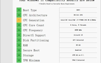 Solution to i7-7700 unable to upgrade to Windows 11
Dec 26, 2023 pm 06:52 PM
Solution to i7-7700 unable to upgrade to Windows 11
Dec 26, 2023 pm 06:52 PM
The performance of i77700 is completely sufficient to run win11, but users find that their i77700 cannot be upgraded to win11. This is mainly due to restrictions imposed by Microsoft, so they can install it as long as they skip this restriction. i77700 cannot be upgraded to win11: 1. Because Microsoft limits the CPU version. 2. Only the eighth generation and above versions of Intel can directly upgrade to win11. 3. As the 7th generation, i77700 cannot meet the upgrade needs of win11. 4. However, i77700 is completely capable of using win11 smoothly in terms of performance. 5. So you can use the win11 direct installation system of this site. 6. After the download is complete, right-click the file and "load" it. 7. Double-click to run the "One-click
 Browser compatibility
Sep 14, 2023 am 11:08 AM
Browser compatibility
Sep 14, 2023 am 11:08 AM
Methods for setting browser compatibility include selecting appropriate HTML and CSS standards, using CSS prefixes and resets, using browser compatibility prefix libraries, detecting browser features, using browser compatibility tools, and conducting cross-browser testing. Detailed introduction: 1. Choose appropriate HTML and CSS standards. When writing HTML and CSS codes, you should try to follow W3C standards. Different browsers will have different support for standards, but following standards can maximize compatibility. sex; 2. Use CSS prefixes, etc.
 How compatible is the Go language on Linux systems?
Mar 22, 2024 am 10:36 AM
How compatible is the Go language on Linux systems?
Mar 22, 2024 am 10:36 AM
The Go language has very good compatibility on Linux systems. It can run seamlessly on various Linux distributions and supports processors of different architectures. This article will introduce the compatibility of Go language on Linux systems and demonstrate its powerful applicability through specific code examples. 1. Install the Go language environment. Installing the Go language environment on a Linux system is very simple. You only need to download the corresponding Go binary package and set the relevant environment variables. Following are the steps to install Go language on Ubuntu system:
 Detailed explanation of win11 compatibility issues with win10 software
Jan 05, 2024 am 11:18 AM
Detailed explanation of win11 compatibility issues with win10 software
Jan 05, 2024 am 11:18 AM
The software in the win10 system has been perfectly optimized, but for the latest win11 users, everyone must be curious about whether this system can be supported, so the following is a detailed introduction to the win11 software that does not support win10. Come and find out together. Does win11 support win10 software: 1. Win10 system software and even Win7 system applications are well compatible. 2. According to feedback from experts who use the Win11 system, there are currently no application incompatibility issues. 3. So you can upgrade boldly with confidence, but ordinary users are advised to wait until the official version of Win11 is released before upgrading. 4. Win11 not only has good compatibility, but also has Windo
 Can I use Bluetooth headphones in airplane mode?
Feb 19, 2024 pm 10:56 PM
Can I use Bluetooth headphones in airplane mode?
Feb 19, 2024 pm 10:56 PM
With the continuous development of modern technology, wireless Bluetooth headsets have become an indispensable part of people's daily lives. The emergence of wireless headphones frees our hands, allowing us to enjoy music, calls and other entertainment activities more freely. However, when we fly, we are often asked to put our phones in airplane mode. So the question is, can I use Bluetooth headphones in airplane mode? In this article, we will explore this question. First, let’s understand what airplane mode does and means. Airplane mode is a special mode for mobile phones
 Best practices for resolving PHP function compatibility issues
May 01, 2024 pm 02:42 PM
Best practices for resolving PHP function compatibility issues
May 01, 2024 pm 02:42 PM
Best practices to solve PHP function compatibility issues: Use versioned function names (for example: array_map_recursive()) Leverage function aliases (for example: functionarray_map($callback,$array){...}) to check function availability (for example: if (function_exists('array_map_recursive')){...}) use namespace (for example: namespaceMyNamespace{...})
 WIN10 compatibility lost, steps to recover it
Mar 27, 2024 am 11:36 AM
WIN10 compatibility lost, steps to recover it
Mar 27, 2024 am 11:36 AM
1. Right-click the program and find that the [Compatibility] tab is not found in the properties window that opens. 2. On the Win10 desktop, right-click the Start button in the lower left corner of the desktop and select the [Run] menu item in the pop-up menu. 3. The Win10 run window will open, enter gpedit.msc in the window, and then click the OK button. 4. The Local Group Policy Editor window will open. In the window, click the [Computer Configuration/Administrative Templates/Windows Components] menu item. 5. In the opened Windows component menu, find the [Application Compatibility] menu item, and then find the [Remove Program Compatibility Property Page] setting item in the right window. 6. Right-click the setting item, and in the pop-up menu
