
 Web Front-end
JS Tutorial
JS component Bootstrap dropdown component extends hover event_javascript skills
Web Front-end
JS Tutorial
JS component Bootstrap dropdown component extends hover event_javascript skills
JS component Bootstrap dropdown component extends hover event_javascript skills

The dropdown component in the bootstrap navigation bar is used very frequently. This article will introduce the dropdown component in bootstrap to extend the hover event. The specific content is as follows
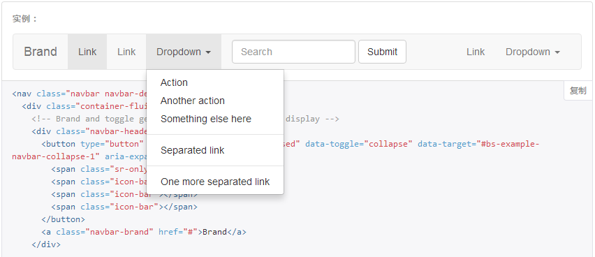
How to implement this hover event? In fact, it can be easily accomplished based on the click event of the dropdown component. Those who are careful can find that when the drop-down box appears, its parent will have an open class attribute. We only need to add or delete the open class to the parent when listening to the hover event.
boostrap-hover-dropdown.js plugin, code URL hosted on github: View
The following is the complete js plug-in code:
// bootstrap响应式导航条<br>;(function($, window, undefined) {
  // outside the scope of the jQuery plugin to
  // keep track of all dropdowns
  var $allDropdowns = $();

  // if instantlyCloseOthers is true, then it will instantly
  // shut other nav items when a new one is hovered over
  $.fn.dropdownHover = function(options) {

    // the element we really care about
    // is the dropdown-toggle's parent
    $allDropdowns = $allDropdowns.add(this.parent());

    return this.each(function() {
      var $this = $(this).parent(),
        defaults = {
          delay: 500,
          instantlyCloseOthers: true
        },
        data = {
          delay: $(this).data('delay'),
          instantlyCloseOthers: $(this).data('close-others')
        },
        options = $.extend(true, {}, defaults, options, data),
        timeout;

      $this.hover(function() {
        if(options.instantlyCloseOthers === true)
          $allDropdowns.removeClass('open');

        window.clearTimeout(timeout);
        $(this).addClass('open');
      }, function() {
        timeout = window.setTimeout(function() {
          $this.removeClass('open');
        }, options.delay);
      });
    });
  };

  $('[data-hover="dropdown"]').dropdownHover();
})(jQuery, this);You can see that the author added a semicolon; in front of the plug-in to increase the compatibility of the plug-in, because the previous js code may not have been written;. If you do not add a semicolon here, it may cause a js error because there is no line break.
Optional parameters
delay: (optional) Delay in milliseconds. This is the time to wait before closing the dropdown when the mouse is no longer over the dropdown menu or button/navigation item, activating it. Default value is 500.
instantlyCloseOthers: (optional) A Boolean value that, if true, will immediately close all other dropdown menus in use when you launch a new selector matching navigation. Default value is true.
After adding the above js code, the effect cannot be achieved at this time, because we need to do one more step, which is to add the data-* attribute to the element:
data-hover="dropdown"
Complete HTML element code:
Options can be set through data attributes, or through data-delay and data-close-others
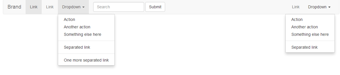
Of course, there is the easiest way, which is to use CSS hover control
[/code].nav> li:hover .dropdown-menu {display: block;}[/code]
Such a line of code can also achieve the desired hover effect, but if you click on the component while hovering, and then hover another component, the following effect will appear:
The above is how to use the Bootstrap dropdown component to extend the hover event. I hope it will be helpful for everyone to master the hover event.

Hot AI Tools

Undresser.AI Undress
AI-powered app for creating realistic nude photos

AI Clothes Remover
Online AI tool for removing clothes from photos.

Undress AI Tool
Undress images for free

Clothoff.io
AI clothes remover

Video Face Swap
Swap faces in any video effortlessly with our completely free AI face swap tool!

Hot Article
Hot Tools

Notepad++7.3.1
Easy-to-use and free code editor

SublimeText3 Chinese version
Chinese version, very easy to use

Zend Studio 13.0.1
Powerful PHP integrated development environment

Dreamweaver CS6
Visual web development tools

SublimeText3 Mac version
God-level code editing software (SublimeText3)
Hot Topics
 1668
1668
 14
1427
52
1329
25
1273
29
1256
24
14
1427
52
1329
25
1273
29
1256
24

 How to use bootstrap in vue
Apr 07, 2025 pm 11:33 PM
How to use bootstrap in vue
Apr 07, 2025 pm 11:33 PM
Using Bootstrap in Vue.js is divided into five steps: Install Bootstrap. Import Bootstrap in main.js. Use the Bootstrap component directly in the template. Optional: Custom style. Optional: Use plug-ins.
 How to get the bootstrap search bar
Apr 07, 2025 pm 03:33 PM
How to get the bootstrap search bar
Apr 07, 2025 pm 03:33 PM
How to use Bootstrap to get the value of the search bar: Determines the ID or name of the search bar. Use JavaScript to get DOM elements. Gets the value of the element. Perform the required actions.
 How to do vertical centering of bootstrap
Apr 07, 2025 pm 03:21 PM
How to do vertical centering of bootstrap
Apr 07, 2025 pm 03:21 PM
Use Bootstrap to implement vertical centering: flexbox method: Use the d-flex, justify-content-center, and align-items-center classes to place elements in the flexbox container. align-items-center class method: For browsers that do not support flexbox, use the align-items-center class, provided that the parent element has a defined height.
 How to insert pictures on bootstrap
Apr 07, 2025 pm 03:30 PM
How to insert pictures on bootstrap
Apr 07, 2025 pm 03:30 PM
There are several ways to insert images in Bootstrap: insert images directly, using the HTML img tag. With the Bootstrap image component, you can provide responsive images and more styles. Set the image size, use the img-fluid class to make the image adaptable. Set the border, using the img-bordered class. Set the rounded corners and use the img-rounded class. Set the shadow, use the shadow class. Resize and position the image, using CSS style. Using the background image, use the background-image CSS property.
 How to write split lines on bootstrap
Apr 07, 2025 pm 03:12 PM
How to write split lines on bootstrap
Apr 07, 2025 pm 03:12 PM
There are two ways to create a Bootstrap split line: using the tag, which creates a horizontal split line. Use the CSS border property to create custom style split lines.
 How to set up the framework for bootstrap
Apr 07, 2025 pm 03:27 PM
How to set up the framework for bootstrap
Apr 07, 2025 pm 03:27 PM
To set up the Bootstrap framework, you need to follow these steps: 1. Reference the Bootstrap file via CDN; 2. Download and host the file on your own server; 3. Include the Bootstrap file in HTML; 4. Compile Sass/Less as needed; 5. Import a custom file (optional). Once setup is complete, you can use Bootstrap's grid systems, components, and styles to create responsive websites and applications.
 How to use bootstrap button
Apr 07, 2025 pm 03:09 PM
How to use bootstrap button
Apr 07, 2025 pm 03:09 PM
How to use the Bootstrap button? Introduce Bootstrap CSS to create button elements and add Bootstrap button class to add button text
 How to resize bootstrap
Apr 07, 2025 pm 03:18 PM
How to resize bootstrap
Apr 07, 2025 pm 03:18 PM
To adjust the size of elements in Bootstrap, you can use the dimension class, which includes: adjusting width: .col-, .w-, .mw-adjust height: .h-, .min-h-, .max-h-
