

How to make a bar graph in Excel

This tutorial shows you how to create and customize bar graphs in Excel, including sorting data automatically. We'll cover creating various bar chart types, adjusting bar width and colors, and handling negative values.
Bar graphs, alongside pie charts, are frequently used for comparing numerical data like percentages, frequencies, or measurements across different categories. A specialized bar graph, the Gantt chart, is common in project management.
This tutorial explores:
- Bar chart fundamentals
- Creating bar charts in Excel
- Different bar chart types
- Customization:
- Adjusting bar width and spacing
- Handling negative values
- Sorting data in bar charts
Bar Chart Basics
A bar graph (or bar chart) uses rectangular bars to represent data categories, with bar lengths proportional to the data values. They can be vertical or horizontal (vertical bar graphs are called column charts in Excel).
The image below shows a standard 2-D clustered bar chart with three data series (grey, green, blue) and four categories (Jan-Apr).

Creating Bar Charts in Excel
Creating a bar chart is straightforward: select your data, go to the "Insert" tab, and choose your desired bar chart type from the "Charts" group.
The image below shows creating a standard 2-D bar chart.

The resulting chart (shown below) displays one data series if your data has a single numerical column; multiple columns create multiple data series, each with a different color.


To view all available bar chart types, click "More Column Charts..." and select from the subtypes. Adjust layout and style using the "Design" tab's "Quick Layout" and "Chart Styles" options.


Excel Bar Chart Types
Excel offers several bar chart subtypes:
-
Clustered Bar Charts: Compare values across categories.

-
Stacked Bar Charts: Show the proportion of individual items to the whole.
-
100% Stacked Bar Charts: Show the percentage contribution of each value to the total in each category.
-
Cylinder, Cone, and Pyramid Charts: Similar to rectangular bar charts, but with different shapes. In Excel 2013 and later, create a 3-D bar chart and then change the column shape in the "Format Data Series" pane.


Customizing Bar Graphs
Customize your chart title, axes, data labels, legend, gridlines, and more using standard Excel chart formatting options.
Changing Bar Width and Spacing
Right-click a data series, choose "Format Data Series...", and adjust the "Gap Width" and "Series Overlap" (2-D) or "Gap Depth" (3-D) sliders to control bar width and spacing.


Bar Charts with Negative Values
Excel handles negative values, but you may need to adjust the vertical axis label position ("Low" in "Format Axis...") and use different colors for negative bars ("Invert if Negative" in "Format Data Series...").


Sorting Data on Bar Charts
By default, Excel reverses the order of data categories in bar charts. To sort correctly, sort your source data accordingly (ascending for ascending order on the chart, and vice versa).


To sort without changing source data, in "Format Axis...", select "At maximum category" and "Categories in reverse order". This also affects data series order.


To reorder data series independently, use the "Select Data Source" dialog or edit data series formulas.


This comprehensive guide helps you master Excel bar graph creation and customization.
The above is the detailed content of How to make a bar graph in Excel. For more information, please follow other related articles on the PHP Chinese website!

Hot AI Tools

Undresser.AI Undress
AI-powered app for creating realistic nude photos

AI Clothes Remover
Online AI tool for removing clothes from photos.

Undress AI Tool
Undress images for free

Clothoff.io
AI clothes remover

Video Face Swap
Swap faces in any video effortlessly with our completely free AI face swap tool!

Hot Article
Hot Tools

Notepad++7.3.1
Easy-to-use and free code editor

SublimeText3 Chinese version
Chinese version, very easy to use

Zend Studio 13.0.1
Powerful PHP integrated development environment

Dreamweaver CS6
Visual web development tools

SublimeText3 Mac version
God-level code editing software (SublimeText3)
Hot Topics
 1664
1664
 14
1421
52
1315
25
1266
29
1239
24
14
1421
52
1315
25
1266
29
1239
24

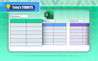 If You Don't Rename Tables in Excel, Today's the Day to Start
Apr 15, 2025 am 12:58 AM
If You Don't Rename Tables in Excel, Today's the Day to Start
Apr 15, 2025 am 12:58 AM
Quick link Why should tables be named in Excel How to name a table in Excel Excel table naming rules and techniques By default, tables in Excel are named Table1, Table2, Table3, and so on. However, you don't have to stick to these tags. In fact, it would be better if you don't! In this quick guide, I will explain why you should always rename tables in Excel and show you how to do this. Why should tables be named in Excel While it may take some time to develop the habit of naming tables in Excel (if you don't usually do this), the following reasons illustrate today
 How to change Excel table styles and remove table formatting
Apr 19, 2025 am 11:45 AM
How to change Excel table styles and remove table formatting
Apr 19, 2025 am 11:45 AM
This tutorial shows you how to quickly apply, modify, and remove Excel table styles while preserving all table functionalities. Want to make your Excel tables look exactly how you want? Read on! After creating an Excel table, the first step is usual
 How to Format a Spilled Array in Excel
Apr 10, 2025 pm 12:01 PM
How to Format a Spilled Array in Excel
Apr 10, 2025 pm 12:01 PM
Use formula conditional formatting to handle overflow arrays in Excel Direct formatting of overflow arrays in Excel can cause problems, especially when the data shape or size changes. Formula-based conditional formatting rules allow automatic formatting to be adjusted when data parameters change. Adding a dollar sign ($) before a column reference applies a rule to all rows in the data. In Excel, you can apply direct formatting to the values or background of a cell to make the spreadsheet easier to read. However, when an Excel formula returns a set of values (called overflow arrays), applying direct formatting will cause problems if the size or shape of the data changes. Suppose you have this spreadsheet with overflow results from the PIVOTBY formula,
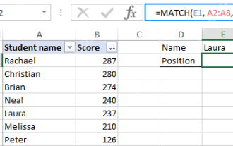 Excel MATCH function with formula examples
Apr 15, 2025 am 11:21 AM
Excel MATCH function with formula examples
Apr 15, 2025 am 11:21 AM
This tutorial explains how to use MATCH function in Excel with formula examples. It also shows how to improve your lookup formulas by a making dynamic formula with VLOOKUP and MATCH. In Microsoft Excel, there are many different lookup/ref

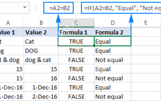 Excel: Compare strings in two cells for matches (case-insensitive or exact)
Apr 16, 2025 am 11:26 AM
Excel: Compare strings in two cells for matches (case-insensitive or exact)
Apr 16, 2025 am 11:26 AM
The tutorial shows how to compare text strings in Excel for case-insensitive and exact match. You will learn a number of formulas to compare two cells by their values, string length, or the number of occurrences of a specific character, a
 How to Make Your Excel Spreadsheet Accessible to All
Apr 18, 2025 am 01:06 AM
How to Make Your Excel Spreadsheet Accessible to All
Apr 18, 2025 am 01:06 AM
Improve the accessibility of Excel tables: A practical guide When creating a Microsoft Excel workbook, be sure to take the necessary steps to make sure everyone has access to it, especially if you plan to share the workbook with others. This guide will share some practical tips to help you achieve this. Use a descriptive worksheet name One way to improve accessibility of Excel workbooks is to change the name of the worksheet. By default, Excel worksheets are named Sheet1, Sheet2, Sheet3, etc. This non-descriptive numbering system will continue when you click " " to add a new worksheet. There are multiple benefits to changing the worksheet name to make it more accurate to describe the worksheet content: carry
 How to Use Excel's AGGREGATE Function to Refine Calculations
Apr 12, 2025 am 12:54 AM
How to Use Excel's AGGREGATE Function to Refine Calculations
Apr 12, 2025 am 12:54 AM
Quick Links The AGGREGATE Syntax
