

How To Get Smoother Rounded Corners

Border-radius — don’t ya just love it? It’s easily over-used, but done nicely and not too often, rounded corners can add a touch of class to pretty-much anything.
However certain color combinations can produce a somewhat jagged effect, even with the anti-aliasing that all browsers apply. In my experience, the offender is dark backgrounds with lighter borders, particularly against off-white backgrounds, and is particularly pronounced in Safari, though it’s there in all browsers.
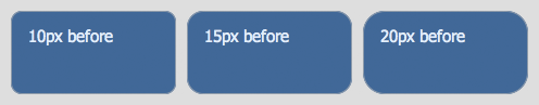
Here’s an image taken with Safari, that illustrates this with three different border radii:
Looks pretty good, but you can clearly see a slightly jagged effect to each corner. Now here’s those boxes again, this time with smoother corners:

And the difference? Simply split the colors between different elements — the outer element has the border and the specified border-radius, while the inner element has the background-color and a slightly smaller border-radius.
It’s a simple trick, and not a huge difference, but there definitely is a difference and a clear improvement, as you can see. I’m not entirely sure why it makes a difference, but I imagine it’s because of the way the anti-aliasing algorithms are applied; because each algorithm only deals with one color instead of two, or the way the now-separate anti-aliasings merge together; something.
If you’d like to poke around those examples in more detail, here are the live demos from which those screenshots were taken. But you can also see it right on this page — the categories tabs at the top, and the boxes down the right with dark-blue headers, all use this technique. I developed it while building these templates, because the jaggedness was bugging me!
And now they’re smooth as the proverbial baby’s bottom!
Photo credit: meltingnoise
Frequently Asked Questions (FAQs) about Smoother Rounded Corners in CSS
What is the significance of using smoother rounded corners in web design?
Smoother rounded corners play a crucial role in enhancing the aesthetics of a website. They make the design more appealing and user-friendly. Rounded corners are easier on the eyes as they guide the viewer’s attention towards the content. They also give a sense of professionalism and sophistication to the design. Moreover, smoother rounded corners can make elements like buttons and cards more clickable and interactive, improving the overall user experience.
How can I create smoother rounded corners using CSS?
CSS provides a property called ‘border-radius’ to create rounded corners. You can specify the radius of the corners to control their roundness. For smoother corners, you can use larger values. For example, ‘border-radius: 50%;’ will create a circle if applied to a square element. You can also specify different values for each corner to create unique shapes.
Can I use percentages with the border-radius property?
Yes, you can use percentages with the border-radius property. When you use a percentage, it’s based on the corresponding dimensions of the box. For instance, ‘border-radius: 50%;’ will create a circle if the element is a square. If the element is a rectangle, it will create an ellipse.
How does the border-radius property work with background images?
The border-radius property also affects background images. The image will be clipped to fit within the rounded corners. This can create a unique effect and can be used to highlight certain parts of an image.
What are the browser compatibility issues with the border-radius property?
The border-radius property is well supported in all modern browsers, including Chrome, Firefox, Safari, and Edge. However, it may not work correctly in older versions of Internet Explorer. To ensure compatibility, you can use vendor prefixes like ‘-webkit-‘ for Chrome and Safari, and ‘-moz-‘ for Firefox.
Can I animate the border-radius property?
Yes, you can animate the border-radius property using CSS transitions or animations. This can create interesting effects, such as a button that changes shape when hovered over.
How can I create complex shapes with the border-radius property?
You can create complex shapes by specifying different values for each corner of the element. For example, ‘border-radius: 10px 20px 30px 40px;’ will give each corner a different radius. You can also use the ‘/’ syntax to specify horizontal and vertical radii for each corner, allowing for even more complex shapes.
What is the difference between ‘border-radius’ and ‘outline-radius’?
The ‘border-radius’ property affects the border of an element, while the ‘outline-radius’ property affects the outline. However, ‘outline-radius’ is not a standard CSS property and is not supported in most browsers.
Can I use the border-radius property with other CSS properties?
Yes, the border-radius property can be used in combination with other CSS properties to create unique effects. For example, you can use it with box-shadow to create a shadow that follows the shape of the rounded corners.
How can I create a smooth transition effect on hover using the border-radius property?
You can create a smooth transition effect on hover by using the ‘transition’ property in combination with ‘border-radius’. For example, ‘transition: border-radius 0.5s;’ will create a smooth transition over half a second when the border-radius changes.
The above is the detailed content of How To Get Smoother Rounded Corners. For more information, please follow other related articles on the PHP Chinese website!

Hot AI Tools

Undresser.AI Undress
AI-powered app for creating realistic nude photos

AI Clothes Remover
Online AI tool for removing clothes from photos.

Undress AI Tool
Undress images for free

Clothoff.io
AI clothes remover

Video Face Swap
Swap faces in any video effortlessly with our completely free AI face swap tool!

Hot Article
Hot Tools

Notepad++7.3.1
Easy-to-use and free code editor

SublimeText3 Chinese version
Chinese version, very easy to use

Zend Studio 13.0.1
Powerful PHP integrated development environment

Dreamweaver CS6
Visual web development tools

SublimeText3 Mac version
God-level code editing software (SublimeText3)
Hot Topics
 1655
1655
 14
1413
52
1306
25
1252
29
1226
24
14
1413
52
1306
25
1252
29
1226
24

 What should I do if I encounter garbled code printing for front-end thermal paper receipts?
Apr 04, 2025 pm 02:42 PM
What should I do if I encounter garbled code printing for front-end thermal paper receipts?
Apr 04, 2025 pm 02:42 PM
Frequently Asked Questions and Solutions for Front-end Thermal Paper Ticket Printing In Front-end Development, Ticket Printing is a common requirement. However, many developers are implementing...
 Demystifying JavaScript: What It Does and Why It Matters
Apr 09, 2025 am 12:07 AM
Demystifying JavaScript: What It Does and Why It Matters
Apr 09, 2025 am 12:07 AM
JavaScript is the cornerstone of modern web development, and its main functions include event-driven programming, dynamic content generation and asynchronous programming. 1) Event-driven programming allows web pages to change dynamically according to user operations. 2) Dynamic content generation allows page content to be adjusted according to conditions. 3) Asynchronous programming ensures that the user interface is not blocked. JavaScript is widely used in web interaction, single-page application and server-side development, greatly improving the flexibility of user experience and cross-platform development.
 Who gets paid more Python or JavaScript?
Apr 04, 2025 am 12:09 AM
Who gets paid more Python or JavaScript?
Apr 04, 2025 am 12:09 AM
There is no absolute salary for Python and JavaScript developers, depending on skills and industry needs. 1. Python may be paid more in data science and machine learning. 2. JavaScript has great demand in front-end and full-stack development, and its salary is also considerable. 3. Influencing factors include experience, geographical location, company size and specific skills.
 How to achieve parallax scrolling and element animation effects, like Shiseido's official website?
or:
How can we achieve the animation effect accompanied by page scrolling like Shiseido's official website?
Apr 04, 2025 pm 05:36 PM
How to achieve parallax scrolling and element animation effects, like Shiseido's official website?
or:
How can we achieve the animation effect accompanied by page scrolling like Shiseido's official website?
Apr 04, 2025 pm 05:36 PM
Discussion on the realization of parallax scrolling and element animation effects in this article will explore how to achieve similar to Shiseido official website (https://www.shiseido.co.jp/sb/wonderland/)...
 The Evolution of JavaScript: Current Trends and Future Prospects
Apr 10, 2025 am 09:33 AM
The Evolution of JavaScript: Current Trends and Future Prospects
Apr 10, 2025 am 09:33 AM
The latest trends in JavaScript include the rise of TypeScript, the popularity of modern frameworks and libraries, and the application of WebAssembly. Future prospects cover more powerful type systems, the development of server-side JavaScript, the expansion of artificial intelligence and machine learning, and the potential of IoT and edge computing.
 How to merge array elements with the same ID into one object using JavaScript?
Apr 04, 2025 pm 05:09 PM
How to merge array elements with the same ID into one object using JavaScript?
Apr 04, 2025 pm 05:09 PM
How to merge array elements with the same ID into one object in JavaScript? When processing data, we often encounter the need to have the same ID...
 JavaScript Engines: Comparing Implementations
Apr 13, 2025 am 12:05 AM
JavaScript Engines: Comparing Implementations
Apr 13, 2025 am 12:05 AM
Different JavaScript engines have different effects when parsing and executing JavaScript code, because the implementation principles and optimization strategies of each engine differ. 1. Lexical analysis: convert source code into lexical unit. 2. Grammar analysis: Generate an abstract syntax tree. 3. Optimization and compilation: Generate machine code through the JIT compiler. 4. Execute: Run the machine code. V8 engine optimizes through instant compilation and hidden class, SpiderMonkey uses a type inference system, resulting in different performance performance on the same code.
 How to implement panel drag and drop adjustment function similar to VSCode in front-end development?
Apr 04, 2025 pm 02:06 PM
How to implement panel drag and drop adjustment function similar to VSCode in front-end development?
Apr 04, 2025 pm 02:06 PM
Explore the implementation of panel drag and drop adjustment function similar to VSCode in the front-end. In front-end development, how to implement VSCode similar to VSCode...
