

Using Modern CSS to Build a Responsive Image Grid

This article explores techniques for mastering the spacing between columns in responsive grid layouts, using a responsive image gallery as a practical example.
For further insights into responsive layouts, view our screencast: Creating Multiple Column Layouts in Flexbox.
Key Takeaways:
- Custom responsive layouts are achievable by precisely controlling inter-column spacing, as demonstrated with the responsive image gallery.
- The
display: inline-blockmethod creates responsive image galleries; setting the parent's font size to zero removes default inline-block spacing. - Flexbox efficiently solves common layout issues, creating equal-height columns across all screen sizes, simplifying inter-column spacing control in responsive image grids.
- Media queries and CSS Grid layouts enable responsive image grids, applying different CSS rules based on device characteristics (screen size).
Building a Responsive Layout:
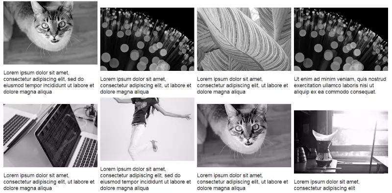
On larger screens, the gallery resembles this:

On smaller screens:

The simple markup:
<div>
  <a href="https://www.php.cn/link/14d2bc475177e1dde633b4ca1972d53c">
    <img src="/static/imghw/default1.png"  data-src="https://img.php.cn/"  class="lazy" alt="Using Modern CSS to Build a Responsive Image Grid " />
  </a>
  <!-- ...more images... -->
</div>Several layout methods achieve this. Before exploring two, let's reiterate the requirements:
- Two-column layout on medium and smaller screens.
- 8px inter-column spacing.
Using inline-block:
The display: inline-block method builds the gallery. Consider this CSS:
div {
  font-size: 0;
}

a {
  font-size: 16px;
  display: inline-block;
  margin-bottom: 8px;
  width: calc(50% - 4px);
  margin-right: 8px;
}

a:nth-of-type(2n) {
  margin-right: 0;
}

@media screen and (min-width: 50em) {
  a {
    width: calc(25% - 6px);
  }

  a:nth-of-type(2n) {
    margin-right: 8px;
  }

  a:nth-of-type(4n) {
    margin-right: 0;
  }
}Explanation:
Default inline-block spacing is overridden by setting the parent's font size to zero. Child element font sizes may need resetting (not here).
Small screens have a two-column layout with 8px spacing. Column width calculation:
- Total inter-column space per row: 1 * 8px = 8px (8px, not 16px, because the right margin is removed from every second column).
- Column width:
calc(50% - 4px)(4px = 8px / 2).

Large screens have a four-column layout with 8px spacing. Column width calculation:
- Total inter-column space per row: 3 * 8px = 24px (24px, not 32px, because the right margin is removed from every fourth column).
- Column width:
calc(25% - 6px)(6px = 24px / 4).

See the CodePen demo for the inline-block method.
Using Flexbox:
The inline-block solution has drawbacks. Adding captions demonstrates one:
Updated markup:
<div>
  <a href="https://www.php.cn/link/14d2bc475177e1dde633b4ca1972d53c">
    <img src="/static/imghw/default1.png"  data-src="https://img.php.cn/"  class="lazy" alt="Using Modern CSS to Build a Responsive Image Grid " />
  </a>
  <!-- ...more images... -->
</div>Large screen gallery with captions:
Unequal heights are resolved with Flexbox. Update the parent element's CSS:
div {
  font-size: 0;
}

a {
  font-size: 16px;
  display: inline-block;
  margin-bottom: 8px;
  width: calc(50% - 4px);
  margin-right: 8px;
}

a:nth-of-type(2n) {
  margin-right: 0;
}

@media screen and (min-width: 50em) {
  a {
    width: calc(25% - 6px);
  }

  a:nth-of-type(2n) {
    margin-right: 8px;
  }

  a:nth-of-type(4n) {
    margin-right: 0;
  }
}The result is equal-height columns across all screens. Large screen example:

See the CodePen demo using Flexbox with improved captions.
Flexbox's justify-content property doesn't directly create this layout. space-between and space-around result in awkward distribution on the last row. CSS:
<div>
  <a href="https://www.php.cn/link/14d2bc475177e1dde633b4ca1972d53c">
    <img src="/static/imghw/default1.png"  data-src="https://img.php.cn/"  class="lazy" alt="Using Modern CSS to Build a Responsive Image Grid " />
    <figcaption>Some text here</figcaption>
  </a>
  <!-- ...more images... -->
</div>No margin-right is needed; justify-content handles item distribution.
See the CodePen demo using the justify-content property.
Conclusion:
This post details techniques for controlling inter-column spacing in responsive image grids. While inline-block suffices, Flexbox is easier and more convenient, especially with calc().
Learn more about Flexbox layouts in our screencast: Creating Multiple Column Layouts in Flexbox.
(FAQs section omitted for brevity, as it's a repetition of common responsive design questions.)
The above is the detailed content of Using Modern CSS to Build a Responsive Image Grid. For more information, please follow other related articles on the PHP Chinese website!

Hot AI Tools

Undresser.AI Undress
AI-powered app for creating realistic nude photos

AI Clothes Remover
Online AI tool for removing clothes from photos.

Undress AI Tool
Undress images for free

Clothoff.io
AI clothes remover

Video Face Swap
Swap faces in any video effortlessly with our completely free AI face swap tool!

Hot Article
Hot Tools

Notepad++7.3.1
Easy-to-use and free code editor

SublimeText3 Chinese version
Chinese version, very easy to use

Zend Studio 13.0.1
Powerful PHP integrated development environment

Dreamweaver CS6
Visual web development tools

SublimeText3 Mac version
God-level code editing software (SublimeText3)
Hot Topics


 Stacked Cards with Sticky Positioning and a Dash of Sass
Apr 03, 2025 am 10:30 AM
Stacked Cards with Sticky Positioning and a Dash of Sass
Apr 03, 2025 am 10:30 AM
The other day, I spotted this particularly lovely bit from Corey Ginnivan’s website where a collection of cards stack on top of one another as you scroll.
 Google Fonts Variable Fonts
Apr 09, 2025 am 10:42 AM
Google Fonts Variable Fonts
Apr 09, 2025 am 10:42 AM
I see Google Fonts rolled out a new design (Tweet). Compared to the last big redesign, this feels much more iterative. I can barely tell the difference
 How to Create an Animated Countdown Timer With HTML, CSS and JavaScript
Apr 11, 2025 am 11:29 AM
How to Create an Animated Countdown Timer With HTML, CSS and JavaScript
Apr 11, 2025 am 11:29 AM
Have you ever needed a countdown timer on a project? For something like that, it might be natural to reach for a plugin, but it’s actually a lot more
 Why are the purple slashed areas in the Flex layout mistakenly considered 'overflow space'?
Apr 05, 2025 pm 05:51 PM
Why are the purple slashed areas in the Flex layout mistakenly considered 'overflow space'?
Apr 05, 2025 pm 05:51 PM
Questions about purple slash areas in Flex layouts When using Flex layouts, you may encounter some confusing phenomena, such as in the developer tools (d...
 How to select a child element with the first class name item through CSS?
Apr 05, 2025 pm 11:24 PM
How to select a child element with the first class name item through CSS?
Apr 05, 2025 pm 11:24 PM
When the number of elements is not fixed, how to select the first child element of the specified class name through CSS. When processing HTML structure, you often encounter different elements...
 HTML Data Attributes Guide
Apr 11, 2025 am 11:50 AM
HTML Data Attributes Guide
Apr 11, 2025 am 11:50 AM
Everything you ever wanted to know about data attributes in HTML, CSS, and JavaScript.
 A Proof of Concept for Making Sass Faster
Apr 16, 2025 am 10:38 AM
A Proof of Concept for Making Sass Faster
Apr 16, 2025 am 10:38 AM
At the start of a new project, Sass compilation happens in the blink of an eye. This feels great, especially when it’s paired with Browsersync, which reloads
 In front-end development, how to use CSS and JavaScript to achieve searchlight effects similar to Windows 10 settings interface?
Apr 05, 2025 pm 10:21 PM
In front-end development, how to use CSS and JavaScript to achieve searchlight effects similar to Windows 10 settings interface?
Apr 05, 2025 pm 10:21 PM
How to implement Windows-like in front-end development...
