

Writing Element Queries Today Using EQCSS

Element Queries: Responsive Design Beyond Viewport Limitations
This article explores element queries, a powerful technique extending responsive design capabilities beyond traditional media queries. Unlike media queries that react to viewport dimensions, element queries allow styling based on individual element properties like width, character count, or scroll position. This enhanced responsiveness is particularly beneficial for creating reusable components and handling dynamic layouts.

This article was peer-reviewed by Adrian Sandu, Giulio Mainardi, and Tom Hodgins. Thanks to SitePoint's peer reviewers for their contributions.
Key Advantages of Element Queries:
- Component-Level Responsiveness: Style elements based on their intrinsic properties, not just viewport size. Adapt layouts to changes within a container, regardless of overall screen dimensions.
- Reusable Components: Create components that adapt seamlessly to different contexts and parent containers, improving code reusability and maintainability.
- Dynamic Layouts: Handle situations where adding or removing elements affects the available space for existing elements, maintaining optimal presentation.
Why Use Element Queries?
Element queries address limitations of media queries in scenarios where individual element properties, rather than viewport dimensions, dictate styling needs. Consider these examples:
- Adding Columns: Adding a sidebar reduces space for existing columns. Media queries won't adjust, but element queries can perfectly resize images and text within the narrower column.
- Responsive Widgets: Widgets embedded in containers of varying widths require styling based on their container's size, not the viewport. Element queries provide this context-aware styling.
- Independent Component Styling: Create components (e.g., navigation bars, tables) that maintain their intended appearance regardless of surrounding elements' dimensions or page layout.

Introducing EQCSS:
EQCSS.js is a JavaScript library enabling element query implementation across modern browsers, including IE9 . Its syntax mirrors media queries, simplifying adoption. While powerful, be mindful of performance; overuse can impact responsiveness, especially in Firefox and Edge.
Getting Started with EQCSS:
-
Include EQCSS.js: Add the EQCSS.js file (available via CDNjs or GitHub) to your HTML. For IE8 support, include the necessary polyfill.
-
Write Element Queries: Use the
@elementdirective followed by selectors and conditions, similar to media queries.@element ".content" and (max-width: 480px) { .content img { width: 100%; } }Copy after login -
Recalculate Styles: EQCSS automatically recalculates styles on resize and scroll, but you can manually trigger recalculation using
EQCSS.apply()for other events.
Advanced Features:
-
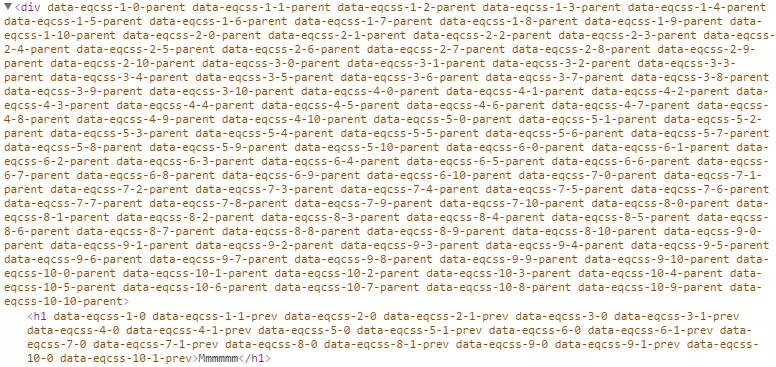
Meta-selectors: Use
$this,$parent,$prev, and$nextto target the element itself, its parent, previous sibling, or next sibling, respectively. -
Character Count: Style elements based on their character count (e.g., adjusting font size for long headings).
Performance Considerations:
EQCSS relies on JavaScript, so performance depends on the number of elements and queries. Avoid excessive use, especially in performance-sensitive areas. Future browser features like ResizeObserver and Houdini promise performance improvements.
Conclusion:
EQCSS empowers developers to create highly responsive designs that adapt to content size and context. While performance considerations exist, its intuitive syntax and powerful capabilities make it a valuable tool for enhancing responsive design workflows. Remember to use it judiciously and test thoroughly.
Frequently Asked Questions (FAQ): (This section is omitted for brevity, but the original text provides comprehensive FAQs which can be easily incorporated here.)
The above is the detailed content of Writing Element Queries Today Using EQCSS. For more information, please follow other related articles on the PHP Chinese website!

Hot AI Tools

Undresser.AI Undress
AI-powered app for creating realistic nude photos

AI Clothes Remover
Online AI tool for removing clothes from photos.

Undress AI Tool
Undress images for free

Clothoff.io
AI clothes remover

Video Face Swap
Swap faces in any video effortlessly with our completely free AI face swap tool!

Hot Article
Hot Tools

Notepad++7.3.1
Easy-to-use and free code editor

SublimeText3 Chinese version
Chinese version, very easy to use

Zend Studio 13.0.1
Powerful PHP integrated development environment

Dreamweaver CS6
Visual web development tools

SublimeText3 Mac version
God-level code editing software (SublimeText3)
Hot Topics
 1658
1658
 14
1415
52
1309
25
1257
29
1231
24
14
1415
52
1309
25
1257
29
1231
24

 Google Fonts Variable Fonts
Apr 09, 2025 am 10:42 AM
Google Fonts Variable Fonts
Apr 09, 2025 am 10:42 AM
I see Google Fonts rolled out a new design (Tweet). Compared to the last big redesign, this feels much more iterative. I can barely tell the difference
 How to Create an Animated Countdown Timer With HTML, CSS and JavaScript
Apr 11, 2025 am 11:29 AM
How to Create an Animated Countdown Timer With HTML, CSS and JavaScript
Apr 11, 2025 am 11:29 AM
Have you ever needed a countdown timer on a project? For something like that, it might be natural to reach for a plugin, but it’s actually a lot more
 HTML Data Attributes Guide
Apr 11, 2025 am 11:50 AM
HTML Data Attributes Guide
Apr 11, 2025 am 11:50 AM
Everything you ever wanted to know about data attributes in HTML, CSS, and JavaScript.
 A Proof of Concept for Making Sass Faster
Apr 16, 2025 am 10:38 AM
A Proof of Concept for Making Sass Faster
Apr 16, 2025 am 10:38 AM
At the start of a new project, Sass compilation happens in the blink of an eye. This feels great, especially when it’s paired with Browsersync, which reloads
 How We Created a Static Site That Generates Tartan Patterns in SVG
Apr 09, 2025 am 11:29 AM
How We Created a Static Site That Generates Tartan Patterns in SVG
Apr 09, 2025 am 11:29 AM
Tartan is a patterned cloth that’s typically associated with Scotland, particularly their fashionable kilts. On tartanify.com, we gathered over 5,000 tartan
 How to Build Vue Components in a WordPress Theme
Apr 11, 2025 am 11:03 AM
How to Build Vue Components in a WordPress Theme
Apr 11, 2025 am 11:03 AM
The inline-template directive allows us to build rich Vue components as a progressive enhancement over existing WordPress markup.
 PHP is A-OK for Templating
Apr 11, 2025 am 11:04 AM
PHP is A-OK for Templating
Apr 11, 2025 am 11:04 AM
PHP templating often gets a bad rap for facilitating subpar code — but that doesn't have to be the case. Let’s look at how PHP projects can enforce a basic
 Programming Sass to Create Accessible Color Combinations
Apr 09, 2025 am 11:30 AM
Programming Sass to Create Accessible Color Combinations
Apr 09, 2025 am 11:30 AM
We are always looking to make the web more accessible. Color contrast is just math, so Sass can help cover edge cases that designers might have missed.
