

Crafting Interactive Scatter Plots with Plotly


Scatter plots are a type of data visualization that shows the relationship between two variables. They are particularly useful for spotting trends, clusters, and outliers within data sets. Without the right tools, creating these plots can be a tedious process, often requiring extensive coding and design skills.
One library that lets you create complex graphs quickly is Plotly. Plotly is a graphing library that makes it easy to create interactive, publication-quality graphs online. It offers a range of plot types and styles, and its interactivity is ideal for creating scatter plots.
Key Takeaways
- Plotly provides a powerful platform for creating interactive scatter plots, offering extensive customization options.
- Vanilla JavaScript and React can both be utilized with Plotly to build dynamic data visualizations.
Plotly allows for quick and easy generation of scatter plots, which are not only accurate but also highly interactive. This interactivity is key for professional developers who want to provide end users with the ability to explore data in depth, through features like hovering to reveal data points, panning, and zooming.
Why Choose Plotly?
Plotly is a popular choice among developers for creating scatter plots due to its comprehensive features that cater to professional needs. Here’s why it stands out:
- Interactivity. Plotly’s scatter plots are not just static images; they’re fully interactive. Users can zoom in on areas of interest, hover to get more information about specific data points, and even click to interact with the data in real time. This level of interactivity is crucial for in-depth data analysis and makes the exploration process much more user-friendly.
- Ease of use. One of Plotly’s most significant advantages is its simplicity. The library provides a high-level interface that abstracts away the complexities of creating detailed charts. This means that developers can produce sophisticated visualizations with less code, which is particularly beneficial when time is a constraint or when working on rapid prototyping.
- Customization. With Plotly, every aspect of a scatter plot can be customized to fit the specific needs of your project. From the color and size of the markers to the layout of the axes and the style of the gridlines, Plotly gives you control over how your data is presented. This flexibility ensures that the final visualization aligns with your design requirements and conveys the intended message effectively.
- Compatibility. Plotly’s compatibility extends beyond just JavaScript and React. It can be used with a variety of programming languages and frameworks, making it a versatile tool in a developer’s arsenal. Whether you’re working on a web application, a mobile app, or even a server-side project, Plotly can be integrated smoothly into your workflow.
- Performance. Handling large datasets can be challenging, but Plotly is designed to manage them efficiently. It uses WebGL for rendering, which helps maintain performance without sacrificing the quality or responsiveness of the visualizations. This is particularly important for applications that require real-time data updates or for those working with big data.
- Community and support. Plotly has a strong community presence and extensive documentation, which are invaluable resources for developers. Whether you’re troubleshooting an issue, looking for best practices, or seeking inspiration for your next project, the community and support available can help guide you through the process.
Getting Started with Plotly
Plotly is a graphing library that makes it easy to create interactive, publication-quality graphs online. It offers a range of plot types and styles, and its interactivity is ideal for creating scatter plots.
Setting Up Plotly
For vanilla JavaScript: you can include Plotly directly in your HTML:
<span><span><span><script</span> src<span>="https://cdn.plot.ly/plotly-latest.min.js"</span>></span><span><span></script</span>></span></span>
For React: install Plotly using npm:
<span>npm install plotly.js-dist-min</span>
Then import it into your React component:
<span>import <span>Plotly</span> from 'plotly.js-dist-min';</span>
Creating a Basic Scatter Plot
Let’s start with a basic scatter plot.
Vanilla JavaScript:
<span><span><span><script</span> src<span>="https://cdn.plot.ly/plotly-latest.min.js"</span>></span><span><span></script</span>></span></span>
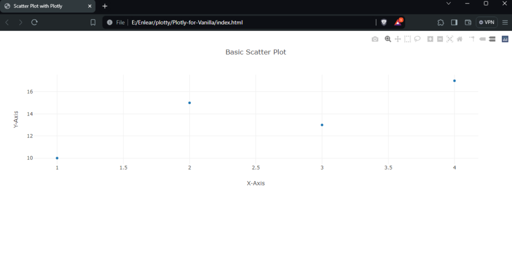
After opening the HTML file in a browser, your basic scatter plot should look like the one below.
React:
<span>npm install plotly.js-dist-min</span>
Run npm start in your React project, and you should see something similar to this:

Enhancing Scatter Plots
You can enhance scatter plots by adding more traces, customizing markers, and adding annotations.
Adding multiple traces:
<span>import <span>Plotly</span> from 'plotly.js-dist-min';</span>
Customizing markers:
<span>const data = [{
</span>  <span>x: [1, 2, 3, 4],
</span>  <span>y: [10, 15, 13, 17],
</span>  <span>mode: 'markers',
</span>  <span>type: 'scatter'
</span><span>}];
</span>
<span>const layout = {
</span>  <span>title: 'Basic Scatter Plot',
</span>  <span>xaxis: { title: 'X-Axis' },
</span>  <span>yaxis: { title: 'Y-Axis' }
</span><span>};
</span>
<span>Plotly.newPlot('myDiv', data, layout);</span>Creating an Interactive Scatter Plot
Interactive scatter plots allow users to engage with the data points directly.
Vanilla JavaScript:
<span>import <span>React</span> from 'react';
</span><span>import <span>Plot</span> from 'react-plotly.js';
</span>
<span>function <span>ScatterPlot</span>() {
</span>  <span>const data = [{
</span>    <span>x: [1, 2, 3, 4],
</span>    <span>y: [10, 15, 13, 17],
</span>    <span>mode: 'markers',
</span>    <span>type: 'scatter'
</span>  <span>}];
</span>
  <span>const layout = {
</span>    <span>title: 'Basic Scatter Plot',
</span>    <span>xaxis: { title: 'X-Axis' },
</span>    <span>yaxis: { title: 'Y-Axis' }
</span>  <span>};
</span>
  <span>return <span><span><Plot</span> data<span>={data}</span> layout<span>={layout}</span> /></span>;
</span><span>}
</span>
<span>export default ScatterPlot;</span>For an interactive preview of the scatter plots, check out this CodePen demo.
See the Pen Plotly for Vanilla by Binara Prabhanga (@Binara-Prabhanga) on CodePen.
React:
<span>const trace1 = {
</span>  <span>x: [1, 2, 3, 4],
</span>  <span>y: [10, 15, 13, 17],
</span>  <span>mode: 'markers',
</span>  <span>type: 'scatter',
</span>  <span>name: 'Dataset 1'
</span><span>};
</span>
<span>const trace2 = {
</span>  <span>x: [2, 3, 4, 5],
</span>  <span>y: [16, 5, 11, 9],
</span>  <span>mode: 'markers',
</span>  <span>type: 'scatter',
</span>  <span>name: 'Dataset 2'
</span><span>};
</span>
<span>const data = [trace1, trace2];
</span>
<span>Plotly.newPlot('myDiv', data);</span>
To see the scatter plots in action, check out this CodeSandbox demo.
Wrapping Up
This tutorial has covered the basics of creating scatter plots with Plotly, including setting up your environment, creating a basic plot, enhancing it with additional features, and making it interactive.
If you wish to check out the code for these graphs, here’s my CodeSandbox demo.
Experiment with these examples and explore Plotly’s documentation for more advanced features and customization options. If you’re looking for info on how to create great data visualizations, we have a handy guide here.
FAQs About Plotly
Can Plotly be used with frameworks other than React?Absolutely. Plotly is versatile and can be integrated with a variety of JavaScript frameworks and libraries, such as Angular, Vue.js, and even Python for server-side rendering with Dash.
How do you add tooltips to scatter plots in Plotly?Tooltips enhance the user experience by providing additional information on hover. In Plotly, you can add tooltips by setting the text property within the trace object. You can also customize the content and appearance of these tooltips using the hoverinfo and hovertemplate attributes.
Is it possible to export Plotly charts?Yes, Plotly provides functionality to export charts in various formats. You can save your visualizations as static images like PNG or JPEG for reports, or as interactive HTML files that can be embedded in web pages. This is particularly useful for sharing insights with others who may not have access to the Plotly environment.
Can Plotly handle large datasets?Plotly is engineered to manage large datasets effectively. It uses WebGL for rendering, which helps in maintaining performance even with substantial amounts of data. However, the performance might be influenced by the dataset’s complexity and the user’s system capabilities.
How do you customize the appearance of markers in a scatter plot?The appearance of markers in a scatter plot can be customized through the marker attribute in the trace object. This includes options for color, size, and even marker symbols. You can set these properties statically or dynamically based on data for more insightful visualizations.
How does Plotly ensure accessibility in scatter plots?Plotly provides several features to make scatter plots more accessible, including options for setting descriptive titles, axis labels, and text annotations. Additionally, you can control the contrast and color choices to accommodate users with visual impairments.
The above is the detailed content of Crafting Interactive Scatter Plots with Plotly. For more information, please follow other related articles on the PHP Chinese website!

Hot AI Tools

Undresser.AI Undress
AI-powered app for creating realistic nude photos

AI Clothes Remover
Online AI tool for removing clothes from photos.

Undress AI Tool
Undress images for free

Clothoff.io
AI clothes remover

Video Face Swap
Swap faces in any video effortlessly with our completely free AI face swap tool!

Hot Article
Hot Tools

Notepad++7.3.1
Easy-to-use and free code editor

SublimeText3 Chinese version
Chinese version, very easy to use

Zend Studio 13.0.1
Powerful PHP integrated development environment

Dreamweaver CS6
Visual web development tools

SublimeText3 Mac version
God-level code editing software (SublimeText3)
Hot Topics


 What should I do if I encounter garbled code printing for front-end thermal paper receipts?
Apr 04, 2025 pm 02:42 PM
What should I do if I encounter garbled code printing for front-end thermal paper receipts?
Apr 04, 2025 pm 02:42 PM
Frequently Asked Questions and Solutions for Front-end Thermal Paper Ticket Printing In Front-end Development, Ticket Printing is a common requirement. However, many developers are implementing...
 Demystifying JavaScript: What It Does and Why It Matters
Apr 09, 2025 am 12:07 AM
Demystifying JavaScript: What It Does and Why It Matters
Apr 09, 2025 am 12:07 AM
JavaScript is the cornerstone of modern web development, and its main functions include event-driven programming, dynamic content generation and asynchronous programming. 1) Event-driven programming allows web pages to change dynamically according to user operations. 2) Dynamic content generation allows page content to be adjusted according to conditions. 3) Asynchronous programming ensures that the user interface is not blocked. JavaScript is widely used in web interaction, single-page application and server-side development, greatly improving the flexibility of user experience and cross-platform development.
 Who gets paid more Python or JavaScript?
Apr 04, 2025 am 12:09 AM
Who gets paid more Python or JavaScript?
Apr 04, 2025 am 12:09 AM
There is no absolute salary for Python and JavaScript developers, depending on skills and industry needs. 1. Python may be paid more in data science and machine learning. 2. JavaScript has great demand in front-end and full-stack development, and its salary is also considerable. 3. Influencing factors include experience, geographical location, company size and specific skills.
 Is JavaScript hard to learn?
Apr 03, 2025 am 12:20 AM
Is JavaScript hard to learn?
Apr 03, 2025 am 12:20 AM
Learning JavaScript is not difficult, but it is challenging. 1) Understand basic concepts such as variables, data types, functions, etc. 2) Master asynchronous programming and implement it through event loops. 3) Use DOM operations and Promise to handle asynchronous requests. 4) Avoid common mistakes and use debugging techniques. 5) Optimize performance and follow best practices.
 How to merge array elements with the same ID into one object using JavaScript?
Apr 04, 2025 pm 05:09 PM
How to merge array elements with the same ID into one object using JavaScript?
Apr 04, 2025 pm 05:09 PM
How to merge array elements with the same ID into one object in JavaScript? When processing data, we often encounter the need to have the same ID...
 How to achieve parallax scrolling and element animation effects, like Shiseido's official website?
or:
How can we achieve the animation effect accompanied by page scrolling like Shiseido's official website?
Apr 04, 2025 pm 05:36 PM
How to achieve parallax scrolling and element animation effects, like Shiseido's official website?
or:
How can we achieve the animation effect accompanied by page scrolling like Shiseido's official website?
Apr 04, 2025 pm 05:36 PM
Discussion on the realization of parallax scrolling and element animation effects in this article will explore how to achieve similar to Shiseido official website (https://www.shiseido.co.jp/sb/wonderland/)...
 The Evolution of JavaScript: Current Trends and Future Prospects
Apr 10, 2025 am 09:33 AM
The Evolution of JavaScript: Current Trends and Future Prospects
Apr 10, 2025 am 09:33 AM
The latest trends in JavaScript include the rise of TypeScript, the popularity of modern frameworks and libraries, and the application of WebAssembly. Future prospects cover more powerful type systems, the development of server-side JavaScript, the expansion of artificial intelligence and machine learning, and the potential of IoT and edge computing.
 The difference in console.log output result: Why are the two calls different?
Apr 04, 2025 pm 05:12 PM
The difference in console.log output result: Why are the two calls different?
Apr 04, 2025 pm 05:12 PM
In-depth discussion of the root causes of the difference in console.log output. This article will analyze the differences in the output results of console.log function in a piece of code and explain the reasons behind it. �...
