
 Web Front-end
CSS Tutorial
Adapting to user motion and theme preferences with CSS and JavaScript
Web Front-end
CSS Tutorial
Adapting to user motion and theme preferences with CSS and JavaScript
Adapting to user motion and theme preferences with CSS and JavaScript

Written by Oscar Jite-Orimiono✏️
The internet is full of color, animations, and graphic effects that can make websites both captivating and overstimulating. As frontend enthusiasts and professionals, we need to balance vibrant visuals with accessible, user-centered options for those who prefer a more subdued experience.
In this article, we're going to do more with less by taking a look at the below items:
- Learn to use media queries like prefers-reduced-motion and prefers-color-scheme to manage animations and themes
- Follow correct syntax in @media rules to apply user preferences
- View options like prefers-reduced-data that will minimize data use for users with limited connectivity

Motion preferences
For many users, animations can enhance their experience on a website, but they may impede others. Too much motion can cause discomfort or be a distraction, plus it could cause performance issues.
The prefers-reduced-motion media query checks if a user has enabled settings on their computer to limit website animations. You can modify or completely disable animations for users who prefer reduced motion.
To get started, let's create a webpage with some animation. How about an animated striped background?
Here’s the HTML for the page:
<div>


<p>And here’s the CSS:<br>
</p>

<pre class="brush:php;toolbar:false">.container {
  position: relative;
  width: 100%;
  height: 100%;

  &::before {
    position: absolute;
    content: "";
    top: 0;
    left: 0;
    height: 100%;
    width: calc(100% + 110px);
    background: repeating-linear-gradient(
      45deg,
      #553c9a 0%,
      #553c9a 25%,
      #301934 25%,
      #301934 50%
    );
    background-size: 110px 110px;
    animation: animateStripes 2s linear infinite;
  }
}
@keyframes animateStripes {
 to {
    transform: translateX(-110px);
  }
}
Here’s how it looks with the animated stripes:

The no-preference syntax is for users with no preference settings while reduce is for those who do. You can completely disable or modify animations for the users who prefer reduced motion. Here’s how to disable the moving background using the prefers-reduced-motion media query:
@media (prefers-reduced-motion: reduce) {
  .container::before {
    animation: none;
  }
}
Side note: On devices that run Windows 11, you can disable animations by going into Settings, selecting Accessibility, then Visual Effects, and toggling off Animation Effects. The process is similar for nearly every type of device/operating system.
Here’s a CodePen:
You can choose to change the type of animation instead of disabling them. For instance, instead of a slide-in transform animation, you use a fade-in animation for users who prefer reduced motion.
If you use scroll animations with elements sliding in from one side of the page, you can switch to a simpler effect, like a fade-in.
Here’s CSS for a simple scroll animation:
<div>


<p>And here’s the CSS:<br>
</p>

<pre class="brush:php;toolbar:false">.container {
  position: relative;
  width: 100%;
  height: 100%;

  &::before {
    position: absolute;
    content: "";
    top: 0;
    left: 0;
    height: 100%;
    width: calc(100% + 110px);
    background: repeating-linear-gradient(
      45deg,
      #553c9a 0%,
      #553c9a 25%,
      #301934 25%,
      #301934 50%
    );
    background-size: 110px 110px;
    animation: animateStripes 2s linear infinite;
  }
}
@keyframes animateStripes {
 to {
    transform: translateX(-110px);
  }
}
In this example, the box elements will fade in from the right side of the webpage and move towards the left. This movement is controlled by the transform property, so you can simply remove it for users who prefer reduced motion:
@media (prefers-reduced-motion: reduce) {
  .container::before {
    animation: none;
  }
}
Users with no-preference will see this when they scroll:

And here’s what users with reduce will see:

With the prefers-reduced-motion media query you can tone/slow down complex animations or disable them entirely based on what the user wants.
Here’s a CodePen to interact with where you can disable animations on your device to see the difference:
Users with vestibular disorders like motion sickness and vertigo may become disoriented or dizzy when looking at animations. Animations can also be distracting for users who prefer to have a simple UI.
Having the option of reduced motion will make websites much more comfortable to use for users sensitive to motion.
Theme preferences
It’s now common practice for websites and applications to have the option of switching from a light theme to a darker one. Some websites give you an extra option based on system preferences.
The prefers-color-scheme media query detects if a user prefers dark or light themes. The users can get a default theme based on their device settings.
Here’s a webpage with light colors:

This is what users will see if their default theme is light. You can then use the prefers-color-scheme to create the dark theme:
.box {
  transform: translateX(100%);
  opacity: 0;
  transition: transform 0.5s linear, opacity 0.5s linear;
}
.reveal {
  transform: translateX(0);
  opacity: 1;
}
@keyframes reveal {
  to {
    transform: translateX(0);
    opacity: 1;
  }
}
Writing out the CSS rules like this for both light and dark modes might be too much work, especially when several properties share the same values. Using variables to map out the color schemes will help you avoid repetition:
@media (prefers-reduced-motion: reduce) {
  .box {
    transform: translateX(0);
  }
}
Here’s a screenshot of the same page as before but with dark mode activated:

Here’s a CodePen you can interact with:
The prefers-color-scheme is not limited to colors only; you can use it to swap out images:
<div>


<p>And here’s the CSS:<br>
</p>

<pre class="brush:php;toolbar:false">.container {
  position: relative;
  width: 100%;
  height: 100%;

  &::before {
    position: absolute;
    content: "";
    top: 0;
    left: 0;
    height: 100%;
    width: calc(100% + 110px);
    background: repeating-linear-gradient(
      45deg,
      #553c9a 0%,
      #553c9a 25%,
      #301934 25%,
      #301934 50%
    );
    background-size: 110px 110px;
    animation: animateStripes 2s linear infinite;
  }
}
@keyframes animateStripes {
 to {
    transform: translateX(-110px);
  }
}
Here’s a screenshot of the webpage in light mode:

Background photo by Plufow Le Studio on Unsplash.
And here’s the page in dark mode:
[caption>
Background photo by Plufow Le Studio on Unsplash.
Best practices
Be sure to test color contrasts before using them to ensure better readability. There are several tools available that can help you pick the colors to use.
Consider every possible element that needs updating when switching themes, not just the background and text. This is why storing the themes using CSS variables is a good idea, you may need to provide alternates for buttons, shadows, borders, links, and more.
Implementation
The most straightforward way to implement user preferences is to use the @media rule. You must specify the preference for motion or themes, otherwise, the CSS rules inside the media query will override any other rules or device settings.
This means that for motion preferences, you must specify if it’s reduce or no-preference, and for themes, it’s light or dark:
@media (prefers-reduced-motion: reduce) {
  .container::before {
    animation: none;
  }
}
This can be useful when testing your code, but be sure to specify the exact preference before implementation.
Implementing user preferences with JavaScript
User preferences can also be implemented with JavaScript. You can add a new class to specific elements based on user preferences.
Using our first example with the animated stripes, here’s how to check for user preferences with JavaScript:
.box {
  transform: translateX(100%);
  opacity: 0;
  transition: transform 0.5s linear, opacity 0.5s linear;
}
.reveal {
  transform: translateX(0);
  opacity: 1;
}
@keyframes reveal {
  to {
    transform: translateX(0);
    opacity: 1;
  }
}
Here’s the CSS:
@media (prefers-reduced-motion: reduce) {
  .box {
    transform: translateX(0);
  }
}
Note that pseudo-elements are not part of the DOM and can’t be directly selected in JavaScript, hence this approach.
Implementing user preferences with data attributes
Custom HTML data attributes and JavaScript allow you to implement user preferences. Data attributes allow you to store information on HTML elements without affecting the document's structure. They use the data prefix and can be easily manipulated using JavaScript:
@media (prefers-color-scheme: dark) {
    #main {
    background-image: repeating-linear-gradient(
      45deg,
      #553c9a,
    #553c9a 50px,
    #3a1e4f 50px,
    #3a1e4f 100px,
    #301934 100px,
    #301934 150px
    );
  }
  nav{
    background: rgba(0, 0, 0, 0.5);
  }
  .logo a,
  nav ul li a{
    color: #b393d3;
  }
  .content {
    background: rgba(0, 0, 0, 0.5);
  }
  .content h1 {
    color: #b393d3;
  }
  .content p{
    color: #b393d3;
  }
}
Here’s the CSS:
<div>


<p>And here’s the CSS:<br>
</p>

<pre class="brush:php;toolbar:false">.container {
  position: relative;
  width: 100%;
  height: 100%;

  &::before {
    position: absolute;
    content: "";
    top: 0;
    left: 0;
    height: 100%;
    width: calc(100% + 110px);
    background: repeating-linear-gradient(
      45deg,
      #553c9a 0%,
      #553c9a 25%,
      #301934 25%,
      #301934 50%
    );
    background-size: 110px 110px;
    animation: animateStripes 2s linear infinite;
  }
}
@keyframes animateStripes {
 to {
    transform: translateX(-110px);
  }
}
Reduced data usage
While still experimental, prefers-reduced-data is a proposed media query that allows websites to detect if users prefer to save data.
It uses the same syntax as the prefers-reduced-motion media query, which is reduce for users who prefer lightweight content and no-preference for users with no data preference.
Some of its potential applications include reducing high-resolution images, loading alternate fonts, disabling autoplay videos, and lazy-loading non-critical content. This media query could help improve load times for users on limited or costly data plans, or with unreliable internet connections.
Final words
Respecting user preferences is crucial for enhancing every user's experience. In this tutorial, you learned how to use the prefers-reduced-motion and prefers-color-scheme media query to detect a user’s motion and theme settings. There are also @media rules for contrast and transparency preferences.
As a web developer, you’re the architect with the power to make every website comfortable, accessible, and efficient for every type of user.
Is your frontend hogging your users' CPU?
As web frontends get increasingly complex, resource-greedy features demand more and more from the browser. If you’re interested in monitoring and tracking client-side CPU usage, memory usage, and more for all of your users in production, try LogRocket.
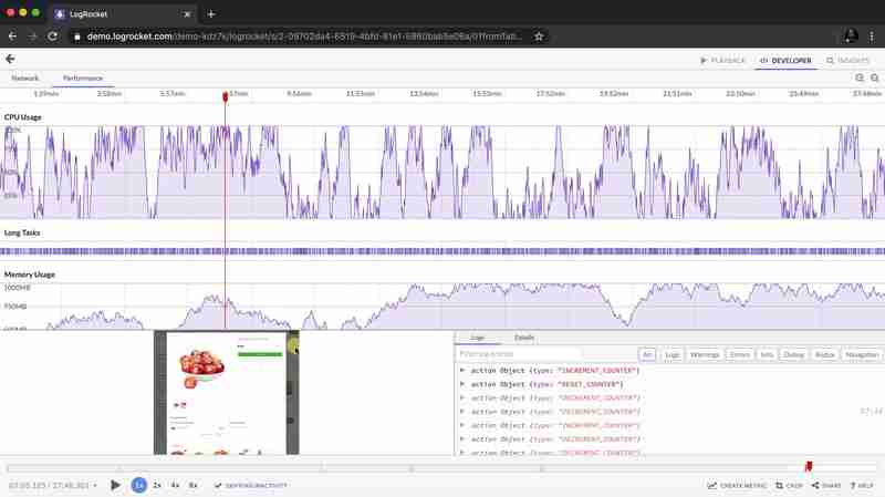
LogRocket is like a DVR for web and mobile apps, recording everything that happens in your web app, mobile app, or website. Instead of guessing why problems happen, you can aggregate and report on key frontend performance metrics, replay user sessions along with application state, log network requests, and automatically surface all errors.
Modernize how you debug web and mobile apps — start monitoring for free.
The above is the detailed content of Adapting to user motion and theme preferences with CSS and JavaScript. For more information, please follow other related articles on the PHP Chinese website!

Hot AI Tools

Undresser.AI Undress
AI-powered app for creating realistic nude photos

AI Clothes Remover
Online AI tool for removing clothes from photos.

Undress AI Tool
Undress images for free

Clothoff.io
AI clothes remover

Video Face Swap
Swap faces in any video effortlessly with our completely free AI face swap tool!

Hot Article
Hot Tools

Notepad++7.3.1
Easy-to-use and free code editor

SublimeText3 Chinese version
Chinese version, very easy to use

Zend Studio 13.0.1
Powerful PHP integrated development environment

Dreamweaver CS6
Visual web development tools

SublimeText3 Mac version
God-level code editing software (SublimeText3)
Hot Topics


 Stacked Cards with Sticky Positioning and a Dash of Sass
Apr 03, 2025 am 10:30 AM
Stacked Cards with Sticky Positioning and a Dash of Sass
Apr 03, 2025 am 10:30 AM
The other day, I spotted this particularly lovely bit from Corey Ginnivan’s website where a collection of cards stack on top of one another as you scroll.
 Google Fonts Variable Fonts
Apr 09, 2025 am 10:42 AM
Google Fonts Variable Fonts
Apr 09, 2025 am 10:42 AM
I see Google Fonts rolled out a new design (Tweet). Compared to the last big redesign, this feels much more iterative. I can barely tell the difference
 How to Create an Animated Countdown Timer With HTML, CSS and JavaScript
Apr 11, 2025 am 11:29 AM
How to Create an Animated Countdown Timer With HTML, CSS and JavaScript
Apr 11, 2025 am 11:29 AM
Have you ever needed a countdown timer on a project? For something like that, it might be natural to reach for a plugin, but it’s actually a lot more
 Why are the purple slashed areas in the Flex layout mistakenly considered 'overflow space'?
Apr 05, 2025 pm 05:51 PM
Why are the purple slashed areas in the Flex layout mistakenly considered 'overflow space'?
Apr 05, 2025 pm 05:51 PM
Questions about purple slash areas in Flex layouts When using Flex layouts, you may encounter some confusing phenomena, such as in the developer tools (d...
 How to select a child element with the first class name item through CSS?
Apr 05, 2025 pm 11:24 PM
How to select a child element with the first class name item through CSS?
Apr 05, 2025 pm 11:24 PM
When the number of elements is not fixed, how to select the first child element of the specified class name through CSS. When processing HTML structure, you often encounter different elements...
 HTML Data Attributes Guide
Apr 11, 2025 am 11:50 AM
HTML Data Attributes Guide
Apr 11, 2025 am 11:50 AM
Everything you ever wanted to know about data attributes in HTML, CSS, and JavaScript.
 A Proof of Concept for Making Sass Faster
Apr 16, 2025 am 10:38 AM
A Proof of Concept for Making Sass Faster
Apr 16, 2025 am 10:38 AM
At the start of a new project, Sass compilation happens in the blink of an eye. This feels great, especially when it’s paired with Browsersync, which reloads
 In front-end development, how to use CSS and JavaScript to achieve searchlight effects similar to Windows 10 settings interface?
Apr 05, 2025 pm 10:21 PM
In front-end development, how to use CSS and JavaScript to achieve searchlight effects similar to Windows 10 settings interface?
Apr 05, 2025 pm 10:21 PM
How to implement Windows-like in front-end development...
