

odern CSS Styles You Should Know In 4

TL;DR: This blog uses code examples to explore five of the best CSS styles and features for web development: container queries, subgrid, pseudo-classes, logical properties, and lab color space. They enhance responsiveness, simplify layouts, and improve design consistency.
Cascading Style Sheets (CSS) is a well-known styling language used to style webpages. With CSS, you can customize HTML elements by adding space; defining colors, font sizes, and font styles; and more. CSS has improved a lot within the past few years with new features to improve the developer experience.
So, this article will discuss five innovative CSS features you can use in your next project.
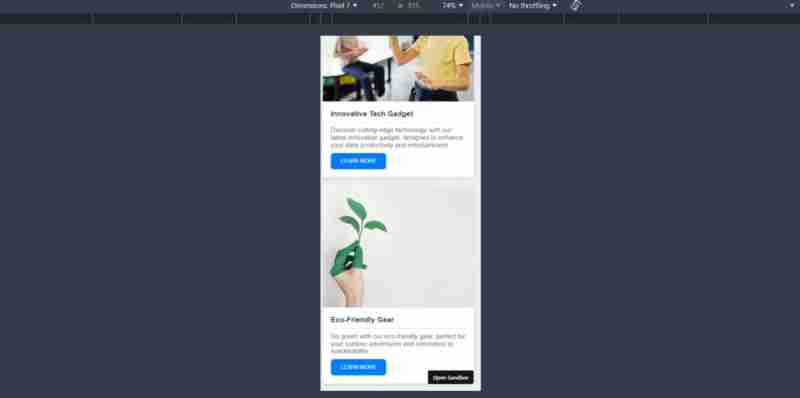
1. Container Queries
CSS container queries introduced a new approach to responsiveness. Previously, we used media queries to create UIs that adapted to different screen sizes. But it wasn’t as easy as it sounds. There were issues in maintenance, performance, flexibility, and style overlapping.
Container queries resolve these issues by allowing developers to customize elements depending on their parent container size. Since this method doesn’t depend on the viewport size, it makes the HTML components fully modular and self-contained.
Following is a simple example of how container queries work.
.wrapper {
  display: grid;
  grid-template-columns: 2fr 1fr;
  gap: 20px;
}
@container (min-width: 500px) {
  .profile-card {
    grid-template-columns: 150px 1fr;
    grid-template-rows: auto 1fr;
    align-items: start;
    gap: 20px;
  }

  .profile-card header,
  .profile-card .bio {
    grid-column: 2;
  }

  .profile-card .profile-image {
    grid-row: 1 / 3;
    grid-column: 1;
  }
}
This container query adjusts the layout of the profile-card when its width reaches 500px or more. It changes the card from a stacked layout (with the image on top) to a two-column layout where the image appears on the left and the text content aligns on the right.
Refer to the following images.


Container queries are very useful in design systems where components need to adapt based on their immediate environment rather than the entire viewport. However, container queries still lack full browser support. If your users are using any unsupported browsers or older versions, they might face styling issues.

Note: Take a look at this working demo for CSS container queries.
2. Subgrid
Subgrid is an exciting addition to the CSS grid layout model that allows you to inherit the grid structure of the parent grid container in child grid items. In simple words, a subgrid allows you to align child elements according to the rows or columns of the parent grid. With this method, you can easily create complex nested grids without using nested grid overrides.
In the following code example, the layout uses a subgrid approach within a list.
.product-wrapper {
  display: grid;
  grid-template-columns: repeat(auto-fit, minmax(300px, 1fr));
}
.product-card {
  display: grid;
  grid-template-rows: subgrid; /* Allows the nested grid to align directly with the parent grid */
}
In the example, the product-wrapper creates a flexible grid layout to control the number of columns based on the container width. Then, each product-card aligns its rows directly with the grids defined by the product-wrapper.
Subgrid is particularly useful for e-commerce sites where product cards may contain varying amounts of content but must maintain a uniform appearance.
Refer to the following images.

Note: Check out the working demo for CSS subgrid.
3. Pseudo-Classes
Pseudo-classes such as :hover, :focus, and :first-child are options that select HTML elements based on their state rather than their hierarchy or sequence in the document. These selectors allow developers to create more interactive and responsive UIs without using JavaScript.
The following code example demonstrates several pseudo-classes in action.
// HTML
...
.hover-section:hover {
  background-color: rgb(82, 11, 145); /* Changes the background color on hover */
  color: white;
}
.input-section input[type="text"]:focus {
  border-color: orange; /* Highlights the input field when focused */
  background-color: lightyellow;
}
.list-section li:first-child {
  color: green; /* Styles the first item in a list */
}
.list-section li:last-child {
  color: red; /* Styles the last item in a list */
}
This CSS code example shows how to enhance user interaction by changing styles based on user actions, such as hovering or focusing on elements, and how to style specific children of a container.
These pseudo-classes are pretty useful when developing forms, navigation menus, and interactive content that requires visual cues to guide user interactions.
Refer to the following image.

Note: Check out this working demo for pseudo-classes.
4. Logical properties
CSS logical properties allow developers to manage layout and spacing in a direction-agnostic way. In other words, with CSS logical properties, you can use different writing modes, such as left-to-right (LTR) and right-to-left (RTL), without changing the structural code.
Here’s an example that uses logical properties for layout adjustments.
.lab-gradient-generator {
  margin-inline-start: 2rem; /* Responsive margin that adjusts based on text direction */
}
.lab-gradient-display {
  background: linear-gradient(
    to right,
    lab(var(--l-start) var(--a-start) var(--b-start)),
    lab(var(--l-end) var(--a-end) var(--b-end))
  ); /* Creates a gradient using LAB colors */
}
In this code example, margin-inline-start uses logical properties to ensure margins are always on the content starting side, adapting automatically to different writing systems. The background property with a LAB color gradient illustrates the use of logical properties in defining visually consistent color transitions.
Logical properties are particularly useful in global apps that require support for multiple languages, keeping the layouts the same regardless of directionality.
Refer to the following image.

Note: Refer to the working demo of how CSS logical properties can be used with internationalization.
5. Lab Color Space
Lab color space allows you to specify colors to align more closely with human vision. This method provides a broader and more precise range of colors, facilitating greater consistency across different displays.
Here’s a code example showcasing the usage of lab color space in CSS.
.color-strip:nth-child(1) {
  --l: 90%;
  --a: -80;
  --b: 80;
  background-color: lab(var(--l) var(--a) var(--b));
}
.color-strip:nth-child(2) {
  --l: 75%;
  --a: -40;
  --b: 40;
  background-color: lab(var(--l) var(--a) var(--b));
}
.color-strip:nth-child(3) {
  --l: 60%;
  --a: 0;
  --b: 0;
  background-color: lab(var(--l) var(--a) var(--b));
}
.color-strip:nth-child(4) {
  --l: 45%;
  --a: 40;
  --b: -40;
  background-color: lab(var(--l) var(--a) var(--b));
}
.color-strip:nth-child(5) {
  --l: 30%;
  --a: 80;
  --b: -80;
  background-color: lab(var(--l) var(--a) var(--b));
}
This code example sets up a series of divs (color-strip), each with a unique background color defined in the lab color space. It shows how lab colors produce a variety of hues and shades that are consistent across various displays.
Lab colors are invaluable in digital design, particularly in industries where color accuracy is critical, like digital art, online commerce, and brand design.
Refer to the following image.

Note: For more details, refer to the lab color space demo.
Conclusion
Thanks for reading! These CSS features offer unique advantages and new possibilities to improve the functionality and the user experience of your app. They also improve the developer experience, since these features simplify complex tasks for them.
So, make sure to try these examples yourself and implement them in your next web app to make it a modern one.
Related blogs
- React Styling: Essential Tips and Tricks for Designers
- Top 7 Ways to Write CSS in Your React or Next.js App
- Responsive Web Design Evolved: Introducing CSS Container Queries
- CSS Flex: What Every Developer Should Know
The above is the detailed content of odern CSS Styles You Should Know In 4. For more information, please follow other related articles on the PHP Chinese website!

Hot AI Tools

Undresser.AI Undress
AI-powered app for creating realistic nude photos

AI Clothes Remover
Online AI tool for removing clothes from photos.

Undress AI Tool
Undress images for free

Clothoff.io
AI clothes remover

Video Face Swap
Swap faces in any video effortlessly with our completely free AI face swap tool!

Hot Article
Hot Tools

Notepad++7.3.1
Easy-to-use and free code editor

SublimeText3 Chinese version
Chinese version, very easy to use

Zend Studio 13.0.1
Powerful PHP integrated development environment

Dreamweaver CS6
Visual web development tools

SublimeText3 Mac version
God-level code editing software (SublimeText3)
Hot Topics
 1677
1677
 14
1430
52
1333
25
1278
29
1257
24
14
1430
52
1333
25
1278
29
1257
24

 A Comparison of Static Form Providers
Apr 16, 2025 am 11:20 AM
A Comparison of Static Form Providers
Apr 16, 2025 am 11:20 AM
Let’s attempt to coin a term here: "Static Form Provider." You bring your HTML
 A Proof of Concept for Making Sass Faster
Apr 16, 2025 am 10:38 AM
A Proof of Concept for Making Sass Faster
Apr 16, 2025 am 10:38 AM
At the start of a new project, Sass compilation happens in the blink of an eye. This feels great, especially when it’s paired with Browsersync, which reloads
 Weekly Platform News: HTML Loading Attribute, the Main ARIA Specifications, and Moving from iFrame to Shadow DOM
Apr 17, 2025 am 10:55 AM
Weekly Platform News: HTML Loading Attribute, the Main ARIA Specifications, and Moving from iFrame to Shadow DOM
Apr 17, 2025 am 10:55 AM
In this week's roundup of platform news, Chrome introduces a new attribute for loading, accessibility specifications for web developers, and the BBC moves
 Some Hands-On with the HTML Dialog Element
Apr 16, 2025 am 11:33 AM
Some Hands-On with the HTML Dialog Element
Apr 16, 2025 am 11:33 AM
This is me looking at the HTML element for the first time. I've been aware of it for a while, but haven't taken it for a spin yet. It has some pretty cool and
 Paperform
Apr 16, 2025 am 11:24 AM
Paperform
Apr 16, 2025 am 11:24 AM
Buy or build is a classic debate in technology. Building things yourself might feel less expensive because there is no line item on your credit card bill, but
 Weekly Platform News: Text Spacing Bookmarklet, Top-Level Await, New AMP Loading Indicator
Apr 17, 2025 am 11:26 AM
Weekly Platform News: Text Spacing Bookmarklet, Top-Level Await, New AMP Loading Indicator
Apr 17, 2025 am 11:26 AM
In this week's roundup, a handy bookmarklet for inspecting typography, using await to tinker with how JavaScript modules import one another, plus Facebook's
 Where should 'Subscribe to Podcast' link to?
Apr 16, 2025 pm 12:04 PM
Where should 'Subscribe to Podcast' link to?
Apr 16, 2025 pm 12:04 PM
For a while, iTunes was the big dog in podcasting, so if you linked "Subscribe to Podcast" to like:
 Quick Gulp Cache Busting
Apr 18, 2025 am 11:23 AM
Quick Gulp Cache Busting
Apr 18, 2025 am 11:23 AM
You should for sure be setting far-out cache headers on your assets like CSS and JavaScript (and images and fonts and whatever else). That tells the browser
