

Cosmic Canvas: Interactive Deep Space CSS Art

This is a submission for Frontend Challenge v24.09.04, CSS Art: Space.
Inspiration
This project, "Cosmic Canvas: Interactive Deep Space CSS Art," was inspired by the vast beauty of outer space and the challenge of recreating celestial phenomena using only CSS and JavaScript. The goal was to create an immersive, animated space scene that demonstrates the power of modern web technologies to create complex, visually stunning art without the need for heavy graphics libraries.
Demo
Github Repo Link: https://github.com/ZibrasIsmail/Interactive-Deep-Space-CSS-Art
Github Hosted Link: https://zibrasismail.github.io/Interactive-Deep-Space-CSS-Art
Journey
This project began as an exploration of advanced CSS techniques and grew into a comprehensive space scene. Here are some key aspects of the journey:
- Complex CSS Animations: Creating realistic orbital movements for moons and asteroids was a significant challenge. I learned to use complex CSS animations with multiple transformations to achieve smooth, circular orbits.
Dynamic Element Creation: Using JavaScript to dynamically create stars, galaxies, and asteroids taught me a lot about DOM manipulation and how to efficiently generate many elements with varying properties.
Color and Texture: Crafting the right colors and textures for celestial bodies was an exercise in creativity. I experimented with various gradients and box-shadows to achieve a sense of depth and realism.
HTML Structure
The HTML file sets up the basic structure of the space scene:
<div class="space-scene">
  <div class="stars"></div>
  <div class="galaxies"></div>
  <div class="shooting-stars"></div>
  <div class="nebula"></div>
  <div class="planet-system">
    <div class="planet main-planet"></div>
    <div class="planet-ring"></div>
    <div class="moon moon1"></div>
    <div class="moon moon2"></div>
    <div class="moon moon3"></div>
  </div>
  <div class="asteroid-belt"></div>
</div>
This structure creates containers for various space elements, which will be styled and animated using CSS and populated with JavaScript.
CSS Styling and Animations
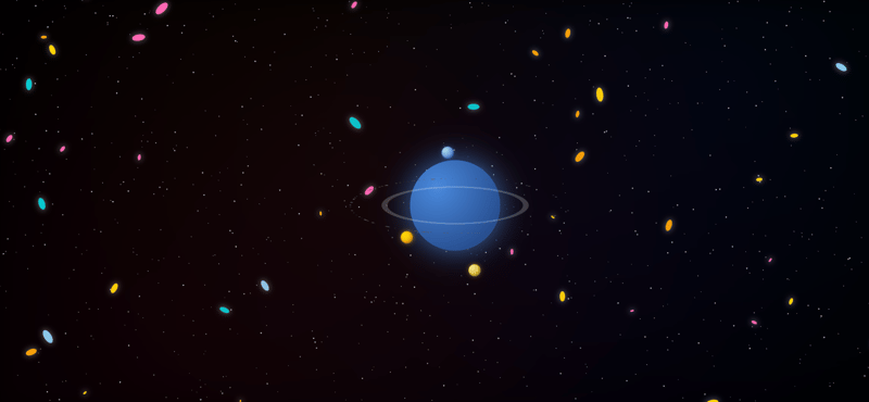
The CSS code creates a visually rich space scene with various celestial elements. It sets up a full-screen, dark background for the space scene and defines styles and animations for different space objects. Stars and galaxies are positioned absolutely and given twinkling and glowing animations. A nebula effect is created using multiple radial gradients. The main planet is styled with a radial gradient and a glow effect, while a planetary ring is created using a border and rotated for a 3D appearance. Three moons are styled with different colors and given orbiting animations using rotate and translate transformations. Shooting stars are created with a linear gradient and animated to move across the screen. An asteroid belt is positioned around the planet, with individual asteroids animated to rotate. The CSS extensively uses keyframe animations to create movement and visual effects, bringing life to the static HTML elements.
body,
html {
  margin: 0;
  padding: 0;
  height: 100%;
  overflow: hidden;
}

.space-scene {
  width: 100%;
  height: 100%;
  background: #000000;
  position: relative;
  overflow: hidden;
}

.stars,
.galaxies {
  position: absolute;
  top: 0;
  left: 0;
  width: 100%;
  height: 100%;
}

.star {
  position: absolute;
  background-color: #fff;
  border-radius: 50%;
  animation: twinkle 4s infinite ease-in-out;
}

.galaxy {
  position: absolute;
  border-radius: 50%;
  animation: glow 4s infinite alternate;
}

@keyframes twinkle {
  0%,
  100% {
    opacity: 0.5;
    transform: scale(1);
  }
  50% {
    opacity: 1;
    transform: scale(1.2);
  }
}

@keyframes glow {
  0% {
    box-shadow: 0 0 2px 1px rgba(255, 255, 255, 0.1);
  }
  100% {
    box-shadow: 0 0 10px 2px rgba(255, 255, 255, 0.3);
  }
}

.nebula {
  position: absolute;
  top: 0;
  left: 0;
  right: 0;
  bottom: 0;
  background: radial-gradient(
      circle at 20% 80%,
      rgba(255, 0, 100, 0.1) 0%,
      transparent 50%
    ),
    radial-gradient(
      circle at 80% 20%,
      rgba(0, 100, 255, 0.1) 0%,
      transparent 50%
    ),
    radial-gradient(
      circle at 40% 40%,
      rgba(255, 100, 0, 0.1) 0%,
      transparent 60%
    ),
    radial-gradient(
      circle at 60% 60%,
      rgba(100, 0, 255, 0.1) 0%,
      transparent 60%
    );
  filter: blur(20px);
  opacity: 0.5;
}

.planet-system {
  position: absolute;
  top: 50%;
  left: 50%;
  transform: translate(-50%, -50%);
  width: 300px;
  height: 300px;
}

.main-planet {
  width: 150px;
  height: 150px;
  background: radial-gradient(circle at 30% 30%, #4a89dc, #1c3c78);
  border-radius: 50%;
  box-shadow: 0 0 50px rgba(74, 137, 220, 0.8);
  position: absolute;
  top: 50%;
  left: 50%;
  transform: translate(-50%, -50%);
}

.planet-ring {
  width: 225px;
  height: 225px;
  border: 10px solid rgba(255, 255, 255, 0.2);
  border-radius: 50%;
  position: absolute;
  top: 50%;
  left: 50%;
  transform: translate(-50%, -50%) rotateX(75deg);
}

.moon {
  width: 20px;
  height: 20px;
  border-radius: 50%;
  position: absolute;
  top: 50%;
  left: 50%;
}

.moon1 {
  animation: orbit 30s linear infinite; /* Increased from 10s to 30s */
  background: radial-gradient(circle at 30% 30%, #ffd700, #ffa500);
  box-shadow:
    inset -2px -2px 4px rgba(0, 0, 0, 0.3),
    0 0 8px rgba(255, 215, 0, 0.6);
}

.moon2 {
  animation: orbit 45s linear infinite reverse; /* Increased from 15s to 45s */
  background: radial-gradient(circle at 30% 30%, #add8e6, #4169e1);
  box-shadow:
    inset -2px -2px 4px rgba(0, 0, 0, 0.3),
    0 0 8px rgba(65, 105, 225, 0.6);
}

.moon3 {
  animation: orbit 60s linear infinite; /* Increased from 20s to 60s */
  background: radial-gradient(circle at 30% 30%, #f0e68c, #daa520);
  box-shadow:
    inset -2px -2px 4px rgba(0, 0, 0, 0.3),
    0 0 8px rgba(218, 165, 32, 0.6);
}

@keyframes orbit {
  0% {
    transform: rotate(0deg) translateX(100px) rotate(0deg);
  }
  100% {
    transform: rotate(360deg) translateX(100px) rotate(-360deg);
  }
}

.shooting-stars {
  position: absolute;
  top: 0;
  left: 0;
  width: 100%;
  height: 100%;
}

.shooting-star {
  position: absolute;
  height: 2px;
  background: linear-gradient(90deg, #ffffff, transparent);
  animation: shoot 3s ease-out infinite;
}

@keyframes shoot {
  0% {
    transform: translateX(-100px) translateY(100px);
    opacity: 1;
  }
  70% {
    opacity: 1;
  }
  100% {
    transform: translateX(1000px) translateY(-1000px);
    opacity: 0;
  }
}

.asteroid-belt {
  position: absolute;
  top: 50%;
  left: 50%;
  transform: translate(-50%, -50%) rotateX(75deg);
  width: 350px;
  height: 350px;
  border-radius: 50%;
}

.asteroid {
  position: absolute;
  background: #555;
  border-radius: 50%;
  top: 50%;
  left: 50%;
  transform-origin: 175px 0;
  animation: rotate 20s linear infinite;
}

@keyframes rotate {
  0% {
    transform: rotate(0deg) translateX(175px) rotate(0deg);
  }
  100% {
    transform: rotate(360deg) translateX(175px) rotate(-360deg);
  }
}
The JavaScript code dynamically creates and positions numerous small elements that make up the space scene. The main function, create Celestial Objects, selects container elements and then loops to create a specified number of stars, galaxies, shooting stars, and asteroids. For each created element, it sets appropriate CSS classes, randomly determines properties like size and position, and adds animation delays and durations for a more natural appearance. For galaxies, it also randomly selects colors from a predefined array. Each created element is then appended to its respective container in the DOM. This dynamic creation allows for a large number of elements to be added efficiently, creating a detailed space scene without manually coding each object. The script runs when the window loads, ensuring all HTML elements are in place before adding the celestial objects.
function createCelestialObjects() {
  const starsContainer = document.querySelector(".stars");
  const galaxiesContainer = document.querySelector(".galaxies");
  const shootingStarsContainer = document.querySelector(".shooting-stars");
  const asteroidBelt = document.querySelector(".asteroid-belt");

  const starCount = 1000;
  const galaxyCount = 50;
  const shootingStarCount = 5;
  const asteroidCount = 100;

  const galaxyColors = ["#FFD700", "#87CEEB", "#FFA500", "#FF69B4", "#00CED1"];

  for (let i = 0; i < starCount; i++) {
    const star = document.createElement("div");
    star.className = "star";
    star.style.width = star.style.height = `${Math.random() * 2}px`;
    star.style.left = `${Math.random() * 100}%`;
    star.style.top = `${Math.random() * 100}%`;
    star.style.animationDuration = `${Math.random() * 2 + 2}s`;
    star.style.animationDelay = `${Math.random() * 4}s`;
    starsContainer.appendChild(star);
  }

  for (let i = 0; i < galaxyCount; i++) {
    const galaxy = document.createElement("div");
    galaxy.className = "galaxy";
    const size = Math.random() * 20 + 5;
    galaxy.style.width = `${size}px`;
    galaxy.style.height = `${size / 2}px`;
    galaxy.style.left = `${Math.random() * 100}%`;
    galaxy.style.top = `${Math.random() * 100}%`;
    galaxy.style.backgroundColor =
      galaxyColors[Math.floor(Math.random() * galaxyColors.length)];
    galaxy.style.transform = `rotate(${Math.random() * 360}deg)`;
    galaxiesContainer.appendChild(galaxy);
  }

  for (let i = 0; i < shootingStarCount; i++) {
    const shootingStar = document.createElement("div");
    shootingStar.className = "shooting-star";
    shootingStar.style.left = `${Math.random() * 100}%`;
    shootingStar.style.top = `${Math.random() * 100}%`;
    shootingStar.style.animationDelay = `${Math.random() * 5}s`;
    shootingStarsContainer.appendChild(shootingStar);
  }

  for (let i = 0; i < asteroidCount; i++) {
    const asteroid = document.createElement("div");
    asteroid.className = "asteroid";
    asteroid.style.width = asteroid.style.height = `${Math.random() * 3 + 1}px`;
    asteroid.style.animationDuration = `${Math.random() * 10 + 10}s`;
    asteroid.style.animationDelay = `${Math.random() * 10}s`;
    asteroidBelt.appendChild(asteroid);
  }
}

window.addEventListener("load", createCelestialObjects);
The above is the detailed content of Cosmic Canvas: Interactive Deep Space CSS Art. For more information, please follow other related articles on the PHP Chinese website!

Hot AI Tools

Undresser.AI Undress
AI-powered app for creating realistic nude photos

AI Clothes Remover
Online AI tool for removing clothes from photos.

Undress AI Tool
Undress images for free

Clothoff.io
AI clothes remover

Video Face Swap
Swap faces in any video effortlessly with our completely free AI face swap tool!

Hot Article
Hot Tools

Notepad++7.3.1
Easy-to-use and free code editor

SublimeText3 Chinese version
Chinese version, very easy to use

Zend Studio 13.0.1
Powerful PHP integrated development environment

Dreamweaver CS6
Visual web development tools

SublimeText3 Mac version
God-level code editing software (SublimeText3)
Hot Topics
 1669
1669
 14
1428
52
1329
25
1273
29
1256
24
14
1428
52
1329
25
1273
29
1256
24

 A Comparison of Static Form Providers
Apr 16, 2025 am 11:20 AM
A Comparison of Static Form Providers
Apr 16, 2025 am 11:20 AM
Let’s attempt to coin a term here: "Static Form Provider." You bring your HTML
 A Proof of Concept for Making Sass Faster
Apr 16, 2025 am 10:38 AM
A Proof of Concept for Making Sass Faster
Apr 16, 2025 am 10:38 AM
At the start of a new project, Sass compilation happens in the blink of an eye. This feels great, especially when it’s paired with Browsersync, which reloads
 Weekly Platform News: HTML Loading Attribute, the Main ARIA Specifications, and Moving from iFrame to Shadow DOM
Apr 17, 2025 am 10:55 AM
Weekly Platform News: HTML Loading Attribute, the Main ARIA Specifications, and Moving from iFrame to Shadow DOM
Apr 17, 2025 am 10:55 AM
In this week's roundup of platform news, Chrome introduces a new attribute for loading, accessibility specifications for web developers, and the BBC moves
 Some Hands-On with the HTML Dialog Element
Apr 16, 2025 am 11:33 AM
Some Hands-On with the HTML Dialog Element
Apr 16, 2025 am 11:33 AM
This is me looking at the HTML element for the first time. I've been aware of it for a while, but haven't taken it for a spin yet. It has some pretty cool and
 Paperform
Apr 16, 2025 am 11:24 AM
Paperform
Apr 16, 2025 am 11:24 AM
Buy or build is a classic debate in technology. Building things yourself might feel less expensive because there is no line item on your credit card bill, but
 Where should 'Subscribe to Podcast' link to?
Apr 16, 2025 pm 12:04 PM
Where should 'Subscribe to Podcast' link to?
Apr 16, 2025 pm 12:04 PM
For a while, iTunes was the big dog in podcasting, so if you linked "Subscribe to Podcast" to like:
 Options for Hosting Your Own Non-JavaScript-Based Analytics
Apr 15, 2025 am 11:09 AM
Options for Hosting Your Own Non-JavaScript-Based Analytics
Apr 15, 2025 am 11:09 AM
There are loads of analytics platforms to help you track visitor and usage data on your sites. Perhaps most notably Google Analytics, which is widely used
 Weekly Platform News: Text Spacing Bookmarklet, Top-Level Await, New AMP Loading Indicator
Apr 17, 2025 am 11:26 AM
Weekly Platform News: Text Spacing Bookmarklet, Top-Level Await, New AMP Loading Indicator
Apr 17, 2025 am 11:26 AM
In this week's roundup, a handy bookmarklet for inspecting typography, using await to tinker with how JavaScript modules import one another, plus Facebook's
