
 Web Front-end
JS Tutorial
Detailed knowledge of Bootstrap progress bar component_javascript skills
Web Front-end
JS Tutorial
Detailed knowledge of Bootstrap progress bar component_javascript skills
Detailed knowledge of Bootstrap progress bar component_javascript skills

In web pages, progress bar effects are often seen, such as: bisection system, loading status, etc. The progress bar component uses the transition and animation attributes of CSS3 to complete some special effects. These special effects are in IE9 and below versions, Firefox It is not supported in older versions, and Opera 12 does not support the animation attribute.
The progress bar is the same as other independent components. Developers can choose the corresponding version according to their own needs:
LESS: progress-bars.less
SASS: _progress-bars.scss
Basic progress bar
Implementation principle:
Two containers are required. The outer container uses the class name .progress, and the sub-container uses the class name .progress-bar; .progress is used to set the background color of the progress bar container, the height and spacing of the container, etc.; and .progress- bar sets the progress direction, background color and transition effect of the progress bar; the following is the css source code:
progress {
height: 20px;
margin-bottom: 20px;
overflow: hidden;
background-color: #f5f5f5;
border-radius: 4px;
-webkit-box-shadow: inset 0 1px 2px rgba(0, 0, 0, .1);
box-shadow: inset 0 1px 2px rgba(0, 0, 0, .1);
}

.progress-bar {
float: left;
width: 0;
height: 100%;
font-size: 12px;
line-height: 20px;
color: #fff;
text-align: center;
background-color: #428bca;
-webkit-box-shadow: inset 0 -1px 0 rgba(0, 0, 0, .15);
box-shadow: inset 0 -1px 0 rgba(0, 0, 0, .15);
-webkit-transition: width .6s ease;
transition: width .6s ease;
}Example:
<div class="progress">
<div class="progress-bar" style="width:30%;" role="progressbar" aria-valuenow="30" aria-valuemin="0" aria-valuemax="100">
<span class="sr-only">30%</span>
</div>
</div>

Role attribute: Tell search engines that this div functions as a progress bar;
aria-valuenow="30" attribute function: the current progress bar is 40%;
aria-valuemin="0" attribute function: the minimum value of the progress bar is 0%;
aria-valuemax="100" attribute function: the maximum value of the progress bar is 100%;
You can remove the tag with the .sr-only class from the progress bar component and let the current progress be displayed;
<div class="progress">
<div class="progress-bar" style="width:40%;" role="progressbar" aria-valuenow="40" aria-valuemin="0" aria-valuemax="100" >40%</div>
</div>

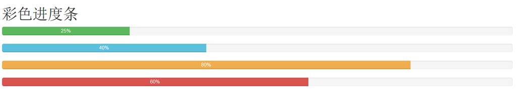
Colored progress bar
The colored progress bar is the same as the warning progress bar. In order to give users a better experience, different progress bar colors are configured according to different states, mainly including the following four types:
progress-bar-info: indicates the information progress bar, blue
progress-bar-success: indicates a successful progress bar, green
progress-bar-warning: indicates a warning progress bar, yellow
progress-bar-danger: indicates error progress bar, red
css source code:
.progress-bar-success {
background-color: #5cb85c;
}
.progress-bar-info {
background-color: #5bc0de;
}
.progress-bar-warning {
background-color: #f0ad4e;
}
.progress-bar-danger {
background-color: #d9534f;
}How to use:
Just add the corresponding class name to the basic progress bar
Example:
<h1>彩色进度条</h1>
<div class="progress">
<div class="progress-bar progress-bar-success" style="width:25%;" role="progressbar" aria-valuenow="25" aria-valuemin="0" aria-valuemax="100">25%</div>
</div>
<div class="progress">
<div class="progress-bar progress-bar-info" style="width:40%;" role="progressbar" aria-valuenow="40" aria-valuemax="100" aria-valuemin="0">40%</div>
</div>
<div class="progress">
<div class="progress-bar progress-bar-warning" style="width:80%;" role="progressbar" aria-valuenow="25" aria-valuemin="0" aria-valuemax="100">80%</div>
</div>
<div class="progress">
<div class="progress-bar progress-bar-danger" style="width:60%;" role="progressbar" aria-valuenow="40" aria-valuemax="100" aria-valuemin="0">60%</div>
</div>
The effect is as follows:
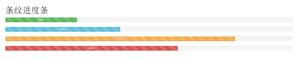
Striped progress bar
The striped progress bar is implemented using the linear gradient of CSS3 without using any pictures. To use the striped progress bar, just add the class name "progress-striped" to the container.progress of the progress bar. If you want the progress stripe to be colored The progress is the same, with color effects, just add the corresponding color class name
to the progress barThe following is the .progress-striped style source code:
.progress-striped .progress-bar {
background-image: -webkit-linear-gradient(45deg, rgba(255, 255, 255, .15) 25%, transparent 25%, transparent 50%, rgba(255, 255, 255, .15) 50%, rgba(255, 255, 255, .15) 75%, transparent 75%, transparent);
background-image:linear-gradient(45deg, rgba(255, 255, 255, .15) 25%, transparent 25%, transparent 50%, rgba(255, 255, 255, .15) 50%, rgba(255, 255, 255, .15) 75%, transparent 75%, transparent);
background-size: 40px 40px;
}Each state corresponding to the stripe progress also has a different color
.progress-striped .progress-bar-success {
background-image: -webkit-linear-gradient(45deg, rgba(255, 255, 255, .15) 25%, transparent 25%, transparent 50%, rgba(255, 255, 255, .15) 50%, rgba(255, 255, 255, .15) 75%, transparent 75%, transparent);
background-image:linear-gradient(45deg, rgba(255, 255, 255, .15) 25%, transparent 25%, transparent 50%, rgba(255, 255, 255, .15) 50%, rgba(255, 255, 255, .15) 75%, transparent 75%, transparent);
}
.progress-striped .progress-bar-info {
background-image: -webkit-linear-gradient(45deg, rgba(255, 255, 255, .15) 25%, transparent 25%, transparent 50%, rgba(255, 255, 255, .15) 50%, rgba(255, 255, 255, .15) 75%, transparent 75%, transparent);
background-image:linear-gradient(45deg, rgba(255, 255, 255, .15) 25%, transparent 25%, transparent 50%, rgba(255, 255, 255, .15) 50%, rgba(255, 255, 255, .15) 75%, transparent 75%, transparent);
}
.progress-striped .progress-bar-warning {
background-image: -webkit-linear-gradient(45deg, rgba(255, 255, 255, .15) 25%, transparent 25%, transparent 50%, rgba(255, 255, 255, .15) 50%, rgba(255, 255, 255, .15) 75%, transparent 75%, transparent);
background-image:linear-gradient(45deg, rgba(255, 255, 255, .15) 25%, transparent 25%, transparent 50%, rgba(255, 255, 255, .15) 50%, rgba(255, 255, 255, .15) 75%, transparent 75%, transparent);
}
.progress-striped .progress-bar-danger {
background-image: -webkit-linear-gradient(45deg, rgba(255, 255, 255, .15) 25%, transparent 25%, transparent 50%, rgba(255, 255, 255, .15) 50%, rgba(255, 255, 255, .15) 75%, transparent 75%, transparent);
background-image:linear-gradient(45deg, rgba(255, 255, 255, .15) 25%, transparent 25%, transparent 50%, rgba(255, 255, 255, .15) 50%, rgba(255, 255, 255, .15) 75%, transparent 75%, transparent);
}Let’s take a look at the application of striped progress bar:
<h1>条纹进度条</h1>
<div class="progress progress-striped">
<div class="progress-bar progress-bar-success" style="width:25%;" role="progressbar" aria-valuenow="25" aria-valuemin="0" aria-valuemax="100">25%</div>
</div>
<div class="progress progress-striped">
<div class="progress-bar progress-bar-info" style="width:40%;" role="progressbar" aria-valuenow="40" aria-valuemax="100" aria-valuemin="0">40%</div>
</div>
<div class="progress progress-striped">
<div class="progress-bar progress-bar-warning" style="width:80%;" role="progressbar" aria-valuenow="25" aria-valuemin="0" aria-valuemax="100">80%</div>
</div>
<div class="progress progress-striped">
<div class="progress-bar progress-bar-danger" style="width:60%;" role="progressbar" aria-valuenow="40" aria-valuemax="100" aria-valuemin="0">60%</div>
</div>
Dynamic striped progress bar
On the basis of the two classes of progress bar .progress and .progress-striped, adding the class name .active can realize the dynamic striped progress bar.
The implementation principle is mainly accomplished through CSS3 animation. First, a progress-bar-stripes animation is created through @keyframes. This animation mainly does one thing, which is to change the position of the background image, which is the value of background-position. Because the striped progress bar is made through the linear gradient of CSS3, and linear-gradient implements the background image in the corresponding background
The following is the css source code:
@-webkit-keyframes progress-bar-stripes {
from {
background-position: 40px 0;
}
to {
background-position: 0 0;
}
}
@keyframes progress-bar-stripes {
from {
background-position: 40px 0;
}
to {
background-position: 0 0;
}
}@keyframes only creates an animation effect. If we want the progress bar to really move, we need to call the animation "progress-bar-stripes" created by @keyframes in a certain way, and trigger the animation to take effect through an event. . In the Bootstrap framework, add a class name "active" to the progress bar container "progress", and let the "progress-bar-stripes" animation take effect when the document is loaded
The style code corresponding to calling animation is as follows:
.progress.active .progress-bar {
-webkit-animation: progress-bar-stripes 2s linear infinite;
animation: progress-bar-stripes 2s linear infinite;
}Example:
<h1>动态条纹进度条</h1>
<div class="progress progress-striped active">
<div class="progress-bar progress-bar-success" style="width:25%;" role="progressbar" aria-valuenow="25" aria-valuemin="0" aria-valuemax="100">25%</div>
</div>
<div class="progress progress-striped active">
<div class="progress-bar progress-bar-info" style="width:40%;" role="progressbar" aria-valuenow="40" aria-valuemax="100" aria-valuemin="0">40%</div>
</div>
<div class="progress progress-striped active">
<div class="progress-bar progress-bar-warning" style="width:80%;" role="progressbar" aria-valuenow="25" aria-valuemin="0" aria-valuemax="100">80%</div>
</div>
<div class="progress progress-striped active">
<div class="progress-bar progress-bar-danger" style="width:60%;" role="progressbar" aria-valuenow="40" aria-valuemax="100" aria-valuemin="0">60%</div>
</div>
效果如下(由于是直接从网页上结果来的图,这里并看不到它的动态效果):

层叠进度条:
层叠进度可以将不容状态的进度条放在一起,按水平方式排列
例子:

<div class="progress">
<div class="progress-bar progress-bar-success" style="width:20%"></div>
<div class="progress-bar progress-bar-info" style="width:10%"></div>
<div class="progress-bar progress-bar-warning" style="width:30%"></div>
<div class="progress-bar progress-bar-danger" style="width:15%"></div>
</div>
除了层叠彩色进度条之外,还可以层叠条纹进度条,或者说条纹进度条和彩色进度条混合层叠,仅需要在“progress”容器中添加对应的进度条,同样要注意,层叠的进度条之和不能大于100%。
下面来看一个例子:
<div class="progress">
<div class="progress-bar progress-bar-success" style="width:20%"></div>
<div class="progress-bar progress-bar-info" style="width:20%"></div>
<div class="progress-bar progress-bar-warning" style="width:30%"></div>
<div class="progress-bar progress-bar-danger" style="width:15%"></div>
</div>
<div class="progress">
<div class="progress-bar progress-bar-success progress-bar-striped" style="width:20%"></div>
<div class="progress-bar progress-bar-info progress-bar-striped" style="width:20%"></div>
<div class="progress-bar progress-bar-striped progress-bar-warning" style="width:30%"></div>
<div class="progress-bar progress-bar-danger progress-bar-striped" style="width:15%"></div>
</div>
<div class="progress">
<div class="progress-bar progress-bar-success" style="width:20%"></div>
<div class="progress-bar progress-bar-info progress-bar-striped" style="width:20%"></div>
<div class="progress-bar progress-bar-warning" style="width:30%"></div>
<div class="progress-bar progress-bar-danger progress-bar-striped" style="width:15%"></div>
</div>

关于Bootstrap进度条组件知识详解到此就介绍了,希望对大家有所帮助!

Hot AI Tools

Undresser.AI Undress
AI-powered app for creating realistic nude photos

AI Clothes Remover
Online AI tool for removing clothes from photos.

Undress AI Tool
Undress images for free

Clothoff.io
AI clothes remover

Video Face Swap
Swap faces in any video effortlessly with our completely free AI face swap tool!

Hot Article
Hot Tools

Notepad++7.3.1
Easy-to-use and free code editor

SublimeText3 Chinese version
Chinese version, very easy to use

Zend Studio 13.0.1
Powerful PHP integrated development environment

Dreamweaver CS6
Visual web development tools

SublimeText3 Mac version
God-level code editing software (SublimeText3)
Hot Topics
 1662
1662
 14
1419
52
1313
25
1263
29
1236
24
14
1419
52
1313
25
1263
29
1236
24

 Demystifying JavaScript: What It Does and Why It Matters
Apr 09, 2025 am 12:07 AM
Demystifying JavaScript: What It Does and Why It Matters
Apr 09, 2025 am 12:07 AM
JavaScript is the cornerstone of modern web development, and its main functions include event-driven programming, dynamic content generation and asynchronous programming. 1) Event-driven programming allows web pages to change dynamically according to user operations. 2) Dynamic content generation allows page content to be adjusted according to conditions. 3) Asynchronous programming ensures that the user interface is not blocked. JavaScript is widely used in web interaction, single-page application and server-side development, greatly improving the flexibility of user experience and cross-platform development.
 The Evolution of JavaScript: Current Trends and Future Prospects
Apr 10, 2025 am 09:33 AM
The Evolution of JavaScript: Current Trends and Future Prospects
Apr 10, 2025 am 09:33 AM
The latest trends in JavaScript include the rise of TypeScript, the popularity of modern frameworks and libraries, and the application of WebAssembly. Future prospects cover more powerful type systems, the development of server-side JavaScript, the expansion of artificial intelligence and machine learning, and the potential of IoT and edge computing.
 JavaScript Engines: Comparing Implementations
Apr 13, 2025 am 12:05 AM
JavaScript Engines: Comparing Implementations
Apr 13, 2025 am 12:05 AM
Different JavaScript engines have different effects when parsing and executing JavaScript code, because the implementation principles and optimization strategies of each engine differ. 1. Lexical analysis: convert source code into lexical unit. 2. Grammar analysis: Generate an abstract syntax tree. 3. Optimization and compilation: Generate machine code through the JIT compiler. 4. Execute: Run the machine code. V8 engine optimizes through instant compilation and hidden class, SpiderMonkey uses a type inference system, resulting in different performance performance on the same code.
 JavaScript: Exploring the Versatility of a Web Language
Apr 11, 2025 am 12:01 AM
JavaScript: Exploring the Versatility of a Web Language
Apr 11, 2025 am 12:01 AM
JavaScript is the core language of modern web development and is widely used for its diversity and flexibility. 1) Front-end development: build dynamic web pages and single-page applications through DOM operations and modern frameworks (such as React, Vue.js, Angular). 2) Server-side development: Node.js uses a non-blocking I/O model to handle high concurrency and real-time applications. 3) Mobile and desktop application development: cross-platform development is realized through ReactNative and Electron to improve development efficiency.
 Python vs. JavaScript: The Learning Curve and Ease of Use
Apr 16, 2025 am 12:12 AM
Python vs. JavaScript: The Learning Curve and Ease of Use
Apr 16, 2025 am 12:12 AM
Python is more suitable for beginners, with a smooth learning curve and concise syntax; JavaScript is suitable for front-end development, with a steep learning curve and flexible syntax. 1. Python syntax is intuitive and suitable for data science and back-end development. 2. JavaScript is flexible and widely used in front-end and server-side programming.
 How to Build a Multi-Tenant SaaS Application with Next.js (Frontend Integration)
Apr 11, 2025 am 08:22 AM
How to Build a Multi-Tenant SaaS Application with Next.js (Frontend Integration)
Apr 11, 2025 am 08:22 AM
This article demonstrates frontend integration with a backend secured by Permit, building a functional EdTech SaaS application using Next.js. The frontend fetches user permissions to control UI visibility and ensures API requests adhere to role-base
 From C/C to JavaScript: How It All Works
Apr 14, 2025 am 12:05 AM
From C/C to JavaScript: How It All Works
Apr 14, 2025 am 12:05 AM
The shift from C/C to JavaScript requires adapting to dynamic typing, garbage collection and asynchronous programming. 1) C/C is a statically typed language that requires manual memory management, while JavaScript is dynamically typed and garbage collection is automatically processed. 2) C/C needs to be compiled into machine code, while JavaScript is an interpreted language. 3) JavaScript introduces concepts such as closures, prototype chains and Promise, which enhances flexibility and asynchronous programming capabilities.
 Building a Multi-Tenant SaaS Application with Next.js (Backend Integration)
Apr 11, 2025 am 08:23 AM
Building a Multi-Tenant SaaS Application with Next.js (Backend Integration)
Apr 11, 2025 am 08:23 AM
I built a functional multi-tenant SaaS application (an EdTech app) with your everyday tech tool and you can do the same. First, what’s a multi-tenant SaaS application? Multi-tenant SaaS applications let you serve multiple customers from a sing
