

移动端视网膜(Retina)屏幕下如何解决网页中1px显示问题?

苹果发布iPhone6(375x667,devicePixelRatio:2)、iPhone6 plus(414x736,devicePixelRatio:3)等Android机型分辨率如何处理兼容最优。
- 手机淘宝的flexible设计与实现
- A tale of two viewports
- REMs And Viewport Measurements
- Configuring the Viewport
- CSS Media Queries for iPads & iPhones
回复内容:
可以用1px尺寸的带背景色元素然后scaleX(0.5)或scaleY(0.5)实现0.5px效果。比如要实现一个元素的下边框1px效果:
<span class="nc">.item</span> <span class="p">{</span>
    <span class="k">position</span><span class="o">:</span> <span class="k">relative</span><span class="p">;</span>
<span class="p">}</span>
<span class="nc">.item</span><span class="nd">:after</span> <span class="p">{</span>
    <span class="k">content</span><span class="o">:</span> <span class="s1">''</span><span class="p">;</span>
    <span class="k">display</span><span class="o">:</span> <span class="k">block</span><span class="p">;</span>
    <span class="k">position</span><span class="o">:</span> <span class="k">absolute</span><span class="p">;</span>
    <span class="k">width</span><span class="o">:</span> <span class="m">100%</span><span class="p">;</span>
    <span class="k">left</span><span class="o">:</span> <span class="m">0</span><span class="p">;</span>
    <span class="k">bottom</span><span class="o">:</span> <span class="m">0</span><span class="p">;</span>
    <span class="k">height</span><span class="o">:</span> <span class="m">1px</span><span class="p">;</span>
    <span class="k">background-color</span><span class="o">:</span> <span class="m">#c8c7cc</span><span class="p">;</span>
    <span class="o">-</span><span class="n">webkit</span><span class="o">-</span><span class="n">transform</span><span class="o">:</span> <span class="n">scaleY</span><span class="p">(</span><span class="m">0</span><span class="o">.</span><span class="m">5</span><span class="p">);</span>
    <span class="n">transform</span><span class="o">:</span> <span class="n">scaleY</span><span class="p">(</span><span class="m">0</span><span class="o">.</span><span class="m">5</span><span class="p">);</span>
<span class="p">}</span>
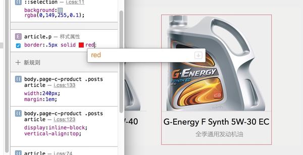

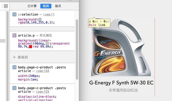
二, linear-gradient
 手机答题,待会再补详细的。
有几种方案,一种是用图片:2像素,一个透明的,一个目标颜色,可结合border-image与base64玩。
另外一种不同于@张云龙的scale原理,采用目标元素的整体缩小一半,再加上原大小的写法。
还有是通过控制viewport缩小为0.5来实现全局的原大小
还有一些忘了。。 实现的方式有很多种:
- background-image (border-image)
- scale(0.5)
- box-shadow

Hot AI Tools

Undresser.AI Undress
AI-powered app for creating realistic nude photos

AI Clothes Remover
Online AI tool for removing clothes from photos.

Undress AI Tool
Undress images for free

Clothoff.io
AI clothes remover

Video Face Swap
Swap faces in any video effortlessly with our completely free AI face swap tool!

Hot Article
Hot Tools

Notepad++7.3.1
Easy-to-use and free code editor

SublimeText3 Chinese version
Chinese version, very easy to use

Zend Studio 13.0.1
Powerful PHP integrated development environment

Dreamweaver CS6
Visual web development tools

SublimeText3 Mac version
God-level code editing software (SublimeText3)
Hot Topics
 1671
1671
 14
1428
52
1331
25
1276
29
1256
24
14
1428
52
1331
25
1276
29
1256
24

 CSS Viewport: How to use vh, vw, vmin, and vmax units for responsive design
Sep 13, 2023 pm 12:15 PM
CSS Viewport: How to use vh, vw, vmin, and vmax units for responsive design
Sep 13, 2023 pm 12:15 PM
CSSViewport: How to use vh, vw, vmin and vmax units to implement responsive design, specific code examples required In modern responsive web design, we usually want web pages to adapt to different screen sizes and devices to provide a good user experience. The CSSViewport unit (viewport unit) is one of the important tools to help us achieve this goal. In this article, we’ll cover how to use vh, vw, vmin, and vmax units to achieve responsive design.
 Tips for creating media queries using CSS Viewport units vh and vmin
Sep 13, 2023 am 11:18 AM
Tips for creating media queries using CSS Viewport units vh and vmin
Sep 13, 2023 am 11:18 AM
Tips for creating media queries using CSSViewport units vh and vmin With the popularity of mobile devices, responsive design has become an essential technology for modern web design. To adapt to different screen sizes, developers need to adjust layout and styles through media queries. In media queries, the most commonly used unit is pixels (px). However, CSS3 introduces a new window unit, vh and vmin, which can better adapt to different device sizes. This article will introduce how to use vh and v
 How to use CSS Viewport unit vh to create a web page layout that adapts to mobile screens
Sep 13, 2023 am 11:15 AM
How to use CSS Viewport unit vh to create a web page layout that adapts to mobile screens
Sep 13, 2023 am 11:15 AM
How to use CSSViewport unit vh to create a web page layout adapted to mobile phone screens. The popularity and use of mobile phone devices is becoming more and more widespread, and more and more web pages need to be adapted to mobile phone screens. To solve this problem, CSS3 introduced a new unit - the Viewport unit, which includes vh (viewportheight). In this article, we will explore how to use vh units to create web page layouts that adapt to mobile screens, and provide specific code examples. one
 CSS Viewport: How to use vmax and vw to implement adaptive text width
Sep 13, 2023 am 10:16 AM
CSS Viewport: How to use vmax and vw to implement adaptive text width
Sep 13, 2023 am 10:16 AM
CSSViewport: How to use vmax and vw to implement adaptive text width. With the popularity of mobile devices, responsive design has become an important concept in web design. Among them, adaptive text width to maintain consistent display effects under different screen sizes is an important technology. This article will introduce how to use CSSViewport units, especially vmax and vw units, to implement adaptive text width. In addition to theoretical explanations, we will also provide specific
 How to create a full screen background image using CSS Viewport units vh and vw
Sep 13, 2023 am 10:57 AM
How to create a full screen background image using CSS Viewport units vh and vw
Sep 13, 2023 am 10:57 AM
Method to create a full-screen background image using CSSViewport units vh and vw, specific code examples are required. With the popularity of mobile devices and responsive design, full-screen background images have become a common element in design. The traditional method is to use JavaScript or jQuery to achieve it, but now you can use CSSViewport units vh and vw to easily achieve a full-screen background image. Viewport units are relative to the viewport (i.e.
 CSS Viewport: How to create adaptive screen height using vh and vmax
Sep 13, 2023 am 08:43 AM
CSS Viewport: How to create adaptive screen height using vh and vmax
Sep 13, 2023 am 08:43 AM
CSSViewport: A method to create adaptive screen height using vh and vmax. In modern web design, adaptive layout has become an essential technology. Since the screen sizes and resolutions of different devices vary, how to display the page well on various devices becomes a challenge. In CSS, Viewport is an important element used to control the layout and display of web pages. Viewport can be regarded as the window of the web page view, which defines the width, height, and zoom of the web page.
 How to use CSS Viewport units vh and vw to adapt layout to different screen heights
Sep 13, 2023 am 09:19 AM
How to use CSS Viewport units vh and vw to adapt layout to different screen heights
Sep 13, 2023 am 09:19 AM
How to use CSSViewport units vh and vw to implement layout that adapts to different screen heights. With the popularity of mobile devices, many websites and applications need to render well on different screen heights. CSS provides a range of units, of which the vh (viewport height) and vw (viewport width) units are ideal for adapting layouts to different screen heights. This article details how to use these two units and provides specific code examples. First, let's understand how these two units work:
 How to solve the 1px pixel problem on Vue mobile terminal
Jun 30, 2023 pm 06:21 PM
How to solve the 1px pixel problem on Vue mobile terminal
Jun 30, 2023 pm 06:21 PM
How to solve the 1px pixel problem on the mobile side in Vue development. With the rapid development of the mobile Internet, the demand for mobile applications is increasing day by day. However, the diversity of mobile device screen sizes and pixel densities poses certain challenges for developers. One of the common problems is the 1px pixel problem on mobile. This article will introduce how to solve the 1px pixel problem on the mobile side in Vue development. The root of the problem The root of the 1px pixel problem on the mobile side lies in the mismatch between the physical pixels of the mobile device and the device-independent pixels. Device independent pixels (CSS like
