



自从我在博客上写一篇技术文章以来已经有一段时间了,这是一篇关于使用 @shopify/restyle 和 expo 在 react native 中构建类型强制 ui 组件的新文章。
@shopify/restyle 是一个强大的 react native 样式库,可为您的 ui 组件带来类型安全性和一致性。与传统的样式方法不同,restyle 允许您创建集中式主题配置,在整个应用程序中强制执行设计系统原则。
入门
项目设置
- 使用 expo 设置您的 react native 项目
npx create-expo-app@latest
- 转到您的项目目录并使用 expo 安装 @shopify/restyle 包
cd /path/to/project
npx expo install @shopify/restyle
创建你的主题
创建 theme.tsx 文件来定义您的设计系统:
touch theme.tsx
- 复制并粘贴默认主题配置
import {createtheme} from '@shopify/restyle';

const palette = {
  purplelight: '#8c6ff7',
  purpleprimary: '#5a31f4',
  purpledark: '#3f22ab',

  greenlight: '#56dcba',
  greenprimary: '#0ecd9d',
  greendark: '#0a906e',

  black: '#0b0b0b',
  white: '#f0f2f3',
};

const theme = createtheme({
  colors: {
    mainbackground: palette.white,
    cardprimarybackground: palette.purpleprimary,
  },
  spacing: {
    s: 8,
    m: 16,
    l: 24,
    xl: 40,
  },
  textvariants: {
    header: {
      fontweight: 'bold',
      fontsize: 34,
    },
    body: {
      fontsize: 16,
      lineheight: 24,
    },
    defaults: {
      // we can define a default text variant here.
    },
  },
});

export type theme = typeof theme;
export default theme;
实施主题提供者
更新您的 app/_layout.tsx:
import { darktheme, defaulttheme } from "@react-navigation/native";
import { usefonts } from "expo-font";
import { stack } from "expo-router";
import * as splashscreen from "expo-splash-screen";
import { statusbar } from "expo-status-bar";
import { useeffect } from "react";
import "react-native-reanimated";

import { themeprovider } from "@shopify/restyle";
import theme from "@/theme";

// prevent the splash screen from auto-hiding before asset loading is complete.
splashscreen.preventautohideasync();

export default function rootlayout() {
  const [loaded] = usefonts({
    spacemono: require("../assets/fonts/spacemono-regular.ttf"),
  });

  useeffect(() => {
    if (loaded) {
      splashscreen.hideasync();
    }
  }, [loaded]);

  if (!loaded) {
    return null;
  }

  return (
    <themeprovider theme={theme}>
      <stack>
        <stack.screen name="(tabs)" options={{ headershown: false }} />
        <stack.screen name="+not-found" />
      </stack>
      <statusbar style="auto" />
    </themeprovider>
  );
}
创建可重用组件
文本组件
touch components/text.tsx
// in components/text.tsx

import {createtext} from '@shopify/restyle';
import {theme} from '../theme';

export const text = createtext<theme>();
让我们在主屏幕上使用它
import { text } from "@/components/text";
import { safeareaview } from "react-native-safe-area-context";

export default function homescreen() {
  return (
    <safeareaview>
      <text margin="m" variant="header">
        this is the home screen. built using @shopify/restyle.
      </text>
    </safeareaview>
  );
}
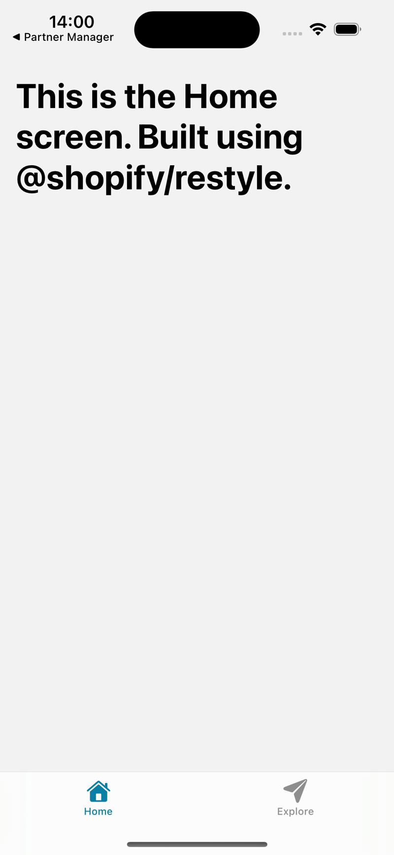
正如您在上面的代码中看到的,我们将边距作为“m”而不是数字传递。我们从 theme.tsxfile 中获取值。
// ./theme.tsx

const theme = createtheme({
  spacing: {
    s: 8,
    m: 16, // margin="m"
    l: 24,
    xl: 40,
  },
  textvariants: {
    header: { // our text header variant
      fontweight: 'bold',
      fontsize: 34,
    },
    body: {
      fontsize: 16,
      lineheight: 24,
    },
  },
    // ...rest of code
  },
});
这就是我们的主页视图的外观
骨架装载机组件
让我们构建一张骨架装载机卡
touch components/skeletonloader.tsx
// components/skeletonloader.tsx

import {
  backgroundcolorprops,
  createbox,
  createrestylecomponent,
  createvariant,
  spacing,
  spacingprops,
  variantprops,
} from "@shopify/restyle";
import { theme } from "@/theme";
import { view } from "react-native";

const box = createbox<theme>();

type props = spacingprops<theme> &
  variantprops<theme, "cardvariants"> &
  backgroundcolorprops<theme> &
  react.componentprops<typeof view>;

const cardskeleton = createrestylecomponent<props, theme>([
  spacing,
  createvariant({ themekey: "cardvariants" }),
]);

const skeletonloader = () => {
  return (
    <cardskeleton variant="elevated">
      <box
        backgroundcolor="cardprimarybackground"
        height={20}
        marginbottom="s"
        width="70%"
        overflow="hidden"
        borderradius={"m"}
      >
      </box>

      <box
        backgroundcolor="cardprimarybackground"
        height={100}
        marginbottom="s"
        width="90%"
        overflow="hidden"
        borderradius={"m"}
      >
      </box>
      <box
        backgroundcolor="cardprimarybackground"
        height={50}
        marginbottom="s"
        width="70%"
        overflow="hidden"
        borderradius={"m"}
      >
      </box>
    </cardskeleton>
  );
};

export default skeletonloader;
- 我们从 @shopify/restyle 包中创建一个新框作为预定义组件,这将是我们创建骨架框的方式
const box = createbox<theme>();
- 使用createstylecomponent创建一个新的cardskeleton组件来创建自定义组件,我们传递了必须在theme.tsx文件中定义的间距和cardvariants的道具
type props = spacingprops<theme> &
  variantprops<theme, "cardvariants"> &
  backgroundcolorprops<theme> &
  react.componentprops<typeof view>;

const cardskeleton = createrestylecomponent<props, theme>([
  spacing,
  createvariant({ themekey: "cardvariants" }),
]);
- 创建一个 skeletonloader 组件来渲染我们的 skelton card 组件
// components/skeletonloader.tsx

export const skeletonloader = () => {
  return (
    <cardskeleton variant="elevated">
      <box
        backgroundcolor="cardprimarybackground"
        height={20}
        marginbottom="s"
        width="70%"
        overflow="hidden"
        borderradius={"m"}
      ></box>

      <box
        backgroundcolor="cardprimarybackground"
        height={100}
        marginbottom="s"
        width="90%"
        overflow="hidden"
        borderradius={"m"}
      ></box>
      <box
        backgroundcolor="cardprimarybackground"
        height={50}
        marginbottom="s"
        width="70%"
        overflow="hidden"
        borderradius={"m"}
      ></box>
    </cardskeleton>
  );
};
我们还剩下一件事要使其正常工作,更新 theme.tsx 文件以拥有 cardvariants
const theme = createtheme({
  colors: {
    // add black color to use it later on
    black: palette.black,
  },
  // add border radius variants
  borderradii: {
    s: 4,
    m: 10,
    l: 25,
    xl: 75,
  },
  // add card variants
  cardvariants: {
    elevated: {
      shadowcolor: "black",
      shadowoffset: { width: 0, height: 2 },
      shadowopacity: 0.1,
      shadowradius: 4,
      elevation: 3,
      borderradius: "m",
    },
    defaults: {
      padding: "m",
      borderradius: "m",
    },
  },
});
太棒了,但是让我们为我们的组件添加动画
// components/skeletonloader.tsx

const shimmeranimation = () => {
  const shimmertranslate = useref(new animated.value(0)).current;

  useeffect(() => {
    animated.loop(
      animated.timing(shimmertranslate, {
        tovalue: 1,
        duration: 1500,
        usenativedriver: true,
      })
    ).start();
  }, [shimmertranslate]);

  const translatex = shimmertranslate.interpolate({
    inputrange: [0, 1],
    outputrange: [-300, 300],
  });

  return (
    <animated.view
      style={{
        position: "absolute",
        top: 0,
        left: 0,
        bottom: 0,
        width: 100,
        backgroundcolor: "rgba(255,255,255,0.2)",
        transform: [{ translatex }],
      }}
    />
  );
};
让我们在骨架加载器组件中使用它

// components/skeletonloader.tsx

export const skeletonloader = () => {
  return (
    <cardskeleton variant="elevated">
      <box
        backgroundcolor="cardprimarybackground"
        height={20}
        marginbottom="s"
        width="70%"
        overflow="hidden"
        borderradius={"m"}
      >
        <shimmeranimation />
      </box>

      <box
        backgroundcolor="cardprimarybackground"
        height={100}
        marginbottom="s"
        width="90%"
        overflow="hidden"
        borderradius={"m"}
      >
        <shimmeranimation />
      </box>
      <box
        backgroundcolor="cardprimarybackground"
        height={50}
        marginbottom="s"
        width="70%"
        overflow="hidden"
        borderradius={"m"}
      >
        <shimmeranimation />
      </box>
    </cardskeleton>
  );
};
这是完整的组件代码:
// components/skeletonloader.tsx

import { useeffect, useref } from "react";
import { animated } from "react-native";
import {
  backgroundcolorprops,
  createbox,
  createrestylecomponent,
  createvariant,
  spacing,
  spacingprops,
  variantprops,
} from "@shopify/restyle";
import { theme } from "@/theme";
import { view } from "react-native";

const box = createbox<theme>();

const shimmeranimation = () => {
  const shimmertranslate = useref(new animated.value(0)).current;

  useeffect(() => {
    animated.loop(
      animated.timing(shimmertranslate, {
        tovalue: 1,
        duration: 1500,
        usenativedriver: true,
      })
    ).start();
  }, [shimmertranslate]);

  const translatex = shimmertranslate.interpolate({
    inputrange: [0, 1],
    outputrange: [-300, 300],
  });

  return (
    <animated.view
      style={{
        position: "absolute",
        top: 0,
        left: 0,
        bottom: 0,
        width: 100,
        backgroundcolor: "rgba(255,255,255,0.2)",
        transform: [{ translatex }],
      }}
    />
  );
};

type props = spacingprops<theme> &
  variantprops<theme, "cardvariants"> &
  backgroundcolorprops<theme> &
  react.componentprops<typeof view>;

const cardskeleton = createrestylecomponent<props, theme>([
  spacing,
  createvariant({ themekey: "cardvariants" }),
]);

export const skeletonloader = () => {
  return (
    <cardskeleton variant="elevated">
      <box
        backgroundcolor="cardprimarybackground"
        height={20}
        marginbottom="s"
        width="70%"
        overflow="hidden"
        borderradius={"m"}
      >
        <shimmeranimation />
      </box>

      <box
        backgroundcolor="cardprimarybackground"
        height={100}
        marginbottom="s"
        width="90%"
        overflow="hidden"
        borderradius={"m"}
      >
        <shimmeranimation />
      </box>
      <box
        backgroundcolor="cardprimarybackground"
        height={50}
        marginbottom="s"
        width="70%"
        overflow="hidden"
        borderradius={"m"}
      >
        <shimmeranimation />
      </box>
    </cardskeleton>
  );
};
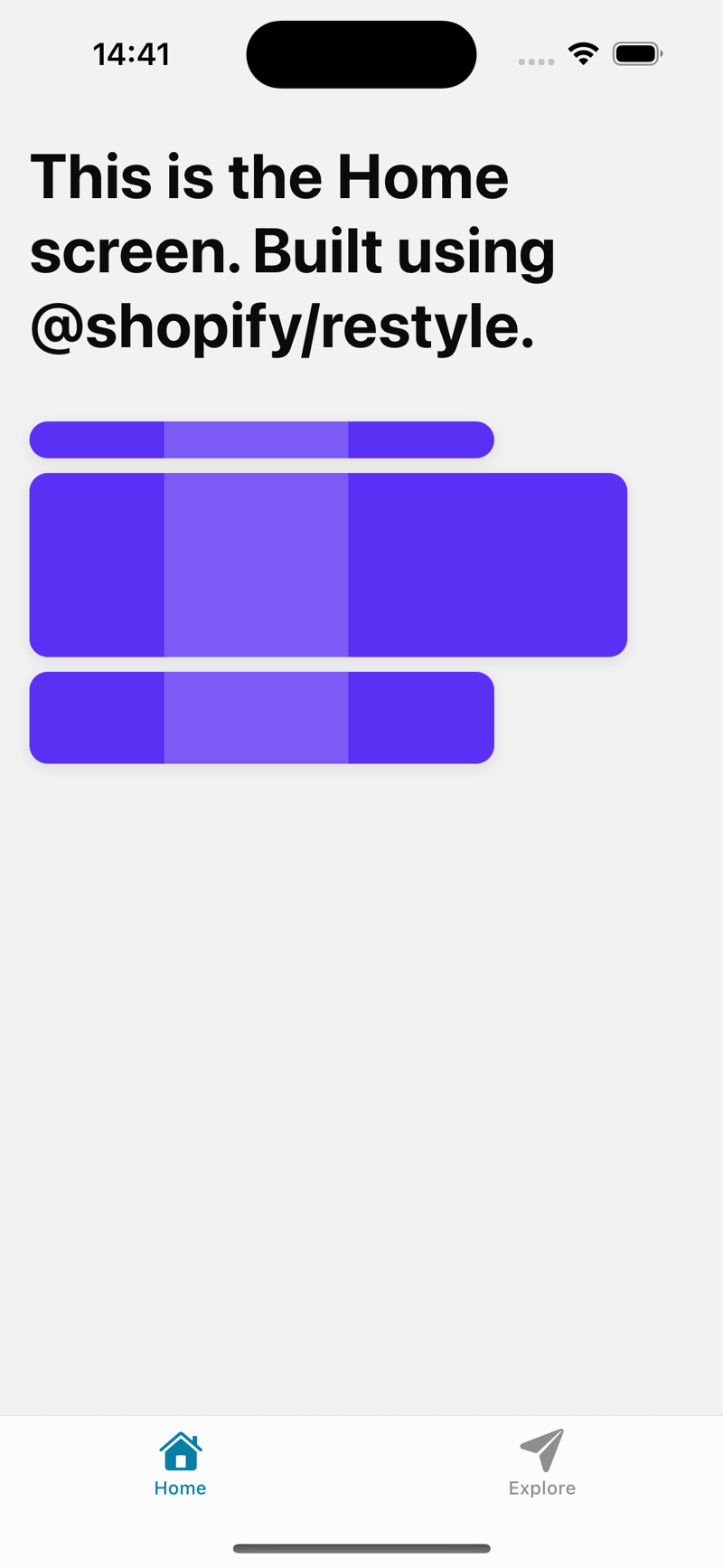
瞧,我们使用 @shopify/restyle 使用
制作了一个骨架加载卡
支持深色模式
让我们从在 theme.tsx 文件中添加深色主题配置开始
// theme.tsx

export const darktheme: theme = {
  ...theme,
  colors: {
    ...theme.colors,
    mainbackground: palette.white,
    cardprimarybackground: palette.purpledark,
    greenprimary: palette.purplelight,
  },
  textvariants: {
    ...theme.textvariants,
    defaults: {
      ...theme.textvariants.header,
      color: palette.purpledark,
    },
  },
通过将深色主题配置添加到我们的layout.tsx 文件中来将其添加到我们的应用布局中
 // app/_layout.tsx

import { usefonts } from "expo-font";
import { stack } from "expo-router";
import * as splashscreen from "expo-splash-screen";
import { statusbar } from "expo-status-bar";
import { useeffect } from "react";
import "react-native-reanimated";

import { themeprovider } from "@shopify/restyle";
import theme, { darktheme } from "@/theme";
import { usecolorscheme } from "react-native";

// prevent the splash screen from auto-hiding before asset loading is complete.
splashscreen.preventautohideasync();

export default function rootlayout() {
  const [loaded] = usefonts({
    spacemono: require("../assets/fonts/spacemono-regular.ttf"),
  });

  const colorschema = usecolorscheme();

  useeffect(() => {
    if (loaded) {
      splashscreen.hideasync();
    }
  }, [loaded]);

  if (!loaded) {
    return null;
  }

  return (
    <themeprovider theme={colorschema === "dark" ? darktheme : theme}>
      <stack>
        <stack.screen name="(tabs)" options={{ headershown: false }} />
        <stack.screen name="+not-found" />
      </stack>
      <statusbar style="auto" />
    </themeprovider>
  );
}
- 使用react-native中的usecolorscheme钩子获取颜色模式
  // app/_layout.tsx

 import { usecolorscheme } from "react-native";

  //... rest of the code

  const colorschema = usecolorscheme();
- 基于颜色模式,使用默认的浅色主题或在深色模式下使用 theme.tsx 文件中定义的 darktheme 配置
 // app/_layout.tsx

 import theme, { darkTheme } from "@/theme";

 //... rest of the code

    <ThemeProvider theme={colorSchema === "dark" ? darkTheme : theme}>
      <Stack>
        <Stack.Screen name="(tabs)" options={{ headerShown: false }} />
        <Stack.Screen name="+not-found" />
      </Stack>
      <StatusBar style="auto" />
    </ThemeProvider>
这是深色和浅色模式。
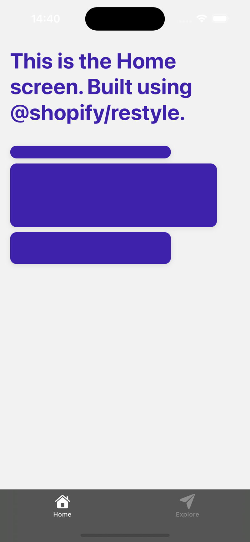
瞧,我们成功地使用 @shopify/restyle 包创建了类型强制的 ui 组件
谢谢你:)