Use CSS3 to create practical loading animation effects (two types)
In the previous article "Use CSS3 to create a cool triangle background image", we introduced the method of using CSS3 to create a cool triangle background. This time we continue to share CSS3 effects and see how to use pure CSS3 to achieve loading animation effects. If you are interested, you can learn about it~
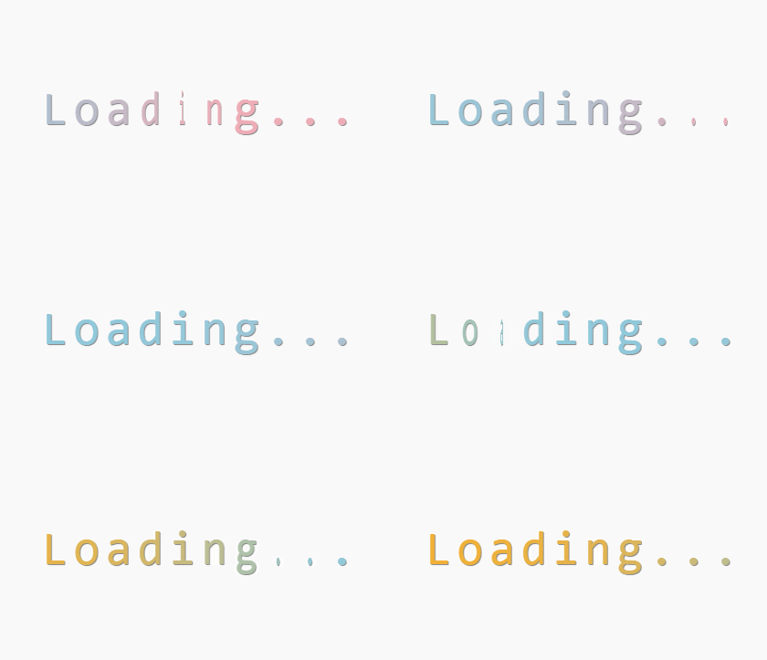
When entering a website, because many pictures need to be displayed, it often takes a while to load. . If you add a dynamic loading effect here, it will not make waiting boring. For example, the picture below looks like this:

#This article will share with you two loading animation effects achieved using CSS3. Both methods are implemented using animation and @keyframes. Let’s take a look at the implementation code:
How to achieve the first effect:
<!DOCTYPE html>
<html>
	<head>
		<meta charset="utf-8">
		<style type="text/css">
			html,
			body {
				padding: 0;
				height: 100%;
				display: table;
				margin: 0 auto;
				font-size: 52px;
				font-family: Monaco, Consolas, "Lucida Console", monospace;
				background-image: url("http://subtlepatterns.subtlepatterns.netdna-cdn.com/patterns/kindajean.png");
			}

			.loading {
				text-align: center;
				display: table-cell;
				vertical-align: middle;
				text-shadow: grey 1px 1px 1px;
			}

			.letter {
				float: left;
				width: 35px;
				height: 60px;
				position: relative;
				-webkit-animation: flip 2s infinite;
				-webkit-transform-style: preserve-3d;
				-webkit-transition: -webkit-transform 1s;
			}

			.letter div {
				width: 100%;
				height: 100%;
				position: absolute;
				-webkit-transform: translate(0);
				-webkit-backface-visibility: hidden;
				-webkit-animation: color 8s infinite;
			}

			.letter div.back {
				-webkit-transform: rotateY(180deg);
			}

			.letter:nth-child(1),
			.letter:nth-child(1) div {
				-webkit-animation-delay: 0.125s;
			}

			.letter:nth-child(2),
			.letter:nth-child(2) div {
				-webkit-animation-delay: 0.25s;
			}

			.letter:nth-child(3),
			.letter:nth-child(3) div {
				-webkit-animation-delay: 0.375s;
			}

			.letter:nth-child(4),
			.letter:nth-child(4) div {
				-webkit-animation-delay: 0.5s;
			}

			.letter:nth-child(5),
			.letter:nth-child(5) div {
				-webkit-animation-delay: 0.625s;
			}

			.letter:nth-child(6),
			.letter:nth-child(6) div {
				-webkit-animation-delay: 0.75s;
			}

			.letter:nth-child(7),
			.letter:nth-child(7) div {
				-webkit-animation-delay: 0.875s;
			}

			.letter:nth-child(8),
			.letter:nth-child(8) div {
				-webkit-animation-delay: 1s;
			}

			.letter:nth-child(9),
			.letter:nth-child(9) div {
				-webkit-animation-delay: 1.125s;
			}

			.letter:nth-child(10),
			.letter:nth-child(10) div {
				-webkit-animation-delay: 1.25s;
			}

			@-webkit-keyframes flip {
				0% {
					-webkit-transform: rotateY(0deg) translate(0);
				}

				40%,
				100% {
					-webkit-transform: rotateY(180deg) translate(0);
				}
			}

			@-webkit-keyframes color {
				0% {
					color: #88E488;
				}

				25% {
					color: #EEADB7;
				}

				50% {
					color: #90C9DB;
				}

				75% {
					color: #F3B034;
				}

				100% {
					color: #828282;
				}
			}
		</style>
	</head>
		<body>
			<div class="loading">
				<div class="letter">
					<div>L</div>
					<div class="back">L</div>
				</div>
				<div class="letter">
					<div>o</div>
					<div class="back">o</div>
				</div>
				<div class="letter">
					<div>a</div>
					<div class="back">a</div>
				</div>
				<div class="letter">
					<div>d</div>
					<div class="back">d</div>
				</div>
				<div class="letter">
					<div>i</div>
					<div class="back">i</div>
				</div>
				<div class="letter">
					<div>n</div>
					<div class="back">n</div>
				</div>
				<div class="letter">
					<div>g</div>
					<div class="back">g</div>
				</div>
				<div class="letter dot">
					<div>.</div>
					<div class="back">.</div>
				</div>
				<div class="letter dot">
					<div>.</div>
					<div class="back">.</div>
				</div>
				<div class="letter dot">
					<div>.</div>
					<div class="back">.</div>
				</div>
			</div>
		</body>
</html>In the above code, first use two animation attributes to bind two animations, flip and color, to each word to control the flip action and color change respectively; then use the @keyframes rule to bind the two animations respectively. Just set the action for each frame of the animation.
The flip action needs to be controlled using the transform attribute, which can apply 2D or 3D transformation to the element.
The effect is as follows:

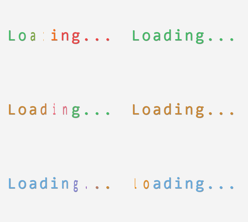
The following effect is also the same realization idea, but there are some changes in subtleties.
How to achieve the second effect:
<!DOCTYPE html>
<html>
	<head>
		<meta charset="utf-8">
		<style>
			html,
			body {
				padding: 0;
				height: 100%;
				display: table;
				margin: 0 auto;
				font-size: 52px;
				font-family: Monaco, Consolas, "Lucida Console", monospace;
				background: #F5F5F5;
			}

			.loading {
				top: 50%;
				left: 50%;
				width: 350px;
				height: 60px;
				font-size: 52px;
				position: absolute;
				text-align: center;
				margin-top: -30px;
				margin-left: -175px;
				text-shadow: #808080 1px 1px 1px;
				font-family: Monaco, Consolas, "Lucida Console", monospace;
			}

			.letter {
				float: left;
				width: 35px;
				height: 60px;
				position: relative;
				animation: flip 2s infinite;
				transform-style: preserve-3d;
				transition: transform 1s;
			}

			.letter div {
				color: #4B6;
				width: 100%;
				height: 100%;
				position: absolute;
				transform: translate(0);
				backface-visibility: hidden;
				animation: color 16s infinite;
			}

			.letter div.back {
				transform: rotateY(180deg);
			}

			.letter:nth-child(1),
			.letter:nth-child(1) div {
				animation-delay: 0.125s;
			}

			.letter:nth-child(2),
			.letter:nth-child(2) div {
				animation-delay: 0.25s;
			}

			.letter:nth-child(3),
			.letter:nth-child(3) div {
				animation-delay: 0.375s;
			}

			.letter:nth-child(4),
			.letter:nth-child(4) div {
				animation-delay: 0.5s;
			}

			.letter:nth-child(5),
			.letter:nth-child(5) div {
				animation-delay: 0.625s;
			}

			.letter:nth-child(6),
			.letter:nth-child(6) div {
				animation-delay: 0.75s;
			}

			.letter:nth-child(7),
			.letter:nth-child(7) div {
				animation-delay: 0.875s;
			}

			.letter:nth-child(8),
			.letter:nth-child(8) div {
				animation-delay: 1s;
			}

			.letter:nth-child(9),
			.letter:nth-child(9) div {
				animation-delay: 1.125s;
			}

			.letter:nth-child(10),
			.letter:nth-child(10) div {
				animation-delay: 1.25s;
			}

			@keyframes flip {
				0% {
					transform: rotateY(0deg) translate(0);
				}

				40%,
				100% {
					transform: rotateY(180deg) translate(0);
				}
			}

			@keyframes color {
				1.5% {
					color: #6AD;
				}

				3%,
				12.5% {
					color: #F80;
				}

				14% {
					color: #4B6;
				}

				15.5%,
				25% {
					color: #F68;
				}

				26.5% {
					color: #C83;
				}

				28%,
				37.5% {
					color: #96C;
				}

				39% {
					color: #C83;
				}

				40.5%,
				50% {
					color: #E44;
				}

				51.5% {
					color: #F80;
				}

				53%,
				62.5% {
					color: #4B6;
				}

				64% {
					color: #F68;
				}

				65.5%,
				75% {
					color: #C83;
				}

				76.5% {
					color: #96C;
				}

				78%,
				87.5% {
					color: #6AD;
				}

				89% {
					color: #F80;
				}

				90.5%,
				100%,
				0% {
					color: #4B6;
				}
			}
		</style>
	</head>
	<body>
		<div class="loader">
			<div class="loading">
				<div class="letter">
					<div>L</div>
					<div class="back">L</div>
				</div>
				<div class="letter">
					<div>o</div>
					<div class="back">o</div>
				</div>
				<div class="letter">
					<div>a</div>
					<div class="back">a</div>
				</div>
				<div class="letter">
					<div>d</div>
					<div class="back">d</div>
				</div>
				<div class="letter">
					<div>i</div>
					<div class="back">i</div>
				</div>
				<div class="letter">
					<div>n</div>
					<div class="back">n</div>
				</div>
				<div class="letter">
					<div>g</div>
					<div class="back">g</div>
				</div>
				<div class="letter">
					<div>.</div>
					<div class="back">.</div>
				</div>
				<div class="letter">
					<div>.</div>
					<div class="back">.</div>
				</div>
				<div class="letter">
					<div>.</div>
					<div class="back">.</div>
				</div>
			</div>
		</div>
	</body>
</html>The effect is as follows:

The following are 3 keys Attribute animation, @keyframes and transform:
CSS3
animation(animation) Attribute
Syntax: animation : name duration timing-function delay iteration-count direction fill-mode play-state;
animation-name:指定要绑定到选择器的关键帧的名称
animation-duration:动画指定需要多少秒或毫秒完成
animation-timing-function:设置动画将如何完成一个周期
animation-delay:设置动画在启动前的延迟间隔。
animation-iteration-count:定义动画的播放次数。
animation-direction:指定是否应该轮流反向播放动画。
animation-fill-mode:规定当动画不播放时(当动画完成时,或当动画有一个延迟未开始播放时),要应用到元素的样式。
animation-play-state:指定动画是否正在运行或已暂停。
@keyframesRules
Animations can be created using @keyframes rules. Animation is created by gradually changing from one CSS style setting to another. To put it simply: @keyframes is used to set the action of each frame of animation.
@keyframes need to be used together with the animation attribute to achieve animation:
@keyframe rules consist of the keyword "@keyframe", followed by an identifier giving the name of the animation (animation will be used -name), followed by a set of style rules (delimited by curly braces). The animation is then applied to the element by using the identifier as the value of the animation-name attribute. For example:
/* 定义动画*/
@keyframes 动画名称{
    /* 样式规则*/
}

/* 将它应用于元素 */
.element {
    animation-name: 动画名称(在@keyframes中已经声明好的);

    /* 或使用动画简写属性*/
    animation: 动画名称 1s ...
}CSS3
transformProperties
The transform property applies a 2D or 3D transformation to an element. This property allows us to rotate, scale, move or tilt the element.
Grammar: transform: none|transform-functions;
none	定义不进行转换。
matrix(n,n,n,n,n,n)	定义 2D 转换,使用六个值的矩阵。
matrix3d(n,n,n,n,n,n,n,n,n,n,n,n,n,n,n,n)	定义 3D 转换,使用 16 个值的 4x4 矩阵。
translate(x,y)	定义 2D 转换。
translate3d(x,y,z)	定义 3D 转换。
translateX(x)	定义转换,只是用 X 轴的值。
translateY(y)	定义转换,只是用 Y 轴的值。
translateZ(z)	定义 3D 转换,只是用 Z 轴的值。
scale(x,y)	定义 2D 缩放转换。
scale3d(x,y,z)	定义 3D 缩放转换。
scaleX(x)	通过设置 X 轴的值来定义缩放转换。
scaleY(y)	通过设置 Y 轴的值来定义缩放转换。
scaleZ(z)	通过设置 Z 轴的值来定义 3D 缩放转换。
rotate(angle)	定义 2D 旋转,在参数中规定角度。
rotate3d(x,y,z,angle)	定义 3D 旋转。
rotateX(angle)	定义沿着 X 轴的 3D 旋转。
rotateY(angle)	定义沿着 Y 轴的 3D 旋转。
rotateZ(angle)	定义沿着 Z 轴的 3D 旋转。
skew(x-angle,y-angle)	定义沿着 X 和 Y 轴的 2D 倾斜转换。
skewX(angle)	定义沿着 X 轴的 2D 倾斜转换。
skewY(angle)	定义沿着 Y 轴的 2D 倾斜转换。
perspective(n)	为 3D 转换元素定义透视视图。
The PHP Chinese website platform has a lot of video teaching resources, everyone is welcome to learn "css video tutorial》!
The above is the detailed content of Use CSS3 to create practical loading animation effects (two types). For more information, please follow other related articles on the PHP Chinese website!

Hot AI Tools

Undresser.AI Undress
AI-powered app for creating realistic nude photos

AI Clothes Remover
Online AI tool for removing clothes from photos.

Undress AI Tool
Undress images for free

Clothoff.io
AI clothes remover

Video Face Swap
Swap faces in any video effortlessly with our completely free AI face swap tool!

Hot Article

Hot Tools

Notepad++7.3.1
Easy-to-use and free code editor

SublimeText3 Chinese version
Chinese version, very easy to use

Zend Studio 13.0.1
Powerful PHP integrated development environment

Dreamweaver CS6
Visual web development tools

SublimeText3 Mac version
God-level code editing software (SublimeText3)

Hot Topics
 How to achieve wave effect with pure CSS3? (code example)
Jun 28, 2022 pm 01:39 PM
How to achieve wave effect with pure CSS3? This article will introduce to you how to use SVG and CSS animation to create wave effects. I hope it will be helpful to you!
 How to use Vue to implement loading animation and progress bar effects?
Jun 27, 2023 pm 04:36 PM
Vue is a popular front-end framework that greatly simplifies website or application development. One of the common features is loading animation and progress bar effects to make the interface more attractive and interactive. In this article, we will explore how to achieve these effects using Vue. Loading animation effect Loading animation effect means that while waiting for data to be loaded, an animation effect will appear on the website or application to indicate that the data is loading. This helps convey the concept of wait time to the user, thus preventing them from getting bored or losing interest. The following is the implementation of the loading action
 Use CSS skillfully to realize various strange-shaped buttons (with code)
Jul 19, 2022 am 11:28 AM
This article will show you how to use CSS to easily realize various weird-shaped buttons that appear frequently. I hope it will be helpful to you!
 How to hide elements in css without taking up space
Jun 01, 2022 pm 07:15 PM
Two methods: 1. Using the display attribute, just add the "display:none;" style to the element. 2. Use the position and top attributes to set the absolute positioning of the element to hide the element. Just add the "position:absolute;top:-9999px;" style to the element.
 How to implement lace borders in css3
Sep 16, 2022 pm 07:11 PM
In CSS, you can use the border-image attribute to achieve a lace border. The border-image attribute can use images to create borders, that is, add a background image to the border. You only need to specify the background image as a lace style; the syntax "border-image: url (image path) offsets the image border width inward. Whether outset is repeated;".
 How to enlarge the image by clicking the mouse in css3
Apr 25, 2022 pm 04:52 PM
Implementation method: 1. Use the ":active" selector to select the state of the mouse click on the picture; 2. Use the transform attribute and scale() function to achieve the picture magnification effect, the syntax "img:active {transform: scale(x-axis magnification, y Axis magnification);}".
 It turns out that text carousel and image carousel can also be realized using pure CSS!
Jun 10, 2022 pm 01:00 PM
How to create text carousel and image carousel? The first thing everyone thinks of is whether to use js. In fact, text carousel and image carousel can also be realized using pure CSS. Let’s take a look at the implementation method. I hope it will be helpful to everyone!
 How to set animation rotation speed in css3
Apr 28, 2022 pm 04:32 PM
In CSS3, you can use the "animation-timing-function" attribute to set the animation rotation speed. This attribute is used to specify how the animation will complete a cycle and set the speed curve of the animation. The syntax is "element {animation-timing-function: speed attribute value;}".


