

css bfc what does it mean

In CSS, bfc means "block-level formatting context" in Chinese. It is the CSS rendering mode of the box model layout in the Web page. It refers to an independent rendering area or an isolated independent container. A block formatting context contains all content inside the element that creates it.

The operating environment of this tutorial: Windows 7 system, CSS3&&HTML5 version, Dell G3 computer.
What is BFC
BFC (Block Formatting Context) block-level formatting context is the CSS rendering mode of the box model layout in the Web page, referring to a An independent rendering area or an isolated independent container.
BFC is Block Formatting Contexts (block-level formatting context), which is a normal stream.
You can think of BFC as a large closed box. No matter how much the elements inside the box go through, they will not affect the outside.
Conditions for forming BFC
1. Floating elements, float values other than none;
2. Absolutely positioned elements, position (absolute, fixed);
3. display is one of the following values: inline-block, table-cell, table-caption, flex;
4. overflow is a value other than visible (hidden, auto, scroll);
5. Body root element
Features of BFC
1. Internal Boxes will be placed one after another in the vertical direction.
2. The distance in the vertical direction is determined by margin
3. The bfc area will not overlap with the float element area.
4. When calculating the height of bfc, floating elements also participate in the calculation
5. Bfc is an independent container on the page, and the child elements inside the container will not affect the outside elements.
Practice is the only criterion for testing truth
(1) Box alignment in BFC
The first feature Yes: Internal Boxes will be placed one after another in the vertical direction.

#The same is true for floating elements. Box3 is floating, but it is still arranged vertically following the previous box. And all boxes are left aligned.
html:
<div class="container">
        <div class="box1"></div>
        <div class="box2"></div>
        <div class="box3"></div>
        <div class="box4"></div>
</div>(2) Margin folding
The second feature: the distance in the vertical direction is determined by margin
In regular document flow, the vertical distance between two sibling boxes is determined by their margins, but not the sum of their two margins, but whichever is larger. 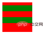
html:
div {
            height: 20px;
        }

        .container {
            position: absolute;  /* 创建一个BFC环境*/
            height: auto;
            background-color: #eee;
        }

        .box1 {
            width: 400px;
            background-color: red;
        }

        .box2 {
            width: 300px;
            background-color: green;
        }

        .box3 {
            width: 100px;
            background-color: yellow;
            float: left;
        }

        .box4 {
            width: 200px;
            height: 30px;
            background-color: purple;
} <div class="container">
<div class="box"></div>
<div class="box"></div>
</div>Here we can see that the first sub-box has a top margin (the problem of margin penetration will not occur); the two sub-boxes The vertical distance is 20px instead of 30px, because the vertical margins will collapse, and the spacing will be larger.
So is there a way to prevent the vertical margins from collapsing? The answer is: yes. Item 5 of the feature says: bfc is an independent container on the page. The sub-elements inside the container will not affect the outside elements, and the outside elements will not affect the elements inside the BFC. So just let box1 or box2 be in another BFC.
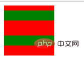
.container {
            overflow: hidden;
            width: 100px;
            height: 100px;
            background-color: red;
        }

        .box1 {
            height: 20px;
            margin: 10px 0;
            background-color: green;
        }

        .box2 {
            height: 20px;
            margin: 20px 0;
            background-color: green;
}<div class="container">
<div class="wrapper">
<div class="box1"></div>
</div>
<div class="box2"></div>
</div>(3) Not covered by floating elements
Take the common two-column layout as an example .
The left side has a fixed width, and the right side has no width, so the width on the right side is adaptive and changes with the size of the browser window.
html:
.container {
        overflow: hidden;
        width: 100px;
        height: 100px;
        background-color: red;
    }

    .wrapper {
        overflow: hidden;
    }

    .box1 {
        height: 20px;
        margin: 10px 0;
        background-color: green;
    }

    .box2 {
        height: 20px;
        margin: 20px 0;
        background-color: green;
}<div class="column"></div> <div class="column"></div>
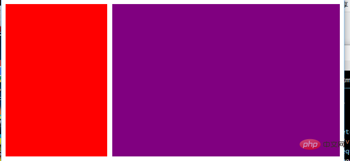
Also has a three-column layout.
The left and right sides have a fixed width, and there is no width in the middle. Therefore, the width in the middle is adaptive and changes with the size of the browser.
html:
.column:nth-of-type(1) {
float: left;
width: 200px;
height: 300px;
margin-right: 10px;
background-color: red;
}
.column:nth-of-type(2) {
overflow: hidden;/*创建bfc */
height: 300px;
background-color: purple;
} <div class="contain">
<div class="column"></div>
<div class="column"></div>
<div class="column"></div>
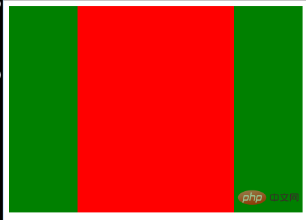
</div>can also be used to prevent font wrapping:
It is known that a floating box will cover the box below, but The text in the box below will not be covered, but the text will surround the floating box. This is also an interesting feature.
html:
.column:nth-of-type(1),
        .column:nth-of-type(2) {
            float: left;
            width: 100px;
            height: 300px;
            background-color: green;
        }

        .column:nth-of-type(2) {
            float: right;
        }

        .column:nth-of-type(3) {
            overflow: hidden;  /*创建bfc*/
            height: 300px;
            background-color: red;
}css:
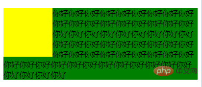
(1) Surround
 <div class="left"></div>
    <p>你好你好你好你好你好你好你好你好你好你好你好你好你好你好你好你好你好你好你好
       你好你好你好你好你好你好你好你好你好你好你好你好你好你好你好你好你好你好你好
       你好你好你好你好你好你好你好你好你好你好你好你好你好你好你好你好你好你好你好你好你好你好你好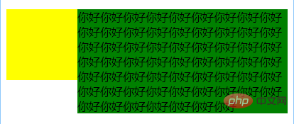
</p>(2)Use bfc prevents wrapping
   .left {
            float: left;
            width: 100px;
            height: 100px;
            background-color: yellow;
        }

        p {
            background-color: green;            /* overflow: hidden; */
}(4) BFC contains floating blocks
这个是大家再熟悉不过的了,利用overflow:hidden清除浮动嘛,因为浮动的盒子无法撑出处于标准文档流的父盒子的height。这个就不过多解释了,相信大家都早已理解。
⑵ BFC可以包含浮动的元素(清除浮动)
浮动的元素会脱离普通文档流,来看下下面一个例子:
<div style="border: 1px solid #000;">
    <div style="width: 100px;height: 100px;background: #eee;float: left;"></div>
</div>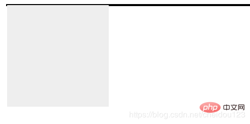
由于容器内元素浮动脱离文档流,导致容器只剩下2px边距高度,我们这时候可以采用BFC:
<div style="border: 1px solid #000;overflow: hidden">
    <div style="width: 100px;height: 100px;background: #eee;float: left;"></div>
</div>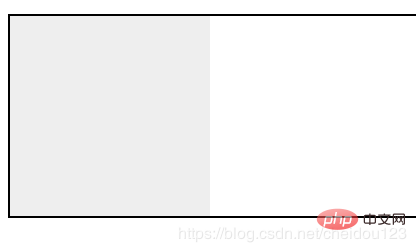
⑶ 可以阻止元素被浮动元素覆盖
先看一个文字环绕效果:
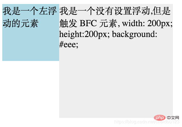
<div style="height: 100px;width: 100px;float: left;background: lightblue">我是一个左浮动的元素</div>
<div style="width: 200px; height: 200px;background: #eee">我是一个没有设置浮动,
也没有触发 BFC 元素, width: 200px; height:200px; background: #eee;</div>
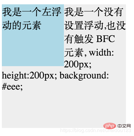
这时候其实第二个元素有部分被浮动元素所覆盖,(但是文本信息不会被浮动元素所覆盖) 如果想避免元素被覆盖,可触第二个元素的 BFC 特性,
在第二个元素中加入 overflow: hidden,就会变成:
学习视频分享:css视频教程
The above is the detailed content of css bfc what does it mean. For more information, please follow other related articles on the PHP Chinese website!

Hot AI Tools

Undresser.AI Undress
AI-powered app for creating realistic nude photos

AI Clothes Remover
Online AI tool for removing clothes from photos.

Undress AI Tool
Undress images for free

Clothoff.io
AI clothes remover

Video Face Swap
Swap faces in any video effortlessly with our completely free AI face swap tool!

Hot Article
Hot Tools

Notepad++7.3.1
Easy-to-use and free code editor

SublimeText3 Chinese version
Chinese version, very easy to use

Zend Studio 13.0.1
Powerful PHP integrated development environment

Dreamweaver CS6
Visual web development tools

SublimeText3 Mac version
God-level code editing software (SublimeText3)
Hot Topics
 1653
1653
 14
1413
52
1305
25
1251
29
1224
24
14
1413
52
1305
25
1251
29
1224
24

 How to use bootstrap in vue
Apr 07, 2025 pm 11:33 PM
How to use bootstrap in vue
Apr 07, 2025 pm 11:33 PM
Using Bootstrap in Vue.js is divided into five steps: Install Bootstrap. Import Bootstrap in main.js. Use the Bootstrap component directly in the template. Optional: Custom style. Optional: Use plug-ins.
 Understanding HTML, CSS, and JavaScript: A Beginner's Guide
Apr 12, 2025 am 12:02 AM
Understanding HTML, CSS, and JavaScript: A Beginner's Guide
Apr 12, 2025 am 12:02 AM
WebdevelopmentreliesonHTML,CSS,andJavaScript:1)HTMLstructurescontent,2)CSSstylesit,and3)JavaScriptaddsinteractivity,formingthebasisofmodernwebexperiences.
 The Roles of HTML, CSS, and JavaScript: Core Responsibilities
Apr 08, 2025 pm 07:05 PM
The Roles of HTML, CSS, and JavaScript: Core Responsibilities
Apr 08, 2025 pm 07:05 PM
HTML defines the web structure, CSS is responsible for style and layout, and JavaScript gives dynamic interaction. The three perform their duties in web development and jointly build a colorful website.
 How to write split lines on bootstrap
Apr 07, 2025 pm 03:12 PM
How to write split lines on bootstrap
Apr 07, 2025 pm 03:12 PM
There are two ways to create a Bootstrap split line: using the tag, which creates a horizontal split line. Use the CSS border property to create custom style split lines.
 How to insert pictures on bootstrap
Apr 07, 2025 pm 03:30 PM
How to insert pictures on bootstrap
Apr 07, 2025 pm 03:30 PM
There are several ways to insert images in Bootstrap: insert images directly, using the HTML img tag. With the Bootstrap image component, you can provide responsive images and more styles. Set the image size, use the img-fluid class to make the image adaptable. Set the border, using the img-bordered class. Set the rounded corners and use the img-rounded class. Set the shadow, use the shadow class. Resize and position the image, using CSS style. Using the background image, use the background-image CSS property.
 How to use bootstrap button
Apr 07, 2025 pm 03:09 PM
How to use bootstrap button
Apr 07, 2025 pm 03:09 PM
How to use the Bootstrap button? Introduce Bootstrap CSS to create button elements and add Bootstrap button class to add button text
 How to set up the framework for bootstrap
Apr 07, 2025 pm 03:27 PM
How to set up the framework for bootstrap
Apr 07, 2025 pm 03:27 PM
To set up the Bootstrap framework, you need to follow these steps: 1. Reference the Bootstrap file via CDN; 2. Download and host the file on your own server; 3. Include the Bootstrap file in HTML; 4. Compile Sass/Less as needed; 5. Import a custom file (optional). Once setup is complete, you can use Bootstrap's grid systems, components, and styles to create responsive websites and applications.
 How to resize bootstrap
Apr 07, 2025 pm 03:18 PM
How to resize bootstrap
Apr 07, 2025 pm 03:18 PM
To adjust the size of elements in Bootstrap, you can use the dimension class, which includes: adjusting width: .col-, .w-, .mw-adjust height: .h-, .min-h-, .max-h-
