What is float? Detailed explanation of float attribute
What is float? Why use float? This article will introduce to you what float is, let you understand the role of float on layout, and how to clear float. It has certain reference value. Friends in need can refer to it. I hope it will be helpful to you.
First of all, let’s understand what float is?
float is a positioning attribute of css. To understand its purpose and origin, we can look at typographic design. In a print layout, you can set images to the page so that the text wraps around them as desired. This is often aptly called "text wrapping." Here's an example:
#In a page layout program, the box holding the text can be told to follow text wrapping, or to ignore it. Ignoring text wrapping will allow the words to flow above the image as if it wasn't even there. This is the difference between whether the image is part of the page flow (or not). Web design is very similar.

In web design, page elements to which the CSS float property is applied behave like images with text surrounding them in a print layout. Floated elements are still part of the flow of the web page. This is significantly different from using absolutely positioned page elements. Absolutely positioned page elements will be removed from the web page flow, just like text boxes in print layouts are told to ignore page wraps. Absolutely positioned page elements do not affect the position of other elements, nor do other elements affect them, regardless of whether they touch each other.
Using CSS to set float on an element will happen as follows:
.demo {
  float: right;
}The float attribute has four valid values, which are:
left: Set the element to the left Float;
right: Set the element to float to the right;
none: Default value, set the element not to float;
inherit: Specify that the value of the float attribute should be inherited from the parent element .
Why use float?

Floating also helps with layout in smaller areas. Take this small area of a web page, for example. If we use float for our little avatar image, when that image changes size, the text in the box will reflow to fit:

using relative positioning on the container and The same layout can also be achieved with absolute positioning on the avatar. This way the text will not be affected by the avatar and cannot reflow when the size changes.

Why do we need to clear floats?
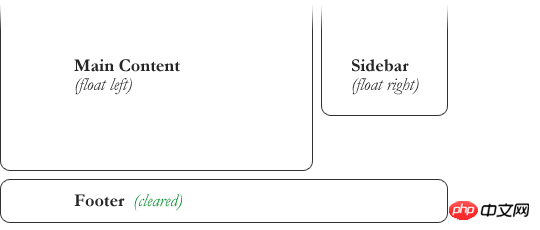
float (float) allows the element to be removed from the normal flow, and other elements will be displayed next to it, so if we want to prevent subsequent elements from moving up (as shown below, prevent the footer from moving up) move), which requires clearing it. We need to clear the footer's float to make sure it is below the two floated columns. To solve this problem, you need to use the clear attribute.

.footer {
  clear: both;
}
The clear attribute has five valid values, which are:
left: clear the floating ones on the left element.
right: Clear elements floating on the right.
both: Clear elements that are floating on both the left and right sides.
none: Default value, allowing floating elements to appear on both sides. Usually a value that is unnecessary unless the clear value is removed from the cascade.
inherit: The setting specifies that the value of the clear attribute should be inherited from the parent element.
Summary: The above is all the content of this article on float-related issues. I hope it will be helpful to everyone's study.
The above is the detailed content of What is float? Detailed explanation of float attribute. For more information, please follow other related articles on the PHP Chinese website!

Hot AI Tools

Undresser.AI Undress
AI-powered app for creating realistic nude photos

AI Clothes Remover
Online AI tool for removing clothes from photos.

Undress AI Tool
Undress images for free

Clothoff.io
AI clothes remover

Video Face Swap
Swap faces in any video effortlessly with our completely free AI face swap tool!

Hot Article

Hot Tools

Notepad++7.3.1
Easy-to-use and free code editor

SublimeText3 Chinese version
Chinese version, very easy to use

Zend Studio 13.0.1
Powerful PHP integrated development environment

Dreamweaver CS6
Visual web development tools

SublimeText3 Mac version
God-level code editing software (SublimeText3)

Hot Topics
 How to use bootstrap in vue
Apr 07, 2025 pm 11:33 PM
Using Bootstrap in Vue.js is divided into five steps: Install Bootstrap. Import Bootstrap in main.js. Use the Bootstrap component directly in the template. Optional: Custom style. Optional: Use plug-ins.
 The Roles of HTML, CSS, and JavaScript: Core Responsibilities
Apr 08, 2025 pm 07:05 PM
HTML defines the web structure, CSS is responsible for style and layout, and JavaScript gives dynamic interaction. The three perform their duties in web development and jointly build a colorful website.
 Understanding HTML, CSS, and JavaScript: A Beginner's Guide
Apr 12, 2025 am 12:02 AM
WebdevelopmentreliesonHTML,CSS,andJavaScript:1)HTMLstructurescontent,2)CSSstylesit,and3)JavaScriptaddsinteractivity,formingthebasisofmodernwebexperiences.
 How to set up the framework for bootstrap
Apr 07, 2025 pm 03:27 PM
To set up the Bootstrap framework, you need to follow these steps: 1. Reference the Bootstrap file via CDN; 2. Download and host the file on your own server; 3. Include the Bootstrap file in HTML; 4. Compile Sass/Less as needed; 5. Import a custom file (optional). Once setup is complete, you can use Bootstrap's grid systems, components, and styles to create responsive websites and applications.
 How to write split lines on bootstrap
Apr 07, 2025 pm 03:12 PM
There are two ways to create a Bootstrap split line: using the tag, which creates a horizontal split line. Use the CSS border property to create custom style split lines.
 How to insert pictures on bootstrap
Apr 07, 2025 pm 03:30 PM
There are several ways to insert images in Bootstrap: insert images directly, using the HTML img tag. With the Bootstrap image component, you can provide responsive images and more styles. Set the image size, use the img-fluid class to make the image adaptable. Set the border, using the img-bordered class. Set the rounded corners and use the img-rounded class. Set the shadow, use the shadow class. Resize and position the image, using CSS style. Using the background image, use the background-image CSS property.
 How to use bootstrap button
Apr 07, 2025 pm 03:09 PM
How to use the Bootstrap button? Introduce Bootstrap CSS to create button elements and add Bootstrap button class to add button text
 How to resize bootstrap
Apr 07, 2025 pm 03:18 PM
To adjust the size of elements in Bootstrap, you can use the dimension class, which includes: adjusting width: .col-, .w-, .mw-adjust height: .h-, .min-h-, .max-h-


