

CSS3 implements vertical text arrangement

This article mainly introduces the vertical arrangement of text in CSS3, which has certain reference value. Now I share it with you. Friends in need can refer to
In a recent project, text was arranged vertically. , that is, using the writing-mode attribute of CSS.
writing-mode was originally an attribute supported by IE. Later, this new attribute was added in CSS3, so the syntax in IE will be different from that in other browsers.
1.0 CSS3 standard
writing-mode:horizontal-tb;//默认:水平方向,从上到下
writing-mode:vertical-rl;  //垂直方向,从右向左
writing-mode:vertical-lr;  //垂直方向,从左向右
<!DOCTYPE html>
<html>
    <head>
        <meta charset="utf-8">
        <title>CSS文字垂直排列</title>
        <style type="text/css">
            div{
                border: 1px solid lightblue;
                padding: 5px;
            }
            .vertical-text{
                -webkit-writing-mode: vertical-rl;
                writing-mode: vertical-rl;
            }
        </style>
    </head>
    <body>
        <div class="vertical-text">
            1. 文字垂直排列 <br />
            2. 文字垂直排列
        </div>
    </body>
</html>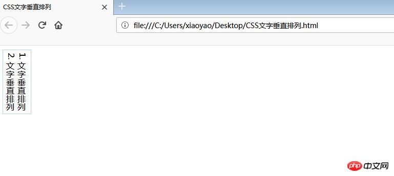
2.0 In IE
Due to historical reasons, the value of this attribute under IE is particularly complicated:
-ms-writing-mode: lr-tb | rl-tb | tb-rl | bt-rl | tb-lr | bt-lr | lr-bt | rl-bt | lr | rl | tb
For details, you can view the official documentation:
https://developer.mozilla.org/en-US/docs/Web/CSS/writing-mode/
3.0 Some applications
3.1 Vertical centering
By using this attribute, we can combine text-align:center to achieve vertical centering or use margin: auto.
<!DOCTYPE html>
<html>
    <head>
        <meta charset="utf-8">
        <title>CSS3 图片垂直居中</title>
        <style type="text/css">
            div{
                border: 1px solid lightblue;
                padding: 5px;
                height: 500px;
            }
            .vertical-img{
                -webkit-writing-mode: vertical-rl;
                -ms-writing-mode: bt-rl;
                writing-mode: vertical-rl;
                text-align: center;
            }
        </style>
    </head>
    <body>
        <div class="vertical-img">
             <img src="1.jpg"/>
        </div>
    </body>
</html>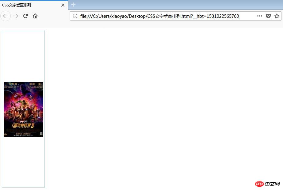
3.2 Text sinking effect
We can set the writing-mode of the text, and then combine it with text-indent to realize the sinking of the text when clicked Effect;
<!DOCTYPE html> 2 <html>
    <head>
        <meta charset="utf-8">
        <title>文字下沉效果</title>
        <style type="text/css">
            .btn{
                width: 50px;
                height: 50px;
                line-height: 50px;
                color: white;
                text-align: center;
                font-size: 16px;;
                display: inline-block;
                border-radius: 50%;
                background: gray;
                cursor: pointer;
            }
            .btn:active{
                text-indent: 2px;
            }
            .vertical-text{
                 writing-mode: tb-rl;
                -webkit-writing-mode: vertical-rl;
                writing-mode: vertical-rl;
                *writing-mode: tb-rl;
            }
        </style>
    </head>
    <body>
        <span>点击领红包</span>
        <p class="vertical-text btn">开 </p>
    </body>
</html>The above is the entire content of this article. I hope it will be helpful to everyone’s study. For more related content, please pay attention to the PHP Chinese website!
Related recommendations:
Comprehensive introduction to css gradient color omission mark embedded font text shadow
in CSS3 Analysis of transform transformation model rendering
The above is the detailed content of CSS3 implements vertical text arrangement. For more information, please follow other related articles on the PHP Chinese website!

Hot AI Tools

Undresser.AI Undress
AI-powered app for creating realistic nude photos

AI Clothes Remover
Online AI tool for removing clothes from photos.

Undress AI Tool
Undress images for free

Clothoff.io
AI clothes remover

Video Face Swap
Swap faces in any video effortlessly with our completely free AI face swap tool!

Hot Article
Hot Tools

Notepad++7.3.1
Easy-to-use and free code editor

SublimeText3 Chinese version
Chinese version, very easy to use

Zend Studio 13.0.1
Powerful PHP integrated development environment

Dreamweaver CS6
Visual web development tools

SublimeText3 Mac version
God-level code editing software (SublimeText3)
Hot Topics


 Vue 3
Apr 02, 2025 pm 06:32 PM
Vue 3
Apr 02, 2025 pm 06:32 PM
It's out! Congrats to the Vue team for getting it done, I know it was a massive effort and a long time coming. All new docs, as well.
 Can you get valid CSS property values from the browser?
Apr 02, 2025 pm 06:17 PM
Can you get valid CSS property values from the browser?
Apr 02, 2025 pm 06:17 PM
I had someone write in with this very legit question. Lea just blogged about how you can get valid CSS properties themselves from the browser. That's like this.
 Stacked Cards with Sticky Positioning and a Dash of Sass
Apr 03, 2025 am 10:30 AM
Stacked Cards with Sticky Positioning and a Dash of Sass
Apr 03, 2025 am 10:30 AM
The other day, I spotted this particularly lovely bit from Corey Ginnivan’s website where a collection of cards stack on top of one another as you scroll.
 A bit on ci/cd
Apr 02, 2025 pm 06:21 PM
A bit on ci/cd
Apr 02, 2025 pm 06:21 PM
I'd say "website" fits better than "mobile app" but I like this framing from Max Lynch:
 Using Markdown and Localization in the WordPress Block Editor
Apr 02, 2025 am 04:27 AM
Using Markdown and Localization in the WordPress Block Editor
Apr 02, 2025 am 04:27 AM
If we need to show documentation to the user directly in the WordPress editor, what is the best way to do it?
 Comparing Browsers for Responsive Design
Apr 02, 2025 pm 06:25 PM
Comparing Browsers for Responsive Design
Apr 02, 2025 pm 06:25 PM
There are a number of these desktop apps where the goal is showing your site at different dimensions all at the same time. So you can, for example, be writing
 Why are the purple slashed areas in the Flex layout mistakenly considered 'overflow space'?
Apr 05, 2025 pm 05:51 PM
Why are the purple slashed areas in the Flex layout mistakenly considered 'overflow space'?
Apr 05, 2025 pm 05:51 PM
Questions about purple slash areas in Flex layouts When using Flex layouts, you may encounter some confusing phenomena, such as in the developer tools (d...
 How to select a child element with the first class name item through CSS?
Apr 05, 2025 pm 11:24 PM
How to select a child element with the first class name item through CSS?
Apr 05, 2025 pm 11:24 PM
When the number of elements is not fixed, how to select the first child element of the specified class name through CSS. When processing HTML structure, you often encounter different elements...
