

Using CSS3 to realize the rotation of the earth

This article mainly introduces the use of CSS3 to realize the rotation of the earth. It has certain reference value. Now I share it with you. Friends in need can refer to it.
CSS3 realizes the rotation of the earth. It is incredible, but it is true. It can be achieved. Friends who don’t believe it can read this article. The source code is attached
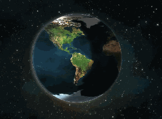
Final result:
Materials: two pictures,
espaco .jpg(1600*1000)

terra.jpg(900*450)

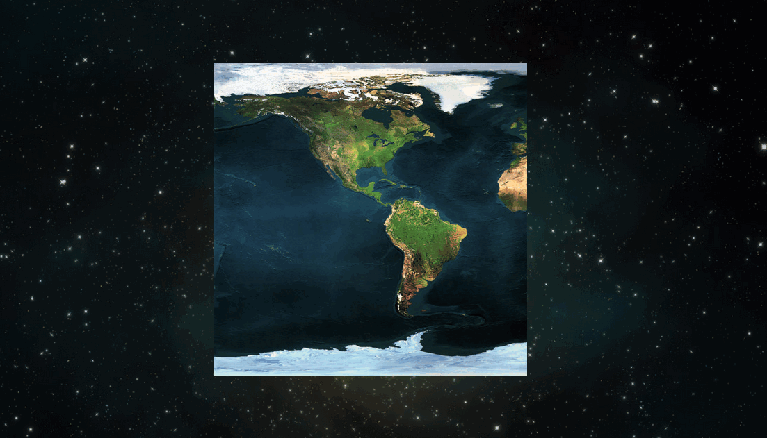
First Steps to form a static image (the earth background is full screen, the earth size is 450px*450px, the earth position is up, down, left, right, and centered):
<!DOCTYPE html>
<html>
<head>
    <meta charset="UTF-8">
    <title>Planet Earth</title>
    <style type="text/css">
body{
    background: url(espaco.jpg) no-repeat 0 0;
    background-size: 100%; /* 背景图片被拉伸为全屏 */
}
.earth{
    background: url(terra.jpg) repeat-x 0 0; /* 背景图片在水平方向复制*/
        /*下面的属性可使地球位于浏览器窗口垂直水平居中国*/
    height: 450px;
    left: 50%;
    margin: -225px 0 0 -225px;
    position: absolute;
    top: 50%;
    width: 450px;
}
    </style>
</head>
<body>
    <p class="earth"></p>
</body>
</html>Rendering:
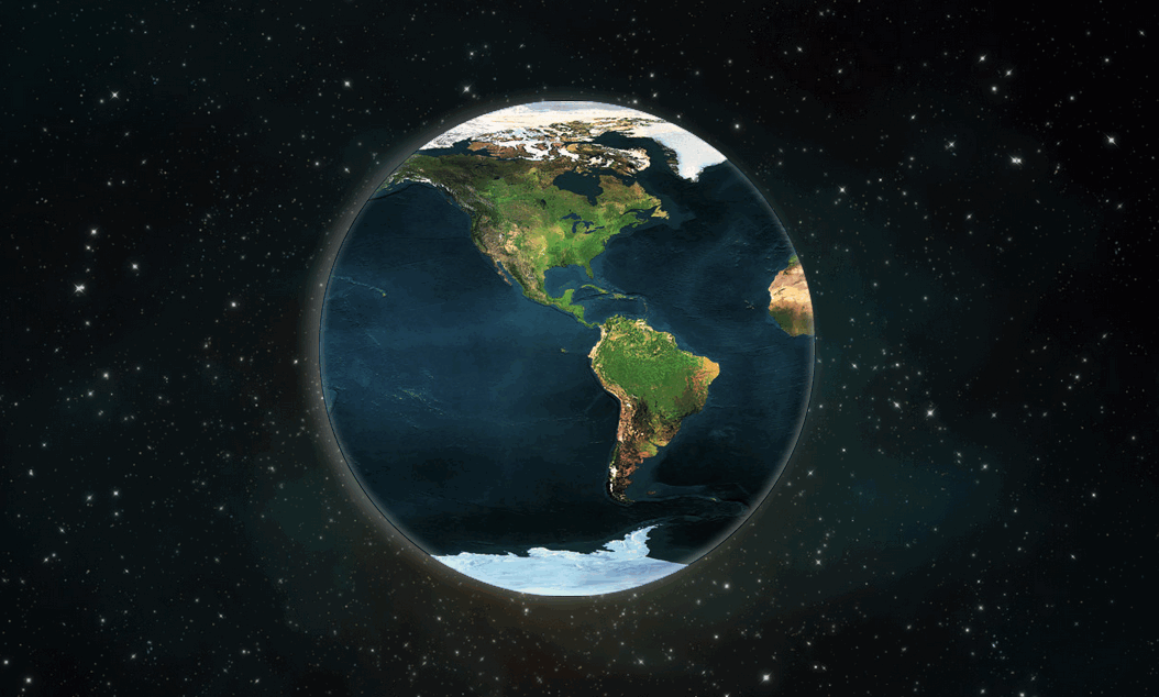
The second step is to form a round earth effect and add a moon halo effect:
/*在earth中添加以下属性样式*/
  border: 1px solid rgba(26,18,101,0.3); /*形成圆边效果,视觉效果更好,不用也行*/
  border-radius: 225px; /*使地球形成圆形效果*/
  box-shadow: -8px 0 25px rgba(256,256,256,0.3), -1px -2px 14px rgba(256,256,256,0.5) inset; /*形成圆形外面的模糊月晕效果*/
Rendering:
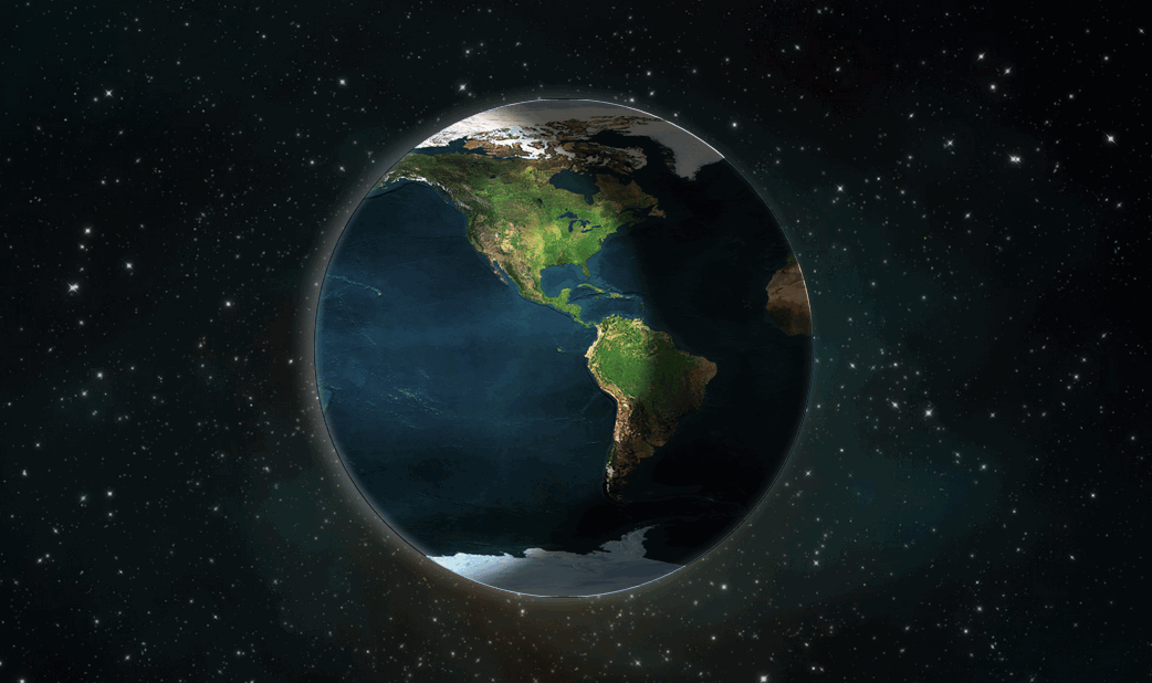
The third step is to form the day and night effect:
.earth:before{
    content: "";
    border-radius: 225px;
    box-shadow: -150px -6px 25px rgba(0,0,0,0.7) inset;/*弧形阴影,形成白天黑夜效果*/
    left: 0;
    position:absolute;
    top: 0;
    height: 450px;
    width: 450px;
}Rendering:
##Finally One step to form the earth's rotation effect:
@-webkit-keyframes loop {
% { background-position: 0 0; }
%{ background-position: -900px 0;} /* Using CSS3 to realize the rotation of the earth的大小为900*450,所以background-position-x: -900px */ }
/*在earth中添加如下样式*/
-webkit-animation: loop 20s linear infinite; /* 这的时间是可以设置的,如果你想地球转快一点的话,时间改小点就行了,比如10s */Use the border-radius of CSS3 to draw Tai Chi and love patterns
CSS to realize text wrapping The effect of the picture
About HTML5 and CSS3 to achieve the effect of the clock
##
The above is the detailed content of Using CSS3 to realize the rotation of the earth. For more information, please follow other related articles on the PHP Chinese website!

Hot AI Tools

Undresser.AI Undress
AI-powered app for creating realistic nude photos

AI Clothes Remover
Online AI tool for removing clothes from photos.

Undress AI Tool
Undress images for free

Clothoff.io
AI clothes remover

Video Face Swap
Swap faces in any video effortlessly with our completely free AI face swap tool!

Hot Article
Hot Tools

Notepad++7.3.1
Easy-to-use and free code editor

SublimeText3 Chinese version
Chinese version, very easy to use

Zend Studio 13.0.1
Powerful PHP integrated development environment

Dreamweaver CS6
Visual web development tools

SublimeText3 Mac version
God-level code editing software (SublimeText3)
Hot Topics


 How to achieve wave effect with pure CSS3? (code example)
Jun 28, 2022 pm 01:39 PM
How to achieve wave effect with pure CSS3? (code example)
Jun 28, 2022 pm 01:39 PM
How to achieve wave effect with pure CSS3? This article will introduce to you how to use SVG and CSS animation to create wave effects. I hope it will be helpful to you!
 Use CSS skillfully to realize various strange-shaped buttons (with code)
Jul 19, 2022 am 11:28 AM
Use CSS skillfully to realize various strange-shaped buttons (with code)
Jul 19, 2022 am 11:28 AM
This article will show you how to use CSS to easily realize various weird-shaped buttons that appear frequently. I hope it will be helpful to you!
 How to hide elements in css without taking up space
Jun 01, 2022 pm 07:15 PM
How to hide elements in css without taking up space
Jun 01, 2022 pm 07:15 PM
Two methods: 1. Using the display attribute, just add the "display:none;" style to the element. 2. Use the position and top attributes to set the absolute positioning of the element to hide the element. Just add the "position:absolute;top:-9999px;" style to the element.
 How to implement lace borders in css3
Sep 16, 2022 pm 07:11 PM
How to implement lace borders in css3
Sep 16, 2022 pm 07:11 PM
In CSS, you can use the border-image attribute to achieve a lace border. The border-image attribute can use images to create borders, that is, add a background image to the border. You only need to specify the background image as a lace style; the syntax "border-image: url (image path) offsets the image border width inward. Whether outset is repeated;".
 How to enlarge the image by clicking the mouse in css3
Apr 25, 2022 pm 04:52 PM
How to enlarge the image by clicking the mouse in css3
Apr 25, 2022 pm 04:52 PM
Implementation method: 1. Use the ":active" selector to select the state of the mouse click on the picture; 2. Use the transform attribute and scale() function to achieve the picture magnification effect, the syntax "img:active {transform: scale(x-axis magnification, y Axis magnification);}".
 It turns out that text carousel and image carousel can also be realized using pure CSS!
Jun 10, 2022 pm 01:00 PM
It turns out that text carousel and image carousel can also be realized using pure CSS!
Jun 10, 2022 pm 01:00 PM
How to create text carousel and image carousel? The first thing everyone thinks of is whether to use js. In fact, text carousel and image carousel can also be realized using pure CSS. Let’s take a look at the implementation method. I hope it will be helpful to everyone!
 How to set animation rotation speed in css3
Apr 28, 2022 pm 04:32 PM
How to set animation rotation speed in css3
Apr 28, 2022 pm 04:32 PM
In CSS3, you can use the "animation-timing-function" attribute to set the animation rotation speed. This attribute is used to specify how the animation will complete a cycle and set the speed curve of the animation. The syntax is "element {animation-timing-function: speed attribute value;}".
 Does css3 animation effect have deformation?
Apr 28, 2022 pm 02:20 PM
Does css3 animation effect have deformation?
Apr 28, 2022 pm 02:20 PM
The animation effect in css3 has deformation; you can use "animation: animation attribute @keyframes ..{..{transform: transformation attribute}}" to achieve deformation animation effect. The animation attribute is used to set the animation style, and the transform attribute is used to set the deformation style. .
