

How to remove blur white edges in CSS3
This time I will show you how to remove the blur white edges of CSS3, and what are the precautions for removing the blur white edges of CSS3. The following is a practical case, let’s take a look.
Make a login page with a full-screen background image with a frosted glass effect. The implementation method is as follows:
HTML:
1 2 3 4 5 6 7 8 9 10 11 12 |
|
CSS:
1 2 3 4 5 6 7 8 9 10 11 12 13 14 15 16 17 18 19 20 21 22 23 24 25 26 27 28 29 30 31 32 |
|
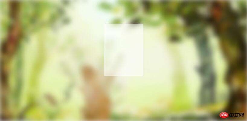
The effect is as follows:

You can find that there are white edges on the edges. This is a case where the blur value is very large. The solution at this time is to directly change background-size:cover; to background-size:150% 150%;. The rendering is as follows:

#If you look carefully, you can see that the white edges are not so obvious.
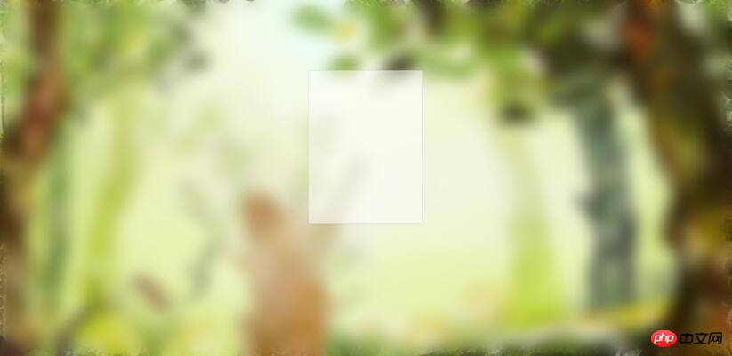
The other is when the blur value is relatively small, for example, changing the above blur value to 20, the effect is as follows:
You can see The white edges are obvious. If you add the same background image to the body at this time, the white edges will disappear:
1 2 3 4 5 6 7 |
|
The rendering is as follows:
You can see the difference at the edges is obvious. But the contrast is a bit obvious, and the effect is not good. Change the blur value a little smaller, to 5, and the effect is as follows:

The white edges on the edges are removed. And it doesn’t look so inconsistent anymore.
I believe you have mastered the method after reading the case in this article. For more exciting information, please pay attention to other related articles on the php Chinese website!
Recommended reading:
How to deal with the disappearance of CSS border lines
##Realizing multiple backgrounds to simulate dynamic borders
The above is the detailed content of How to remove blur white edges in CSS3. For more information, please follow other related articles on the PHP Chinese website!

Hot AI Tools

Undresser.AI Undress
AI-powered app for creating realistic nude photos

AI Clothes Remover
Online AI tool for removing clothes from photos.

Undress AI Tool
Undress images for free

Clothoff.io
AI clothes remover

Video Face Swap
Swap faces in any video effortlessly with our completely free AI face swap tool!
Hot Article
Hot Tools

Notepad++7.3.1
Easy-to-use and free code editor

SublimeText3 Chinese version
Chinese version, very easy to use

Zend Studio 13.0.1
Powerful PHP integrated development environment

Dreamweaver CS6
Visual web development tools

SublimeText3 Mac version
God-level code editing software (SublimeText3)
Hot Topics


 How to achieve wave effect with pure CSS3? (code example)
Jun 28, 2022 pm 01:39 PM
How to achieve wave effect with pure CSS3? (code example)
Jun 28, 2022 pm 01:39 PM
How to achieve wave effect with pure CSS3? This article will introduce to you how to use SVG and CSS animation to create wave effects. I hope it will be helpful to you!
 Use CSS skillfully to realize various strange-shaped buttons (with code)
Jul 19, 2022 am 11:28 AM
Use CSS skillfully to realize various strange-shaped buttons (with code)
Jul 19, 2022 am 11:28 AM
This article will show you how to use CSS to easily realize various weird-shaped buttons that appear frequently. I hope it will be helpful to you!
 How to hide elements in css without taking up space
Jun 01, 2022 pm 07:15 PM
How to hide elements in css without taking up space
Jun 01, 2022 pm 07:15 PM
Two methods: 1. Using the display attribute, just add the "display:none;" style to the element. 2. Use the position and top attributes to set the absolute positioning of the element to hide the element. Just add the "position:absolute;top:-9999px;" style to the element.
 How to implement lace borders in css3
Sep 16, 2022 pm 07:11 PM
How to implement lace borders in css3
Sep 16, 2022 pm 07:11 PM
In CSS, you can use the border-image attribute to achieve a lace border. The border-image attribute can use images to create borders, that is, add a background image to the border. You only need to specify the background image as a lace style; the syntax "border-image: url (image path) offsets the image border width inward. Whether outset is repeated;".
 How to enlarge the image by clicking the mouse in css3
Apr 25, 2022 pm 04:52 PM
How to enlarge the image by clicking the mouse in css3
Apr 25, 2022 pm 04:52 PM
Implementation method: 1. Use the ":active" selector to select the state of the mouse click on the picture; 2. Use the transform attribute and scale() function to achieve the picture magnification effect, the syntax "img:active {transform: scale(x-axis magnification, y Axis magnification);}".
 It turns out that text carousel and image carousel can also be realized using pure CSS!
Jun 10, 2022 pm 01:00 PM
It turns out that text carousel and image carousel can also be realized using pure CSS!
Jun 10, 2022 pm 01:00 PM
How to create text carousel and image carousel? The first thing everyone thinks of is whether to use js. In fact, text carousel and image carousel can also be realized using pure CSS. Let’s take a look at the implementation method. I hope it will be helpful to everyone!
 How to set animation rotation speed in css3
Apr 28, 2022 pm 04:32 PM
How to set animation rotation speed in css3
Apr 28, 2022 pm 04:32 PM
In CSS3, you can use the "animation-timing-function" attribute to set the animation rotation speed. This attribute is used to specify how the animation will complete a cycle and set the speed curve of the animation. The syntax is "element {animation-timing-function: speed attribute value;}".
 Comparison of focus and blur methods in jQuery
Feb 23, 2024 pm 03:51 PM
Comparison of focus and blur methods in jQuery
Feb 23, 2024 pm 03:51 PM
Comparison of focus and blur methods in jQuery In JavaScript, focus and blur are two commonly used events, used to handle the situation when an element gains focus and loses focus. In jQuery, there are also corresponding methods for handling the focus and blur events of elements. This article will compare the usage of focus and blur methods in jQuery, and illustrate their differences and application scenarios through specific code examples. focus method focus method is used for
