
 Web Front-end
CSS Tutorial
Detailed explanation of CSS using position:sticky to implement sticky layout examples
Web Front-end
CSS Tutorial
Detailed explanation of CSS using position:sticky to implement sticky layout examples
Detailed explanation of CSS using position:sticky to implement sticky layout examples

This article mainly introduces to you the relevant information on the method of using CSS position:sticky to achieve sticky layout. The editor thinks it is quite good, so I will share it with you now and give it as a reference. Let’s follow the editor to take a look, I hope it can help everyone.
Introduction
I wrote an article earlier to explain several commonly used attributes of position: "CSS Basics - Position Attribute Explanation"
Generally, we all know the following commonly used ones:
1 2 3 4 5 6 |
|
also said at https://developer.mozilla.org/zh-CN/docs/Web/CSS/position The following three values:
1 2 3 4 |
|
It is estimated that most of them have never used position:sticky. This attribute value is still in the experimental stage. How to describe it?
First look at position:sticky
sticky literally means sticky in English, so let’s call it sticky positioning. Let’s learn about the specific functions and practical scenarios of this experimental value.
This is a special positioning that combines the two positioning functions of position:relative and position:fixed, and is suitable for some special scenarios.
What is the combination of two positioning functions in one?
The element is first positioned according to the normal document flow, and then positioned relative to the flow root (BFC) and containing block (nearest block-level ancestor element) of the element in the flow.
Then, element positioning is relative positioning before crossing a specific threshold, and fixed positioning thereafter.
This specific threshold refers to one of top, right, bottom or left. In other words, sticky positioning can only take effect by specifying one of the four thresholds top, right, bottom or left. Otherwise the behavior is the same as relative positioning.
sticky: Object follows normal flow when normal. It is like a combination of relative and fixed. When it is on the screen, it is typed according to the normal flow. When it is scrolled out of the screen, it behaves like fixed. The performance of this attribute is the adsorption effect you see in reality.
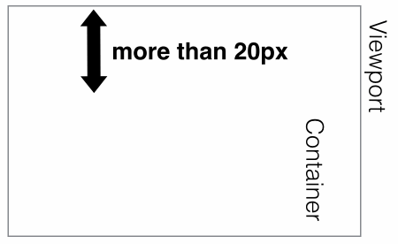
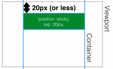
Common scenarios: When the distance between the element and the top of the page viewport (Viewport, which is the reference for fixed positioning) is greater than 0px, the element is positioned in a relative position, and when the distance between the element and the page viewport is greater than 0px When it is less than 0px, the element behaves as fixed positioning and will be fixed at the top.
Code:
1 2 3 4 5 |
|
It is expressed as shown below:
is greater than 20px from the top of the page, expressed as position:relative;
 ## The distance
x, which appears as position:fixed;
 Use
Use
to achieve head navigation bar fixationhtml code:
1 2 3 4 5 6 7 8 9 10 11 12 13 14 15 16 17 18 19 20 21 22 23 24 25 26 27 28 29 30 31 32 33 34 35 36 37 38 |
|
CSS code:
1 2 3 4 5 6 7 |
|
Similarly, the side navigation bar can also be exceeded and fixed. Effective rules
- Must specify one of the four thresholds
- top, right, bottom or left
Enable sticky positioning. Otherwise the behavior is the same as relative positioning.
- top
and
bottomare set at the same time,toptakes effect with higher priority, ## When #leftandrightare set at the same time,lefthas higher priority.Set to - The
overflow
attribute of any parent node of the element must bevisible, otherwiseposition:sticky will not take effect. An explanation is needed here:If any parent node positioning of the - element is set to
overflow:hidden
If the positioning of any parent node of the, then the parent The container cannot be scrolled, so theposition:stickyelement will not be scrolled and then fixed.position:sticky - element is set to
position:relative | absolute | fixed
, the element will be positioned relative to the parent element Positioning, rather than relativeviewprotpositioning. reaches the set threshold. This is fairly easy to understand, that is, whether an element with - is set to behave as
relative
orfixedis determined based on whether the element reaches the set threshold. of. Compatibility
- And
- position:sticky
The compatibility of this attribute is not very good. It is still an experimental attribute and is not a standard recommended by W3C. 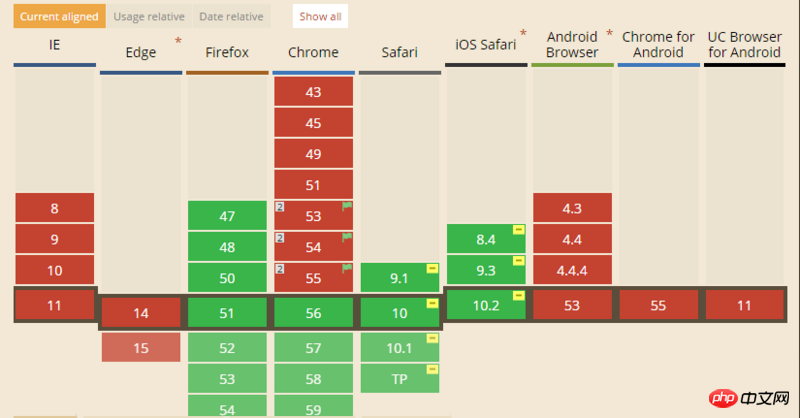
CSS Sticky Footer Implementation Example Tutorial
JS method to solve position:sticky compatibility problem
The above is the detailed content of Detailed explanation of CSS using position:sticky to implement sticky layout examples. For more information, please follow other related articles on the PHP Chinese website!

Hot AI Tools

Undresser.AI Undress
AI-powered app for creating realistic nude photos

AI Clothes Remover
Online AI tool for removing clothes from photos.

Undress AI Tool
Undress images for free

Clothoff.io
AI clothes remover

Video Face Swap
Swap faces in any video effortlessly with our completely free AI face swap tool!
Hot Article
Hot Tools

Notepad++7.3.1
Easy-to-use and free code editor

SublimeText3 Chinese version
Chinese version, very easy to use

Zend Studio 13.0.1
Powerful PHP integrated development environment

Dreamweaver CS6
Visual web development tools

SublimeText3 Mac version
God-level code editing software (SublimeText3)
Hot Topics


 CSS layout property optimization tips: position sticky and flexbox
Oct 20, 2023 pm 03:15 PM
CSS layout property optimization tips: position sticky and flexbox
Oct 20, 2023 pm 03:15 PM
CSS layout attribute optimization tips: positionsticky and flexbox In web development, layout is a very important aspect. A good layout structure can improve the user experience and make the page more beautiful and easy to navigate. CSS layout properties are the key to achieving this goal. In this article, I will introduce two commonly used CSS layout property optimization techniques: positionsticky and flexbox, and provide specific code examples. 1. positions
 Flexible application skills of position attribute in H5
Dec 27, 2023 pm 01:05 PM
Flexible application skills of position attribute in H5
Dec 27, 2023 pm 01:05 PM
How to flexibly use the position attribute in H5. In H5 development, the positioning and layout of elements are often involved. At this time, the CSS position property will come into play. The position attribute can control the positioning of elements on the page, including relative positioning, absolute positioning, fixed positioning and sticky positioning. This article will introduce in detail how to flexibly use the position attribute in H5 development.
 How to put div at the bottom in html
Mar 02, 2021 pm 05:44 PM
How to put div at the bottom in html
Mar 02, 2021 pm 05:44 PM
How to place a div at the bottom of HTML: 1. Use the position attribute to position the div tag relative to the browser window, with the syntax "div{position:fixed;}"; 2. Set the distance to the bottom to 0 to permanently place the div at At the bottom of the page, the syntax is "div{bottom:0;}".
 How to use position in h5
Dec 26, 2023 pm 01:39 PM
How to use position in h5
Dec 26, 2023 pm 01:39 PM
In H5, you can use the position attribute to control the positioning of elements through CSS: 1. Relative positioning, the syntax is "style="position: relative;"; 2. Absolute positioning, the syntax is "style="position: absolute;" "; 3. Fixed positioning, the syntax is "style="position: fixed;" and so on.
 What attributes does position have?
Oct 10, 2023 am 11:18 AM
What attributes does position have?
Oct 10, 2023 am 11:18 AM
The position attribute values include static, relative, absolute, fixed, sticky, etc. Detailed introduction: 1. static is the default value of the position attribute, which means that the elements are laid out according to the normal document flow without special positioning. The position of the elements is determined by their order in the HTML document and cannot be passed through top, right, and bottom. Adjust with the left attribute; 2. relative is relative positioning and so on.
 How to clear position in css
Oct 07, 2023 pm 12:02 PM
How to clear position in css
Oct 07, 2023 pm 12:02 PM
How to clear position in css: 1. Use the static attribute, which can be set to static to clear the position attribute; 2. Use the inherit attribute to clear the position attribute of the element and inherit the position attribute of the parent element; 3. Use the unset attribute, Restore the attributes to their default values and clear the position attribute of the element; 4. Use the !important rule, which will override other style rules and clear the position attribute, etc.
 Interpretation of CSS cascading properties: z-index and position
Oct 20, 2023 pm 07:19 PM
Interpretation of CSS cascading properties: z-index and position
Oct 20, 2023 pm 07:19 PM
Interpretation of CSS cascading properties: z-index and position In CSS, the design of layout and style is very important. In design, it is often necessary to layer and position elements. Two important CSS properties, z-index and position, can help us achieve these needs. This article will dive into these two properties and provide specific code examples. 1. z-index attribute The z-index attribute is used to define the stacking order of elements in the vertical direction. Stacking of elements
 Common application scenarios of position attribute in H5 development
Dec 27, 2023 am 10:08 AM
Common application scenarios of position attribute in H5 development
Dec 27, 2023 am 10:08 AM
Common application scenarios of the position attribute in H5 development require specific code examples. In H5 development, the position attribute of CSS is very important. It controls the positioning of elements in the web page. By properly applying the position attribute, we can achieve flexibility and beauty in page layout. In this article, we will introduce common application scenarios of the position attribute and illustrate them with specific code examples. Static (static positioning): The default value of the position attribute is st
