
 Web Front-end
CSS Tutorial
Example sharing of CSS3 font-feature-settings feature to reduce font animation tremor effect
Web Front-end
CSS Tutorial
Example sharing of CSS3 font-feature-settings feature to reduce font animation tremor effect
Example sharing of CSS3 font-feature-settings feature to reduce font animation tremor effect

When working on the GithubProfile project, we used digital animation display effects, such as the commits, stars and followers numbers in the My GithubProfile page. In actual use, due to the unequal width of the digital fonts, there is obvious tremor during the digital growth animation, and the experience is very bad. font-feature-settings is an advanced feature of CSS, used to provide adjustments to the display of OpenType fonts and graphics. This article mainly introduces how to use the CSS3 font-feature-settings feature to reduce the tremor effect of font animation. Friends who need it can refer to it. I hope it can help everyone.
Here I finally used the font-feature-settings attribute of CSS to solve this problem. Let’s first look at the comparison of the effects before and after the solution.

font-feature-settings
font-feature-settings is an advanced feature of CSS. Use To provide adjustments to OpenType font graphics display, MDN·font-feature-settings.
First of all, CSS3 provides a set of attributes and values that are mapped to OpenType font characteristics. Here we first use font-variant-numeric and set its value to tabular -nums , which means that the font's numeric images are required to be consistent in size and aligned as in a table, which is equivalent to tnum in OpenType fonts.
When there is no corresponding attribute mapping, we can use the font-feature-settings attribute. Here we directly set it to the required OpenType attribute tnum. The
font-feature-settings and font-variant-numeric properties can be applied simultaneously, either of them will achieve the same effect, but for more compatibility support, they are defined at the same time.
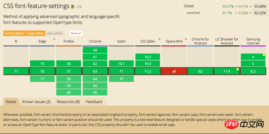
Compatibility
font-feature-settingsCompatibility:
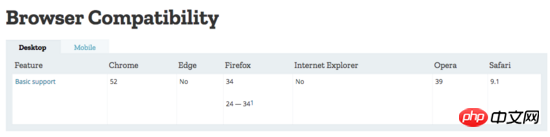
font-variant- numeric compatibility:
No results were found in the CanIUse database. Post the MDN compatibility description
and you can see font -feature-settings has better compatibility and support for mainstream browsers, so this feature is preferred when using it.
Demo comparison
Here is the effect of montserrat font before and after turning on this feature
Related recommendations:
JavaScript Advanced Features - Scope Sample Code Details
Advanced Feature Analysis of PHP Objects, Patterns and Practices
php Advanced Features-Detailed Examples of Reflection
The above is the detailed content of Example sharing of CSS3 font-feature-settings feature to reduce font animation tremor effect. For more information, please follow other related articles on the PHP Chinese website!

Hot AI Tools

Undresser.AI Undress
AI-powered app for creating realistic nude photos

AI Clothes Remover
Online AI tool for removing clothes from photos.

Undress AI Tool
Undress images for free

Clothoff.io
AI clothes remover

Video Face Swap
Swap faces in any video effortlessly with our completely free AI face swap tool!

Hot Article
Hot Tools

Notepad++7.3.1
Easy-to-use and free code editor

SublimeText3 Chinese version
Chinese version, very easy to use

Zend Studio 13.0.1
Powerful PHP integrated development environment

Dreamweaver CS6
Visual web development tools

SublimeText3 Mac version
God-level code editing software (SublimeText3)
Hot Topics
 1653
1653
 14
1413
52
1305
25
1251
29
1224
24
14
1413
52
1305
25
1251
29
1224
24

 How to achieve wave effect with pure CSS3? (code example)
Jun 28, 2022 pm 01:39 PM
How to achieve wave effect with pure CSS3? (code example)
Jun 28, 2022 pm 01:39 PM
How to achieve wave effect with pure CSS3? This article will introduce to you how to use SVG and CSS animation to create wave effects. I hope it will be helpful to you!
 Use CSS skillfully to realize various strange-shaped buttons (with code)
Jul 19, 2022 am 11:28 AM
Use CSS skillfully to realize various strange-shaped buttons (with code)
Jul 19, 2022 am 11:28 AM
This article will show you how to use CSS to easily realize various weird-shaped buttons that appear frequently. I hope it will be helpful to you!
 How to hide elements in css without taking up space
Jun 01, 2022 pm 07:15 PM
How to hide elements in css without taking up space
Jun 01, 2022 pm 07:15 PM
Two methods: 1. Using the display attribute, just add the "display:none;" style to the element. 2. Use the position and top attributes to set the absolute positioning of the element to hide the element. Just add the "position:absolute;top:-9999px;" style to the element.
 How to implement lace borders in css3
Sep 16, 2022 pm 07:11 PM
How to implement lace borders in css3
Sep 16, 2022 pm 07:11 PM
In CSS, you can use the border-image attribute to achieve a lace border. The border-image attribute can use images to create borders, that is, add a background image to the border. You only need to specify the background image as a lace style; the syntax "border-image: url (image path) offsets the image border width inward. Whether outset is repeated;".
 How to enlarge the image by clicking the mouse in css3
Apr 25, 2022 pm 04:52 PM
How to enlarge the image by clicking the mouse in css3
Apr 25, 2022 pm 04:52 PM
Implementation method: 1. Use the ":active" selector to select the state of the mouse click on the picture; 2. Use the transform attribute and scale() function to achieve the picture magnification effect, the syntax "img:active {transform: scale(x-axis magnification, y Axis magnification);}".
 It turns out that text carousel and image carousel can also be realized using pure CSS!
Jun 10, 2022 pm 01:00 PM
It turns out that text carousel and image carousel can also be realized using pure CSS!
Jun 10, 2022 pm 01:00 PM
How to create text carousel and image carousel? The first thing everyone thinks of is whether to use js. In fact, text carousel and image carousel can also be realized using pure CSS. Let’s take a look at the implementation method. I hope it will be helpful to everyone!
 How to set animation rotation speed in css3
Apr 28, 2022 pm 04:32 PM
How to set animation rotation speed in css3
Apr 28, 2022 pm 04:32 PM
In CSS3, you can use the "animation-timing-function" attribute to set the animation rotation speed. This attribute is used to specify how the animation will complete a cycle and set the speed curve of the animation. The syntax is "element {animation-timing-function: speed attribute value;}".
 Does css3 animation effect have deformation?
Apr 28, 2022 pm 02:20 PM
Does css3 animation effect have deformation?
Apr 28, 2022 pm 02:20 PM
The animation effect in css3 has deformation; you can use "animation: animation attribute @keyframes ..{..{transform: transformation attribute}}" to achieve deformation animation effect. The animation attribute is used to set the animation style, and the transform attribute is used to set the deformation style. .
