

CSS styles specifically designed to control printing
Most web designers are new to print controls and are often more enamored with pixels than printers. In the real world, many people rely on printing web pages from websites for reference: In this digital age, many people still have paper in their hands on some special occasions. There are a few things web developers can do to bridge the gap between printers and LCD screens.
Styles designed for printers rather than screens
/* 样式将只应用于打印 */
@media print {


}Note* You can also set the media="print" attribute of the link in a separate CSS file to specify that this style is dedicated to printing
<link type="text/css" rel="stylesheet" href="css/print.css" media="print">
It is not necessary to reshape the entire CSS for your site; overall, the default style is inherited by print; only qualify for different needs. To save toner when printing, most browsers automatically invert colors. For best results, color changes should be noticeable:
/*白纸黑字*/
@media print {
   body {
      color: #000;
      background: #fff;
   }
}We are not creating screenshots of the entire web page, just to show a well-designed, readable website:
/*去除背景图片, 节约笔黑 */

h1 {
   color: #fff;
   background: url(banner.jpg);
}


@media print {
   h1 {
      color: #000;
      background: none;
   }


   nav, aside {
      display: none;
   }
}In order to make the printer more efficient, only the main content should be displayed and the header and footer navigation bars should be removed
@media print {
   h1 {
      color: #000;
      background: none;
   }


   nav, aside {
      display: none;
   }


   body, article {
      width: 100%;
      margin: 0;
      padding: 0;
   }


   @page {
      margin: 2cm;
   }
}Link processing
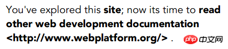
The link cannot be seen on the printer. The hyperlink should be expanded
/*在超链接后面添加带<http://XXX>的完整地址*/
@media print {
   article a {
      font-weight: bolder;
      text-decoration: none;
   }


   article a[href^=http]:after {
      content:" <" attr(href) "> ";
   }
}The display effect may be like this
Control print setting options
The @page rule allows you to specify various aspects of the page. For example, you will want to specify the dimensions of the page. Page margins, headers and footers are all very important. [Many browsers already support it]
@PAGE rule paper size setting
Through the following CSS you can set the paper size, 5.5 inches wide and 8.5 inches high.
@page {
  size: 5.5in 8.5in;
}You can also control the paper size through aliases, such as "A4" or "legal."
@page {
  size: A4;
}You can also control the printing direction, portrait: print vertically, landscape: horizontally
@page {
  size: A4 landscape;
}PAGE Model The Page Model
In the paginated media format model, the document is moved into one or more page boxes. The page frame is mapped to a rectangular plane. This is roughly similar to the CSS box model.
Note* Few browsers are supported

@page { width: 50em; }PAGE margin model Page-Margin Boxes
Before going any further, we should understand the box model of pages, as its behavior is somewhat different from how it works on the screen.
The page model defines the page area and then divides it into 16 peripheral edge boxes. You can control the size of the page area and the size of the margin between the edge of the page area and the end of the page itself.

Left and right margins
@page :left {
  margin-left: 30cm;
}


@page :right {
  margin-left: 4cm;
}The following css will display the title at the bottom left, the page counter at the bottom right, and the chapter title at the top right.
@page:right{
  @bottom-left {
    margin: 10pt 0 30pt 0;
    border-top: .25pt solid #666;
    content: "Our Cats";
    font-size: 9pt;
    color: #333;
  }


  @bottom-right {
    margin: 10pt 0 30pt 0;
    border-top: .25pt solid #666;
    content: counter(page);
    font-size: 9pt;
  }


  @top-right {
    content:  string(doctitle);
    margin: 30pt 0 10pt 0;
    font-size: 9pt;
    color: #333;
  }
}The display effect is as follows:

Note* This article is compiled from: Tips And Tricks For Print Style Sheets and Designing For Print With CSS and css3 page specification
The above is the detailed content of CSS styles specifically designed to control printing. For more information, please follow other related articles on the PHP Chinese website!

Hot AI Tools

Undresser.AI Undress
AI-powered app for creating realistic nude photos

AI Clothes Remover
Online AI tool for removing clothes from photos.

Undress AI Tool
Undress images for free

Clothoff.io
AI clothes remover

Video Face Swap
Swap faces in any video effortlessly with our completely free AI face swap tool!

Hot Article
Hot Tools

Notepad++7.3.1
Easy-to-use and free code editor

SublimeText3 Chinese version
Chinese version, very easy to use

Zend Studio 13.0.1
Powerful PHP integrated development environment

Dreamweaver CS6
Visual web development tools

SublimeText3 Mac version
God-level code editing software (SublimeText3)
Hot Topics


 How to create a slideshow layout page using HTML and CSS
Oct 16, 2023 am 09:07 AM
How to create a slideshow layout page using HTML and CSS
Oct 16, 2023 am 09:07 AM
How to create a slide layout page using HTML and CSS Introduction: Slide layout is widely used in modern web design and is very attractive and interactive when displaying information or pictures. This article will introduce how to create a slide layout page using HTML and CSS, and provide specific code examples. 1. HTML layout structure First, we need to create an HTML layout structure, including a slide container and multiple slide items. The code looks like this: <!DOCTYPEhtml&
 How to use:nth-child(-n+5) pseudo-class selector to select the CSS style of child elements whose position is less than or equal to 5
Nov 20, 2023 am 11:52 AM
How to use:nth-child(-n+5) pseudo-class selector to select the CSS style of child elements whose position is less than or equal to 5
Nov 20, 2023 am 11:52 AM
How to use:nth-child(-n+5) pseudo-class selector to select the CSS style of child elements whose position is less than or equal to 5. In CSS, the pseudo-class selector is a powerful tool that can be selected through a specific selection method. Certain elements in an HTML document. Among them, :nth-child() is a commonly used pseudo-class selector that can select child elements at specific positions. :nth-child(n) can match the nth child element in HTML, and :nth-child(-n) can match
 How to create a responsive card wall layout using HTML and CSS
Oct 25, 2023 am 10:42 AM
How to create a responsive card wall layout using HTML and CSS
Oct 25, 2023 am 10:42 AM
How to create a responsive card wall layout using HTML and CSS In modern web design, responsive layout is a very important technology. By using HTML and CSS, we can create a responsive card wall layout that adapts to devices of different screen sizes. Here’s a closer look at how to create a simple responsive card wall layout using HTML and CSS. HTML part: First, we need to set up the basic structure in the HTML file. We can use unordered list (<ul>) and
 How to implement a simple chat page layout using HTML and CSS
Oct 18, 2023 am 08:42 AM
How to implement a simple chat page layout using HTML and CSS
Oct 18, 2023 am 08:42 AM
How to use HTML and CSS to implement a simple chat page layout With the development of modern technology, people increasingly rely on the Internet for communication and communication. In web pages, chat pages are a very common layout requirement. This article will introduce you to how to use HTML and CSS to implement a simple chat page layout, and give specific code examples. First, we need to create an HTML file, you can use any text editor. Taking index.html as an example, first create a basic HTML
 How to implement a detailed page layout using HTML and CSS
Oct 20, 2023 am 09:54 AM
How to implement a detailed page layout using HTML and CSS
Oct 20, 2023 am 09:54 AM
How to use HTML and CSS to implement a detailed page layout HTML and CSS are the basic technologies for creating and designing web pages. By using these two appropriately, we can achieve various complex web page layouts. This article will introduce how to use HTML and CSS to implement a detailed page layout and provide specific code examples. Create an HTML structure First, we need to create an HTML structure to place our page content. The following is a basic HTML structure: <!DOCTYPEhtml&g
 How to create a responsive video playback page layout using HTML and CSS
Oct 18, 2023 am 10:48 AM
How to create a responsive video playback page layout using HTML and CSS
Oct 18, 2023 am 10:48 AM
How to Create a Responsive Video Playback Page Layout Using HTML and CSS In today’s Internet age, videos have become an integral part of our daily lives. More and more websites and applications provide video playback functions. In order to provide a better user experience, developers need to create a responsive video playback page layout to adapt to different devices and screen sizes. This article details how to achieve this using HTML and CSS, and provides specific code examples. Step 1: HTML Structure First, I
 How to create a responsive music player layout using HTML and CSS
Oct 19, 2023 am 10:02 AM
How to create a responsive music player layout using HTML and CSS
Oct 19, 2023 am 10:02 AM
How to use HTML and CSS to create a responsive music player layout In today's era of rapid development of information technology, music, as a form of entertainment, has penetrated deeply into people's lives. For a better music experience, many websites and applications provide online music players. This article will introduce how to create a responsive music player layout using HTML and CSS, and provide specific code examples. First, we need to create a basic structure using HTML. Here is a simple HTML layout example: <!
 How to create a web sidebar layout using HTML and CSS
Oct 18, 2023 pm 12:27 PM
How to create a web sidebar layout using HTML and CSS
Oct 18, 2023 pm 12:27 PM
HTML and CSS are two of the most commonly used technologies in modern web design. They can be used to create a variety of different types of web page layouts, including sidebar layouts. In this article, we will introduce in detail how to use HTML and CSS to create a simple web page sidebar layout, with specific code examples. First, create a basic HTML document structure. In the <head> tag, add a <link> tag to reference an external CSS style sheet file. Then, in <b
