

css px automatically converted to rem

As a front-end developer, especially when doing mobile terminal adaptation, rem is a unit we often use. You can search for its benefits. There are many online.
But when we convert the px on the design draft into rem, we have to manually calculate it. This is a very time-consuming and laborious process. Is there any way to "liberate" us? (Forgive my laziness~)
1. CSS processor
Processors such as Sass, LESS and PostCSS can all handle it.
Sass (implemented using Sass’s functions and hybrid macros):
@function px2em($px, $base-font-size: 16px) {
  @if (unitless($px)) {
    @warn "Assuming #{$px} to be in pixels, attempting to convert it into pixels for you";
    @return px2em($px + 0px); // That may fail.
  } @else if (unit($px) == em) {
    @return $px;
  }
  @return ($px / $base-font-size) * 1em;
}Sass (using Sass’s hybrid macros):
@mixin px2rem($property,$px-values,$baseline-px:16px,$support-for-ie:false){
  //Conver the baseline into rems
  $baseline-rem: $baseline-px / 1rem * 1;
  //Print the first line in pixel values
  @if $support-for-ie {
    #{$property}: $px-values;
  }
  //if there is only one (numeric) value, return the property/value line for it.
  @if type-of($px-values) == "number"{
    #{$property}: $px-values / $baseline-rem;
  }
  @else {
    //Create an empty list that we can dump values into
    $rem-values:();
    @each $value in $px-values{
      // If the value is zero or not a number, return it
      @if $value == 0 or type-of($value) != "number"{
        $rem-values: append($rem-values, $value / $baseline-rem);
      }
    }
    // Return the property and its list of converted values
    #{$property}: $rem-values;
  }
}For the above method, we have to learn additional writing rules such as sass, and also need to configure it. Although it is very simple, can it be simpler?
2.CSSREM
This is a plug-in written by flashlizi for sublime text. It is really convenient to use! We can see it on GitHub.
Let me introduce how to configure it:
2.1 We can download the dependent files on GitHub;
2.2 Open Sublime Text and enter the packages directory (Sublime Text - > Preferences -> Browse Packages);
2.3 Place the cssrem-master folder in the directory opened in the previous step, and restart sublime text to take effect;
我们也可以修改默认配置:
打开cssrem-master文件夹下的cssrem.sublime-settings文件,进行修改
{
    "px_to_rem": 40, //px转rem的单位比例,默认为40
    "max_rem_fraction_length": 6, //px转rem的小数部分的最大长度。默认为6。
    "available_file_types": [".css", ".less", ".sass",".html"]
    //启用此插件的文件类型。默认为:[".css", ".less", ".sass"]
}Actual test:
Create a new .css file:
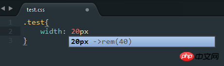
Press the tab key to get the following results:
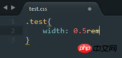
Isn’t it very convenient? Come and try it~
js to implement mobile device adaptation.
The above is the detailed content of css px automatically converted to rem. For more information, please follow other related articles on the PHP Chinese website!

Hot AI Tools

Undresser.AI Undress
AI-powered app for creating realistic nude photos

AI Clothes Remover
Online AI tool for removing clothes from photos.

Undress AI Tool
Undress images for free

Clothoff.io
AI clothes remover

Video Face Swap
Swap faces in any video effortlessly with our completely free AI face swap tool!

Hot Article
Hot Tools

Notepad++7.3.1
Easy-to-use and free code editor

SublimeText3 Chinese version
Chinese version, very easy to use

Zend Studio 13.0.1
Powerful PHP integrated development environment

Dreamweaver CS6
Visual web development tools

SublimeText3 Mac version
God-level code editing software (SublimeText3)
Hot Topics


 How to use bootstrap in vue
Apr 07, 2025 pm 11:33 PM
How to use bootstrap in vue
Apr 07, 2025 pm 11:33 PM
Using Bootstrap in Vue.js is divided into five steps: Install Bootstrap. Import Bootstrap in main.js. Use the Bootstrap component directly in the template. Optional: Custom style. Optional: Use plug-ins.
 The Roles of HTML, CSS, and JavaScript: Core Responsibilities
Apr 08, 2025 pm 07:05 PM
The Roles of HTML, CSS, and JavaScript: Core Responsibilities
Apr 08, 2025 pm 07:05 PM
HTML defines the web structure, CSS is responsible for style and layout, and JavaScript gives dynamic interaction. The three perform their duties in web development and jointly build a colorful website.
 Understanding HTML, CSS, and JavaScript: A Beginner's Guide
Apr 12, 2025 am 12:02 AM
Understanding HTML, CSS, and JavaScript: A Beginner's Guide
Apr 12, 2025 am 12:02 AM
WebdevelopmentreliesonHTML,CSS,andJavaScript:1)HTMLstructurescontent,2)CSSstylesit,and3)JavaScriptaddsinteractivity,formingthebasisofmodernwebexperiences.
 How to write split lines on bootstrap
Apr 07, 2025 pm 03:12 PM
How to write split lines on bootstrap
Apr 07, 2025 pm 03:12 PM
There are two ways to create a Bootstrap split line: using the tag, which creates a horizontal split line. Use the CSS border property to create custom style split lines.
 How to set up the framework for bootstrap
Apr 07, 2025 pm 03:27 PM
How to set up the framework for bootstrap
Apr 07, 2025 pm 03:27 PM
To set up the Bootstrap framework, you need to follow these steps: 1. Reference the Bootstrap file via CDN; 2. Download and host the file on your own server; 3. Include the Bootstrap file in HTML; 4. Compile Sass/Less as needed; 5. Import a custom file (optional). Once setup is complete, you can use Bootstrap's grid systems, components, and styles to create responsive websites and applications.
 How to insert pictures on bootstrap
Apr 07, 2025 pm 03:30 PM
How to insert pictures on bootstrap
Apr 07, 2025 pm 03:30 PM
There are several ways to insert images in Bootstrap: insert images directly, using the HTML img tag. With the Bootstrap image component, you can provide responsive images and more styles. Set the image size, use the img-fluid class to make the image adaptable. Set the border, using the img-bordered class. Set the rounded corners and use the img-rounded class. Set the shadow, use the shadow class. Resize and position the image, using CSS style. Using the background image, use the background-image CSS property.
 How to use bootstrap button
Apr 07, 2025 pm 03:09 PM
How to use bootstrap button
Apr 07, 2025 pm 03:09 PM
How to use the Bootstrap button? Introduce Bootstrap CSS to create button elements and add Bootstrap button class to add button text
 How to resize bootstrap
Apr 07, 2025 pm 03:18 PM
How to resize bootstrap
Apr 07, 2025 pm 03:18 PM
To adjust the size of elements in Bootstrap, you can use the dimension class, which includes: adjusting width: .col-, .w-, .mw-adjust height: .h-, .min-h-, .max-h-
