

CSS Float and Float Clear (BFC) Simple Tutorial

Float
1. What is float
When the <a href="http://www.php.cn/wiki/919.html" target="_blank">float</a> attribute of an element If it is not none, a float will occur.
<p class="float">float</p>
.float {
  float: left;
  width: 100px;
  height: 100px;
  background-color: #ddd;
}2. The impact of floating
Floating will cause elements to break away from the document flow. The specific performance is:
-
The parent element is highly collapsed, that is, it will not contain floating elements.
For example, the above code will appear as
The height of the parent element is collapsed
-
The text is wrapped.
Text wrapping effect
You can notice that the width of the.normalelement here covers.floatelement, but there is no text under the.floatelement, which means that the text is "squeezed" out. This is because although it will break away from the document flow, it will not Break away from the text flow. This effect is also the original intention of thefloatattribute. The code is as follows:<p class="float">float</p>
正常元素正常元素正常元素正常元素正常元素正常元素正常元素正常元素正常元素正常元素正常元素正常元素正常元素正常元素正常元素正常元素正常元素正常元素正常元素正常元素正常元素正常元素正常元素正常元素正常元素正常元素正常元素正常元素正常元素正常元素正常元素正常元素正常元素正常元素正常元素正常元素正常元素正常元素正常元素正常元素正常元素正常元素正常元素正常元素正常元素正常元素正常元素正常元素正常元素正常元素正常元素正常元素正常元素正常元素正常元素正常元素正常元素正常元素正常元素正常元素正常元素正常元素正常元素正常元素正常元素正常元素正常元素正常元素正常元素正常元素正常元素正常元素正常元素正常元素正常元素正常元素正常元素正常元素正常元素正常元素正常元素正常元素正常元素正常元素正常元素正常元素正常元素正常元素正常元素正常元素正常元素正常元素正常元素正常元素正常元素正常元素
Copy after loginbody { background-color: #ccc; } .float { float: left; width: 100px; height: 100px; background-color: #ddd; } .normal { background-color: #fff; }Copy after login


The margins of floating elements will not be merged.
For related content about margin merging, you can click here. Once the
element is floated, it will become an inline block element, that is, <a href="http://www.php.cn/wiki/927.html" target="_blank">display</a>: inline-block.
3. Floating application
The text wrapping mentioned above.
-
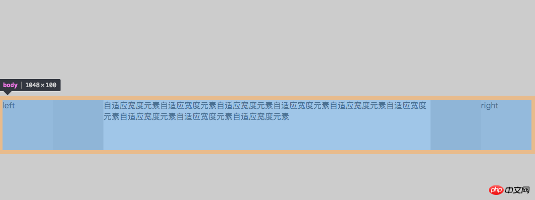
Write a three-column layout with fixed width on the left and right and adaptive middle.
<body>
  <p class="left float">left</p>
  <p class="right float">right</p>
  <p class="mid">自适应宽度元素自适应宽度元素自适应宽度元素自适应宽度元素自适应宽度元素自适应宽度元素自适应宽度元素自适应宽度元素自适应宽度元素</p>
</body>
Copy after loginbody { background-color: #ccc; } .float { float: left; width: 100px; height: 100px; background-color: #ddd; } .left { float: left; } .right { float: right; } .mid { height: 100px; background-color: #fff; margin: 200px; /*故意加上了上下 margin 值*/ }Copy after loginHere I deliberately added the
marginvalue, you can see the effect:Three column layout
bodyalso falls down along with themarginof.mid. This can be explained by the merging of margins introduced earlier.ps: When I first wrote this three-column layout, the html was written like this
<body>
  <p class="left float">left</p>
  <p class="mid">自适应宽度元素自适应宽度元素自适应宽度元素自适应宽度元素自适应宽度元素自适应宽度元素自适应宽度元素自适应宽度元素自适应宽度元素</p>
  <p class="right float">right</p>
</body>
Copy after loginAs above, write the middle adaptive element in the middle. In fact, this is more logical. But if you write it like this, it won't work. The elements on the right will fall down, because the
.midelement is a block-level element and will occupy the entire line..leftwill not fall down. Because it is originally a floating element separated from the document flow.
Clear floats
Clear on child elements
Here I only write methods that do not produce meaningless tags.
If there is a sibling element behind the floating element, you can add the
<a href="http://www.php.cn/wiki/917.html" target="_blank">clear</a>attribute to its sibling element.
If the text surrounds that part of the code, addclear:left<a href="http://www.php.cn/wiki/974.html" target="_blank"> or </a>clear:bothto.normal. The specific usage ofclearwill not be elaborated here.-
Add pseudo-class or pseudo-element to the element to be cleared.
.float::after {
  content: '';
  display: block;
  visiability: hidden;
  height: 0;
  clear: both;
}
Copy after loginFor information on the use of ::after, please see the MDN documentation.
Clear on the parent element, that is, BFC
BFC (Block Formatting Context), that is, block-level formatting context, its official explanation Yes:
Floating, Absolutely positioned elements (
<a href="http://www.php.cn/wiki/902.html" target="_blank">position</a>isabsoluteorfixed), inline block elementdisplay:inline-block, tablecelldisplay:table-cell, table titledisplay:table-captionand<a href="http://www.php.cn/wiki/923.html" target="_blank">overflow</a>elements whose attribute value is notvisible(except that the value is propagated to the viewport<a href="http://www.php.cn/css/css-rwd-viewport.html" target="_blank">viewport</a>) will create a new block-level formatting context.
In summary, it must meet one of the following conditions:
floatis notnonepositionis not<a href="http://www.php.cn/wiki/188.html" target="_blank">static</a>orrelativedisplayistable-cell,table-caption,inline-block,flex,inline-flexoverflowis notvisible
As long as you add any of the above attributes to the parent element to meet the conditions, that is, adding BFC to the parent element can clear the floating of the child element.
The above is the detailed content of CSS Float and Float Clear (BFC) Simple Tutorial. For more information, please follow other related articles on the PHP Chinese website!

Hot AI Tools

Undresser.AI Undress
AI-powered app for creating realistic nude photos

AI Clothes Remover
Online AI tool for removing clothes from photos.

Undress AI Tool
Undress images for free

Clothoff.io
AI clothes remover

Video Face Swap
Swap faces in any video effortlessly with our completely free AI face swap tool!

Hot Article
Hot Tools

Notepad++7.3.1
Easy-to-use and free code editor

SublimeText3 Chinese version
Chinese version, very easy to use

Zend Studio 13.0.1
Powerful PHP integrated development environment

Dreamweaver CS6
Visual web development tools

SublimeText3 Mac version
God-level code editing software (SublimeText3)
Hot Topics
 1657
1657
 14
1415
52
1309
25
1257
29
1230
24
14
1415
52
1309
25
1257
29
1230
24

 How to use bootstrap in vue
Apr 07, 2025 pm 11:33 PM
How to use bootstrap in vue
Apr 07, 2025 pm 11:33 PM
Using Bootstrap in Vue.js is divided into five steps: Install Bootstrap. Import Bootstrap in main.js. Use the Bootstrap component directly in the template. Optional: Custom style. Optional: Use plug-ins.
 Understanding HTML, CSS, and JavaScript: A Beginner's Guide
Apr 12, 2025 am 12:02 AM
Understanding HTML, CSS, and JavaScript: A Beginner's Guide
Apr 12, 2025 am 12:02 AM
WebdevelopmentreliesonHTML,CSS,andJavaScript:1)HTMLstructurescontent,2)CSSstylesit,and3)JavaScriptaddsinteractivity,formingthebasisofmodernwebexperiences.
 The Roles of HTML, CSS, and JavaScript: Core Responsibilities
Apr 08, 2025 pm 07:05 PM
The Roles of HTML, CSS, and JavaScript: Core Responsibilities
Apr 08, 2025 pm 07:05 PM
HTML defines the web structure, CSS is responsible for style and layout, and JavaScript gives dynamic interaction. The three perform their duties in web development and jointly build a colorful website.
 How to write split lines on bootstrap
Apr 07, 2025 pm 03:12 PM
How to write split lines on bootstrap
Apr 07, 2025 pm 03:12 PM
There are two ways to create a Bootstrap split line: using the tag, which creates a horizontal split line. Use the CSS border property to create custom style split lines.
 How to insert pictures on bootstrap
Apr 07, 2025 pm 03:30 PM
How to insert pictures on bootstrap
Apr 07, 2025 pm 03:30 PM
There are several ways to insert images in Bootstrap: insert images directly, using the HTML img tag. With the Bootstrap image component, you can provide responsive images and more styles. Set the image size, use the img-fluid class to make the image adaptable. Set the border, using the img-bordered class. Set the rounded corners and use the img-rounded class. Set the shadow, use the shadow class. Resize and position the image, using CSS style. Using the background image, use the background-image CSS property.
 How to set up the framework for bootstrap
Apr 07, 2025 pm 03:27 PM
How to set up the framework for bootstrap
Apr 07, 2025 pm 03:27 PM
To set up the Bootstrap framework, you need to follow these steps: 1. Reference the Bootstrap file via CDN; 2. Download and host the file on your own server; 3. Include the Bootstrap file in HTML; 4. Compile Sass/Less as needed; 5. Import a custom file (optional). Once setup is complete, you can use Bootstrap's grid systems, components, and styles to create responsive websites and applications.
 How to use bootstrap button
Apr 07, 2025 pm 03:09 PM
How to use bootstrap button
Apr 07, 2025 pm 03:09 PM
How to use the Bootstrap button? Introduce Bootstrap CSS to create button elements and add Bootstrap button class to add button text
 How to resize bootstrap
Apr 07, 2025 pm 03:18 PM
How to resize bootstrap
Apr 07, 2025 pm 03:18 PM
To adjust the size of elements in Bootstrap, you can use the dimension class, which includes: adjusting width: .col-, .w-, .mw-adjust height: .h-, .min-h-, .max-h-
